Dungarven
-
Posts
69 -
Joined
-
Last visited
Everything posted by Dungarven
-
Thank you Richard and Stepaan. Your comments are much appreciated. Thanks for steering me in the right direction. Seasons greetings!
-
Could someone please help me to understand how to work on a duplicate and save the original as is in a separate layer. Affinity instructions read: "Affinity Photo lets you make duplicate layers to increase workflow or to temporarily create a 'backup' layer." I can make a duplicate which appears above the original, but when I work on the duplicate, which is locked, the original still gets modified. So what was the point of making a duplicate? It means I can't easily compare the before and after when I make adjustments. Help would be appreciated.
-
Thanks again!
-
Wow, you guys rule!! I learned more in two minutes there than I did in the two hours I spent on tutorials and fiddling with it today. A big thank you! Garry your video was like magic - I was really sorry when it was over! Watched again and made notes. Very satisfying! Where can I find more demos like that? Thanks for your input too thomaso. You made me feel a lot better! It was most kind of you both to help me out.
-
Hello again trusty expert helpers! I want to generate a hardback book cover and am studying tutorials on working with layers and images. I am currently working my way through this Robert Chalmers guide as an exercise. https://robert-chalmers.uk/2019/07/23/design-a-book-cover-in-affinity-publisher/ I have followed the instructions as far as Step 2 (I know! I haven't got very far!) where he says With the Picture Frame selected, select the Transparency Tool (wine glass) Set the Fill to White, Type as Radial and set the MidPoint to 50 %. It WILL fill the rectangle with White. Don’t panic. Maneuver the Gradient Slider into place as shown. Trouble is, the rectangle did not go white. Furthermore I don't know what a gradient slider is. If it is the radius on my image, I can't make it go left to right as shown on his screen. Also I note his screen shows more layers than mine. I am wondering what I have done wrong. I would love to get my tram image to blur like his! Here is a screen shot showing the instructions on the left and my efforts on the right. I will attach my file. Thanks for your help 22021031 Chalmers Tram.afpub

-
Thank you Walt. The right click trick is useful. I set my language to UK English, but the spelling errors Affpub that showed up were inconsistent with UK spellings sometimes. Also I notice you can have it learn, say, the word 'recognize' but you will still have to tell it to learn 'recognized'. All a bit confusing, so I have generated a check list of acceptable variations of spellings now to help with consistency. Thank goodness for F&R! Thanks, Walt. I hope you have lots more patience, because I am going to play with images next! 😃
-
1. Is there any way to remove a word from the spell check dictionary once you have told Affpub to learn it? I added a British spelling of a word to the dictionary, but I now want to write with the American spelling. Spell checker does not pick up the British version now. Agh! 2. Spell check highlighted spelling errors of words I had already told it to learn. The only way to get rid of the red line was to click on Unlearn... which seems counterintuitive. Is this normal? I don't understand how this works. 3 Is there any way to review a list of words that you have added? Thanks
-
Once again, Walt, you cracked it. I thought I had already changed that spacing, but maybe I forgot to click OK. Anyway, that issue is now sorted. Thank you, thank you, thank you! And my thanks to others who all helped too. Much appreciated. Any suggestions for the idea of an em dash without the tabs please, anyone?
-
Walt, What would I do without you? Now I know what it was I clicked that I shouldn't have! Warms thanks once again.
-
Thanks again, lacerto. What you have suggested should have worked, but unfortunately, the preflight alarm was triggered in each case. I guess Affinity Publishers have decided double spaced TOCs are all the rage and that's all you can have! Guess that only leaves the manual option with last minute update as you said. Another question, please. I would like to know how to delete the tab separators and replace with an em dash. I can insert the em dash OK, but clicking on the tab to deselect it only added another line of tabs! The author of this guide was not helpful when it came to removing tabs. How would you achieve this effect?
-
I have managed to update my TOC styles with PART ONE formatting, so now if I can just remove the spaces between the PART and its name, I will be done! Can that be done? Thanks!
-
Thank you Iacerto. Your analysis is very comprehensive and much appreciated. I am beginning to get an understanding of the limitations of Affpub. What would you suggest as a work around? Type up a last minute TOC? It is such a simple one with only four parts and their titles, this may be the best alternative for me. Red lights in pre-flight are to be avoided at all costs I gather. Once again, sincere thanks for your help.
-
Thank you Walt. Your explanations and illustrations make it very easy to follow. Success! I now know how to add leader dots. I think esthetically I prefer it without in tis case, but am very pleased I can do it now! Thank you. Thank you too, Old Bruce. Very kind of you to take the trouble to enlighten me! That made perfect sense and it worked a treat. We are getting closer! Now my TOC looks as seen below. But if I format it so that the PART ONE is in caps and there is no paragraph break between that and the name of the part, Pre-flight checker rings alarm bells again. So,is there a way to format the TOC to look prettier and have the Part titles closer to the PART Numbers? That lower case t in Part Two is still a mystery!
-
My first image above shows my TOC as generated except now I know how to put numbers in, thanks to you! So that is all good. I was able to edit the format so that my TOC was a bit fancier. See image below and was very happy with it. Unfortunately, my preflight checker is not happy about these changes, and if I click on Fix it reverts to the format shown above, (but with number). Could someone please enlighten me as to how I can put my TOC into a more pleasing format that will pass preflight checks? Here is what I hope to achieve:
-
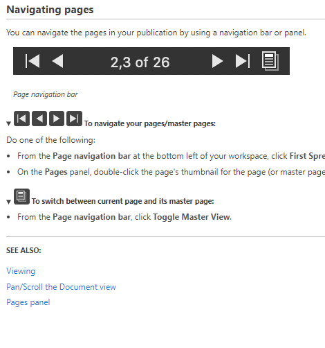
Help! Don't know what I clicked, but I lost the tool bar that goes along the bottom of the screen. Can't see the Preflight warning or the page navigator and don't know how to recover them. I have closed and reopened, and I have opened older saved documents. No luck. Here is the page about the page navigator but it does not tell me how to view it if it is not there. Thanks for any help!
-
Sorry! I meant elipses ...... dots!
-
PS. For future reference, if I want to add the epsilons.... between the entry and the page number next time, how would I do that? Clicking on bullet in drop down only gets me one bullet after the chapter entry. I'd also like to know how to change the position of the TOC - clicking on the tab indent etc in the drop down doesn't seem to do anything. If you can refer me to the instructions or a tutorial to explain, that might be easier for you, and I would be grateful. I don't want to have to trouble you with long explanations! It is good of you to give me your time.
-
Thank you, Walt and firstdefence. That worked like a charm! I am stoked! It looks great!
-
Hi again! Your help with generating a Table of Contents would be appreciated. I have followed the instructions and tutorials but have run into problems. I can't get the TOC to generate the page numbers. It will only show me the Headings. I formatted the headings using my chosen style, Half Right Title. There is also something odd going on because although the headings are all styled the same way in the desired Open Sans Font, all Caps, one entry in the TOC appears without a capital T for Two. Screen shot of TOC Page below. Any clues, anyone? Thanks!
-
Thank you very much, Iacerto! That was very helpful and instructive. There is so much to learn! Thank you for sharing your knowledge. Cheers D
-
If someone could point me to the right tutorials to find out how to do this, I would be grateful. I have formatted my memoir for POD. I treated each Chapter Heading as a style with 60pt space before to drop it down consistently each page. Now I want to create the Half Title and Title pages which will use larger fonts than the Chapter Headings, but which I want to have aligned with them vertically. Trouble is when I increase the font size for the Title, the tops of the letters are no longer vertically aligned with the tops of the Chapter Headings. Thanks for guidance.
-
Thank you all for your advice and good work around ideas. I was hoping that Affinity Pub would have a way of using space before as measured from the top margin. It was disappointing to learn that NNN had asked for this some time ago, and it is still not being offered. That would have been the perfect solution. As it is I will try Walt's idea of three different stylings for three different lengths of quote. That one is the easiest for me as a beginner. With much appreciation!
-
Thanks, v_kyr. That was just what I needed to review! Cheers
-
Can someone please help me to understand these terms. Is next Style the style that follows in the Hierarchy or what comes next in the document? I take it next level means another text style that hangs off this one in the group? Thanks
-
Hi, I would be grateful for help with finding the most efficient way to format an opening page for a memoir. I have created paragraph styles for the CHAPTER Headings, adding space before and after to place them where I want them. I have made them start on the next page, and created another style based on that for the ones that need to start on the next odd page. So far so good. Then I created another style for the Quotation that follows in italics a certain distance below the Chapter heading. I am treating the Author's name as a Character style below that again. Maybe there is a better way to do that. Anyway, then comes the challenge because some of the quotations are one line long, some are two, and some are three lines long. I will need to vary the space below the author's name so that my initial paragraph starts consistently in the right place on the page below it. I may need one empty line for a long quotation, or three empty lines below if the quotation is short. I have experimented with space before and after and wondered if I will need to adjust spacing locally in each instance. Then I remembered this vast wealth of experience and knowledge waiting to be tapped in the Forum! I would be grateful if anyone can be so kind as to steer me in the right direction. What would be the most elegant way to tackle this, please? What would be the easiest way? Here is how I want it to look: Forum Kobo test.afpub