MoonaticDestiny
-
Posts
506 -
Joined
-
Last visited
Everything posted by MoonaticDestiny
-
........But we can change the system to make it better for users and not let them get confused while working........ Ive always said that the undo and redo buttons should not be at the bottom right corner of the interface because they cause workflow disruption. Im so glad we can hide them in the preferences. Ive also said the help "?" button shouldnt be at the bottom right of the interface because it too causes workflow disruption. I made a whole forum post about it a while back. The help bottom seriously needs to be moved some place else and that would make room for this new stroke indicator. However, thats still the same amount of icons on the studio bar. I know that Ash is going to introduce tool and studio customization in a future build. That would allow users to remove studios they dont use to make room for more space on the studio bar. If thats still an issue then the spacing between each icon on the studio bar needs to be less. And if thats still an issue youre going to have to work portrait mode on your ipad. I hate suggesting this to you. But I truly believe this new stroke indicator icon has to happen. It has to because it solves an issue where as the undo/redo and help bottom cause workflow disruption. Id rather have a problem solved than workflow disruption. Sigh. This is going to be a process. The new stroke indicator needs to be added, the redo/undo and help buttons need to be placed somewhere else, studio customization will eventually happen, youll be able to remove studios you dont need then, and that will make room for users hands and their smaller ipads. If thats still an issue the spacing between the studio icons needs to be less and if thats still an issue users will have to work portrait mode. But I dont think that will happen once studio customization happens.
-
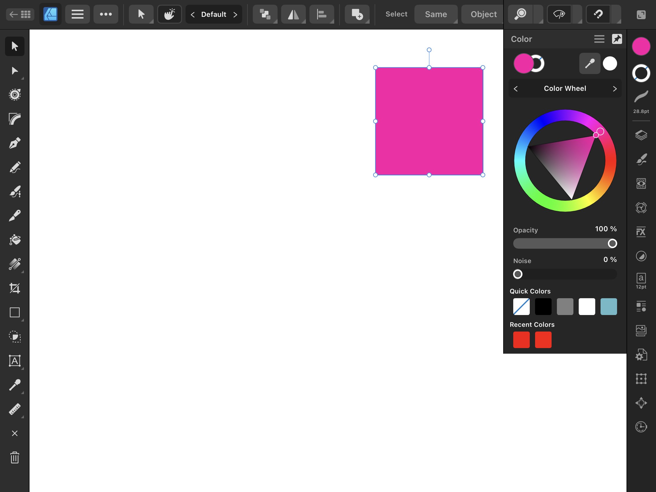
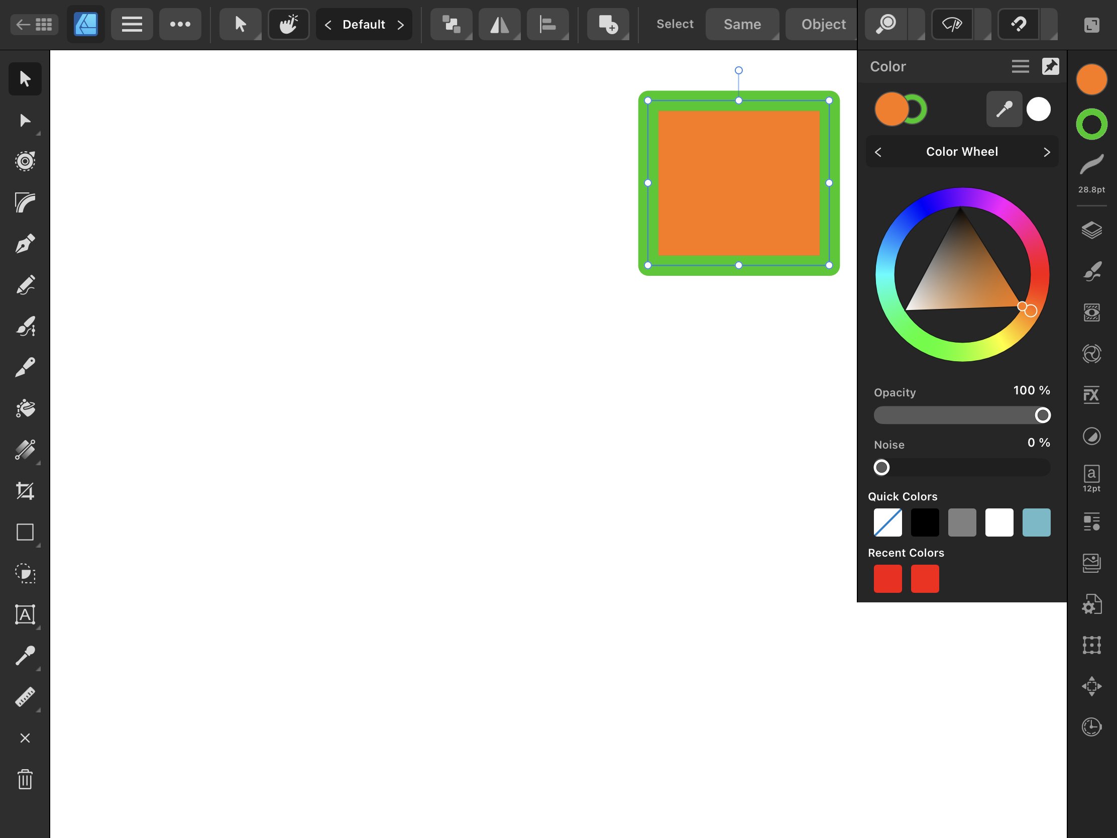
I just wanted to show 3 examples of how this new stroke icon on the studio bar would work. The 1st example is a pink square. The color fill is pink but the stroke fill has no fill. The 2nd example is a blue stroke. It has no color fill but has a blue stroke fill. The 3rd example is an orange square with a green stroke. It an orange fill and a green stroke. Now, I can click on my new stroke icon to change its color instead of clicking on the stroke studio icon because it no longer has a color indicator for my stroke. This new stroke icon will take me to the color studio to change my stroke color. I want to also note that whatever icon you click on, the circle color fill or the outlined circle stroke fill icon, will open up the color studio and depending on which one you clicked on will be the one that is above the other. So if I clicked on the color fill the color fill will be above the stroke fill in the color studio. If i clicked on the stroke fill the stroke fill will be above the color fill in the color studio. That way the app presents to me which fill I want to change based on which one I clicked on. So in the 3rd example the orange fill is above the green stroke fill in the color studio. That means I had clicked on my color fill icon on the studio bar to change my color fill. So in the 2nd example, I wouldnt click on my stroke studio icon to change the color of my stroke because theres no longer a color indicator. Its now grayed out. Now, I would click on the new stroke fill icon to change my strokes color because of iconography and color indication. The iconography of an outlined circle icon to represent stroke and the color indication of the color blue.

-
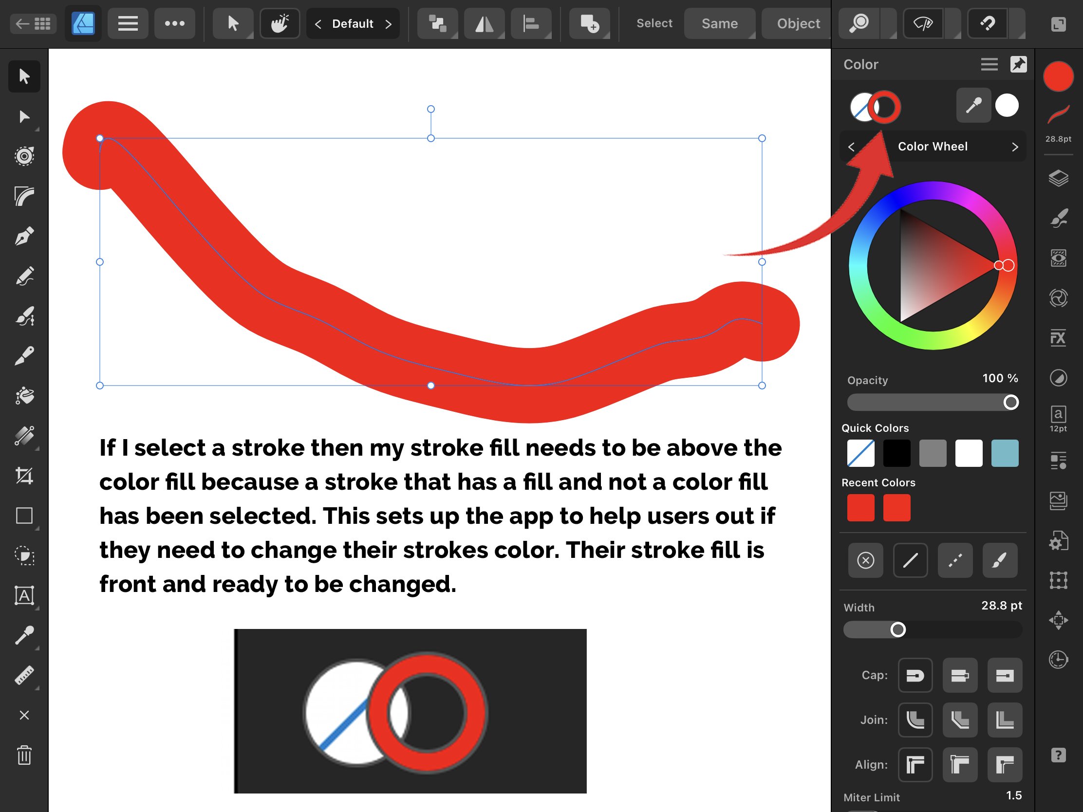
The problem is the color indicator for the stroke studio is confusing users into thinking that the color property for their stroke is in the stroke studio. Its not. So users are left confused into why their color isnt in the stroke studio only to realize that they have to go to the color studio to change it there causing workflow disruption. The solution is to create a 3rd icon on the studio bar that will represent the color of a stroke. This 3rd icon will be represented by an outlined circle icon. Then you need to take the color indicator that the stroke studio previously had, remove it, and apply this color indicator to this new outlined circle icon because this icon will now indicate the color of your stroke. And now if I want to change the color of my stroke I would click on this new 3rd icon. The outlined circle icon because this icon represents my stroke and the color indicator tells me this is where i change the color of my stroke. Im not going to click on my stroke studio icon no more because theres no color indicator there. I wont be confused anymore because theres no color indicator on the stroke studio icon to confuse me. Its now gray colored like the other studios. No studios will be combined and the color fill icon and stroke fill icon will both open the color studio while the stroke studio icon opens up the stroke studio. THIS is the solution to everything. Please watch the video below. solution.mp4
-
I no longer agree that the color and stroke studio should combine. I found the solution to all this and I will share it in a video soon. This solution will solve EVERYTHING.
-
@fde101 @Old Bruce I apologize for my noise removal request. Im educated now on why it should stay in the color studio. Disregard this feature request, Serif.
-
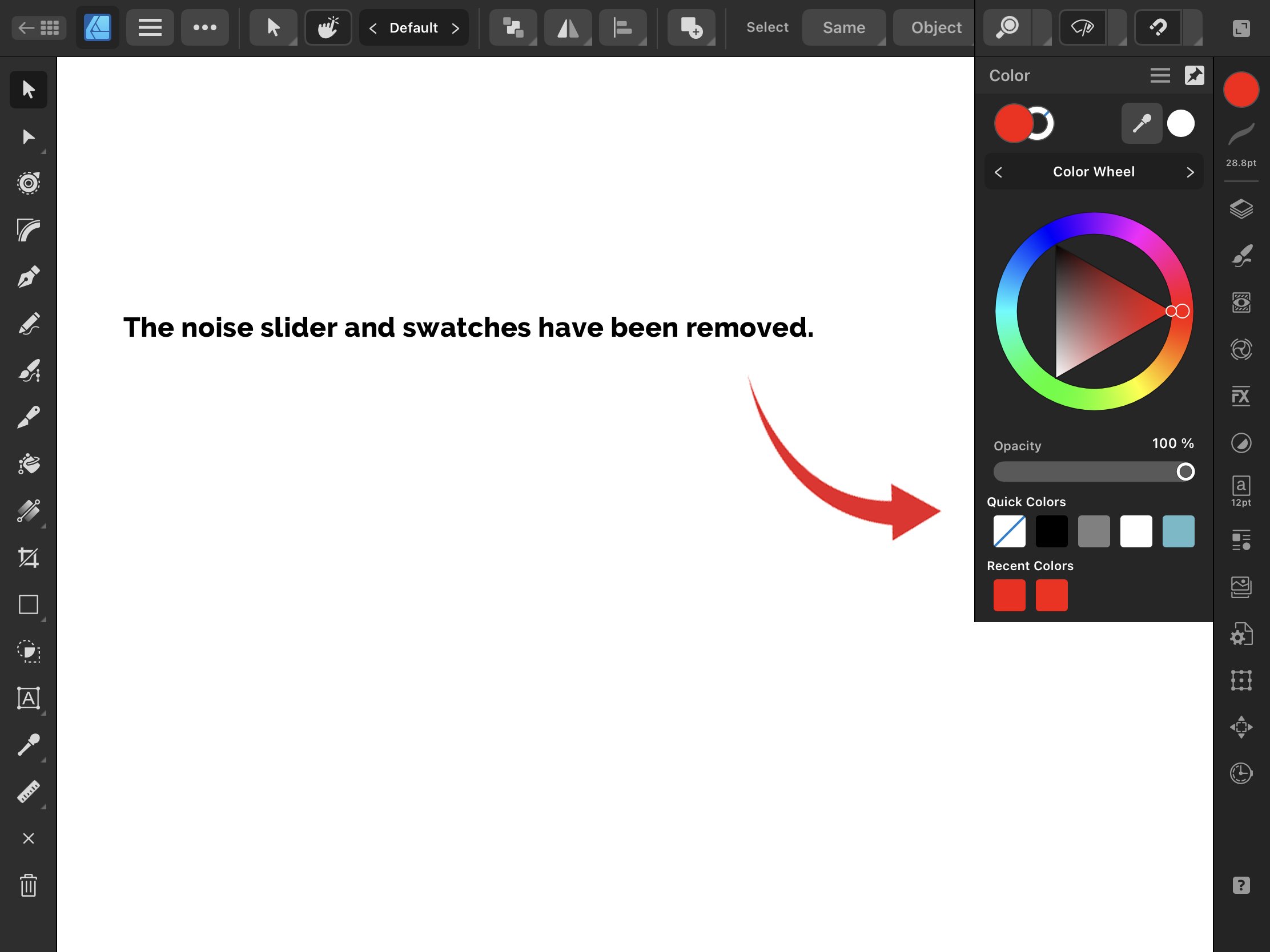
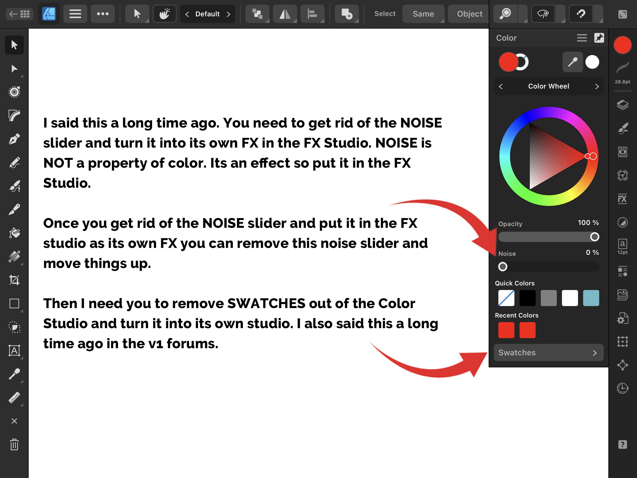
I didnt know you could gradient noise through the gradients stops. Im just finding out. Thats such a very weird way of working because gradients is mainly for color. Not noise. You dont gradient noise. You gradient color. If you wanted to gradient noise you should add a noise fx to a layer and then use the transparency tool to gradient the noise instead. I say that Noise should be an FX in the FX studio because currently noise only has 1 property, the opacity property in the color studio. Noise should have more properties that you could change like the color of the noise, the size of the noise, the blend mode of the noise, the opacity of the noise, the intensity of the noise, and different types of noise. These are properties that appear in an FXs context menu. You dont have these properties in the color studio for the Noise. Theyre unavailable. Thats why I say Noise should be an FX because it needs to have other properties that you could change other than just opacity. What a weird way of using noise in the gradient stops. Its an FX thats being applied to the gradient stops.
-
The color studio icon displays the color for both the color and stroke fill. It should not be like that because you already have a color indicator for the stroke fill. Which is the stroke studio icon. So the color studio icon should only be displaying the color for an object with a color fill. Not a stroke fill. So you need to create a 3rd icon that is an outlined circle icon to represent the stroke fill to an object. That way the color studio represents an objects color fill, the outlined circle represents an objects stroke fill, and the stroke studio can represent a strokes width. This would then allow users to perform their studio gestures to change their color or strokes value. Please watch the videos below. It explains more in detail. Theres also a mock up of the 3 icons at the bottom. At the end I reference the color and stroke studio combined. I talk about combining both studios here in this forum on how they need to combine. fill issue1.mp4 fill issue2.mp4
-
I found another issue while trying to solve this issue. Theres actually ✌️2 color indicators in the app and 1 of these color indicators is WRONG because its indicating the color for both the color fill AND stroke fill when it should just be the color indicator for the color fill. I will make a whole separate forum post about it, and I will quote this post with the new forum post.
-
I want to also note that if a user taps the stroke studio icon then the stroke fill should be above the color fill and if a user taps the color studio icon then the color fill should be above the stroke fill. Color Studio --- Color Fill above Stroke Fill Stroke Studio --- Stroke Fill above Stroke Fill
-
So what happens when an object with both a color fill and stroke fill is selected? What should be above what? The color fill or the stroke fill? The answer is the color fill. The color fill should be above the stroke fill.
-
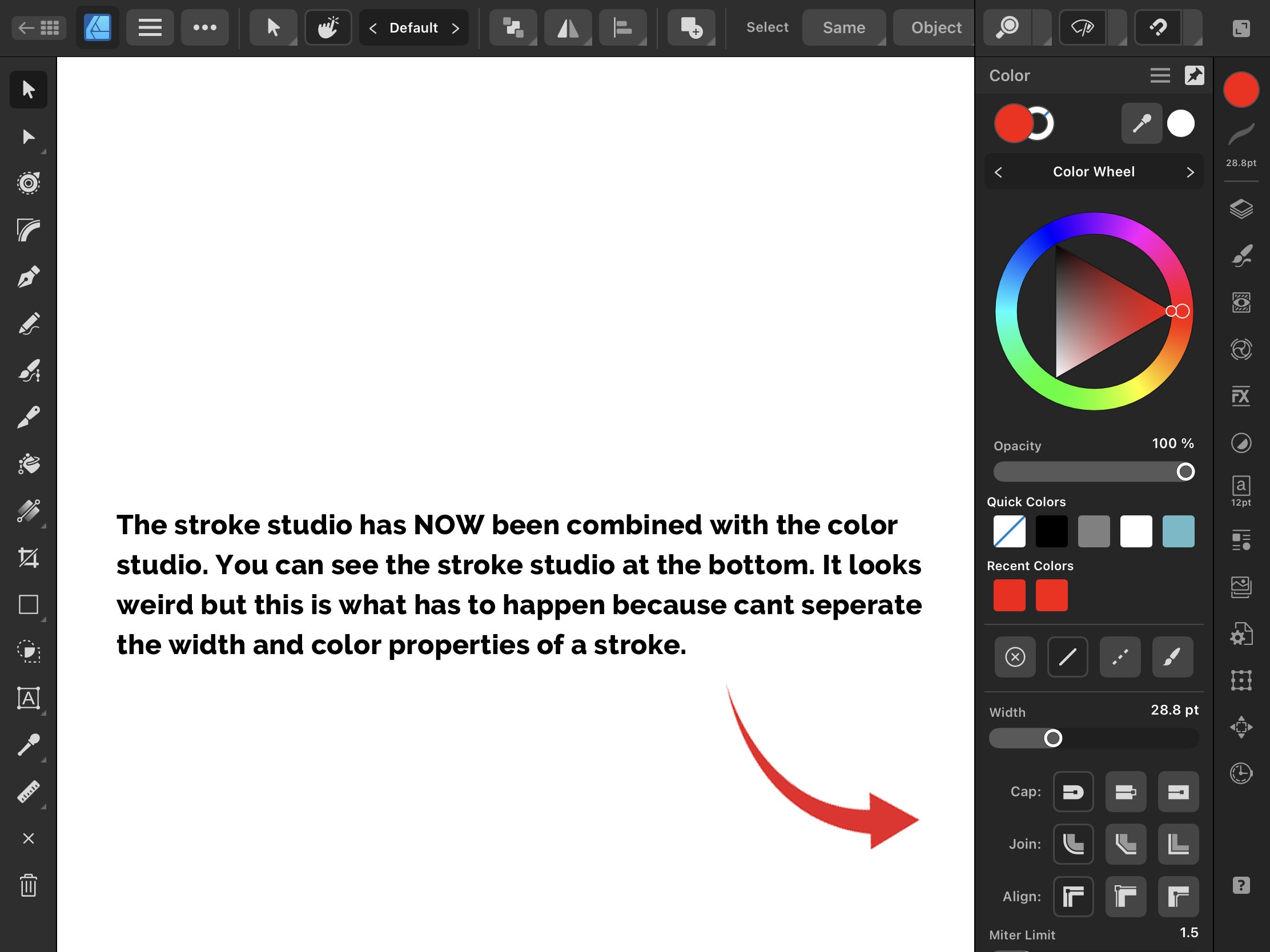
Stroke and Color studio combined. Now, if I select a stroke I can change its color and width. No more going to the stroke studio only to find out that the color property of my stroke isnt there.
-
So first you need to remove the noise slider from the color studio. Noise is not a property of color. It has no reason to be there. Make it its own FX in the FX Studio. Remove the noise slider and bump everything upwwards. Then you need to remove swatches out of the color studio and make it its own studio. You cant have a HIDDEN studio within another studio. Look at the photos below for reference.
-
So the issue is the "color indicator" that the stroke studio icon changes to depending on the color of your stroke is FOOLING users into thinking that the color property of their stroke is in the stroke studio when its not and its causes workflow disruption and we're forced to stop, think a bit, and go to the color studio because thats where the color property of our stroke is. On top of that, Serif, divided the stroke properties, color and width, into 2 studios and it shouldnt be like that because these 2 properties relate and go together. Its time to combine the stroke and color studios into 1 studio to solve this issue.
-
Heres a video of me talking about an issue thats happening with strokes in AD v2 for ipad. Strokes have 2 properties, a color property and a width property. Both of these properties have been divided into 2 studios, the color studio and the stroke studio. This should not be happening. These 2 properties should not be divided nor split into 2 separate studios. They need to be together and the color and stroke studio FINALLY need to combine into 1 single studio. Its long overdue and it needs to happen. This isnt an issue on the desktop version because youre allowed to have multiple studios open. On the ipad you cant have multiple studios open so the solution is to combine these 2 studios into 1 studio that holds all the properties to an object or stroke. Stroke3.mp4 Stroke4.mp4
-
So I actually made a mistake for the artboard contextual menu. I forgot to add the lock icon. The lock icon because locking an artboard is something that you can do in affinity designer so users should have the ability to lock their artboard QUICKLY if they click on an artboard. So its nudge, lock, duplicate, delete, and deselect. Below is an image of the new artboard contextual menu. NOW we are done with the artboard contextual menu.
-
THIS! They did this with the new context menu in v2. Its so upsetting. Im gonna make a whole video about. I like adjusting FX in V1. Not V2. Adjusting FXs in V2 is SO BAD because of the new context menu being split into two. One at the top and the sliders on the left. Im gonna make a whole video about it as well. Sigh. Theres so much that needs to be done. Im just focusing on this new contextual menu because it needs to happen.
-
Heres a new image of the interface below with the new contextual menu. We removed the help button and placed it next to the edit menu to prevent accidental triggering that caused workflow disruption for right handed users. We removed the deselect and delete button at the bottom left of the interface because they caused workflow disruption for left handed users and theyre now located on the new contextual menu. Theres a new contextual menu that appears depending on what object you have selected. Selecting an artboard reveals a contextual menu containing 4 actions. They are nudge, duplicate, delete, and deselect. The personas are now displayed for faster toggling into where before it required an extra step for users to toggle into. and thats it for now. Thats solves most of the issues. This is just a mock up. A blueprint to help you for a future build, Serif.
-
The photo above 👆, THIS is how the affinity designer app should look like minus the top bar icons that I removed for the time being. THIS is how its supposed to look like. THIS is what the app should be and its going to look even better once tool and studio customization happens later on. Im literally giving you all the design logic and evidence to make these changes. This is not me making interface changes just because. Theres design logic behind this. We can make this app better for right and left handed users.
-
Heres the mock up of the help button. You take it from the bottom right corner and move it next to the edit menu. Thats it. No more workflow disruption.
-
Now, we moved the delete and deselect buttons into the new contextual menu. The help button though needs to be placed else where. You probably want to place it next to the edit menu. Thats the only place I can think of where it would be good to place and then what you might want to do is allow users to hide this help button. Just how you allow users to hide the undo/redo buttons, do the same for the help button. Also, those undo/redo buttons shouldnt even be at the bottom right of the interface because they too cause workflow disruption. Its a good thing you can hide them. So let me do a mock up of where the help button should go. Give me some time.