Affinity Jack
-
Posts
241 -
Joined
-
Last visited
Everything posted by Affinity Jack
-
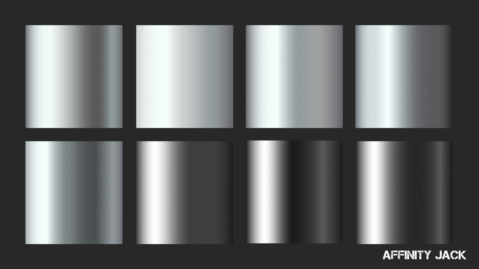
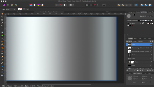
 Hi, In diesem Affinity Photo Tutorial zeige ich wie das Verlaufswerkzeug funktioniert. Dazu erstelle ich einen Metall-Verlauf, definiere Farben und Übergänge, speichere ihn, schaffe dazu Paletten und zeige wie man ihn exportiert oder importiert. In Zukunft werde ich auf unserer Website einige Verläufe zum Free Download zur Verfügung stellen. Hi, In this Affinity Photo Tutorial, I show you how the gradient tool works. I create a metal gradient, set colors, fades, save it, create palettes and show how to import or export. In future, I will provide some metal gradients on our website. Farbcodes für den Beispiel-Verlauf / color codes for the example of metal gradient: (von links nach rechts / from left to right) 1) #1C1C1C 2) #FFFFFF 3) #A0A0A0 4) #3D3D3D 5) #272727 6) #595959 7) #1C1C1C Viel Spaß Euer Jack Video-Tutorial auf YouTube
- 3 replies
-
- 2
-

-
- Affinity Photo
- gradient
- (and 5 more)
-
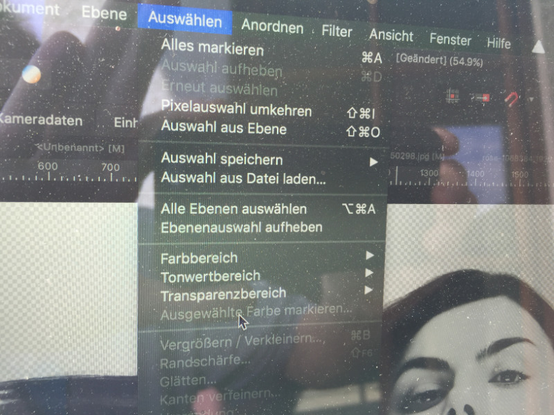
But if I click "color range", it's like shown in the photo. The selection comes over the edges of the png-file (transparent background) and nothing is changeable... It doesn't matter if raster or not, import in many different ways. Strange thing. I want to create a tutorial on YouTube and had to stopp because it doesn't work...
-
I also tried that. No difference. A strange thing. I just made a short screencast, but it's not possible to upload.
-
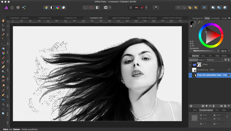
Hi, I have problems with the COLOR RANGE in AP. I want to select color tones. My steps: 1. Selecting a color with the color picker 2. Activate this color 3. "Selection" - "color range" At step 3 there happens a lot of strange things. a. Sometimes it works. Good! (no problem) b. Sometimes it isn't possible to click the "color range". It isn't choosable. (problem) c. Sometimes (png with cut-out background) it selects only the whole "shape". It isn't adjustable. (problem) I don't understand which reason could cause that. I use JPG-files and tried different ways to import. - dragging into AP - Media Browser - "open with..." - rastering / not rastering Could anybody help me? Ciao Jack
-
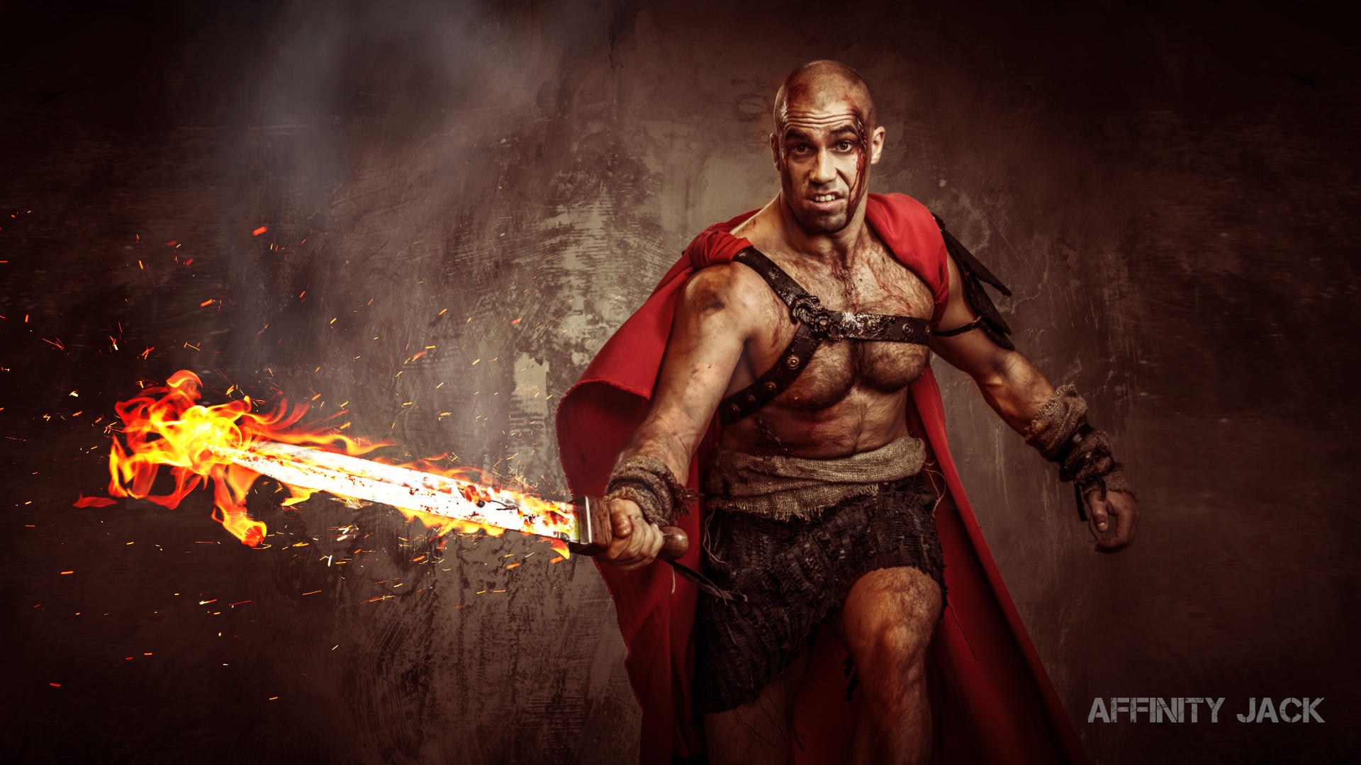
Hi Horslip, thank you very much. And also for the picture. Are you german oder english? Because, I had to do the workflow faster than usually. Otherwise the video would be too long. But the disadvantage is, that is more difficult to follow. Especially in with subtitles. How was that? Was it okay? Your warrior: It works well! In my point of view a new interpretation. Not a frightening barbarian but a Rock Star! Yeah! That rocks! Ciao Jack
-
Hi Graphite Addict, thank you very much. :D :D :D I'm happy. I was a little bit afraid. Because of the idea: the original poster looks perfect Because of the fast workflow. the faster, the more difficult to follow, especially with subtitles. Greetings from Berlin and happy pentecost. Ciao Jack
-
Hi, in diesem Affinity Photo Tutorial zeige ich wie man den Stil vom Kino Poster Warcraft erstellt. Das Kino Poster vom Film Warcraft inspirierte mich dazu, den Effekt zu versuchen. Es stecken ein bisschen Cinematic Effekt, Dragan Effekt und Color Splash Effekt darin. Die wesentlichen Arbeitsmittel sind hier die Anpassungsebenen, Blendmodes und Masken. Besonders alles, was die Kontraste erhöht, die Verlaufsumsetzung und Dodge & Burn. Viel Spaß In this Affinity Photo Tutorial, I show you how to create the style of the movie poster Warcraft. Die cinema poster of Warcraft inspired me to try this effect. There is a little bit of cinematic effect, Dragan effect and color splash effect in it. The main methods are adjustment layers, blendmodes and masks. Particularly all what increases the contrasts, the gradient map and dodge and burn. Have fun. Ciao Jack Video Tutorial auf YouTube
- 4 replies
-
- 3
-
-
- Affinity Photo
- Tutorial
- (and 6 more)
-
Gradients in Graphics
Affinity Jack replied to minimi's topic in Pre-V2 Archive of Desktop Questions (macOS and Windows)
Hi MEB, it works! Without your solution, I never would find out. It's a little bit complicate. More practicable would be creating a gradient directly from the gradient panel. In "adjustment layer - gradient map" there are no favorite gradients offered. Thank you! So I can go on to create some metal gradients. Ciao Jack -
Gradients in Graphics
Affinity Jack replied to minimi's topic in Pre-V2 Archive of Desktop Questions (macOS and Windows)
Affinity Photo: Hi, I want to create some metal-gradients, save them and export (to share) them. But i doesn't work. If I click the palette symbol, only one color is saved. If I click on the settings on the right, I can choose several options, but it will never save a gradient, but a palette of colors. (the layer is active, the gradient tool selected, the dropdown on the right is set to gradients. Sorry, I don't find a way, even in the help-menu. Can you help me? What is my mistake? Ciao Jack
-
:rolleyes: :rolleyes: :rolleyes:
-
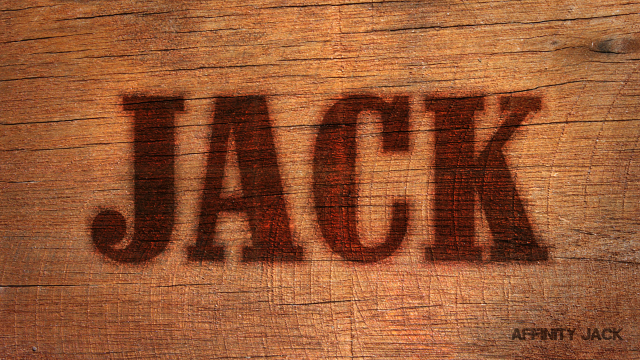
Hi, In diesem Affinity Photo Tutorial zeige ich wie man den Burn Wood Text Effekt erstellt. Oder zu deutsch den eingebrannten Holz Text Effekt. Es soll so wirken als wenn der Text mit einem Brandeisen in das Holz gebrannt wurde. Das bedeutet, dass der Text dunkler sein muss, besonders an den Rändern. Er braucht eine leichte Prägung. Die wesentlichen Arbeitsmittel sind hier die Ebeneneffekte, Blendmodes und Masken. In this Affinity Photo Tutorial, I show you how to create the Burn Wood Text Effect. It should seem like a hot iron burned the text into wood. The main methods are layer styles, blendmodes and masks. Have fun Ciao Jack YouTube Video: Burned Wood Text Effekt (English Subtitles)
- 2 replies
-
- 2
-
-
- Affinity Photo
- Tutorial
- (and 4 more)
-
Hi MBd, wow! Wow! Wooooow! That's awesome! Blue Lightning TV is one of the best artists. Also Phlearn. In my opinion. But they are pro. I have a completely different profession and do this as a hobby. To be honest: I apologize, that is lightyears away from my skills. But I'm working and learning. And perhaps, one day I'm able to do such a "Predator"-look. I didn't see the video, but the result is awesome. So far, I think you tried the right way. - b&w for the person - curves for more contrast - Displacement Filter - blendmode - perhaps gradient map for toning - a kind of distortion, but I think AP hasn't got that kind of feature. That will be difficult. Like the whole composition. Like so often. Some settings make the difference. But now I'm curious. If you have a solution, please write to me. I would try it. Greetings from Berlin Jack
-
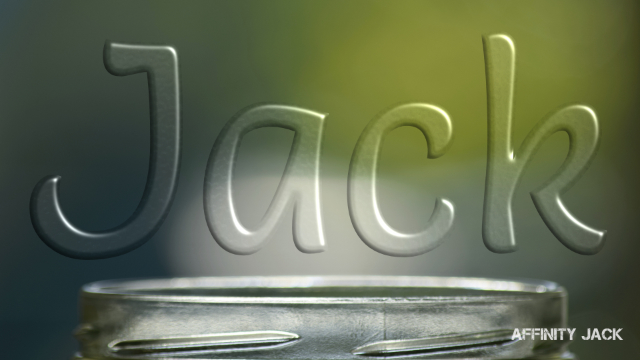
Hi, In diesem Affinity Photo Tutorial zeige ich wie man den Glas Text Effekt erstellt. Das geht im wesentlichen über den Ebenenstil 3D. In this Affinity Photo Tutorial, I show you how to create the glass text effect. It works mainly with the layer style 3D. Ciao Jack YouTube-Tutorial "Glas Text Effekt"
- 2 replies
-
- 2
-
-
- Affinity Photo
- Glas Text Effekt
- (and 3 more)
-
Sky Replacement Issue
Affinity Jack replied to Seadart's topic in Tutorials (Staff and Customer Created Tutorials)
Hi Johannes, Du hast eigentlich fast alles richtig gemacht. Nur vergessen, etwas zu markieren. Am besten geht es so: 1) alten Himmel auf der Burgebene auswählen 2) diese Ebene aktiviert (blau) lassen und die Maske drauf legen. Jetzt ist der Himmel weg. Die Maske sollte jetzt mit dieser Ebene verbunden sein. Das heißt bei Affinity "nested", oder in Photoshop "Schnittmaske/clipping mask" 3) neuen Himmel unter diese Ebene ziehen und so transformieren, dass es gut aussieht. Ich vermute, dass die Farben zu knallig sind und mit dem restlichen Bild nicht zu 100 % harmonieren werden. Das anzupassen, geht etwas weiter. Ich werde das wahrscheinlich mal als Tutorial bringen. Ciao Jack P.S.: Zeig mal ruhig Dein fertiges Werk! -
Hello p_mac, thank you very much! I'm definitely not the best, even not in english... :D :lol: . But also definitely, I have fun with experimenting, sharing, learning and discussing. Trying to turn ideas into projects. And I'm pleased, you recognized that. Greetings from Berlin Ciao Jack
-
Hi Horslip, vielen Dank! Die Idee ist nicht komplett neu. Man sieht diesen Effekt gelegentlich. Ich habe ihn aber etwas verändert. Manche Dinge finde ich einfach gut. Ciao Jack
-
Hi, In diesem Affinity Photo Tutorial zeige ich wie man den Gras-Text-Effekt erstellt. Ein Klassiker, den man immer wieder sieht. Er ist schnell und einfach zu machen. Passt zum Frühling. In this Affinity Photo Tutorial, I show you how to create the Grass-Text-Effect. Classical, and to find everywhere. It is fast and easy to produce, even in spring. Ciao Jack YouTube Tutorial: Gras Text Effekt
- 4 replies
-
- 6
-
-
- Affinity Photo
- Tutorial
- (and 5 more)
-
Hi, in diesem Affinity Photo Tutorial zeige ich wie man einer Landschaft einen dramatischen schwarz/weiß Look verpasst. Dazu gehört die Arbeit in den Farbkanälen und auch dodge & burn. Viel Spaß Euer Jack In this Affinity Photo Tutorial, I show you how to create a dramatic look of a black and white landscape. I work with channels and dodge & burn. Have fun with this Your Jack YouTube-Tutorial
-
- 2
-
-
- Affinity Photo
- Tutorial
- (and 3 more)
-
Hi Rosa, :) :) :) !!! You make me smile from ear to ear. Happy Easter! Ciao Jack Jack
-
Hi, In diesem Affinity Photo Tutorial zeige ich wie man einer Szene einen feurigen Look verpasst. Dazu werden Flammen hinzugefügt, Rauch und ein roter Lichtschein erstellt. In this Affinity Photo Tutorial, I show you how to create a fiery scene. Therefore I add flames, smoke and a red glow. Ciao Jack YouTube Tutorial
- 2 replies
-
- 3
-
-
- Affinity Photo
- Tutorial
- (and 3 more)
-
Hi R C-R, thank you. I'm always learning in this Forum with the excellent "Affinity Familiy". :lol: Ciao Jack
-
Hello alecspra, I don't know exactly what you mean. The reasons for effecting nothing could be: - it is only a black & White layer (Colors are needed) - the selection isn't correct - the effected layer isn't active Or you mean, that there are 2 slide bars. Yes, the upper one has no function. In this tutorial I use the HSL-adjustment: https://youtu.be/fFOjBzKQ1Wo Ciao Jack
-
Hi Painterly, a new topic? This is called "Stichting Panorama" in Affinity. Here is the Tutorial. Ciao Jack
-
Hi Nino Soriano, I made a tutorial but with Affinity Photo. YouTube-Tutorial: Disintegration Effect Perhaps, it will be helpful. Ciao Jack
-
Hi Desmond, every time I'm pleased to see your toning effects. Ciao Jack