wls
-
Posts
38 -
Joined
-
Last visited
Everything posted by wls
-
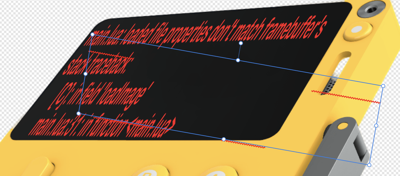
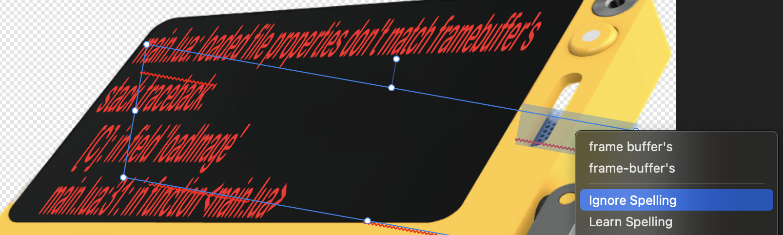
I'm using Affinity Photo v2.3.1 with hardware acceleration on, using macOS Sonoma 14.2.1 and have a reproduce issue with the Artistic Text Tool when used with Distort > Perspective. ( The goal I'm trying to accomplish is put some technical text on a 3D rotated plane. ) Here's how to recreate. 1. Use the Artistic Text Tool and create a block of text; I happened to be using Arial Rounded MT Bold, Regular, 18pt but that shouldn't matter. Provide several lines of text, ideally with words that the Spell Checker does not recognize and therefore underlines with red markings -- this will help you see the problem even better. 2. With the text object selected, hold down Shift and drag the bottom right corner, this is going to stretch the text. 3. Then drag the rotation bar, putting the text at an offset. So far, everything should be fine, with the text (in its own rectangular boundary) stretched and rotated a bit. 4. Now, select Layer / New Live Filter Layer / Distort / Perspective... and grab each of the four corners and distort. If you look at the attachment, you'll see that my attempt was to align the text to an element of another image. Things may start to look a little weird, with that appears to be graphical artifacts on your image -- they are not. 5. Finally, select the Move Tool and click on the text object. Several things are now very wrong. A. The bounding box (blue rectangle) of the text is NOT where the pixels that make up the text are (well outside the bounds). B. There all all kinds of red squiggles floating on the image. That's actually the spell checker, and if you put the cursor inside the bounding area, and right click, you'll see it "selects" where it thinks the word should be, and pops up the autocorrect and dictionary menu.

-
@CleverFox2 -- I noted the same thing moments after posting. So I reposted it (same problem, perhaps with forum?) I sent a copy to SMASH. https://fromsmash.com/Affinity-Photo-v2-Masking-Bug 121997913 Nov 12 20:15 Affinity Masking Bug.MOV (size) 35dd53703f0bff463a98f4b4350b6b64a68611f20972ebbe305893f8edd8fdc5 Affinity Masking Bug.MOV (sha256) Affinity Masking Bug.MOV: ISO Media, Apple QuickTime movie, Apple QuickTime (.MOV/QT) (file type)
- 4 replies
-
- 1
-

-
- bug
- masking adjustment layers
- (and 1 more)
-
Attached is an iPhone movie of an Affinity Photo 2 (v2.0.0 for Mac), canvas rendering problem in Masking mode when the cursor is hovered (not clicked, not drawing) over the canvas. 00:00 - We see a Layer Effect of Gradient Overlay has been applied to a photo (IMG_1146.CR2) and it's Mask layer is all white. 00:13 - We are in brush mode and hover the white brush (00:17) over the canvas just fine, then at 00:27 we switch to black brush and do the same, again all's fine 00:35 - We merely select the Mask layer, and then hover (not paint, not click, not select) the same black cursor over the canvas 00:37 - As the cursor hovers into the canvas boundary, rendering gets all screwed up. Note, again, we are NOT painting. Hover only. 00:47 - We switch the the white brush, still in mask layer, still hovering (not painting, not clicking, not selecting) 00:48 - As the brush enters the canvas area again, portions of the canvas far away from the brush show artifacting 00:53 - "Interacting" with the artifacting does some weird pixel-refresh behavior; note again, we're NOT painting, just hovering. 01:05 - Switching back to the image layer, the rendering problem goes away 01:11 - Switching back to the masking layer causes the problem to return (01:12); again, only hovering ( Unfortunately, I don't have the file, or I'd pass that along to you. ) EDIT: Uploaded Video didn't render when posted. You can get it for the next 14 days at https://fromsmash.com/Affinity-Photo-v2-Masking-Bug EDIT 2: The vertical nature of the iPhone movie seems to be not working on this forum software. Please double check the file you get from the above URL matches this information before opening. 121997913 Nov 12 20:15 Affinity Masking Bug.MOV (size) 35dd53703f0bff463a98f4b4350b6b64a68611f20972ebbe305893f8edd8fdc5 Affinity Masking Bug.MOV (sha256) Affinity Masking Bug.MOV: ISO Media, Apple QuickTime movie, Apple QuickTime (.MOV/QT) (file type) Affinity Masking Bug.MOV
-
Ah, that's what it meant. It's worth pointing out where user-confusion originated from. Here's the actual Affinity Photo Layers against the Documentation. There's a one-for-one listing in the type of layers for the first four, building a pattern of expectation. One would expect, then that any vector would appear as "vector", and so when a layer appears as an "image" that's a surprise and typically one does not think of vectors when told something is an image -- creating the illusion something is either new or missing from the manual. Realistically, snapshots are used less frequently than those four -- so this may not be tried. If one does, the trend breaks. Instead of getting a layer that identifies itself as a snapshot, you a layer with what appears to have been snapshot'd. It causes a moment of pause, but there's the "oh, I guess that makes sense" moment. Knowing this, it opens a whole new level of appreciation, when a true vector is placed as the software identifies it as a "Rounded Rectangle" or a "Curve." Clever! And what we see is that the vocabulary for Affinity Photo is using the term 'image' to mean 'a vector region containing a bitmap'. In hindsight, I have to say the abstract concept of an image is dead-on and Affinity got it right. The unsuspecting user using a pixel editing tool (especially if new or a novice) drags an image file in, the initial uninformed expectation is that they are working on a pixel layer. If one does not realize dragging an image file onto the canvas is also the same as "placing" it, it's easy to not realize what's just happened. This also explains the very subtle differences in the documentation, that a Vector layer is actually many different kind of things. Your posts have both enlightened me and educated me. Very much appreciated!
-
Excellent. That addressed it. Thank you! However, that begs the question -- What is an image layer? And how's it different than a Pixel layer? And what's it used for / makes it special? 🦟 DOCUMENTATION UPDATE: Affinity's official help topic About Layers, doesn't mention them, only Pixel, Mask, Adjustment, Fill, Snapshot, and Vector. I also noted that file I dragged on was a screen shot, giving the layer name a long name like "Screen Shot 2020-09-01 at 1.19.57 PM", which pushed out the indicator of what type of layer it so far it was obscured. (See what I saw in the attachment.) 🦟 POSSIBLE FIX: To handle long layer names, Affinity should put the layer type under the layer name, as there's plenty of room for it.
-
Affinity v1.8.4 -- running into unexpected behavior, could be a bug, could Affinity does things differently... PROBLEM When attempting to do an Edit / Copy on an area of a layer selected by the Marquee Tool, Affinity duplicates the layer as a whole, rather than just the selected area. STEPS TO REPRODUCE 1. Open Affinity Photo and drag in a "large" image to use as the Background layer. 2. Drag in a "smaller" image which should appear as a layer over the background. Make sure this layer is selected. 3. Choose the Rectangle Marquee Tool and select an area of the smaller image. 4. Press Command-C ... you expect that the area within the Marquee is now on the clipboard. 5. Press Command-V ... you expect the clipboard with the copied area will now be pasted as a new layer. ...THIS FAILS, instead you get a duplicate of the layer you dragged in! That's the bug. Now... prove that your expectations weren't wrong. 6. With the Marquee still in place, do Shift-Command-C (the Copy Merged)... this should get the same "area" but now all layers, now just the currently selected one. 7. Press Command-V ... and this time just the area within the Marquee is pasted. 8. If you select the Move Tool (V), you'll see you can move that pasted area around now. This is highly problematic when you want just the layer and not the background layer, i.e. the marquee extends beyond the image within its layer.
-
FOUND THE SOLUTION I'm running into this very problem on v1.8.3 right this moment. I opened a JPG, then dragged another on top of it, and Option-clicked the mask Layer Button, and expanded the layer to select just the mask. Using the D (default colors), X to exchange and put white on top, I'm now trying to paint on my black mask. It's possible to make this stand out as obviously broken. Clicking the mask icon itself, right click and select Edit Mask. At this point, the canvas goes black (as it should), waiting for white paint. Paint Brush Tool (Width 200px, opacity 100%, Flow 100%, Hardness 0%) -- painting with white didn't work. Color Replacement Brush Tool (Width 200px, opacity 100%, Flow 100%, Hardness 0%) -- works Pixel Tool -- works Closer inspection if the tool bar reveals that Protect Alpha is on! It was not on for Pixel Tool, and when turned on there, same problem. Color Replacement doesn't have that option. Mystery solved. Affinity Photo is working as designed, but the "bug" is that when editing a mask, when Protect Alpha is on, you simply can't edit the mask. Turn Protect Alpha Off when Editing a Mask. This will not be obvious to new users (or some old ones) and is great source of frustration. It'd be nice if either that option isn't present when editing a mask, is ignored when editing a mask, or an assistant lets you know what's going on.
-
Hats off to you, that's a great solution! The 100% value could be specified by a drop down or accept user input via text field / slider like the Zoom Tool Bar. Then you'd be able to open to any desired fixed size in addition to dynamically filling the viewing area. Sweet!
-
Hi Chris, thanks for the note about the Navigator Panel and Zoom Tool issue -- I did a quick search of the forums, bit didn't see anything that quite explained the different ways they could fall out of sync. Hope I wasn't too redundant, as I try not to report things already known. I concur with your assessment that the first part is indeed personal preference and for that reason thought about not mentioning it. However, here's why I did: In virtually every case the photo that I'm editing is smaller than the available screen real-estate; this means that I always have to double click Zoom before doing any image work -- that's extra keystrokes/clicks every time. On the rarer occasions I'm working with large-sensor images and want to examine details for editing, again, I'm having to double click Zoom before starting. In fact, if I want to load an image just to see how large it is visually, I have to double click Zoom to do that. It feels like the default behavior ought to be to just open the image at 100% so the person knows exactly what they're really starting with, to zoom-in or zoom-out ought to be the personal preference, not a mandatory step to undo a fit to screen, which incidentally varies for those of us with two monitors. In thinking about this more deeply with my professional QA hat on, I retract my 200% suggestion, given that this just isn't how images are viewed and assessed -- seeing what one needs to do to an image is the first step, higher magnification is only part of a some secondary editing processes. The counter point, while valid, would make more sense if there were more pixel artists out there than graphic designers, web masters, illustrators, painters, photo retouchers, etc. Affinity Photo does not appear to be designed primarily for that audience, as other tools are, it's flexibility just doesn't exclude it. In short, I don't think the demographics support pixel-art behavior as the most popular use case justifying the default behavior of filling the window when initially opening an image. Usually a pixel artist has to consider the resolution at which their art will be used/view, which again suggests that 100% might be the right choice for them as well. I hope I'm making sense in trying to explain this; it's a small change that seems to improve everyone's workflow. Thank you again for letting me know the issue is on Serif's radar.
-
When loading a small image from scratch, the one I'm using is 250x193, Affinity Photo automatically defaults to filling the available area resulting in a pixelated image that's roughly 1000%+ in size. ( It'd be nice if a small image did nothing more than 200% upon first load, which is more in line with the retina displays. ) Anyhow, to quickly set the Zoom back to normal one can double click the Zoom icon (magnifying glass) -- and the image does change size back to 100%. However, the Zoom tool bar still has the old 1000%+ value. Meanwhile, the Navigator shows a different Zoom value. And, if one alters the Navigator zoom slider (the canvas area correctly resizes), then uses the pinch/stretch gesture, and then double clicks the Zoom icon -- the value in the Navigator gets copies to the tool bar, and the Navigator might (if you're lucky) jump back to 100% (often it does not), but the canvas image does. In short, there's the visual canvas area, the Zoom Tool bar, and the Navigator -- all three fall out of sync, so it's difficult to know at any time which one is the authority for what the current zoom level is. They should always be in agreement with the same value.
-
REAL WORLD PROBLEM: I had a vector image that didn't fill my canvas, so I wanted to resize the canvas prior to exporting to PNG as not to have a large transparent layer. BUG: Upon resizing the document, the canvas did not appear to resize, it merely changed position on the screen. However, later when scrolling the canvas out of view and back in showed it had been resized after all. This is a redraw problem. STEPS TO RECREATE Create a canvas 500 x 500, and draw an object that fits just within the upper third or so. With the object unselected, resize the canvas from the top to 500 x 300 (you'll have to unlock the ratio). Nothing appears to happen. Resize the canvas again to 500x150. Again, nothing appears to happen. Press Command-Z to Undo the action in step 3. Very likely you'll see a visual jump. Pan around so the whole of the visible canvas is off screen, then pan back. If you pan partially to the side or bottom, you may see artifacts already. Press Command-Z again. You may need to pan again to see artifacting.
-
Building a Phone Directory Booklet
wls replied to wls's topic in Feedback for Affinity Publisher V1 on Desktop
Interesting discovery, @MikeW. As a side note, I don't use MS Word specifically because of the "subscription" { :cough: rental! } model, which incidentally what also got me into the loving arms of Serif and their Affinity line of products (dropping the whole of the Adobe product line). But... I do use LibreOffice. So this falls into the category of "another word processor" as Mike suggests. As always, the point is to make sure that solutions are independent of requiring other vendor products or specific implementations. As you'll see below, with LibreOffice, I got lucky. However, with Pages, I didn't. Not all word processors are the same. For those reading, Mike discovered something interesting here. If you copy from Safari to Affinity it does not preserve soft-returns. But if you use the same copy/paste buffer to Word or LibreOffice, it does, ...wait for it... but then if you copy that content and paste it over in Affinity Publisher it does retain the soft-returns. This is a viable workaround, but it's inelegant from a software design standpoint coming from a top-caliber development shop such as Serif. Why should a user have to get a third-party tool involved in the workflow pipeline in order to preserve a simple copy'n' paste format? This is exactly Serif's argument for using Publisher and not InDesign -- that you don't have to switch between tools to get stuff done. Given that Mike just proved that the clipboard has the required information directly from the browser copy, and that it can be preserved when coming from other applications, there's no excuse not to take the clipboard as-is. An Aside: You can also Place a saved document from LibreOffice directly in to Affinity as well and get the soft line-breaks, however it doesn't recognize the .oft extension. Instead, you need to save it as a .docx format first. -
Building a Phone Directory Booklet
wls replied to wls's topic in Feedback for Affinity Publisher V1 on Desktop
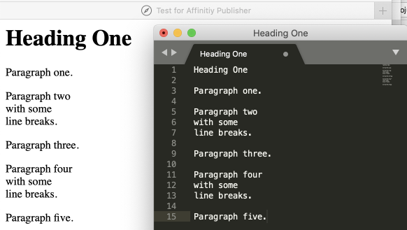
@sfriedberg, thanks for addressing this particular point. While I already have a workable solution, thanks to @Wosven's great explainers, there's still this feature wishlist for Affinity Publisher (although this is likely the wrong forum for it). If you open the attached sample.html file in a browser, you'll see it contains a header, paragraph tags, and some paragraphs have line breaks. The HTML clearly conveys this intent: ... <p>Paragraph one.</p> <p>Paragraph two<br/> with some<br/> line breaks.</p> <p>Paragraph three.</p> ... If you select the rendered browser contents and copy and paste it into an editor, like Sublime, you'll see that it adequately represents in text form what's going on, suggesting that the paragraph and line breaks are being conveyed. It would be nice if Affinity Publisher was able to preserve line breaks (such as in the case of copying poetry). While I'm not talking about importing the .html file itself (though, that'd be cool), if the rendered content simply had the <br/> tags honored as soft-returns and the <p/> tags as actual paragraphs, this would be enough. The point here is that not all of us here are hand-jamming text straight into Affinity, but rather using other applications or are actually generating our own exports. Preserving line breaks, at least to distinguish from paragraphs, is all we ask. Working around it is fairly brutal at the moment. I'm not keen on having to do a bunch of manual data transformations after each import. sample.html
-
Building a Phone Directory Booklet
wls replied to wls's topic in Feedback for Affinity Publisher V1 on Desktop
@Wosven ... that. was. incredible. I had no clue about the Shift - Red Triangle trick. Didn't know you could select multiple paragraphs and apply styles in that manner. Nor did it even occur to me to build pages using transformation operators like /=2, /=3, /=8, etc. for a value. You have just saved me hours upon hours. (I wish I had recorded the actual draw-drop for you that happened as this started working in my own document.) I tell you, the moment those folks at Serif put out a book on Publisher, I'm gonna get a copy, sit down, and read it cover to cover. While I've watched every Publisher tutorial they have (and browsed the help), you've left me wondering just how much more I don't know. This was so valuable. Thank you for taking the time to write such an amazing and comprehensive response. I'm sure others will get just as much value as I did. Again, thank you. -
Building a Phone Directory Booklet
wls replied to wls's topic in Feedback for Affinity Publisher V1 on Desktop
Okay, this looks like some really cool clever magic with Publisher I haven't stumbled into yet, so take this slowly for me. I think there's two or three things happening which are about to turn on enlightenment for me (and ideally, anyone else reading this). INSIGHT #1: When doing an Edit / Paste Without Format of plain text into my newly created text area on a newly created document, my " [No Style]" appeared to treat each text line as a paragraph with gaps. Because your example has all the lines visually together, I was thinking you some how did a line break (like you'd get with Shift-Return). Closer inspection shows that's not the case. My faulty assumption was that a paragraph with "[No Style]" meant no styles at all. That is, void of any styling. What I missed due to cognitive blindness due to size, weight, and lack of paragraph symbol is that above "[No Style]" is a style called Base. It defines a default 12pt space after each paragraph that can be zeroed. As such, in the absence of a value that overrides this, it is used for the paragraphs, such as those I was pasting in. The trickery you're doing with exporting and tabs is taking one-line records that are Tab-separated and converting them into multiple lines. I'd gotten to that part, but was trying to make each paragraph a record, with each line (using line breaks, like a poem would) being data. I like your styling solution much better, but I was attempting to do the above because [in reality] not all records will have the same repeating fields. e.g., Some might have more than one phone number or URL, some might have extra lines in the address, some might be missing information. I'm wondering if there's a way of doing both (perhaps with the regex trickery). INSIGHT #2: I had missed that Styles had a Next Style (it's in the edit style pane under General for those reading this), it works the same way MS Word's does. When you hit return to go to the next paragraph, you can have it automatically select a different (or the same) style. But what I didn't know was that also in the style edit pane under Paragraph / Flow you could tell where the next paragraph should start. While I've manually injected New Page, New Section, New Column in MS Word, it didn't dawn on me that with something like Affinity Publisher that could be done with a style. My faulty assumption was that these were special inline breaks. Nope, and there's a number of them to choose from. One of those is In Next Frame. I simply had no idea. INSIGHT #3: I think I may be approaching my document wrong, and this is where I think you can set me straight, @Wosven. I've been treating Frame Text as simply a container on the page where text should go, which is just split up across multiple pages (and sometimes on the same page). You, however, are doing something I haven't seen before and am not even sure how you're doing it (or if I'm understanding it right)... TEACH ME OBI LAYOUT KENOBI In your document (readers will need to download his example), step 4 says to "Apply Name style then next styles". I'm not completely following. While I know how to apply a style, it seems as if there's a way to cause a trickle-down effect for pre-existing text. e.g., once Name is applied, it transitions to the next style, which applies to the next paragraph, and so on. I'm led to believe this because step 1 has me create several styles and link them (name -> address01 -> address02 -> phone -> ...and back to name), step 2 and 3 have me past the data and turn it into [unstyled] paragraphs, and step 4 then does the apply, and step 5 has me use the results. I doubt you're suggesting that I go through hundreds of records setting styles manually for each paragraph. QUESTION 1: How do I do the "then next styles" part of the operation? Is it a menu item? Maybe I'm misunderstanding something. Put another way, I can apply the Name style, but none of the chaining we set up happens. When I scroll down to look at your examples, my mind is blown. Rather than have one text frame that's a column this data pours into, you've got a grid of Text Frames. Ok, I get that you got Master pages going on behind the scenes, and that's where the grids live. And, wow, I get that's why you wanted the paragraph flow to go to the next text frame -- brilliant! QUESTION 2: How did you make that grid of text frames so beautifully laid out such that each text frame was that same size -and- fit perfectly on the page? I feel like I missed a video tutorial somewhere. I can't thank you enough, this has been a real eye-opener. -
Building a Phone Directory Booklet
wls replied to wls's topic in Feedback for Affinity Publisher V1 on Desktop
Thanks. A quick mock up of this showed it might be a viable short-term solution. The only snag I ran into was that each line imported was treated as a paragraph, as opposed to selective line breaks. Should I be using something other than Place? (Or does place have hidden options somewhere?) -
Hi, I'm trying to build a phone directory booklet with Affinity. Let's go so far as to say that I can export the data from a spreadsheet and/or database in just about any conceivable format, I'm wondering what the right was is to pull it into Affinity Publisher using styles. Say, for instance, that each entry should look like: Smith, John 123 Main St. Blankendale, MN 88304-0014 816.929.4030 https://johnisgreat.com/fake-url-for-example-purposes Without going through every single entry manually (I have about 500 of them) and setting the style, what's the right way to do this in Affinity? I'd love to hear from Serif. In the end, I'm trying to produce a two-column staple-together booklet that I can update the bulk of the data via automation. Advice, tricks, tips, and warnings welcome.
-
Know how like every filter in Affinity does this amazing live preview thing where you see what you're going to get before you commit to it. > LOVE THAT < Well, I was attempting to export an image ...in this case it was a GIF with a reduced color palette... What I was hoping to see, as I was trying to find the right size / quality-diminishing balance, was a preview of the export along with the estimated size. How cool would that be! Unfortunately, I had to export the file and then go see on the file system if what I got was usable. ...ick
-
Insert Page Number of a Reference Anchor
wls replied to wls's topic in Feedback for Affinity Publisher V1 on Desktop
Ha! That is actually quite helpful, believe it or not -- it stops me for looking for those features for now. Thanks... -
BUG: Offset Paragraph Leaves Page
wls replied to wls's topic in [ARCHIVE] Publisher beta on macOS threads
The goal here wasn't to find the missing text (BTW, I did a few back and forths and got to a point where zooming out completely didn't help at all), but rather that incrementing the field in this way with the mouse cursor (on a Mac) made the text move downward, then decrementing the field in this way also made the text move downward. It was like it was altering the position using the value of the box rather than some origin and delta. A little experimentation showed that this happened when the object with text was selected, opposed to the text cursor being inside the object. If no one else is able to recreate the behavior as I did several times, I'll see if I can do it again and post a video... if that helps. -
Suggestion: Descriptive Document Sizes
wls replied to wls's topic in Feedback for Affinity Publisher V1 on Desktop
No offense intended. I'm thinking of two cases here -- other applications which do convey size as additional confirmation you've got the right choice and making the barrier to entry easier for Publisher's adoption by new folks. Yes, I wholeheartedly agree that if you've been given direction (especially if you're talking with a printer), that all makes total sense. But I'm certain there are going to be users who will want to whip up some PDF or such for the web and this will quickly become their go to tool. Being able to have that added information merely allows for a more informative choice. -
I've got a block of text that I'd like to have the page number of some other piece of text elsewhere in my document. I can't figure out how to mark a piece of text as something that'd I'd like to get a reference too. I can't figure out how I'd drop in a page number to a reference.
-
I'm trying to get a set of dots (periods are fine, a lightly dotted line would be more ideal) between the TOC headers and their respective page numbers. Entering in periods as the separator shows only those that I type, rather than filling whitespace with them (and leaving some optional space between the heading and number, since I'm now wishing here). I figure that perhaps the solution was let the system use the right-hand tab stop, but I can't seem to find a way to make the tabs have some repeating character.
-
While I was working on a Table of Contents, with the cursor selected in the middle of one of the TOC generated entries, the Layer / Geometry / Divide option was available. So, like Fargo from Eureka, I pressed it. The table of contents vanished, and instead I got a big block letter T (kind of like a vector graphic) which was resizeable, but had no stroke or fill -- no idea what happened. Command-Z put things back. Is this option supposed to be available while editing?
-
I entered two lines of text (admittedly in Art Text) and went to use the Paragraph Spacing tools... while I can increase the distance between them, I can never set the offsets to a negative value and bring them closer together (as I can with character kerning).