Rusty Fox
-
Posts
31 -
Joined
-
Last visited
Everything posted by Rusty Fox
-
These have all been really useful. As someone not particularly experienced with graphic design these have pointed me down some less manual avenues. Thanks
-
I saw the attached image online and wanted to make something with a similar principle, i.e. a large number of objects where the colour differs slightly each time. So I created a layout like this which had 50 circles. I'm using HSL colours, and I want the Saturation and Lightness to be the same for all objects, but then slightly vary the Hue, e.g. I might want to start with the smallest circle at Hue of 0, then increase the Hue by 5 for each larger ring. Is there a way to do this in bulk? Or is it a case of literally selecting each layer and manually adjusting the hue?\ EDIT I also made each circle by slightly increasing each one's size, would there have been a way to do this by making the first circle at, say 300px, then creating a load of layers in one go that each time increased by 100px?

-
How do I achieve this glow effect?
Rusty Fox replied to Rusty Fox's topic in Desktop Questions (macOS and Windows)
Haha true!! -
How do I achieve this glow effect?
Rusty Fox replied to Rusty Fox's topic in Desktop Questions (macOS and Windows)
Wow, didn't expect someone to do it for me! That's very kind thank you. -
How do I achieve this glow effect?
Rusty Fox posted a topic in Desktop Questions (macOS and Windows)
I've attached a picture. How would I achieve the effect of the border on that image i.e. the outer and inner glow but multicoloured>
-
Thank you
-
Hmm, OK thanks, will see if I can figure that out.
-
I'm sure it's just me being a plonker, but I just cannot find a way to get these 2 hexagons to snap where I've put the red arrows pointing, can someone help me out? I'm not very experienced FYI so need idiots guide! I've tried searching these forums and know it's something to do with snapping, but I can't figure it out.
-
Can noise be greater than 100% in Designer?
Rusty Fox replied to Rusty Fox's topic in Desktop Questions (macOS and Windows)
Ah! Makes sense thanks. -
Can noise be greater than 100% in Designer?
Rusty Fox replied to Rusty Fox's topic in Desktop Questions (macOS and Windows)
Thank you for the replies. Unfortunately I can't work out how to do a lot of what's described there!! 🤦🏻♂️ I'm pretty inexperienced with AD. I'll try Googling to see if I can follow the steps. Thanks. -
Can noise be greater than 100% in Designer?
Rusty Fox replied to Rusty Fox's topic in Desktop Questions (macOS and Windows)
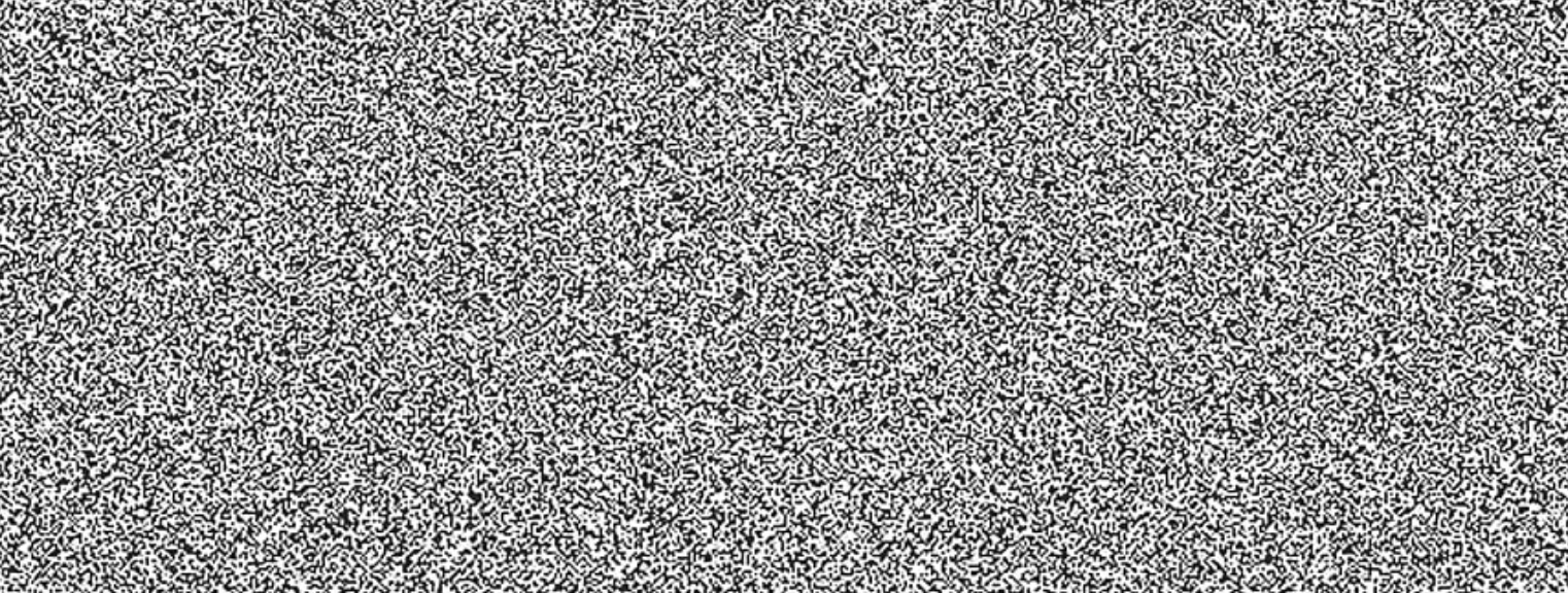
Ah OK. So do you have any idea how people create images like this that are so heavily grained?
-
I'm not sure if I'm asking this using the right terminology, but can noise in Designer be greater than 100%? As an example: I create a simple blue rectangle to use as a background on a website and change the noise to 100%. However, I want it to look more 'grainy' than this, so when setting it as the website background I have to 'zoom in' on the image. This does make it much more grainy, but the image also becomes very blurred as I'm now so zoomed in. So is there a way to keep increasing the noise beyond 100%?
-
Feature Request: Interactive PDF
Rusty Fox replied to crapserK's topic in Feedback for Affinity Publisher V1 on Desktop
+1 I'd really value this feature. I run a small business and have to regularly send out forms I need customers to complete like order confirmations. I need to be able to 'put it on a plate' for them by making the document editable, but really don't want to be sending Word docs to do that -
🤦♂️ Crikey that's embarrassing, apologies. I didn't think to search as I naively assumed they were supported. Apologies again.
-
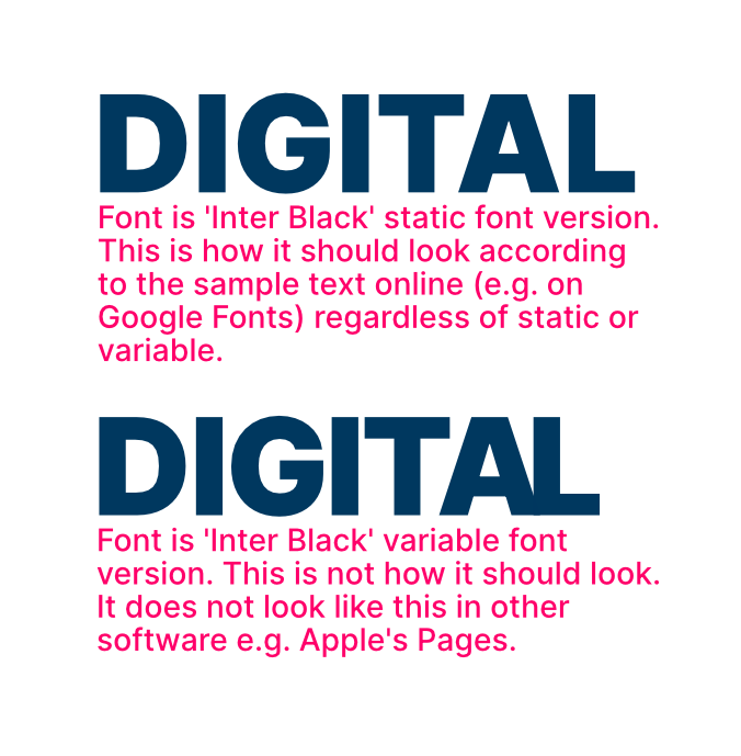
Having a really odd issue with variable fonts. I downloaded 'Inter' font in the variable version, typed out the word 'Digital' for a logo I'm making in Affinity Designer, and it didn't look right. The A and the L being too close together is what initially caught my eye. I went back to Google Fonts and it wasn't displaying how it does when I typed sample text on there. So I downloaded the static font too, and that shows exactly as expected. Initially I tried reinstalling the fonts etc but nothing worked. So then it occurred to me it might be an issue specifically with Affinity, and it turns out it is! If I do this comparison in other software (e.g. Apple Pages) both the variable and the static font look identical. I've attached a screenshot from Affinity Designer to show the problem. Can anyone help?
-
MagicPrefs doesn't seem to work for me any more, thanks for the suggestion though. I guess the next best alternative if Affinity can't actually disable horizontal scroll would be to just maybe add a different 'Page View' where, say, the page filled the width of your screen and in that mode scrolling only went up and down. Thanks for the replies anyway.
-
When I used my MacBook's trackpad and scroll through pages in Affinity Publisher, the scrolling 'wobbles' all over the place as it slightly horizontally scrolls at the same time, and (personally) I find this really annoying. Can horizontal scroll be disabled?
-
Just came across this thread whilst Googling this problem as it's annoying me. Has there been any solution?
-
Gradient Banding
Rusty Fox replied to Rusty Fox's topic in Pre-V2 Archive of Desktop Questions (macOS and Windows)
Thanks for that, it was on RBG/8 so will change to /16. Does colour profile matter much? It's currently set to sRGB IEC61966-2.1. DPI was currently lower I think, so will change to 400. -
Gradient Banding
Rusty Fox replied to Rusty Fox's topic in Pre-V2 Archive of Desktop Questions (macOS and Windows)
Thanks, seems obvious now! -
Gradient Banding
Rusty Fox replied to Rusty Fox's topic in Pre-V2 Archive of Desktop Questions (macOS and Windows)
Ah OK, so apologies for the stupid question, but am I interpreting that correctly as meaning I'd need to make the document the same size as the screen it's being viewed on to avoid seeing banding? -
Gradient Banding
Rusty Fox posted a topic in Pre-V2 Archive of Desktop Questions (macOS and Windows)
Total inexperienced guy here, so apologies if this is obvious. If I create a design in Designer with a gradient, I get what I think is called 'banding' when I export it as a PNG file (i.e. where I can see almost 'stripes' where the colour changes with the gradient). Is there a way to stop this? I've attached a sample file - when I export that as a PNG the banding is clear (especially if I view the PNG on my iPhone). Sample.afdesign -
Got it now! Thanks
-
Hmm, I can't seem to get my head round this one! I keep just making a mess of it and it ends up looking worse. I really appreciate your help though thank you
-
As in literally just paint colour onto the layer? I tried that but I just have a big black line where I used the paint brush which I'm thinking isn't what you meant. (Apologies, real neewbie here)