NightSky
-
Posts
8 -
Joined
-
Last visited
Everything posted by NightSky
-
 Oh, yes. This is odd: the text frame is inherited from the master page, where the "Ingore baseline" is deactivated.
 -
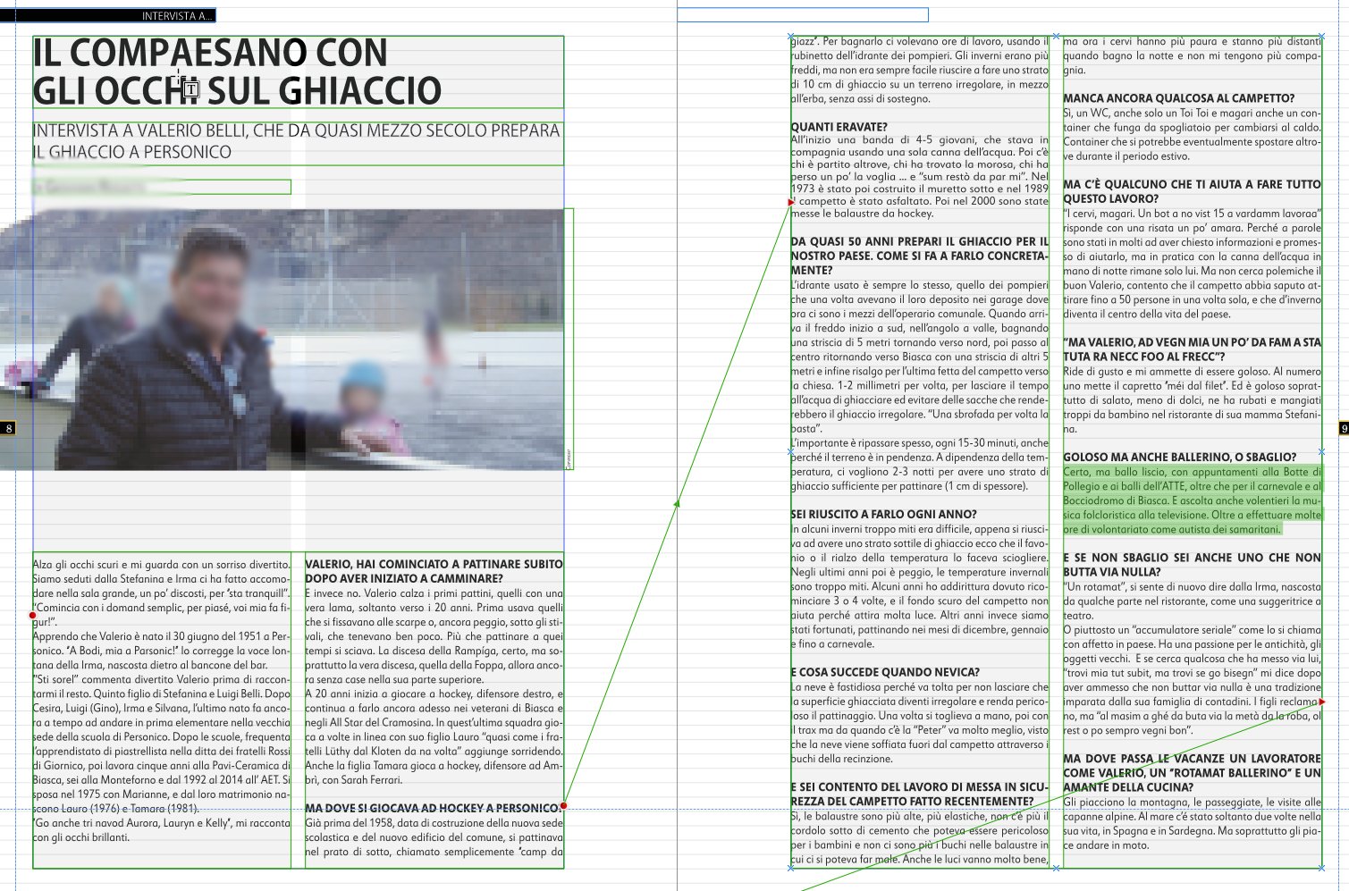
Hello, Sorry to bother, but there is a few problems that I cannot solve on Publisher. First thing: a inespicable problem araise with the baseline: the same text, having the same paragraph style allignes with the baseline in one page and doesnt in a secodo one. I attach an exaple, but this is a constant troughout the whole file. Pages are generated from some master, where the baseline alignment is fine.

-
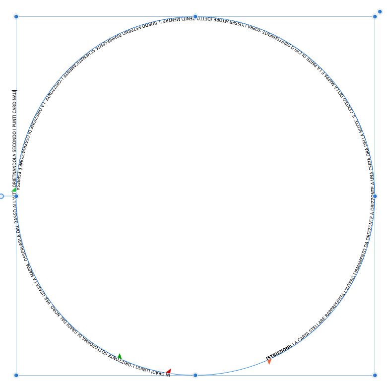
EDIT: Had to redraw the entire circle Hello everyone, I'm getting quite annoied with this problem. I'm trying to write a text around a circle. The problem is that after roughfy 220-230 degrees, the text goes to a new line, messing up everything. I've tryied everyting on the book, but no way to have more than 220-230 degrees on the same line. Any idea? Best
-
Hello, I'm currently working on a magazine layout for a non-profit association. Unfortunately the person charged to page up every issue, for reason unknown to mankind, is still using Xpress (2018) and refusing to switch. So I was wandering if there is a way to port the initial layout form Publisher to Quark Xpress. Please tell me that's possible: I really, really, really don't want to waste my time fighting a software designed decades ago and never really updated in usability.
-
Drop cap
NightSky replied to Roberto.Bargagna's topic in Feedback for Affinity Publisher V1 on Desktop
You just made my day ;) Thx -
Drop cap
NightSky replied to Roberto.Bargagna's topic in Feedback for Affinity Publisher V1 on Desktop
Please, please, pretty please: we really need to be able to specify the number of characters that has to be used as drop caps. -
Wow guys, I cannot leave you alone for one day and you already answred. Thank you, what a great community! @GarryP Thank you for the GIF. In fact i think the "thick underline" was a workaround for InDesign. Will try what @NigelH sudgests. Please let me know if any other idea comes up on this. There's maybe some room for new funcitonality?
-
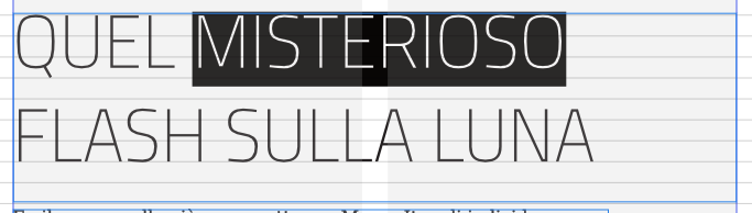
I'm trying to migrate a InDesign project to Publisher and I'm currently stuck with this issue: I want to have a word (or more) with a dark background around it. In InDesign it is done with a ultra large bottom line. In Publisher I found the text background option that almost works. Almost... because it seems not to be a way to vcenter the word onto the background: the bottom part is noticably higher than the top part. Any idea? Is there a feature? Will it ever be one? I attach two examples. The first one is how it appears on InDesign, the second one is how i managed to replicate it on Publisher. Thank you