Search the Community
Showing results for tags 'tight'.
Found 1 result
-
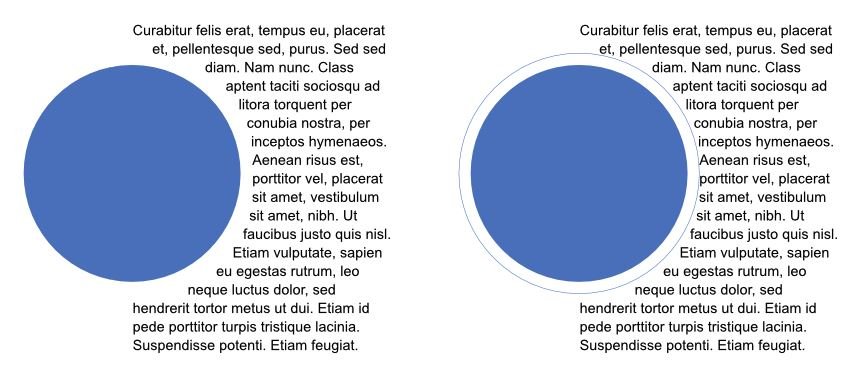
 Windows 10, Publisher Build 145. I've noticed something about tight text wrapping around a curved shape that seems wrong, but maybe someone can explain it to me. Have a look at the first attached image. The text is 7pt Arial on a 9pt baseline grid. The filled blue circle is a layer that has tight text wrapping with a gap of 2pt all-round. The outlined blue circle - on the right-hand diagram - is 4pts wider and taller than the filled blue circle (observing the 2pt gap of the text wrap). As you can see, the text is further away from the circle at the top and bottom than it is at the right. I can understand why, for example, "hendrerit" below the circles isn't anywhere near the outlined circle because the baseline forces it to be further away, but I don't understand why the other text is so far away from the circle. The second attached image shows the same sort of issue but it looks a lot worse there. Can anyone explain why this is supposed to happen, or is it a bug? It just doesn't seem quite right to me. (I've also attached the afpub file in case anyone wants to have a play with it.) tight wrapping round curves.afpub