Jump to content
You must now use your email address to sign in [click for more info] ×

Search the Community

Showing results for tags 'affinity publisher version 2'.

  • Search By Tags

    Type tags separated by commas.
  • Search By Author

Content Type


Forums

  • Affinity Support
    • News and Information
    • Frequently Asked Questions
    • Affinity Support & Questions
    • Feedback & Suggestions
  • Learn and Share
    • Tutorials (Staff and Customer Created Tutorials)
    • Share your work
    • Resources
  • Bug Reporting
    • V2 Bugs found on macOS
    • V2 Bugs found on Windows
    • V2 Bugs found on iPad
    • Reports of Bugs in Affinity Version 1 applications
  • Beta Software Forums
    • 2.5 Beta New Features and Improvements
    • Other New Bugs and Issues in the Betas
    • Beta Software Program Members Area
    • [ARCHIVE] Reports from earlier Affinity betas

Find results in...

Find results that contain...


Date Created

  • Start

    End


Last Updated

  • Start

    End


Filter by number of...

Joined

  • Start

    End


Group


Website URL


Location


Interests


Member Title

Found 1 result

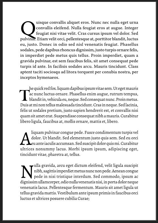
  1. ETA I'm afraid i posted this in entirely the wrong place! I'm having a problem with drop caps in Affinity Pub 2: The drop cap (using the paragraph style and a character style) does not align properly with the top of the text in the first line of the paragraph. It sits on the correct baseline, but the top of the character is below the body text ascenders. I am aware that in many fonts, the top of the uppercase letters is actually lower than some lower case ascenders, but it seems more pronounced in Affinity than in InDesign. I tried scaling the drop cap character style, but this did not seem to have any effect. I could make it work by applying the scaling directly to an individual character, but as part of the drop cap character style, it did not seem to work. I did a comparison with InDesign to demonstrate what I mean: I have not tweaked the positioning or other aspects of the styles in either program, it has never been necessary in ID. The ID sample is first, the second paragraph is especially bad in Affinity, where the bar of the T is on a level with the baseline, the drop cap is in a font called Cicero
×
×
  • Create New...

Important Information

Terms of Use | Privacy Policy | Guidelines | We have placed cookies on your device to help make this website better. You can adjust your cookie settings, otherwise we'll assume you're okay to continue.