William Overington
-
Posts
3,062 -
Joined
-
Last visited
Everything posted by William Overington
-
Possibly. Well, I don't do it. I am just trying to be helpful. Not really if it is an article on the web. Maybe ask in a forum, but inefficient. Far better that the post be written without assuming people know lots already. I just try to be helpful. Would some people prefer silence? William
-
I neither describe myself, nor think of myself, as an "AI artist". I wonder if I may include in this discussion something not about AI. I saw something somewhere sometime about an art exhibition where it was all, and only, wall panels with text of the kind that are normally used to describe a work of art that actually exists and is on display in the art exhibition. So the idea was to imagine the artwork from the description. I wonder if there is something on the web about it. William'
-
In this post. I wrote that trying to be helpful. I consider that to be good advice. If some people know that already, well, better to know twice than not at all. Well, I don't assume that others know basic facts. It is pointless to explain something in terms that assume a prior knowledge of something when in fact the person that one is trying to help does not have that prior knowledge. Face to face I first need to establish what knowledge the person has and go from there, in a text based forum that is not possible, so I explain from first principles. My intent is to enable learning, not to prove that I know something regardless of whether the person learns anything. I have often read posts in various places where people use acronyms and I do not know what they mean and I try to look up the meaning only to find that that acronym has many different meanings. I was taught to always write an acronym in full the first time it is used. But I suppose that some people might take offence if I write about using a PDF (Portable Document Format) file, as telling them something they know, whereas I am thinking of the beginner who might be reading the post who may not know what PDF means. My personality. I tend to think that a personality is like a signet ring in that it can produce an impression, but that can depend on the wax. William
-
Not at all. I never treat anyone like that. But if that is how I seem to you, perhaps I do to some others too. It is something I need to know about. Can you provide some examples please? William
-
Well, I just do not do that. It is not in my nature. Whatever you or others may consider you observe, it needs intent, and there is no such intent in my personality. William
-
No. Well, I suppose that the answer is yes. But I like to think that it is also in deciding what to type in and critically assessing the output. Thank you. I had not thought of that. I will try to look into those. You might like to have a look at the output that has been achieved by looking at the AI threads on pages 1 and 2 at the following place. Art & Literature (Page 1) — Alfred's Serif Users' Forums (punster.me) Well, I am trying to do that. William
-
No I did not. I had not realized that it was a link, I had thought that you had underlined the word for emphasis. In the meantime I have been writing in another thread. I will try to have a look. William
-
Mansplaining! Surely, mansplaining is when a man is explaining something to a woman with an intent to make her feel undermined. I never try to undermine anybody. I do tend to explain things thoroughly without presuming that someone must already know some basic facts when I do not know whether they know or not, on a better to know twice rather than not at all basis. But that is my thoroughness and skill as an adviser. But I do not undermine anyone, it is not in my nature, and I feel no need whatsoever to do so anyway. I like to achieve, yes, but I do not aspire to win such that others do not. William
-
I have just checked and found that as of writing this note that this thread has had 2.2k views. So there seems to be something regarded as interesting and relevant about it. William
-
Well, yes and no. I have entered some text as a prompt. The AI system has acted on that prompt. So, yes, the poem, or song, or story, or picture often, usually, is in some way qualitatively what I asked it to produce. But the result can be something that surprises me and causes me to smile with delight. Alas, due to the restrictions imposed by some of the moderators I am not allowed to include examples here, and I am not allowed to link to them. For me it is because I do not have the ability to produce paintings of that quality myself, and I find it interesting to be able to express a picture that I would like in text and then see the result that the AI system produces. I am a researcher so I find exploring what AI will produce is fascinating. While I do look at what other people produce, for me, just watching the world go by from the sidelines is not enough - I need to produce things myself. Generative AI has allowed me to produce beautiful pictures that may well never have existed otherwise as I could not have painted them and I could not have afforded to pay an artist to paint them. William
-
@KarinC @R C-R Look, I am retired, filling my day with things such as learning some Welsh on Duolingo.com, trying Generative AI, trying to improve my artistic ability using Affinity Designer, having a chat in this thread and some others, sending off for prints, framing them, keeping my mind active, and other bits and pieces in addition to everyday things such as eating and housework. If people start grumbling about this thread, all that is likely to happen is that one of the moderators may intervene, take some action of some sort, and that will be that. So the grumblers may get a win. But will that make them happy? Is it that using Affinity Designer and AI can only be discussed in Alfred's forum rather than the Affinity forum? The thread has now been controversialised. I just don't understand people who are not moderators stirring like this. There should be more happiness, less grumbling. If you would like to discuss using Affinity products to produce a picture like those produced using Bing Chat AI then fine. William
-
@PaulEC Another poster drew attention to an advertising video about PhotoShop and Generative AI. I found it on YouTube and included a link. Just that. William
-
That is not how it looks to me. The outline of the selected area that is drawn cuts across books. William PS But I may have got where the grass goes wrong. I am not sure now,
-
Something that I found some years ago is the following. Museum Of Bad Art – art too bad to be ignored Art deemed bad, yet it was produced by real people, for whatever purpose. It is easy enough for someone who was not there to deem it bad. Some of the pictures have a title that may not have been what the artist intended. For one of them, I thought of a different title that changes the meaning of the picture - but that may well not be the correct meaning either. Yet why were they produced. One is thought to be from a facility of "send us a photograph and some money and we will paint a picture based on the photograph". Yet people involved. Yet please have a look and then later I will put in a spoiler-protected note my opinions. William
-
In the video, please note how the grass covers part of the lowest row of books. William
-
And not necessarily only writing opportunities. William
-
I found it on YouTube.
-
If and when it is published, will you post a link here please? I would like to read it. By the way, my experience is that the best way to get my views published by the editor of a serial publication is to send it as a Letter to the Editor, together with a covering letter. In my experience a Letter to the Editor has a good chance of being published, they are not paying and a Letter to the Editor is an established format. Sending an editorial has more hurdles to getting published. May I suggest doing a word count on some Letters to the Editor that they have published and make your Letter to the Editor a bit shorter. A Letter to the Editor can sometimes lead to other opportunities, not necessarily only opportunities with that publication. William
-
The picture has now been added to an existing thread in the Share your work forum. William
-
Lady reading haiku to an elephant
William Overington replied to William Overington's topic in Share your work
For the backstory of that picture, and the following posts. William -
Lady reading haiku to an elephant
William Overington replied to William Overington's topic in Share your work

-
Five layers, of which four are shown in this illustration.
-
The next stage. There are three layers in the Affinity Designer file now. Two layers are shown in this illustration. The unshown layer is the original illustration output by Bing Chat AI.
-
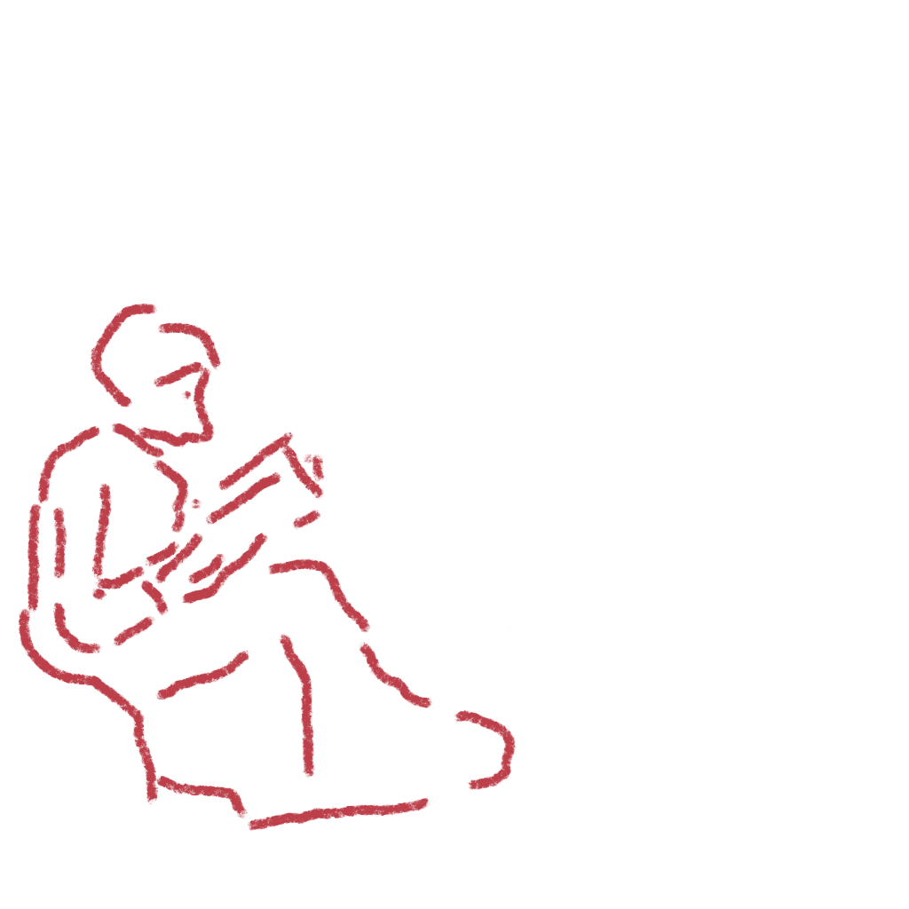
I have got started. Canvas size 1024 pixels square, pixel persona, smooth chalk brush at 15 px, which I think means 15 pixels.