WalterBeiter
-
Posts
70 -
Joined
-
Last visited
Everything posted by WalterBeiter
-
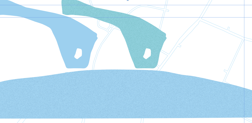
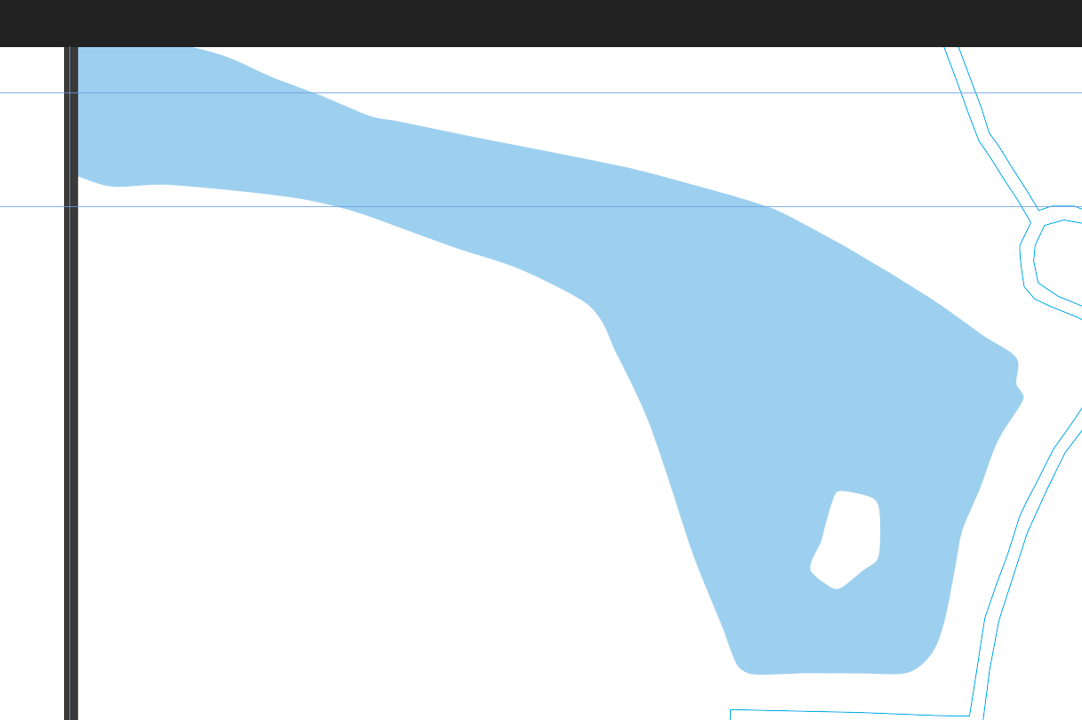
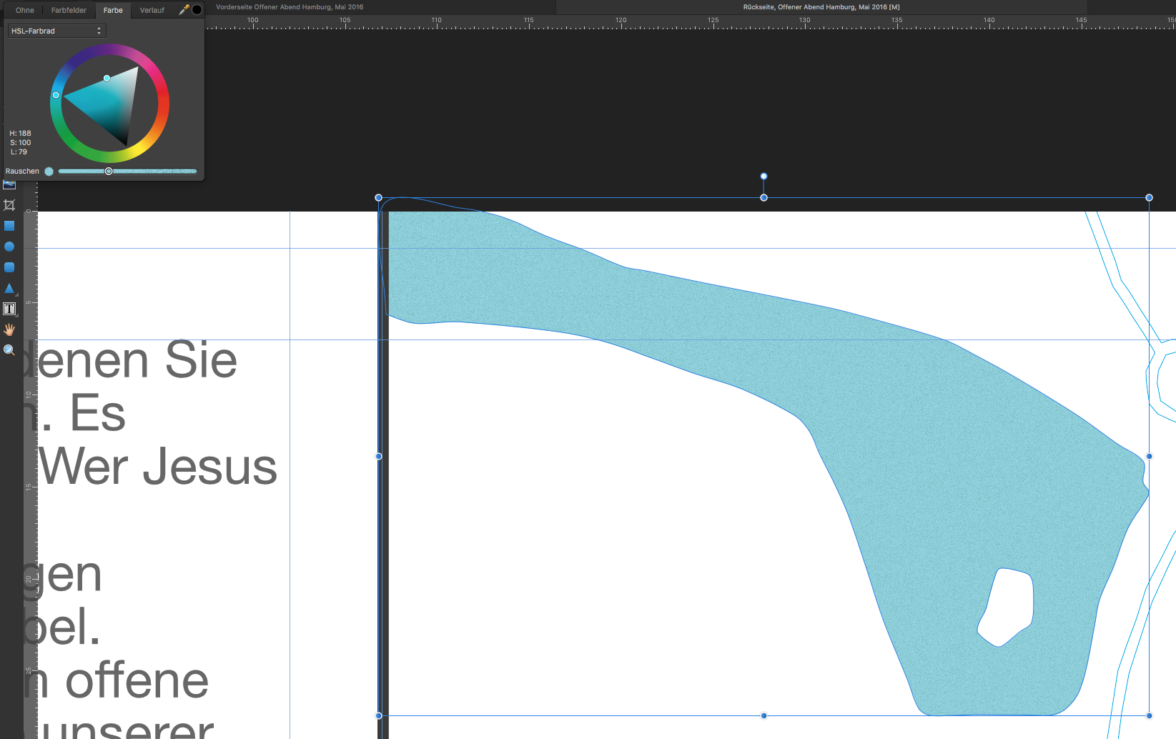
 Well, I copied the right one from the other document. It is a bug, you can clearly see the normal blue, the blue from the other document with noise and the buggy noise one which is shifted towards green.
-
Hey. I have a shape in a document with a specific fill color (bright blue) with noise. In another document, I have a different document i have a shape that I would like to give the same fill color and also add noise. I filled the shape with the exact same color. Everything looks identical. However, as soon as I add noise, the color shifts towards green. Even if I drag the noise slider to zero again, the color shift stays. Any ideas? I am using Affinity Designer 1.4.1
-
RTL Text - Why isn't it in your Roadmap?
WalterBeiter replied to prog's topic in Older Feedback & Suggestion Posts
+1 for rtl text support. I need it for arabic. I came across this tool, but I don't know if it helps: https://www.bitofgold.com/free-photoshop-right-to-left-converter-tool-right-to-left-left-to-right-rtl-to-ltr-text-converter-arabic-hebrew-persianfarsi-text-in-photoshop/ -
Definitely agree. This is something I've been waiting since AD came out. This is a standard feature wich every software has, that handles any kind of text box. So, big thumbs up for this "feature".
-
How can you center a text like this? (see screenshot) (This is from Pages)
-
While the grid mode is very powerful, I want to be able to center the grid in my canvas. So that I don't have to move the layers afterwards to center them.
-
Expand Stroke was exactly what I was looking for. Thank you so much. Here is the result:
-
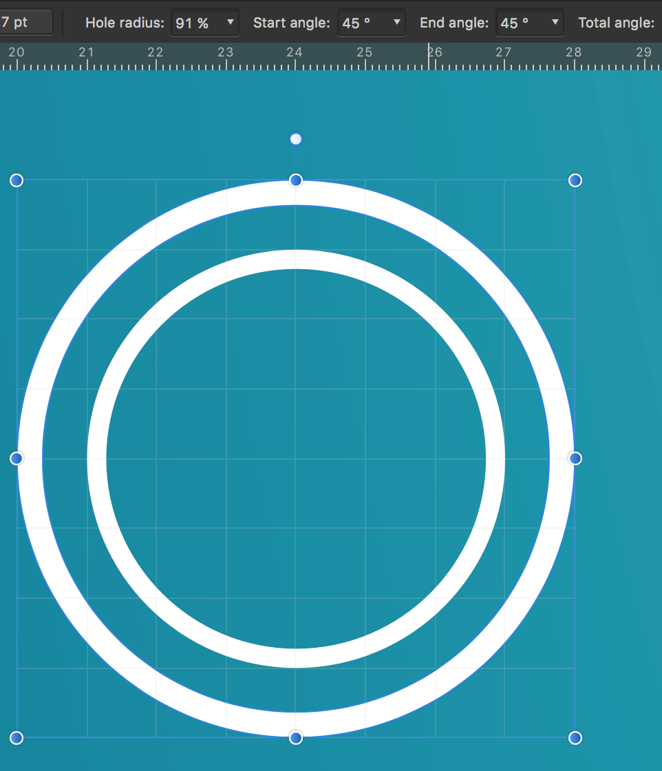
How can I make the hole radius of a pie absolute? I want to have it absolute to restrict the thickness of the pie to us the same thickness an a smaller radius. I could do this with a stroke, but I can't use a stroke with boolean operations the way I want. Is there any way to do this? As you can see in the screenshot, the thickness of the ring with the smaller radius is thinner. But I want to keep it at the same thickness as the one with the bigger radius.
-
As Adobe has decided to make the import screen in Lightroom suitable for Instagram users, I have concerns wether Lightroom should be replaced in the future. Adobe makes this concerns even bigger by publishing buggy apps too early which ruin lives of professionals. Last year, Serif came out with this Affinity-suite and I have high hopes that they will release a Lightroom alternative. I am serious about that, since Capture One, well, does not work for me. But if you do, make sure that people can transfer 100k photos with any adjustments non-destructively. I don't know if you have plans for this, or if you have resources for this. But if you have, well, I would be the first to buy. Adobe is going for Instagram users with all their iOS-photoshop-mix-fix crap, which is not what professionals want. I know that one day, I will enjoy Affinity Designer on my iPad without compromises. And I hope you guys could rescue the professional photography business. I know this post has not the right spot in the forum, since everything is about Designer or Photo. But I just want to post this to see wether this could be the future of photography. Any name suggestions for a Lightroom alternative?
-
Feature request: CMYK 16-Bit
WalterBeiter replied to WalterBeiter's topic in Older Feedback & Suggestion Posts
ok, thanks. I wasn't sure about that. When I send a pdf out to the press, they never said, that it needed to be 8 bit, so I thought I could send 16-bit. Never mind about the 16-bit then. I didn't know, that it wasn't supported by presses. Thanks. -
16-Bit would be so much better for printing. especially with gradients as a background. CMYK 16-Bit please. Thanks.
-
How o I do this?
WalterBeiter replied to WalterBeiter's topic in Pre-V2 Archive of Desktop Questions (macOS and Windows)
Yep, it will work in my project. No problem. Your roadmap is full, I now. -
How o I do this?
WalterBeiter replied to WalterBeiter's topic in Pre-V2 Archive of Desktop Questions (macOS and Windows)
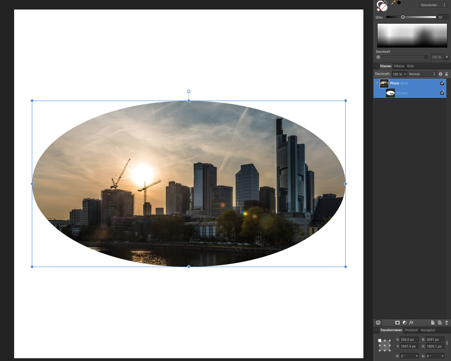
Thank you Jakerlund for the video. Now, I would like to pan around the photo within the oval shape mask. The problem is, that in some circumstances the mask shape has to stay and I simply would like to move the photo around, but without loosing the ability to edit the shape. This would be like clicking the background layer (in your video) and move it, but the oval shape stays in position. Maybe something like this could be added to Affinity. If you click twice on the thumbnail, it would just select the background layer an d the rest stays in position. So I could move it without moving the oval mask. I think I will use the method yakk described. -
How o I do this?
WalterBeiter replied to WalterBeiter's topic in Pre-V2 Archive of Desktop Questions (macOS and Windows)
Ok, it didn't work. The problem is, that I want to edit both. The oval shape and the photo. If I do it the way yakk explained, I have no control anymore over the oval shape. I want this to be non destructive. I want to edit the oval shape as well as moving around the photo in the oval shape. Is this possible? -
How o I do this?
WalterBeiter replied to WalterBeiter's topic in Pre-V2 Archive of Desktop Questions (macOS and Windows)
it worked, thank you for your answeres! -
Sorry for this title, but I just don't know how to describe.. I have the following problem: I have a photo which I would like to crop using an oval shape. I did this, using the layers panel to drag the oval shape "inside" the photo layer. Now, how do I move the original layer? I noticed, I made a mistake. How do i reposition the photo, but not the oval shape? I want to reposition the photo inside the oval crop. How do I do this? See the screenshot for reference.
-
I have already shared this with the affinity support. Everything's fine. It was an embedded document which gets rasterized when exporting.
-
Simple password protection of a document. Much like Pages, Numbers has. There are certain documents I would like to encrypt and protect. For professional work which sometimes requires some protection, or clients who have classified projects, I would like to have some password option.
- 1 reply
-
- 1
-

-
- password
- protection
- (and 2 more)
-
Hiding a layer shours work. I do this all the time. Hiding the reference layer and export. It should be vector.
-
Affinity said that embedded documents even vector drawing will get pixelated when exported. This happened in my case. To solve this: open the embedded document and copy each layer to your original project. This way, they won't get rasterized when being exported.
-
Well, the PDF is sharp, there is no pixelated vector shape. Today, another print came along which has the same problems. My vector hand drawing is a tiny little bit pixelated. Same background, same Handwriting, but different color. I have a white outglow on the shapes. maybe thats the problem. I don't know. I just don't know that much about printing, but I though vector is vector, it should be sharp like normal text. I will send my document to you, maybe you know someone who knows someone who knows about printing problems. edit: The PDF is pixelated, too (but not the text, just the handwriting). (Or maybe this is just OS X and the laggy Preview in Yosemite). I will send you a slightly modified one (without the images, the file is 5.2GB with the images).
-
Hi Aledel, No, I didnt rasterize the vector shapes. 300dpi was the required resolution of the print press. The background noise is everywhere, including the part where the text is, which is not pixelated. My document has photos in it, but they are quite sharp. Print method was offset.
-
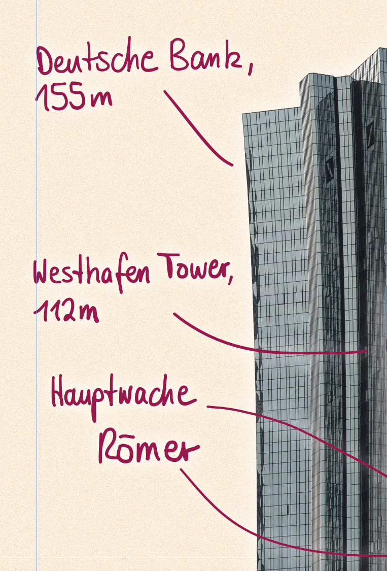
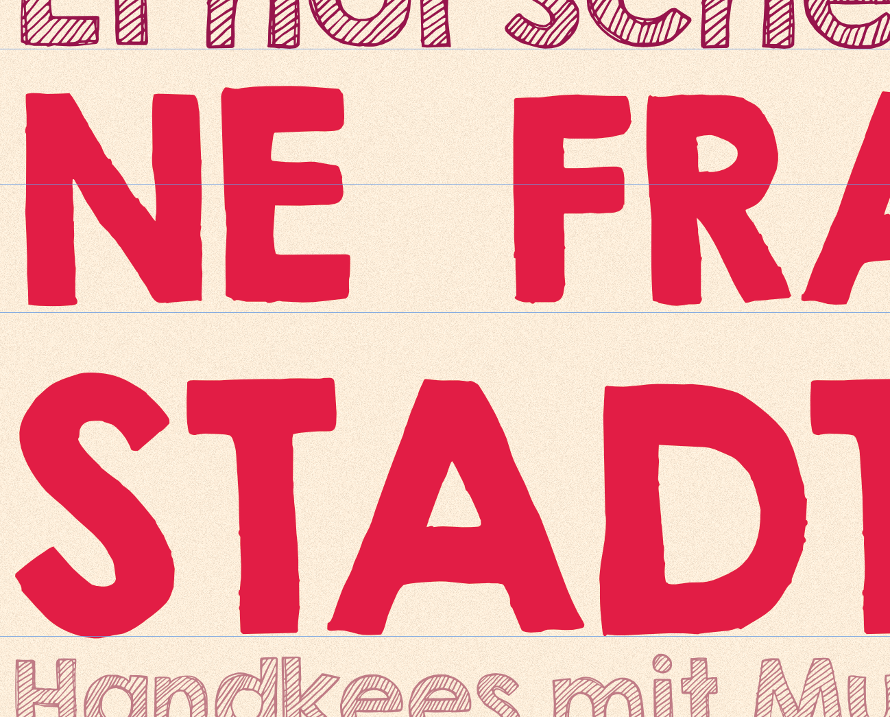
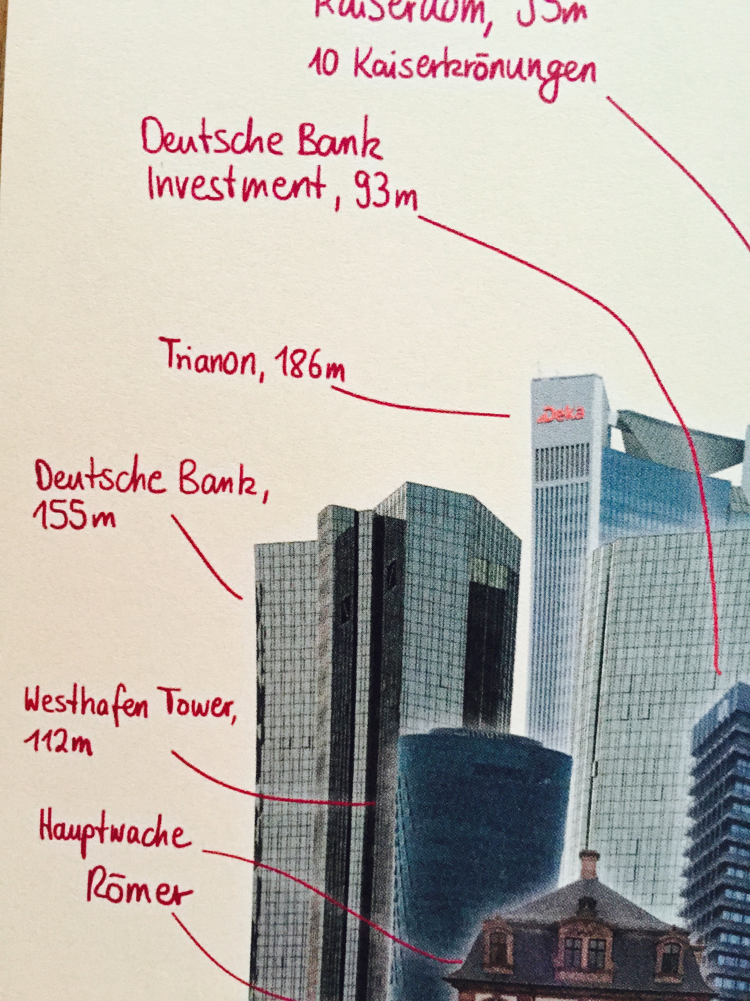
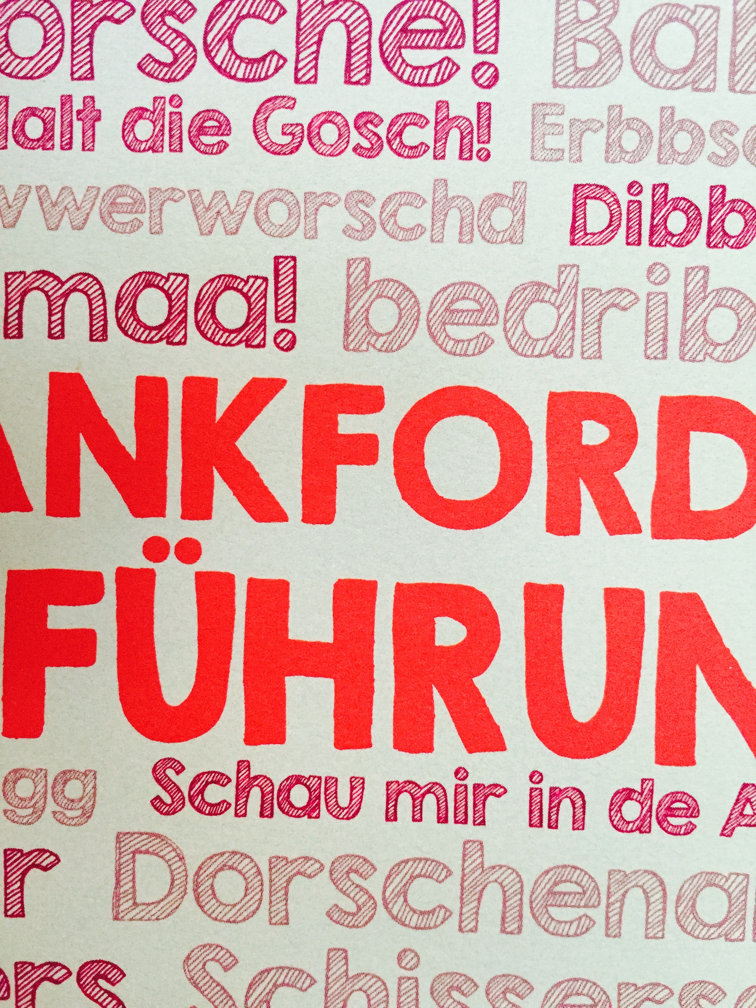
So this question is not truly AD specific, but since I created my printed document in AD, I will kindly ask you to answer my question if you can. So I started by creating an A4 sized paper. I used text as well as other vector graphics I inserted from a PDF I made. Since AD is not very suitable for hand-writing with a tablet ( I tried Wacom Intuos, but the brush kind of smoothed out and it lagged), I used my iPad with GoodNotes and my Adonit Jot Touch (a capacitive stylus). I then exported my hand writings as a PDF (GoodNotes is vector, so should be now problem), inserted the PDF in my AD document and removed the background. I had the beautiful curves I wanted. Still everything was vector graphic. I also used standard text in my document using the text tool in AD. Now I exported as PDF and 300 dpi, which the print press required. Today, my print project was in the mall. I noticed something strange. The text which I made in AD with the standard text tool was sharp, but the vector curves (my handwriting from the iPad) was slightly blurred / pixeled. Now this is strange since even the photos and other rastered objects I had in this document are still sharper than my vector hand writing. Has anybody a clue, how this could have happened? I am just curious, whether there are some differences in vector graphics. Has anybody any experience with this? I have added some screenshots and photos. I just want to make it better next time. The photos are low quality but you can see the difference in the sharpness. The text is very sharp, the hand writing is slightly pixeled. Keep in mind that the handwritten text is about he same size as the text "Schau mir in de ..." below the red title. Please post any ideas on how this could have happened. I will talk to the print press on monday, but I had a similar problem with other print presses as well. (Text was pixeled / low quality, even though it was PDF). Sincerely, Walter
-
thanks a lot. This helps. it worked. But I didn't need to delete any new layer.
-
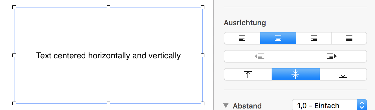
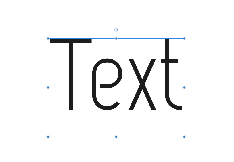
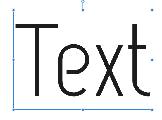
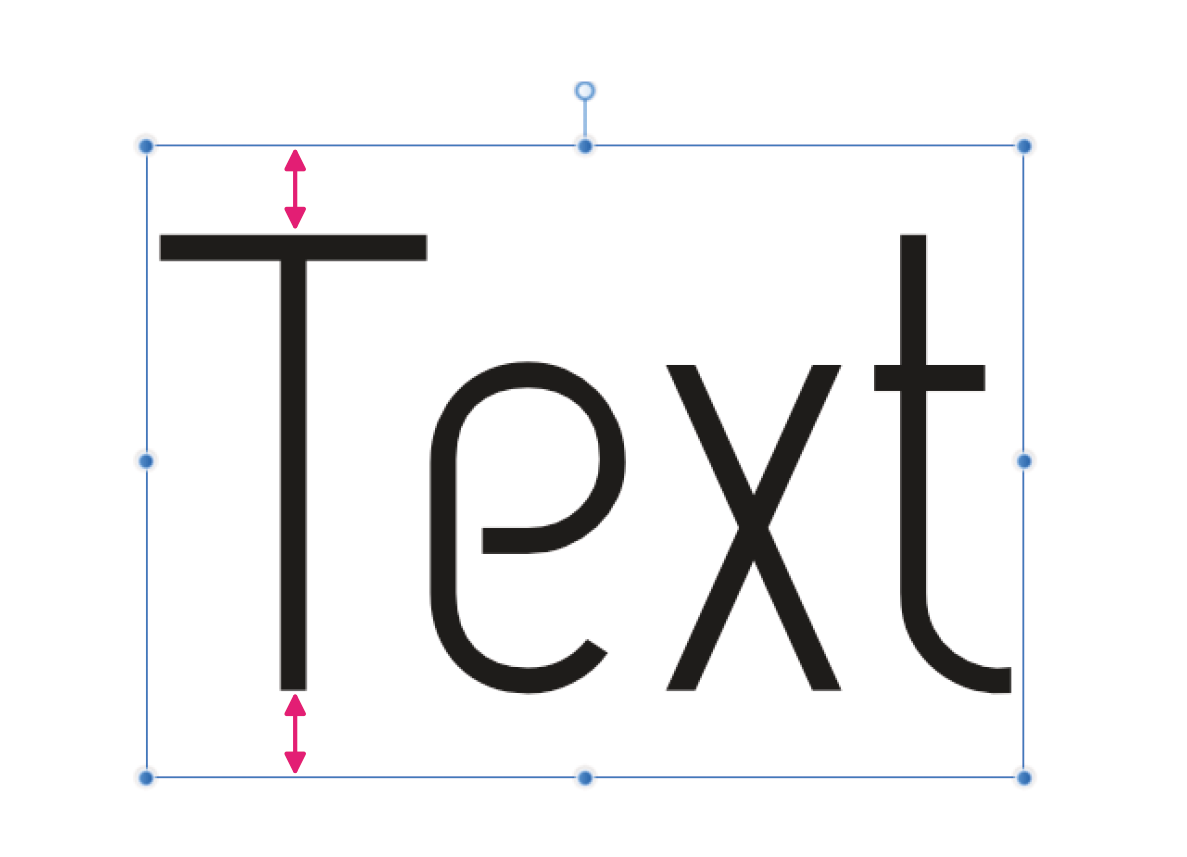
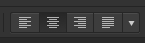
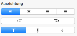
please let me center my text inside a text box horizontally. See screenshots. 1. Screenshot: The problem 2. Screenshot: Manual, very imprecise solution (adjusting the base line in the character menu) 3. Screenshot: What I want to have (just to make things clear) 4. Screenshot: Where this setting has to be in the user interface 5. Screenshot: Just to make things very clear: How Pages handles this. This is a very important feature, every typographer needs. If the textbox is aligned properly using guide lines, the text should be in the center of my textbox, or whereever I want it. It is impossible to align my text properly centered on a horizontal guide line.