Richard Liu
-
Posts
222 -
Joined
-
Last visited
Everything posted by Richard Liu
-
poor quality JPEG export
Richard Liu replied to Martin Feiss's topic in Feedback for Affinity Photo V1 on Desktop
OK, @owenr, thanks for the work. Using the factory display profiles on the laptop and the Thunderbolt display the exported file seems to be identical to the preview. Now the only question is, what is the difference between the profiles. Assuming you are calibrating your display, may I ask, what what color temperature, L and gamma? I'm beginning to suspect the L* in my profile. Thanks again! *** Update *** I have tried all sorts of combinations of D50/D65, 2.2/L*, white and black points, etc., but to no avail. I am unable to create a profile that comes as close as the factory default to making the AP preview match Preview's display of the exported document. I am using basICColor display and an i1 Display Pro. Any help would be appreciated. Thanks. -
poor quality JPEG export
Richard Liu replied to Martin Feiss's topic in Feedback for Affinity Photo V1 on Desktop
Another thought (or doubt, source of problems) occurs to me: Is gamma in the color profile? I have calibrated my monitor to L*, and I was assuming -- I don't know why -- that "ROMM RGB: ISO 22028-2:2013 (linear)" is a version of ROMM RGB with L*. But Preview says that profile in the JPEG is "ROMM RGB: ISO 22028-2:2013" (without "linear"). I wonder whether that might mean that apps that honor that profile find a different gamma in it, or use the monitor's default gamma. Where does "linear" come from anyway? One doesn't find such a profile in the drop-down list of possible output profiles. How would one force Affinity Photo to preview using ROMM RGB: ISO 22028-2:2013 and another gamma? -
poor quality JPEG export
Richard Liu replied to Martin Feiss's topic in Feedback for Affinity Photo V1 on Desktop
Thanks, all. Here's a link to a Dropbox folder containing the three files: https://www.dropbox.com/sh/l5oaidwrbn4xiot/AADQ32NVF14neGoV_fqEYV8Xa?dl=0 -
poor quality JPEG export
Richard Liu replied to Martin Feiss's topic in Feedback for Affinity Photo V1 on Desktop
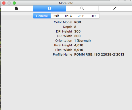
As enlightening as the comments have been, I am still plagued with the problem that full-sized exports are not very good, even when comparing with the preview in Affinity Photo at full size. The problem I have is, the exported files are much too dark. When previewed in Affinity Photo, the structure on a large tree trunk is very clearly visible, even though the tree is in the shade and hence dark. (Actually, the previewed document is much too light for my taste and purpose.) I can supply the .afphoto (601.2 MB) a JPEG export 100% quality, bilinear sampling (30.9 MB) a TIFF-16, Lanczos 3 sampling (174.4 MB) As the files are very large, I don't want to upload the last two unless somebody really wants to take a crack at this. (I just tried to upload the JPEG, but the upload failed.) Further to the problem: My Apple Thunderbolt 27" display is calibrated using basICColor display and an Xrite i1 Display Pro as follows: When working in the Photo persona the document Colour Format is RGB (16 bit) and I see this in the upper left corner: I assume that means that Affinity Photo is using ROMM RGB: ISO 2028-2-2013 to display the previews. Does anybody know this for sure? When exporting the files I have checked to use the document profile and to embed it in the export. I view the exported files with Preview, a macOS app. Preview shows me that I assume that Preview is using the named profile. Does anybody know this for sure? As I said, when displayed at full size in Preview and when previewed at 100% in Affinity Photo, the former is noticeably darker. I imported it into Graphic Convert, a third-party app for the Mac. It is somewhat lighter than in Preview, but still not nearly as light as in Affinity Photo. I really cannot explain the discrepancy but I am getting criticism from a teacher that the photos that I upload to a web site for critique are too dark. I suppose the problem could be the way her monitor is calibrated. Perhaps her's uses a tone response curve, while mine is calibrated to L*, and that, presumably, is what "(linear)" means in "ROMM RGB: ISO 22028-2:2013 (linear)," the output profile that I selected in the Develop persona. Does anybody know for sure what profile Affinity Photo is using when it generates profiles? What about how Preview honors embedded profiles? Should I upload the files? Thanks
-
Thanks @owenr, @carl123, @walt.farrell. I've not encountered the terms "clip-nested" and "mask-nested," and I cannot see any difference in the screen shot. But that's another matter for another thread, I think. Likewise, I have not encountered any videos from Affinity of adjustments or live filters that affect alpha, but thanks for the examples. I'll experiment when I have more time. Right now, the thing that really bothers me is the time that, at least in my case, rendering takes soooo much more time when the live filter layers are nested inside the Background pixel layer than when they are on top of it. Why? I am attaching the two documents. @owenr, am I right in assuming that the layers on top of the Background pixel layer are executed bottom up (in both documents)? In what order are the live filter layers executed that are nested inside the it (in "Child live filters"). Thanks. "Child live filters": "Inline live filters":
-
Thanks, Gabe. I'm reaching the conclusion that the difference between adjustment layers and live filter layers is, simply, that some manipulations are called adjustments, while others are called (live) filters. The adjustments that an adjustment layer applies are equally non-destructive and equally modifiable, no? Are their effects any more "baked into" the document than those of live filters layers? What is it about a live filter layer that merits being called live, while an adjustment layer evidently isn't live, even though I can click its icon, modify its parameters, and the effect will be recalculated. At any rate, whether they are children of Background or "inline" with the other adjustment layers, aren't the exact same manipulations required for rendering (for export or pan/zoom)? As I understand it, when rendering must be performed: When the live filter layers are "inside" the Background pixel layer, they are applied to it in the order top-to-bottom, then the adjustment layers are applied from bottom to top, whereas, when the live filter layers are "inline" with the other adjustment layers, in my case, right on top of the Background layer, they are applied (in my case, admittedly, in reverse order compared to when they are applied as children) to it, then the adjustment layers are applied. So, in both cases, Affinity Photo, presumably, is doing the same amount of work, and I don't understand why, when the live filter layers are children, rendering takes soooo much longer. Lest these points seem argumentative or pedantic, let me assure you that I do not intend them to be. The effect on the rendering times alone makes understanding live filter layers essential. I would hate to miss a fine -- or less fine -- point and, as a matter of habit, always put live filter layers "inline" in the adjustment layers stack because that reduces rerendering time. Thanks again.
-
Situation: A single Background pixel layer developed from a 4016 x 6016 pixel NEF (Nikon RAW) in the Develop persona Processing in the Photo persona: Four live filter layers as children of the Background layer One Clarity operating on highlights and midtones Clarity, High Pass and Unsharp Mark Adjustment layers stacked on top of Background Levels; White Balance; HSL, Shift; Brightness/Contrast; Vibrance; Exposure; Shadows/Highlights; Curves An unchecked group consisting of adjustment layers to be applied when printing and a Soft Proof adjustment layer Problem: When switching from "fit" to 100% view and panning, screen refreshing takes an inordinately long time, so that it is unpractical to use. Exporting to a best-quality JPEG with bilinear sampling takes minutes (approx. 10!). When I move the live filter layers "inline" with the adjustment layers, panning in 100% view becomes better than just usable, and export time is reduced to 35 seconds. Questions: Why, under the circumstances described above, would I every want to put live filter layers "into," instead of "on top of," Background? When are live filters executed, and what is their scope, as children of the Background layer? "inline" with the adjustment layers? Can live filter layers be put "inside" adjustment layers? If so, when are the executed, and what is their scope? Thanks
-
poor quality JPEG export
Richard Liu replied to Martin Feiss's topic in Feedback for Affinity Photo V1 on Desktop
Yeah, I was beginning to reach the conclusion that live filters are somehow the culprit, but not yet that it was the preview at less than 100% that was inaccurate. I have all my live filters (four of them, two Clarify's, one each Unsharp Mask, High Pass) as children of the base pixel layer, and ten adjustment layers stacked on top of it. Processing is excruciatingly slow, to the point that panning in 100% bordered on masochism. I moved the live filters to just on top of the base pixel layer. That made some difference to the histogram, but not to my eyes; however, the drop is processing time was dramatic. The export time was also dramatically reduced to several seconds instead minutes. What is the difference? How often are live filters recalculated as children of the base pixel layer, and how often as layers just above it? When they are children, the adjustment layers do nothing to change the pixel layer, although they are obviously changing what I like to think of as a pixel layer being passed from one to the other. Are the live filters being run after each adjustment layer in the stack? When they are stacked on top of the base pixel layer, my experiment leads me to believe that they run less often, probably only whenever the whole pipeline is (re)run. Is this what is happening? What is the risk of moving child live filters out from under the base pixel layer to just on top of it? As you can surmise from my questions, and as I readily admit, I am confused and do not understand the "liveness" of live filters. Any elucidation would be appreciated. For the sake of completeness, I would also like to know whether live filters can be used as children of adjustment layers, and what effect that has on processing times and, of course, on the results of the pipeline. Thanks. -
I'm not sure this belongs in this thread. If not, just tell me. I won't be insulted (sniff). From this thread I understand how live filters are expensive in terms of processing time, and that's probably what is eating up a lot of the time Affinity Photo requires to export even a "simple" (in terms of the JPEG options) JPEG. My live filters are children of the base pixel layer. I have many more adjustment layers "on top" of it. Do live filter process every time an adjustment layers runs? I would have thought they just run once on the parent layer, but the discussion above seems to indicate that they actually run after each adjustment layer runs. Live filters can evidently occur as layers among adjustment layers. What effect do they have, and when do they run? Can live filters be children of adjustment layers? Again, what effect do they have, and when do they run? It would seem that, if live filters like unsharp mask run "constantly," artefacts that they produce would be compounded.
-
poor quality JPEG export
Richard Liu replied to Martin Feiss's topic in Feedback for Affinity Photo V1 on Desktop
Thanks for the reply. Yeah, I only imported the JPEG to determine whether it wasn't Preview that was screwing up, figuring that, if the program that generated it didn't display it as I expected, it was indeed the program that was at fault, not other programs that might display it. I did export in TIFF-16, PNG-24, etc., but they all looked similar in Preview to the JPEG. The only thing that worked was TIFF-16 with layers, but only when I imported into Affinity Photo and found that all the adjustment layers and live filter were there. So apparently the TIFF format allows arbitrary "stuff" to be occur in the file, and applications that can't do anything with it at least don't choke on it. I was pretty careful with the profiles, telling Develop to use the ROMM RGB: ISO 22028-2-2013 (Linear) profile, ensuring that, in the Photo Persona, the document colour format was set to RGB (32 bit), and even checking in Preview what profile was embedded in the files exported from Affinity Photo. I can't imagine that a modern program like Affinity Photo, or, for that matter, any of the Apple programs, has problems with profiles. On a Mac, applications needn't worry about monitor profiles, as that is handled by the OS. Apps just worry about app-specific profiles. So juggling different profiles, since support for the monitor profiles comes from macOS, not from each application. So Affinity Photo only has to worry about, in this case, ROMM RGB: ISO 22028-2-2013 (Linear). In fact, I did do the exact same work, starting with the NEF and specifying sRGB IEC61966-2.1(Linear), then, first thing in the Photo Persona, setting the document color format to RGB (16 bit) and proceeding to recreate the same workflow of adjustments and live filters. I could not get a result that was the same as the other, but I got one that was good, exported in various formats, and was still not satisfied. Maybe it's just me. The problem with using an external exporter is, as far as I understand, none of them understand .afphoto files, so I have to export something out of Affinity Photo, and I haven't been satisfied with any of the export formats. As I said, when I flattened the layers I found that the resulting pixel layer was a less than faithful rendition of the original. I assume that any export must go through a flattening phase before the specified sampling is performed and the result formatted for the required file type. -
poor quality JPEG export
Richard Liu replied to Martin Feiss's topic in Feedback for Affinity Photo V1 on Desktop
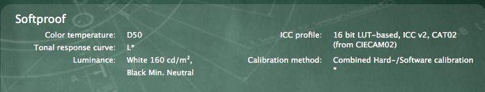
My problem: I am developing and processing NEF (Nikon RAW) files in Affinity Photo, then exporting them as JPEG to upload them to a site to which a professional photographer and fellow students have access. The JPEGs are poor, not what I expected judging by what Affinity Photo displays. Colors are a bit pale, images aren't as sharp, and in some cases the exported photo seems "milky," as when viewed through a slight veil. I am including two screen shots, but they make the discrepancies seem minor. Preview_on_AP_aphoto depicts a JPEG (left) produced by Affinity Photo (left). The JPEG is being displayed by Apple's Preview app, whose window I moved over Affinity Photo before making the screen shot with Grab. After opening the JPEG in Affinity Photo, I wanted to display it side-by-side with the pipeline that produced it. That isn't possible, so I made a screen shot of the JPEG being displayed in Affinity Photo, displayed it in Grab, moved the Grab window over Affinity Photo displaying the original, and made a screen shot of that. That's Grab_on_AP_aphoto. The imported JPEG does not look nearly as sharp and "snappy" as the original. I also flattened the whole pipeline. The resulting pixel layer seemed to lose something in the process, sort of like the JPEG after importing it into Photo. That might explain why neither the file type nor the sampling method seemed to make much difference. The results are poor. Finally, here a longish summary of my experience, my equipment, and how I use Affinity Photo. Setup Nikon D7200 Shooting NEF (Nikon RAW) + JPEG Profile Adobe RGB Picture control Neutral MacBook Pro (17-inch, Late 2011, model ID MacBookPro8,3) 2 TB SSD, 16 GB RAM macOS Sierra 10.12.6 Apple Thunderbolt Display (27-inch) Both monitors calibrated to D50 L-Star 160 cd/m² Software basICColor display Hardware Xrite i1|Display Pro Affinity Photo 1.6.7 Minimal processing in Develop Persona Configuration of Assistant RAW Engine: Serif Labs Lens corrections: Apply lens corrections Noise reduction: Apply colour reduction RAW output format: RGB (32 bit HDR) Tone curve: Take no action Exposure bias: Apply exposure bias as initial state Processing Basic: Pull as much detail from NEF onto histogram Exposure: usually only Blackpoint (-5% or so) and Brightness (up to 20%) Shadows & Highlights: Prevent clipping of highlights and shadows Profile: ROMM RGB: ISO 22028-2-2013 (Linear) Lens: All except Post Crop Vignette Details: Detail Refinement: Usually Radius 50%, Amount 30% Noise Reduction: Usually as is, sometimes Luminance ca. 40% Noise Addition: When Luminance Reduction performed, ca. 3 - 5% Gaussian Main processing in Photo Persona Adjustments Levels White Balance HSL, Shift Brightness/Contrast Vibrance Exposure Shadows/Highlights Curves For printing Adjustments to prevent clipping in printer/paper color space Soft Proof Canon ImagePROGRAF PRO-1000 Profile supplied by Canon for above printer and paper that I intend to use Live Filters (in which order are these executed, does order matter?) Clarity High Pass Unsharp Mask Rarely: Denoise + Add Noise for luminance noise Me (Yep, I’m an integral part of the “setup”) and photography 2003 - 2011: snapshots with various pocket cameras 2011 - 2016: first DSLR, Nikon D7000 Mostly JPEGs NEF + RAW for special courses and projects 2013 - present: father’s Leica M3 + 35, 50 and 135 mm lenses I only shoot black-and-white with the Leica One month Ilford XP 2 Super chromogenic so film could be developed and printed on color equipment at specialty shops Two months Ilford Delta 100 developed (carelessly) by a professional Since the so-called professional ruined a film, I have developed at home and enlarged in an equipped studio. I scan negatives to digital as a backup. I have not yet begun to process them digitally to print. 2016 - present: successor, Nikon D7200 NEF + JPEG Decided against full frame DSLR: Lenses too heavy to carry up mountains. 2018-07: Affinity Photo First exposure to developing NEF No previous experience with Photoshop, Lightroom, etc. Have used Apple’s iPhoto to catalog and view photos to modify photos (ever so occasionally) Interested in landscape, architecture and available light photography Thanks Preview_on_AP_aphoto.tiff Grab_on_AP_aphoto.tiff -
Why a separate develop Persona.
Richard Liu replied to GaryDee's topic in Feedback for Affinity Photo V1 on Desktop
Well I really do apologize if I unintentionally insulted you or anybody else by calling attention to something that certainly help me to understand the intention of the software developer behind the Develop Persona. You might have noticed that not only Advanced Members have been posting in this thread. It was started by a Newbie, and I am one, too. -
Why a separate develop Persona.
Richard Liu replied to GaryDee's topic in Feedback for Affinity Photo V1 on Desktop
For all who do not understand the point of the Develop Persona, I urge you to view You will notice that in the Develop Persona the moderator concentrates on spreading the tones across the histogram without losing any details in the highlights and the shadows, and states that he will do more detailed work with tone curves in the Photo Persona. Basically, in the Develop Persona I try to extract as much detail out of the RAW as possible. It's in the Photo Persona that I then produce an image for a particular purpose. If I want an image to print, I'll start with a Soft Proof adjustment layer in which I select a profile for my printer and paper and turn on gamut checking. All the other adjustment layers will go underneath it, e.g., for adjusting tone, exposure, contrast, brightness, etc. This allows me to refrain from any adjustments that will produce colors that I will have difficulty printing. I might also prefer subtlety to dramatic impact, especially if I'm producing a large print. If, on the other hand, I want to produce an image for a web page, or for sharing, I might want something more dramatic and less subtle than for printing, something with much more contrast, saturated colors, etc. What I produce in the Develop Persona is a good starting point for both, and probably for anything else I might want to produce in the future. -
Why a separate develop Persona.
Richard Liu replied to GaryDee's topic in Feedback for Affinity Photo V1 on Desktop
If its workflow doesn't suit you, don't use it. As you point out, there are alternatives. It suits my workflow and allows me to work the same as I work with black-and-white film. -
Why a separate develop Persona.
Richard Liu replied to GaryDee's topic in Feedback for Affinity Photo V1 on Desktop
Let me take a crack at justifying the Develop Persona, henceforth DP. First, no RAW file is suitable for any purpose except for that for which it was intended, namely, to store the light intensity that impinged on the sensor when you pressed the shutter release. At a minimum the image produced by simply displaying the RAW file must be sharpened, some contrast applied, maybe also a tonal curve applied. The idea behind the DP is the same as the idea behind developing traditional, say, black-and-white, film. By adjusting the time the film spends in the developer solution, you could make the negative more or less contrasty. However, since you can adjust the contrast when you makes enlargements from the negative, you might want to produce a more balanced, neutral negative. That way, you can produce many different kinds of enlargements from it, balanced, contrasty, etc. Similarly, you want to produce in the DP a balanced, neutral result, which will then be, like the traditional negative, the single source of all enlargements. So, you'll want to do just enough sharpening, apply just enough contrast and adjust black level, brightness, exposure and tone curve to spread the histogram between black and white. (See Affinity's video on using tone curves in the DP for more on this.) There is no hard and fast rule about how much to twiddle feature before developing, but I would recommend as little as is needed to obtain a pleasing, neutral result. The more you do in the DP, the less you might need to do, but also, the more you might need to undo, later in the Photo Persona. Second, with practice you will discover how much to do in the DP so that you never need to return to the RAW file to produce both your cooked .jpg and your image for the Web and sharing, but can alway start with the developed "negative" instead. -
Hi, I have the latest version of Affinity Photo running on a MacBook Pro 17" under macOS 10.12.6. When I use a Soft Proof adjustment layer to soft proof my edited photo before printing, I check the box to show the out-of-gamut areas. The tutorial leads me to believe they should be grey, but they seem to be black on my setup, and, depending on the photo, it takes a lot of playing around with the Curves adjustment to get rid of most of them. Is there a special meaning to black areas, as opposed to grey? While I'm at it: Where can I read up on curves, gamut, etc.? I've never used such a photo editing program before, not even Lightroom or Photoshop. Thanks.