Stokestack
-
Posts
433 -
Joined
-
Last visited
Everything posted by Stokestack
-
When you press Apply, the embossing looks drastically different. It may be discarding the angle. This is Photo 1.8.3 under Mac OS 10.15.5. embNotBoss.mov
-
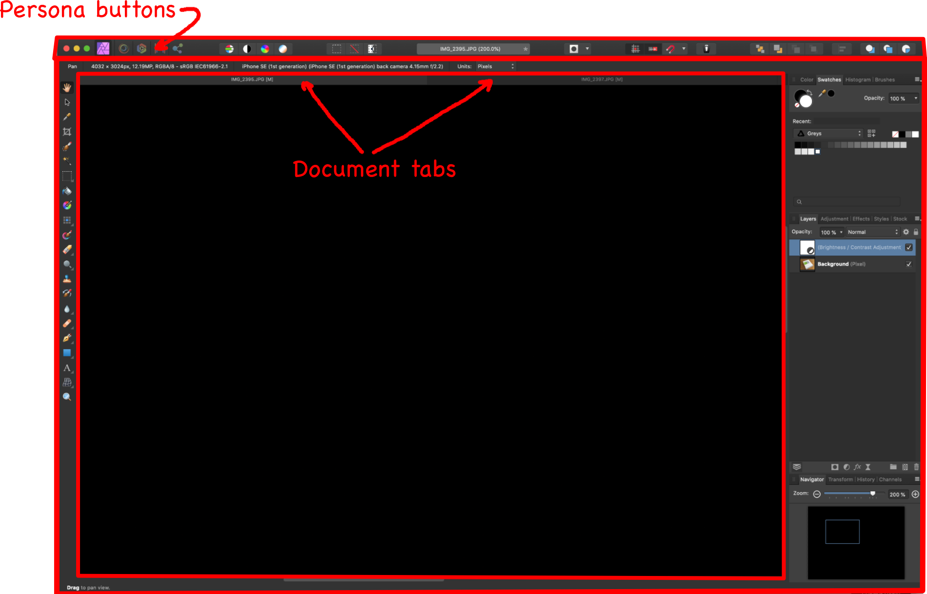
And what surrounds the workspace (in which you find the tabs and active documents)? A frame. You can click and drag on it, and the entire app UI moves. Now try the left side: Yep, same behavior. Try the bottom: Yep, that moves the whole app UI too. Interestingly, the only exception is the right edge. But then... we've seen some wacky UI inconsistency in Affinity apps, haven't we? And whether you think the frame describes a full rectangle or not, there is no debate that it resides at the topmost level of the UI and stretches from edge to edge of it, encompassing everything below it. Like the masthead on a newspaper. Also obvious from the on-screen rendering is that the tabs and their documents are the innermost and most subordinate objects in the UI organization. Personas are shown as outside; documents inside. That's not legitimately debatable, because what happens when you select a persona? Everything around the tabs changes, on all four sides... around and outside all the open documents. And again, as demonstrated in apps with a similar concept: This is how task-specific workspaces (personas) work: They rearrange the UI to present the most-useful controls for a specific mode of working, not for a specific document. Aaaaaand we're done.
-
Great, then that's where they should be depicted. The documents (all of them) are displayed onscreen as being INSIDE the ONE active persona. It's right there. I don't know what to tell you; I didn't design the UI. And I agreed with you. I don't know why you keep bringing it up, or would expect that to happen. I'm mystified as to how a consistent workspace would harm your workflow, but OK. In my case, I opened several files that I quickly needed to resize and compress for Web deployment. So I switched over to Export persona, thinking I could efficiently rip through all three tabs and export them... but no. I had to switch the persona for every tab. That's absolutely antithetical to the whole "persona" idea. Anyway, that's enough time spent on this. I asked for a simple, unobtrusive button that's always visible so the user can immediately perform the action to which this "persona" is dedicated. When you go into the Export persona and there's no visible export button by default... that's counterproductive. Having one wouldn't hamper anyone else's workflow or UI-hierarchy concept, but would help others.
-
Seriously? Scroll up. I don't know what to tell you if you don't know what that is. Frame, window, client area... all standard terms for decades. Grab the outermost area and drag it. Do the interior areas go (or change shape) with it? Then that's the main frame. I got rid of the Adobe suite, but based on Adobe's tutorial video the answer appears to be that workspaces are superior to projects. So if you're in the "editing" workspace (or "persona") and you open a different project, the workspace doesn't change. But of course you're not forced to use any particular workspace, regardless. Even if this weren't true, the situation isn't clearly comparable. Premiere has quite a few more levels in its hierarchy than Photo. There are the files themselves, then timelines, then projects, and then the workspace around all of those. It depends on how the UI depicts this hierarchy. Resolve also has similar workspaces. Blender does too, but you can't have multiple files open.
-
If you could move documents from one pane to another in the app, that analogy might work. But here, the documents don't move. So we're left with changing the environment that surrounds the documents. Thus the persona buttons on the main frame. To support your analogy, "personas" could be selected on or within each document tab. That would be clear. And again: Selectable workspaces are not uncommon in media-centric applications. I don't know of a single one whose relationship to the document is inverted, as Photo's is.
-
Thanks for the reply. I wouldn't expect them be to either. I don't know how that contradicts my reading of the documentation. If you select the crop tool and crop one of your open documents, it doesn't crop the others, right? Thanks for your thoughts on it. Then the UI is poorly designed. If you can find any other example of a workspace spontaneously changing after the user has expressly selected it, simply because he selected another file of the same type, I'm interested in taking a look at it. And because, admittedly, precedent isn't always a great excuse, think it through conceptually: If I'm in a paint booth and I bring a new piece of sheetmetal in, I don't expect the paint booth to transform into a dent-removal workstation. I'm in "painter" persona; I'm doing paint work. Anything I bring in, I'm going to paint.
-
The documentation, for one: And this hierarchy is clearly depicted in the UI. The Persona buttons are on the main frame, which encloses all of the tabs and their images. And finally there's the name itself. By selecting a "persona," you're supposed to be telling the application "I'm working as a designer," or "I'm working as an X." This holds true in other applications that feature task- or role-specific workspaces, such as Adobe Premiere. "I'm working as an audio editor," so audio-centric controls are given most of the screen real-estate. But the UI doesn't completely reorganize itself whenever the user clicks on a different file. It's backward for the document to dictate the priorities of the person editing it.

-
Thanks. I needed to efficiently export several open files with similar export settings. I figured the Export persona, being dedicated to exporting, would provide that efficiency. In fact it was further hampered by Photo inexplicably switching personas when I clicked on different documents' tabs. The persona is supposed to be the mode of the entire workspace, which the tabs are subordinate to. So why on earth would I want it to bounce me out of the current persona simply because I selected a different image? Affinity products are like an Advent calendar of baffling design decisions.
-
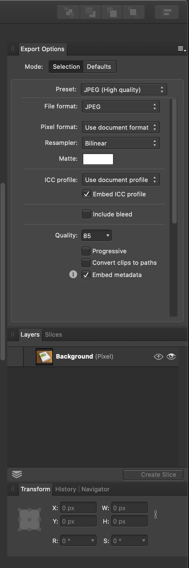
Thanks for the reply, and taking the time to make that illustration! But as I mentioned, I'm not using "slices," and all of these are hidden on the "Slices" tab by default. If you don't have any slices, it doesn't seem logical to go to the Slices tab. This leaves no apparent way to perform the export. This is what you see by default in the Export persona.
-
I needed to export three images with the same size and format, so I decided to try the "Export persona" UI. I spent several minutes scouring the screen for an "Export," "Go," or "Do it!" button in order to actually perform the function that this layout is supposed to serve. No dice. So after searching Help for "export persona" and bringing up an empty page (known, documented bug) and then searching again, I had to read through to the very end to find that the actual Export button is hidden by default, buried on the "Slices" tab. I'm not making or using slices, so I would not have found this. It would be preferable to have the Export button visible at all times. Thanks!
-
That's the great thing about having options, isn't it? Don't want to see it? Don't opt to have it shown. That's how Adobe handles this very thing. Also there's plenty of room at the right end of the status-bar area, if not in the navigator pane, where this could optionally be displayed.
-
Thanks for the reply. I guess you might see that, if you were staring at an irrelevant corner of the screen that is opposite to where the control for the filter appears... and happen to notice it before it disappears on its own. Rasterization is a destructive action that should require user approval. Not to mention that there's still no apparent reason to pick one arbitrary shape out of a multiple selection and rasterize it, but not the others. I realize that you've smushed the window down to conserve space, but here's how ineffectual this UI is in a realistic scenario (on an iMac, in this case).
-
Thanks for the info. This information should be communicated to the user, either by greying out inapplicable actions or presenting a dialog. The program shouldn't just arbitrarily perform the action on one of several selected objects. Nor should it rasterize vector objects without informing the user.
-
The point is to avoid having to go somewhere and use a tool or open a panel to see this important information. Thus, neither of those suggestions addresses the problem. This is basic information about the open document. Even GIMP manages to display it all the time. Photo doesn't even show it in the "navigator" pane. Why?
-
This information is important in many, many cases. If you're preparing an image for posting somewhere, or another space- or data-constrained application, you need to know if you need to resize it. Or maybe you're working on icons that are required to have certain dimensions. Photoshop displays the image dimensions in the status bar at the bottom of the window. The lack of any such display in Photo is mystifying. Please address this.
-
I drew some shapes and then wanted to blur them to match the appearance of the underlying image. So I selected all of them and applied a Gaussian blur. Only one of them was affected. Screen grab attached. effectsNotAppliedToMult.mov
-
Thanks for the replies. If there’s only one document open, there is no tab, so that won’t work. It’s ridiculous to have to use a tool or open a panel to see the document’s dimensions. This information is important in many, many cases. If I’m preparing an image for posting somewhere or another space- or data-constrained application, I need to know if I need to resize it. Or maybe I’m working on icons that are required to have certain dimensions. Photoshop displays the image dimensions in the status bar at the bottom of the window. The lack of any such display in Photo is mystifying.
-
I guess if I'm overlooking it, there's a already a problem. But I don't see the current document's dimensions anywhere in the UI. Are they really not shown?
-
I did a fresh installation on a newly wiped computer, and they were fitted into the "docked" area and overlaid on the other panes there. I didn't even know they weren't docked until I dragged the right side of the main frame to the left and the text panel was left on the desktop.
-
Thanks for that info. The question is why floating panels were disguised as docked panels by default.
-
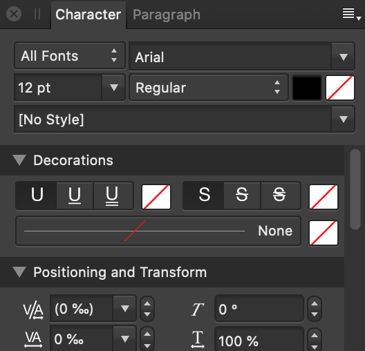
Thanks for the replies. We can debate the arbitrariness and lack of graphical distinction to these buttons, but really there's no excuse for the useless ToolTips. As you can see, it's possible to have multi-word ToolTips that convey useful information. Also, if pressing the button activates the panel, why doesn't pressing it again remove it? And the Paragraph and Character panels are integrated into the same tabbed pane... but only one is shown per button press. So if you want both, you have to run around pressing the buttons separately... but there's no way to remove one panel afterward, so why not immediately show them both if either "Character" or "Paragraph" is pressed, but with the appropriate one focused? And finally: It's a floating panel, disguised as a docked panel by placing it over (and matching the size of) the other controls in the right pane. You discover that when you resize or move the main window, and the text panel stays behind on your desktop. It's also needlessly cut off at the bottom, which can hide that fact that there are more controls available (especially since there's no frame). Why? A. I had no way of knowing that "paragraph panel" had anything to do with this button. B. I don't have questions about using those panels. C. Help often doesn't work:
-
Thanks for the replies. I’m mystified as to why there’s a cryptic button with no info in the ToolTip, to invoke this one panel.
-
Thanks for the replies. That’s a perplexing design.
-
Thanks! Are there dedicated buttons for every other panel in the app? Also, any idea about the original question?
-
I encountered this in Photo today. There's the unexplained "paragraph" button in the tool bar that apparently does nothing and whose ToolTip says "paragraph." But that's it. And the Help file was no help. Any insights? Thanks Wow, nice layout ⬆︎