RoyMcCoy
-
Posts
23 -
Joined
-
Last visited
Everything posted by RoyMcCoy
-
Three Things I Don't Like About Affinity Photo 2
RoyMcCoy replied to RoyMcCoy's topic in Beta Software Program Members Area
My problem was that particularly the seemingly pointless "workspace" (?) covers everything behind it, but it's okay now that I've given up on any other solution and figured out a workaround using the Keyboard Maestro Mac accessory. I nearly always launch or switch to Affinity Photo (as to most apps) using a macro, which up to now was quite simple: Triggered by any of the following: The Hot Key ⌃⌥⌘F12 is pressed Will execute the following actions: Activate Affinity Photo 2 I added the following to this today: Pause Until All Conditions Met Application “Affinity Photo 2” is at the front If All Conditions Met Menu with name “Save As...” is not enabled Execute the Following Actions: Type the ⌘W Keystroke In other words, if no document is open KM immediately dismisses the UI, which I get back whenever I open a doc or create a new one. At this moment I'm thinking I'll disable the added steps, however, since the background doesn't bother me when I launch the program and want to do something with it. The problem was rather as I described, when I closed the last document window and still had that dumb white space looking at me and serving only as a nuisance and a hindrance. I took care of this, the actual problem, with a completely new macro launched in Photo by cmd-w, the standard command for closing a window: Triggered by any of the following: The Hot Key ⌘W is pressed Will execute the following actions: Select Menu Item in Affinity Photo 2 Select: File ⇢ Close Pause for 1.0 Seconds [unfortunately necessary but no big deal] If All Conditions Met Menu with name “Save As...” is not enabled Execute the Following Actions: Type the ⌘W Keystroke picking up the if/then command from the first macro. So now, when I close the last document window, the unwanted white space goes away on its own. Hallelujah. Thanks to all for the help. -
Three Things I Don't Like About Affinity Photo 2
RoyMcCoy replied to RoyMcCoy's topic in Beta Software Program Members Area
That's right, and I continue to see no sense in it at all. But it's okay now – see my reply to Walt. -
Three Things I Don't Like About Affinity Photo 2
RoyMcCoy replied to RoyMcCoy's topic in Beta Software Program Members Area
Thanks, but it's not the monitor brightness level, which makes no essential difference. Neither do the sliders, except Text Contrast as I said to prophet. If I put it on the Dark setting it just makes the background black rather than white, which still undesiredly covers everything else. I open three files, hit cmd-w three times and am looking at the white background. If – Mac users! – can open three files, hit cmd-w three (not four) times and then see the desktop, I'd like to see it. If they can do it then I should be able to also. -
Three Things I Don't Like About Affinity Photo 2
RoyMcCoy replied to RoyMcCoy's topic in Beta Software Program Members Area
Thanks, but I adjusted my settings to match those shown in your screenshot and still had the white. None of those sliders seems to change it except Text Contrast, which will turn the background to solid black and then it's hard to make it white again (not that I want it white, or black, or any shade of gray – I don't want it at all). -
Three Things I Don't Like About Affinity Photo 2
RoyMcCoy replied to RoyMcCoy's topic in Beta Software Program Members Area
This is interesting. I hope you can provide a key to how to avoid the white background.
-
Three Things I Don't Like About Affinity Photo 2
RoyMcCoy replied to RoyMcCoy's topic in Beta Software Program Members Area
Thanks Old Bruce, but then it's a matter of cmd-w cmd-h rather than cmd-w cmd-w, which is hardly an improvement. Nor does it make any difference, since the second cmd-w hides the toolbar, context menu and palettes the same as cmd-h. Is there anyone from Affinity here who might want to defend the white window against at least two users who don't want and are annoyed by it? -
Three Things I Don't Like About Affinity Photo 2
RoyMcCoy replied to RoyMcCoy's topic in Beta Software Program Members Area
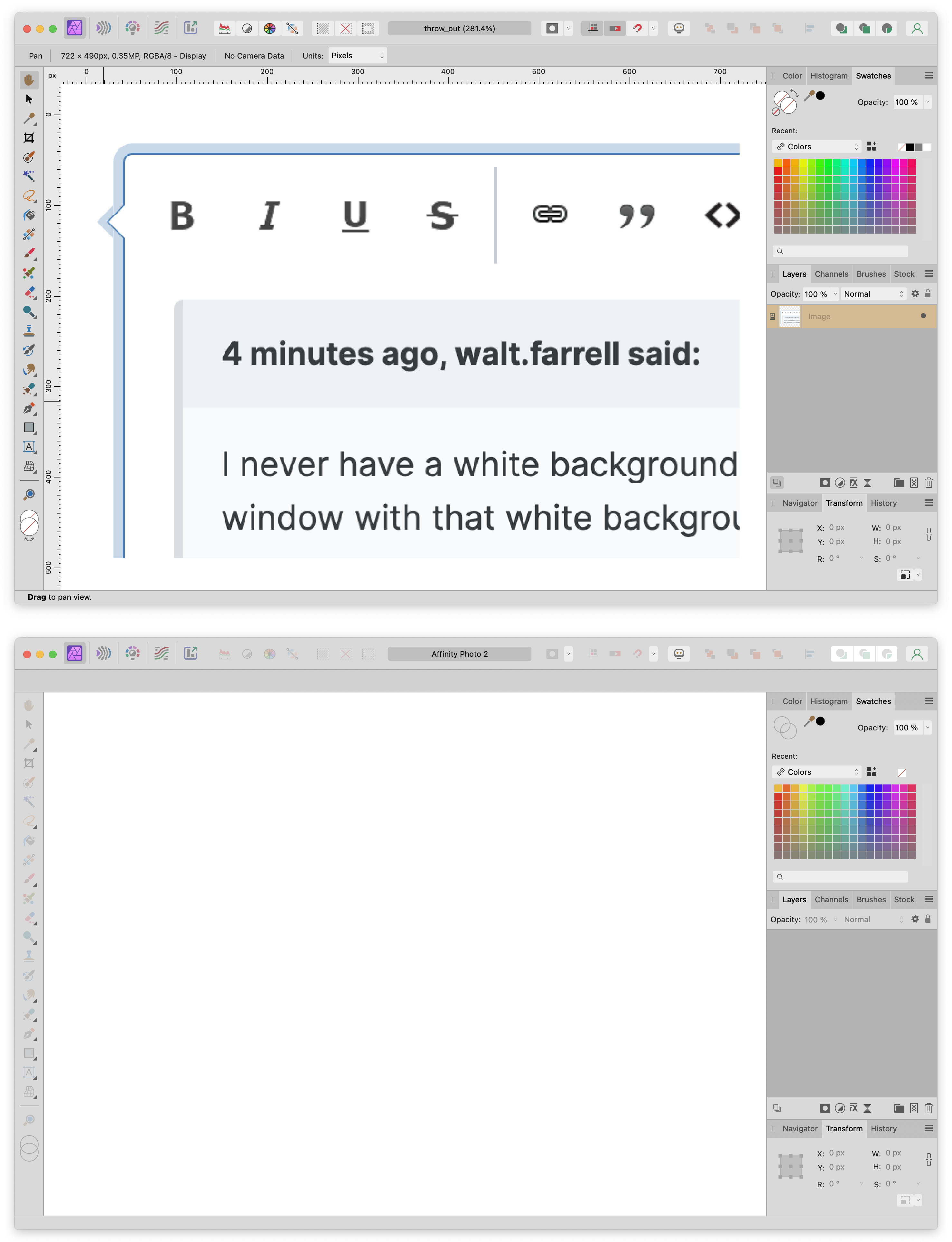
This issue of the white background is still current for me. In a nutshell, it remains an annoyance that more or less every time I close a document window, I have to hit cmd-w a second time to make the damn white background disappear. I don't want it and it serves no purpose that I can even imagine. Is this hard to understand? I want to close the document I was doing something with, but not the program. With the program not in the foreground and momentarily not being used, why would I want its big blotch of white filling up my screen? And why should I have to hit cmd-w a second time to get rid of it, especially when I never wanted it in the first place? I write this in the hope of change. If it's already been changed and there's now an option not to have the white background, somebody please inform me, thanks. -
Thanks again, @Hangman. No, switching to the Designer and Photo Personas isn't what I have in mind here, especially since I have no idea what you're talking about. (Please don't tell me, thanks.) The PDF editing problems I alluded to were never very serious, since if I made the PDF myself I could make the desired change in the originating program, and if it was coming from someone else what business did I have changing it (or why would I have to)? All I really want to do is juggle pages occasionally, and I've now found that Preview does that just fine. Shortcuts? I see it's on my relatively new MacBook Air, but I never noticed it till now. Keyboard Maestro will do about anything I want, so I think I'll leave Shortcuts alone unless I eventually want to use voice commands with Siri – which might be fun but I've never gotten into it.
-
Many thanks, @Hangman, for taking the time and going to the trouble of laying this all out for me. My only remaining question still regards what exactly can be done with text in an imported PDF in Publisher using Interpret. I used to be able to edit PDF text in Acrobat Pro (though not in InDesign, as you correctly point out), but there were always strict limitations as to what I could do and I was generally limited to only the simplest of edits, often not even being able to make those. (I vaguely recall it would say something about a missing system font.) I'd like to see an example of a PDF text edit one can do with Interpret in Publisher that one can't do in Acrobat Pro. If it's around the the same level of capability, I may never be much interested (particularly since I'm not working and am hardly doing anything anymore anyway :-). By the way, I just found out yesterday that I don't need to buy a PDF editor to replace Acrobat Pro on my old Mac (which I don't feel like firing up anymore, particularly with its unrepaired battery and keyboard problems). I was at the point of buying PDF Expert, but when looking for reviews of it on the web I discovered that I can do everything I normally want to with a PDF (combining files, adding and deleting pages) using the Preview app that comes free with the Mac. So I can not only save some bucks, but also avoid making the icons on my Dock even tinier by adding yet another app to it.
-
This sounds like a boilerplate comment that could be defensively made about anything, with the bad guy being the one insisting that the Affinity apps behave exactly like the Adobe ones. But that's not what I'm doing. I have no objection to setting or switching a preference, and in fact I'm assuming that there is some advantage to not importing PDF fonts that led Affinity to not do so originally. I just still don't know what that advantage is or was, exactly. I also (more than) suppose there are gross disadvantages that pressured it to later add the ability to import the fonts. But, er, wait a minute. Interpret may have been the original Publisher mode, but Passthrough has apparently been the default since I acquired the program. So PDF fonts are imported in it, right? They always were, until I was prompted to "fix" the compatibility problem that had never been a problem previously by switching to Interpret; only then did Publisher not import the fonts. Whoa, you're right. I don't know how I missed that this preflight check has "Disabled" too, but apparently I did. Part of my problem with this appears to have been that I couldn't get the "Custom" profile to persist outside of the doc in which I changed its settings. When I just now created a new "Universal" preset, however, it does persist and when I switch a doc to it the doc is okay and doesn't give the unwanted alert anymore. I wonder if that's the difference between a (document?) profile and a (program-wide?) preset. In any event I'm set on this now and know how to get rid of the unwanted "Placed PDF version" alert if I see it again. Thanks!
-
Thanks @Hangman. I understand this. What I don't understand is that I used Aldus PageMaker, Adobe PageMaker, and Adobe InDesign for decades and there was never any question (at least as far as I knew) of whether PDF fonts were imported with a PDF file or not – they simply always were. You could decide whether or not to include fonts when you created a PDF, but there didn't seem to be any Passthrough vs. Interpret option on importing and I don't remember that the lack of something like this was ever noticed. It therefore seems to me that it was the Interpret rather than the so-called Passthrough option that was designed and put into Publisher. It may be that I'm not sufficiently appreciative of Interpret, which may well allow more manipulation of imported PDF text than had previously been possible – I don't know. I get this too. But the Wall Street Journal doesn't care about lost features that it doesn't use in its simple crossword PDFs (presumably preferring maximum backwards compatibility), and I don't either. I don't see why I can't turn this check off in a profile if I don't want it – and, yet again, I don't know why Publisher suddenly started hassling me about it when it hadn't before. I guess I can finally suppose that it's "just one of those things". Yes, but I'm not creating these PDFs. I'm not sure it's persistent. Thanks again.
-
Thanks, Walt and Oufti. Walt: Yes, it was always on Passthrough before, though I was completely unaware of Passthrough vs. Interpret and never set one or the other. It was still on Passthrough when the "Placed PDF version (PDF 1.4) is not compatible with the PDF export version" alert started appearing for some as yet unknown reason, the "fix" of which switched to Interpret and messed up the fonts. Again, I'm sure I didn't change anything, particularly not a profile as I'd also never touched those. It might imaginably be that a program update triggered the change, though the problem occurred before I updated to v. 2.1.1. I notice that the PDF Passthrough compatibility check can't be turned off in the Custom profile, so I can't stop the alert by doing that. None of the files that worked with no problem earlier are doing so now; they all give the Placed PDF Version alert, though they didn't before. Switching to Interpret is no fix, unless I want to go looking for fonts like DJ5RetinaCD-Light and succeed in finding them. Oufti: This is a helpful explanation of font substitution and of why I got the bad letterspacing, thanks. I don't think I'll ever have to pick fonts I have to replace ones I don't have, though, since Passthrough will give me the PDF fonts and I can deal with the PDF version compatibility although it's an annoyance.
-
Thanks Walt, but I'm still confused about this. (1) My understanding is that fonts are usually if not always included in PDF files, and if so why should I have to find and install "missing" fonts now when I never had to before? (2) Publisher was working fine without this problem before. Do you or anyone have an idea as to why the change occurred? (3) Edit Document does show the "missing" fonts (missing in my system but not in the PDF), and after clicking on it (but not before) these fonts also show in the Font Manager window when I select a font in the Preflight panel and click on Fix. Furthermore, Edit Document only shows the Document Contains Missing Fonts alert once, the Assigned Profile alert is transient, and sometimes the Document Contains Missing Fonts alert is transient also. This all seems rather strange and could possibly use some improvement, but if all the missing fonts are being substuted by Helvetica as the Font Manager window indicates, why am I getting the bad letterspacing? Is the font substitution not really working, or what? I don't see why I should have to switch to Passthrough, edit my Preflight profile to specify a different PDF level, or make any color-setting adjustments when all this was working fine before. Is restoring the previous correct behavior impossible? Or maybe I was already set for Passthrough and had the right PDF level and color settings before, they got messed up somehow and now I have to figure out how to restore them? Apparently the Publisher files are already set for Passthrough, and they switch to Interpret only when I click on Fix in response to the "Placed PDF version (PDF 1.4) is not compatible with the PDF export version" alert. The Profile is set to Default as it presumably always was, so there's still the question of what changed and why. When I change the PDF Passthrough Compatibility setting to PDF 1.4, I lose the "Placed PDF version" alert but get another one, "Placed PDF has objects of a color different to the document colorspace. The PDF will still pass through." Colors are not very important in these docs and I don't know how to appropriately readjust the document colorspace anyway, so I unselected "Check color space matches document" under Image Color in the Edit Preflight Profile window. This doesn't get rid of the unwanted color alert, however, also when I click on Check Now. I did another one of these and got a good printout with proper letterspacing. Moreover I lost the unwanted Preflight color alert when printing, though I get it back if I click on Check Now even with the modified profile (why is the same thing apparently called a preset?). I guess this will get me by (especially since I'm going to be printing out these PDFs without Publisher), so thanks indeed. There are still some mysteries and apparently sketchy behavior, however. I'd still like to know what may have gone wrong, and I still think printing should continue to work normally with the Default profile.
-
I'm posting in this old thread because I'm having the same problem now in June 2023 (Ventura 13.4.1 on M2 MacBook Air, all Publisher versions 2), namely the "Placed PDF version (PDF 1.4) is not compatible with the PDF export version" alert. I'm certain I didn't change anything that should have caused this; it just started happening. There have been certain oddities besides this basic one. For one, I'm not seeing the "Placed PDF version" alert anymore, but rather just a list of six allegedly missing fonts. For another, last night I wasn't seeing the list of missing fonts either, but the Publisher file with the imported PDF still printed out with bad letterspacing, which is the bad result of this, the letters themselves looking okay. When I see the list of missing fonts, select one of them and click on Fix, I don't see the name of the font or anything else in the Font Manager window, so apparently there's no way to substitute and I wouldn't want to have to do that with six fonts in every similar doc anyway. I'm retired so this isn't a work thing. The PDFs are saved/downloaded from https://chall.us/hex/hex_all_wsj.html. I open a copy of the previous crossword, select its PDF, click on Replace Document and select the new one. Sample files attached. For me it's showing the missing fonts as DJ5EExchange-Semibolditalic, DJ5RetinaCd-Bold, DJ5RetinaCD-Light, DJ5RetinaNr-Bold, DJ5RetinaNr-Medium and DJ5ZapfDingbats-Regular. It's not so bad that this has happened since I now realize I can just print the PDF out with Fit selected and without importing (I think the printout was clipped at the bottom before and that's why I started placing the PDF in Publisher), but I'd like to get the problem resolved for the future. Thanks. rising and falling.pdf rising and falling.afpub
-
How can you fill it? Edit > Fill... is grayed out, and if I change the color the whole image is colored, not just the selection as desired. This is turning out to be yet another occasion when I have to fire up the old Mac and do what I need to do in Photoshop. The procedure for stroking a selection is not adequately presented in the replies on this, and in any event it seems clearly too complicated. P.S. I finally managed to do it after creating a new layer. My impression is that there are several techniques for doing this, which seems unnecessarily confusing, particularly when the techniques themselves are complicated, at least as compared to the good old simple Photoshop command.
-
Can't choose color
RoyMcCoy replied to RoyMcCoy's topic in Affinity on Desktop Questions (macOS and Windows)
I would never have guessed this, but okay, thanks. I haven't even read the Quickstart Guide, so I'll at least have to do that. If this is not just me it will presumably come up again. I saw a video in which someone pressed on something in a stack of icons on the right side of the screen and the names of all the tools were displayed at the same time. This would be useful to me – can you or someone tell me how to get this? -
I posted the following question in the wrong place on the forum last night, realized my mistake but couldn't delete the post. This Desktop Questions section was proposed as more appropriate, so I'm reposting here with a screenshot as suggested. "I confess that I'm trying to use Photo [2.0.4 and 2.1.0.1709, Ventura 13.2.1 on M2 MacBook Air] without reading a manual on it, but it still seems that it should be easier to choose a color for the paint brush. Both the foreground and background colors are set to Clear, with the red diagonal line through the white circle. Maybe I'm stupid, but I either have great difficulty getting this to change, or – as at the present moment – I can't get it to change at all. One of the several ways I've tried has been to click on the color tab at the right and double-click on the foreground circle, and then the Color Chooser dialog comes up. But I can't choose the color! Whatever I do, it just springs back to where it was originally. I realize there's some kind of trick here and somebody will likely tell me what it is, but I don't think a possibly unintuitive trick should be necessary. TFG reports the same problem at https://forum.affinity.serif.com/index.php?/topic/75219-changing-color-of-brushes/, so it's not just me. If this is indeed happening with multiple users, I think it's something that should be corrected/avoided if possible, thanks." If this is indeed a recurring problem (and I afterwards found yet another person reporting the same thing), then I think this post should be considered a bug report or a beta issue rather than simply as a question, even though it doesn't essentially concern the current beta release (which I'm using, but I have the same problem with 2.0.4). What I wound up having to do last night was boot my old 2013 Mac, copy the file to it, perform the desired operation in Photoshop and then copy the modified file back to my current Mac – hardly an ideal procedure and not one I would want to have to repeat. This morning I discovered the lock icon in the Color tab, and I find that I can move the sliders without their snapping back to their original positions as before. This is only in the Color tab, though: in the Color Chooser they're still snapping back, and in any event I still can't change the foreground and background colors, both of which remain set with the white circle and red diagonal. Or maybe these aren't the foreground and background colors, even though they look the same as Photoshop's and have what appears to be the same switch arrow? It's curious that when I search the Internet on "can't change the foreground color in Affinity Photo", I only get finds on the background color, which itself appears to be different from what's understood as the background color in Photoshop.
-
Three Things I Don't Like About Affinity Photo 2
RoyMcCoy replied to RoyMcCoy's topic in Beta Software Program Members Area
Thanks @Red Sands, these comments are helpful. You too. Unless I misunderstand, you can do this. Create a new "Custom" preset category (button at bottom left of list) and drag it to the top. Then create a new preset in this category, say "Scratch" or "New Custom", and select it as the default. Then it should come up as the top choice every time and you can create new presets in the new Custom category as desired. I think it's very funny that I know almost nothing about the program and can still say something like this. Yes, I'm starting to pick up on this, thanks. I wish I could default to the Favorites view (Affinity please note), but this doesn't seem to be presently possible. What I can do, however, is not see the New Document dialog at all, which I just now discovered is possible by unselecting Show on Startup at the lower left of the window. Most of the time I'm opening new documents from the clipboard these days (⌥⇧⌃N), so none of these New Document dialog matters will matter much to me now that I've discovered how to avoid it entirely. Since I'm on the subject, though, I'll comment on something that seems to be a kind of a bug. For some reason Photo seems to be reverting to the Web > FHD 1080p preset even after I've set the default to Print > Letter or (your new) Custom > Scratch. I have no idea why it's done this; I don't think I ever selected FHD 1080p in the first place, and I can't imagine any reason to give it precedence. -
Three Things I Don't Like About Affinity Photo 2
RoyMcCoy replied to RoyMcCoy's topic in Beta Software Program Members Area
Thanks to Hangman and loukash for their prompt, informative and helpful responses to my issues. And for this supportive one. My current thought is that though dialogs like New Document, Place Document etc. customarily occupy a relatively smaller space in the middle of the screen, there's no logical reason why they shouldn't be larger and contain more information as this Affinity one does. It's probably mostly a matter of not being used to the larger size, though I still don't want to be continually confronted with a list of options that I never use. I have a neurotic resistance to discarding anything I might use, even if the odds are highly against my actually ever using it. So my own preference would be to have the presets out of (constant) sight, but still somewhere for the unlikely event of possibly wanting one of them. I'll probably do something like this, thanks. Thanks. I suppose you mean by assigning a shortcut to turning off Transparent Background. I don't think this should be necessary, and it will be granted that having to do this repeatedly, whether via the menu or a shortcut, will be an undesirable nuisance for anyone who normally wants the eraser to be simply white (or maybe background color). The setting should be persistent, in the Document menu and/or Settings. I can't see any reason for having Transparent Background reset as a default for every new document regardless of the user's preference. To tell you the truth, I didn't notice that the other UI elements were hidden when I hit command-w with no document open. The only thing that concerned me (which kind of makes sense, with no document open and therefore little or nothing to be done with displayed UI elements) was the "white screen-fitting background", which to me was highly unusual and seemingly purposeless. I think I remember one Mac program that did that, way back in the very distant past – maybe MacDraw. I now vaguely remember that Adobe may also have had something like this – I forget what they called it – but as an option that I didn't like and immediately turned off. So I guess I can say it's a matter of relative indifference to me as to whether the Ui elements are displayed with no document open or not. I just don't want that curious big blotch of white. Does it serve any purpose? All I can think is that the intention might be to hide the desktop or whatever else might be behind Photo. But I'm used to seeing whatever's there, and sometimes I want to. If there's a good reason for the white space, then maybe okay; but then the question is still why other programs don't have it if it's indeed useful and desirable. -
I retired nearly ten years ago after having worked with Photoshop for around 25 years, and I haven't been working since then so I won't have much if anything of value to offer. I nevertheless jumped at the chance to be an Affinity beta tester, as this provides me with the opportunity to communicate a couple of things I don't like about Affinity Photo 2 (I haven't used Publisher or Designer much) when I have reason to believe someone from Affinity is seriously listening. These may be minor nits, but they bother me and may others as well. (1) The New Document dialog seems regrettably cluttered by the long visible list of options, most of which will not be used by any individual user. It would be neater if they could be tucked away in a popdown, or perhaps not displayed at all as an option. (2) Having used Photoshop as long as I did, I'm used to the eraser giving me simply white rather than the unsightly gray pattern that I see in Affinity Photo. If Affinity thinks this pattern is a good thing despite the unsightliness, could it at least provide an option for the eraser to be white, as Photoshop's? (3) I don't like the white screen-fitting background when no document is open. That it is not necessary is demonstrated by the fact that it can be closed with command-w and no harm is done thereby. So why have it in the first place? Another thing demonstrating that it isn't needed is that other programs don't have it. I don't think Affinity Photo should either; or, if again a justification can be presented for it, it could conceivably be made an option. Thanks.