Jamesx1
-
Posts
51 -
Joined
-
Last visited
Everything posted by Jamesx1
-
Placed (linked) files are pixelated when AP re-opened
Jamesx1 replied to Jamesx1's topic in V2 Bugs found on Windows
Hi - there's been a couple of updates since I posted this issue, it still persists - is there possibly an ETA for this? Takes me 20 minutes just to display the files I'm working on for my current project. Info appreciated. Thanks. -
Update: When I create a new picture frame on my master page and leave it empty, then add images (replace image) only to the instances of the new picture frame on the individual pages, the files are properly linked and appear in the resource manager. In terms of updating when the files are updated externally, I'll test that over the next couple of days and see if there are any irregularities. When I added the images, the vertical highlight line in the layers panel went to a dashed line, as it does for all replaced content, including text. So it seems that we shouldn't put an image within the picture frame in a master then replace it, even if it does work for some people and not for others. As mentioned on this thread, there must be other parameters of steps that affect the linked files appearing in the Resource Manager.
-
That sounds promising, actually. I didn't even consider that this should be the way it is done. I guess I just wanted to preview how it would look, which is something I'd need to do first if I am going to add guides to help the placement of individual image variations on the document pages. But I might try adding two picture frames - one with a demo images for guides, and an empty one as a clean solution to see if the original issue we're discussing goes away. I will update the forum when I get to try this tomorrow. Thanks again for the tip.
-
Thanks again for looking into it. I'm just going to deal with it manually for now...but I wouldn't want to be working on a huge document with many instances. Luckily I'm just dealing with 12.
-
It is possible that I changed the master page image placeholder at some point from what I originally had. I don't know if this is the problem. I simply expect that the Picture Frame contains the attributes and the image is interchangeable, and I would assume that any image used in the document would either be linked or embedded regardless of any workflow.
-
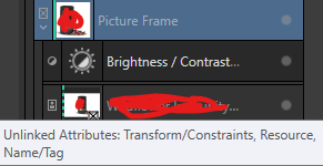
Many thanks for testing it out and letting me know about the bug lodgment. I can work around it manually for now. Is there definitely no user error involved? If I hover over the image in layers, I get this tooltip: I didn't see any way to re-link attributes though. I wonder if this is related to Layer > Master Page > Edit Detached/Linked/Frame Content? Maybe I'm grasping at straws now.

-
Thank you for all your effort. I think I am getting closer to the issue now, probably a knowledge error as I alluded to with my first post. What are these 'unlinked attributes' including 'Resource' associated with the images that are not appearing in my Resource Manager? How can I change/remedy that by linking the resource and ensuring all other attributes are as per the page template?
-
No, the 12 instances don't appear in the Resource Manager at all. Well, 11 don't. One does because it is the one I used in the actual page template. The other 11 do not appear in the Resource Manager at all. No files disappear in the artwork. They just aren't in the Resource Manager, and do not update automatically when the file changes in the folder. It's as if they are just in some cache somewhere. Basically, I believe the Picture Frame or Resource Manager is behaving differently for images added to a picture frame that is fed from a template, as opposed to Picture Frames added directly to a page.
-
Sorry, yes, Picture Frames. I use the Picture Frame on the master to position the image. This then appears on the 12 instances. Then I 'replace image' for each of the 12 picture frame instances to show the correct image. None of these changes show the files I add in the Resource Manager. Only the original one used in the template appears in the Resource Manager. If you need a file example, I'll need to just rework the file, get the file size down and replace with dummy info etc.
-
But I have other pages with image frames I've added directly - eg. not via a page template - and they appear as they should in the Resources Manager. It's as if the images are invisible to the Resource Manager if added to an image frame that is part of a page template.
-
Thank you all for your assistance. Yes, I have a master page template for a product, for which there are 12 instances - 12 pages using that master template. They require different product photos, so I have performed 'replace image' individually for each of the 12 instances of the image frame, since I don't want the demo image used in the master template to be repeated 12 times. The image frame on the master is great because I can set global alignment and adjustment layers, etc. Since the 12 product images will be getting frequently updated, I just need them to update when the file updates. Eg. Export an updated image of a product photo from Affinity Photo into a folder on my PC that contains all the images that Publisher is using (.i.e the external file with the same file name is updated/overwritten). This really should update the image as it appears in Publisher, but for me it does not. And none of the images other than the one I used for the master page template appear in Resource Manager. I'm actually perplexed as to how they are appearing at all, given Resource manager sees them as neither linked nor embedded.
-
I’m having a difficulty in Affinity Publisher 2 where images placed inside image frames do not update when I replace the external file. It may well be that I don't know how to do this... My Situation: This frame's size and position is set in a master page template, and there are 12 instances of this master template throughout the booklet whereby I have replaced the actual image with different images. My preferences are set to "Prefer Linked" and "Automatically Update Linked Resources." However, when I update or replace an external file in my folder, the image inside Publisher does not change. The images also do not appear in Resource Manager—only the one I placed in my Master Page shows as linked. If I rename these external file, Publisher still shows the old images, suggesting there is no link at all for these 12 images. Currently, I need to click on each of the image frames and 'Replace image' every time there is a change to display the updated image file within the frame. How can I ensure that images placed in image frames are properly linked and update automatically when the file is modified? Appreciate any help.
-
Affinity Photo Vector Mask Has White Outline After Update
Jamesx1 replied to Jamesx1's topic in V2 Bugs found on Windows
No worries. I learned something today. Really appreciate your time. Cheers. -
Affinity Photo Vector Mask Has White Outline After Update
Jamesx1 replied to Jamesx1's topic in V2 Bugs found on Windows
Solved! Thanks a million Carl - saved me from a big issue. It was fine until today for some reason, but I'm definitely happy to have the right settings now. -
Affinity Photo Vector Mask Has White Outline After Update
Jamesx1 replied to Jamesx1's topic in V2 Bugs found on Windows
Hmm, interesting. It does appear in the export for me, JPEG and PNG. My PC is fairly powerful and only a few months old (i7 latest gen, 64GB ram). Could low disk space affect it suddenly? The only thing that changed really was the update.
-
Affinity Photo Vector Mask Has White Outline After Update
Jamesx1 replied to Jamesx1's topic in V2 Bugs found on Windows
Thanks. Deleted everything unnecessary and saved as a smaller size, got it down to 13MB. Appreciate you taking a look at it. You can see the vector mask in question in the layers. Affinity Help - Vector Outline Issue - Small.afphoto -
Affinity Photo Vector Mask Has White Outline After Update
Jamesx1 replied to Jamesx1's topic in V2 Bugs found on Windows
OK, nearly done. File size still 300MB though. Is there a way to remove embedded/linked RAW files? I have rasterized the layer in question, but the Resource Manager still indicates it is loading a RAW file but I am no longer using any RAW file. Can you possibly tell me how to remove files that are showing up in Resource Manager? There is no delete option. Many thanks. -
Affinity Photo Vector Mask Has White Outline After Update
Jamesx1 replied to Jamesx1's topic in V2 Bugs found on Windows
Hi Carl - thanks for looking at it. Original file is 1GB, and there are multiple linked files. I could try and delete some layers for your copy and PM you a OneDrive link instead? -
Hi After updating to Affinity 2.6.0, my vector mask has a white border, similar to a stroke, that will not go away. See attachment of the bottom of an object that is masked using a vector mask. No matter where the mask points are dragged, the white fringe/border follows it. This was definitely not there when I last worked on it. I updated and opened again and now it is there, won't go away. Any thoughts on how to fix? Really appreciate it, because I currently can't export my work for my deadline....
-
Placed (linked) files are pixelated when AP re-opened
Jamesx1 replied to Jamesx1's topic in V2 Bugs found on Windows
Unfortunately the Affinity 2.6 update hasn't fixed this issue. -
Thanks Carl. Not sure exactly what I did, but for this project, happy to use the workaround, no problem. Thanks again for all your help.
-
Thanks for your offer Carl - very much appreciate it. I just figured it out though. For every instance of the table on the 12 pages, I had to 'edit detached' each one, select my cell format again, ensure 'apply to selection' etc was ticked, and save it again, for the table format to apply the changes, even though it recognised that that table format was already applied to the table. I thought it would be designed to update globally since they all have the same table format. Is that the intended behaviour, or is it a bug?
-
Thanks Carl. The answer was buried in the videos - basically I had to create my own cell formats instead of trying to make heads or tails of what Publisher extracted as cell formats. However, my main problem still remains. So, now that I have a correct table format and know how to edit it, why doesn't it update all tables using that table format when I change something, like the cell divider/border color? - I edit the table format via my master page by changing a cell border color (which should be irrelevant anyway since all instances of the table are using my table format). - It updates the instance that I originally clicked on (the one in my master page). - It does not update the 12 other instances in my booklet that use that master page. The cell border remains the same as was originally, pre table format change. - I select one of these instance directly, and yes it is still assigned the correct table format I just changed. So via this instance of the table, I open the table format settings again and they in fact have been updated correctly to the new border color, but this color simply does not update the actual table on any of my 12 instances. (How can it say the table format is applied if it doesn't style as per per the table format?) - When I change the color again to test this further, it still doesn't update the 12 instances of my table. Question: My table format is correct, and correctly applied to all instances, so why doesn't the style (border color) update all instances when I update the table format? Why does it refuse to update it at all, while simultaneously recognising that the format is indeed applied, and the correct border color is in fact in the table format settings? My understanding was that the point of a table format was to control table styling globally? I'd really appreciate knowing what I am still missing here and how to change basic styling in one place for all instances.
-
Thanks for your reply Lee, understood. Still having lots of problems with this, though, even with a workaround. I'd be happy to maintain 12 separate/detached instances of the table, aligned via master guides, but I am having serious issues with table formats. I need one table format applied to all of them, so that should be a degree of global control. I change the styling of the tables in the correct table format, and it simply doesn't update the table to which it is applied. All it will change is the overall background fill. All the cell borders, padding, border color etc, will change nothing and I have no idea why. Stroke and Fill doesn't do anything for the cells, only background fill will appear as a change it etc. I've played around extensively with selecting cells and what not, nothing has worked and I'm very confused. Can you please let me know how to edit the table format so that the changes are seen? Or, is this a bug? Really appreciate any guidance here.
-
Spent a couple of hours trying to figure this out, but couldn't do it. In Publisher v2, I have a table on a master page, which is applied to the 12 booklet pages that use that master page. I have styled the table as needed, and I'm happy to use text styles within the cells too. I simply want to maintain my ability to globally tweak the table, while of course writing unique text as needed in each of the table instances on the 12 pages. i.e. I need structure/styling global, while changing content on a per page basis, exactly like I get with all the other elements on my master page (image frames, text boxes, etc). How do I achieve this? Editing any of the cell content in the instances will detach it from the master page table styling. Furthermore, I can't figure out why I can't save my master page table as a table format, and apply that to each instance in 'Edit Detached' mode. This, however, seems to be of no use anyway since the column widths etc are not included. How do I achieve global table control from a master page, with independent content for each instance? Any help is very much appreciated.