

AntiqueFlaneur
-
Posts
201 -
Joined
-
Last visited
Posts posted by AntiqueFlaneur
-
-
13 hours ago, walt.farrell said:
Use Document > Section Manager, and split the book into different sections with each having the numbering you want.
Help: https://affinity.help/publisher/English.lproj/pages/Pages/addingSections.html
Thank you!
-
I'm laying out a book, and I'd like the Forward and Preface to use Roman Numerals, but have the Introduction start over — at page one — with Arabic numerals. How do I pull this off? Currently, I have page numbers embedded in my headers, which are set up with masters. I can't figure out how to restart the count with a different kind of numerals. Thanks!
-
18 minutes ago, sfriedberg said:
It's because you have the Vertical Alignment on that Text Frame set to "Center Vertically".
Look at the Vertical Alignment subpanel of the Text Frame panel. (View Studio to find it if you don't already have it open.) Select that text frame where the text starts about 1/3 of the way down. Select the icon on the left for "Top Align".
*Forehead Slap!* Totally should have seen this. Thanks!
-
10 minutes ago, Old Bruce said:
I used a Character Scaling of 180% in both H and V for the M and then lowered it using a baseline offset. Then there is an underline decoration in the Paragraph section. The decoration has to be set to the text and then the left offset managed by eye. You may have to use up and down offsets depending on the font. Georgia here.

Very cool. Thank you!
-
In the attached Publisher file, the text on page 7 overflows onto page eight, which it's linked to. The correct overflow text appears on page eight, but seems stuck in the middle of the page. Hitting backspace doesn't make the text move higher up the page, but only starts to delete the linked text at the end of page 7. Can anyone suggest what's going on here? Thanks!
-
45 minutes ago, prophet said:
Well, if we're showing our work…
Thank you!
-
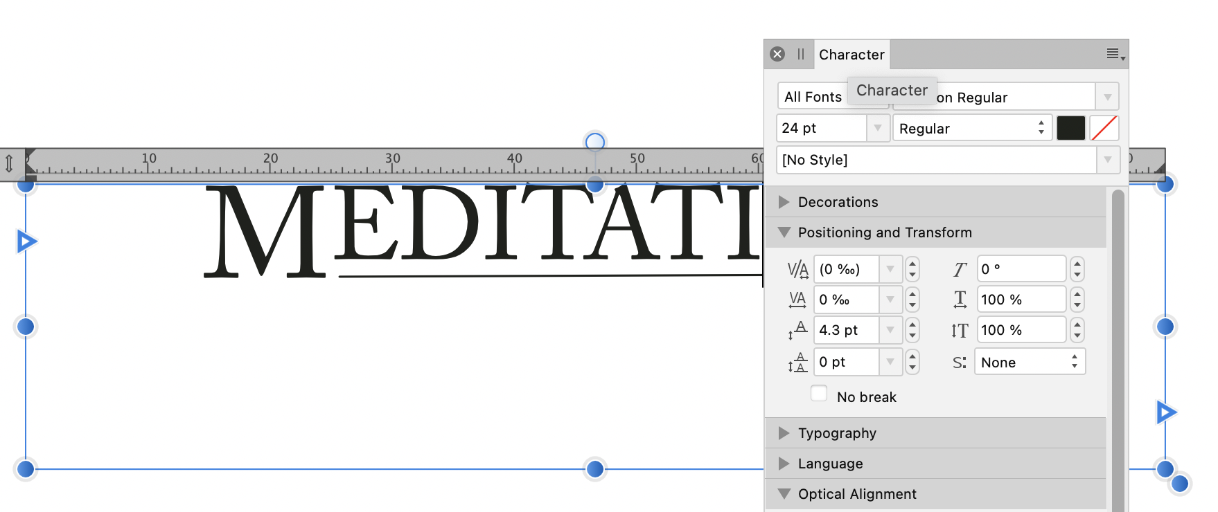
1 hour ago, h_d said:
Here's one way...
The font isn't a perfect match by any means - I've used ACaslon because it's got that classic look, although it's not as distinctive as the font in your photo. Ideally you'd need finer and more tapering serifs to match the weight of the underscore.
The initial 'M' is in 30pt, the remaining letters are in 24pt, given a baseline adjustment of 4.3pt in the Character Panel, Positioning and Transform:
The rule is not a text underline but a line drawn with the Pen tool, set at 0.5pt and positioned to align with the baseline of the initial 'M'.
Depending on the font you might also want to adjust the letter spacing.
Hope it helps,
H
Thanks! Super helpful.
-
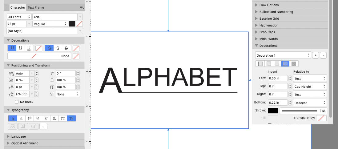
I'm designing a book and basing some of my pages off published books I have in my library.
You can see the "fancy" look I'm going for in the pic below. How do I reproduce this style in Publisher?
It looks like the first letters of the words are larger. The underline for Meditations is not a usual underline, but set a bit lower.Thanks!
-
Currently, page nine has an overflowing text box. I would like it to be linked to page ten and have the text pushed to the top of that page, where there appears to be space. When I do this, though, the text (but not the images) of the subsequent pages seems to disappear. If I instead copy the overflowing text and paste it into onto page 10, the same thing happens. Can anyone explain what's happening here? File attached.
Thanks! -
It would be nice to have an ETA. I have some long-term projects that will require footnotes/endnotes, and I need to decide if I have to acquire other software.
-
6 hours ago, h_d said:
The only real issue I can see is the small square blobs at the beginning of each paragraph, which could easily be removed with a search and replace.
Just to reiterate, this is not from a Word- or Pages-generated .pdf, but from the original .docx, and I really have done minimal layout editing to get it into this state.
I've uploaded the .afpub document as well, but clearly you would need to have Cambria installed for it to open correctly.
I'd normally be the first to say 'strip out the formatting and re-do it from scratch in AFPublisher'. But in this case I'm not so sure.
I just followed you suggested approach.
I agree that it's an improvement, but there's one big problem: there is a significant amount of missing text. For instance, under the bolded "Neutral Spine," header on page one of the original Docx file, you'll read a line that begins "The spine has natural curves in it. The current traditional model shows an S curve..."
When placing the DocX file into publisher, none of this text or what follows appears.
-
Another strange thing I'm noticing is that the text boxes default to a state where they're overflowing outside the bounds of the text box, the margins, and the page.
When I link the overflowing text box to a text box on the next page, it bizarrely makes the text disappear (see linked and unlinked pics below). -
4 hours ago, stokerg said:
I get much better results using a PDF version of the file. I used the Pages app on MacOS to create the attached PDF, which despite me missing the fonts used, import well into Publisher
There are many strange typos inserted in when I load it (see pics). Do you get these?
-
2 hours ago, KevinG said:
As a thought, would saving word docs as PDF then open PDF and copy to your book. I have imported some very complex PDFs into Publisher
I've tried that. I still seem to be having issues, though.
-
1 minute ago, walt.farrell said:
Then it is possible the new font you chose doesn't have those characters. Do they show up in the Glyph Browser for that font?
Yes.
But I just solved the problem. I basically cleared all formatting from the text and then placed it back in. Problem solved in any font.
Thank you.
-
6 minutes ago, walt.farrell said:
Is the font in the original document one you have installed?
Does the font contain the bullet character that you're trying to use?
I don't have the font installed, but I switched the font to something else I do have installed and the boxes still won't go away.
-
When placing text in a text box from a docx file, bullet points don't seem to display properly. There's just an empty box there. If I delete the empty box and hit the bullet point button again, another empty box appears. How can I fix this?
-
I've got numerous Docx files which already have formatting, images, charts, etc in them. I need to turn these into a book. When I file -> place the docx files into publisher, the populated text boxes are very clunky and poorly formated. Stretching the dimensions of the boxes is very slow.
I'm looking for advice on how to do this better. Should I somehow strip out the formatting from these files and then try to place them? Someone import the images in later?
I'm attaching a selection from one of the docx files to give you an idea.
-
-
Is there a way to highlight many cells in a table and set them to all have a specific size/distance between cells?
I understand how you can adjust the size manually by dragging with your mouse, but this is slow and imprecise. -
The above thread documents a bug I was dealing with. Images exported from Publisher appeared distorted. I found a workaround of replacing the .afpub images with .jpgs, which was a giant pain. I hope this bug can be addressed. Thanks.
-
Thanks for your help, guys.
I replaced all the images with.jpgs and that seemed to fix the problem. -
1 hour ago, markw said:
To echo Lagarto, based on the PDF you provided, the problem images seem to be made up of a lot of superfluous Groups, Curves and one Image layer, which is the cause of the darkened area at the top of your Fig 1 image, highlighted blue here in this screenshot. Turning this layer Off fixes the problem of the dark areas.
All you actually need is the image of the group of farmers at the bottom without all the nested stuff above it.
It might be interesting to see how the original .afphoto file is constructed and looks in AP, against how it looks once inside APub before exporting.
If I turn off or remove the curve layer, will this not remove the visual changes the curve layer created?
-
20 hours ago, walt.farrell said:
In the original post, the screenshots for the Fig. 1 and Fig. 3 images show a color distortion; a rectangle in each image is darker than the rest of the image. I think that's the distortion that @AntiqueFlaneur means.
Yes, this is what I meant. The pdfs from publisher seem to export like this.


Publisher won't let me bring these two lines of text together.
in Pre-V2 Archive of Affinity on Desktop Questions (macOS and Windows)
Posted
Publisher won't let me move the two parts of the text at the end of page 30 in the attached .afpub together. When I try to place my cursor at the end "verage" and backspace it up to the a on the previous line, I can't get the cursor into the right spot. Any suggestions?
Weird_Text_Jump.afpub