
AllAppsUser
-
Posts
364 -
Joined
-
Last visited
Everything posted by AllAppsUser
-
Has V2 fixed Affinity's biggest issues?
AllAppsUser replied to Kal's topic in Feedback for the Affinity V2 Suite of Products
As do many-many others. They're pursuing freedom with the same emotion you just expressed, Kal. So of course it expresses itself in the forums as the mirage of a better life seems in danger of slipping away altogether. While I'm in the camp that there's too much emotionally driven stuff happening in the world, I'm not inclined to discount the emotion of frustration in here. It could be the canary in the mine ultimately. The understandable frustration is why these forums are described as a mess, which they are. Only the Stack Overflow model works as a useful resource IMHO. But Serif are a small business despite millions on their accounts, so they've not had the resource. The few who valiantly give their time in any great quantity helping others in these forums are very much to be admired. A bit of give n take, slowness to take offence and a calm response to those who seem a bit off key, often because emotion is near the surface, and usually without intention, goes a long way. -
Has V2 fixed Affinity's biggest issues?
AllAppsUser replied to Kal's topic in Feedback for the Affinity V2 Suite of Products
"Starving" for features in the apps. You've not understood, and that's ok, it's getting late. -
Has V2 fixed Affinity's biggest issues?
AllAppsUser replied to Kal's topic in Feedback for the Affinity V2 Suite of Products
My mistake @François R. I thought it was odd. Thank you both, @walt.farrell too. -
Has V2 fixed Affinity's biggest issues?
AllAppsUser replied to Kal's topic in Feedback for the Affinity V2 Suite of Products
360 posts since the end of 2019? So 180 ish a year. Where do you get 7k from? -
Has V2 fixed Affinity's biggest issues?
AllAppsUser replied to Kal's topic in Feedback for the Affinity V2 Suite of Products
Your device's OS will be the determiner of how long. I can't see Serif will offer updates ad infinitum for previous versions. -
Has V2 fixed Affinity's biggest issues?
AllAppsUser replied to Kal's topic in Feedback for the Affinity V2 Suite of Products
Every single business has 'core' customers who keep them afloat. Who provide 80% of the revenue that pays wages and other bills. It's reality. I hate to break it to you, but you may not be in the 'important customer' bucket with a lot of the firms you're paying. It's not personal. And you've mentioned just one feature you need. Try a dozen. It might be the starving who are pleading a special case here? -
Has V2 fixed Affinity's biggest issues?
AllAppsUser replied to Kal's topic in Feedback for the Affinity V2 Suite of Products
The customer who is most valuable to Serif's, and it's app suite's future, is the one who buys the whole suite, who spends £90, not £30, (actually it's those who'd spend £90 x 6+ for their studio). This isn't about "£30". And they're the one's who will keep buying it when it's £500. Why do they buy the whole suite? Because they use all three apps constantly, every day. <<< That's the defining characteristic of these customers. And yes, there is a distinct pattern to how they use the three apps, so there are 'needs' that are distinct to that pattern of activity. Photographers will possibly never buy Designer, and may never buy Publisher. They'll - probably / likely to / may - only ever spend £30. So here it is - why these particular 'professionals' whinge: I've randomly picked Photo. At the moment, Photo is focussed on the specialist photographer, at the expense of the individual using all three apps every day. Designer is the same. The 'suite' is not a 'suite', other than superficially. There is no incompatibility between specialist photographer and three-app-user, btw. Their needs are not getting met, while photographers and illustrators are. It's not about being special. By the way, I've admired Serif for their stated mission, and it's heart-breaking to see something with so much love and effort poured in to it missing the target they set themselves. --------------- NOTES: 'Professional O_o !' The pattern of activity I've described above is the 'workflow' I'm referring to when I talk about 'professional'. **** Feel free to suggest something else I can use to label those who use all three apps more or less equally, I'll welcome it with both arms. I'll even change my heinous username if I can **** My use of the word professional is NOT a judgement on anyone and I know it's a crude label, but it's the best I've got, unfortunately. @François R, three posts above, has a good definition that I recognise and am referring to. It's a particular process in a context, that doesn't have a label anyone understands instantly, unlike 'photographer', or 'illustrator'. 'Designer' is a label for a plethera of processes - furniture, clothes, bridges, databases, systems, heirarchies, business models, packaging, UI's.... It is not about 'skill' or 'creativity' or 'professional attitude', or 'special status' (I naively thought everyone understood that, and I apologise for offence). The username 'designer' was already taken at the time, and I didn't give it much thought, btw. Marketing gibberish What's the alternative? 'Professionals' should only give time to testing stuff that doesn't make these promises? Importantly, properly testing an app to assess whether it's usable is quite an exercise, requiring no small investment of time - as I said, it's not about £30. -
Has V2 fixed Affinity's biggest issues?
AllAppsUser replied to Kal's topic in Feedback for the Affinity V2 Suite of Products
Exactly my feelings. I'm backtracking on paying for version 2 at the moment. I'm out there conducting a serious review of the alternatives before I do so, and it shouldn't be like that. I'd advise this company to develop a robust process for gathering 'professional workflow' knowledge (Forums are not it), and clarify really diligently who their target market is, or it's never going to reach the heights it set out to at the beginning. It's THE critical thing for their future right now (I've 10+ years experience helping big brands grow bigger, btw). I'd love to know how sales of version 2 are doing, and whether they're on target with expectations. I'll be surprised if they are. They'll be blaming cost-of-living which will be wrong. Here's how wide they are - I use ProCreate on the iPad for the quick n dirty photo work - cut-outs, basic adjustments, simple montages. Five minutes and I'm done. Affinity Photo comes nowhere near. And let's face it, quick n dirty photo work is the bulk of photo activity for design professionals who buy the full suite. -
This colour feature been fixed in Designer 2, iPad?
AllAppsUser replied to AllAppsUser's topic in iPad Questions
Thank you @DM1, for taking the time. It's really disappointing to see that. Interesting to see the app doesn't recognise there are any objects selected - I bet it explains other issues. (I tried to give you a thanks reaction, but it said "no more today". Didn't think I done many. Odd.) -
Has V2 fixed Affinity's biggest issues?
AllAppsUser replied to Kal's topic in Feedback for the Affinity V2 Suite of Products
I really appreciate you both trying to help, I really do, but we're just ending up down a rabbit hole. This is because my post was about how I beleive serif don't 'get' colour (and I'm not the only one highlighting it). My post was NOT about a specific problem I wanted a solution to. The scenario included in my post was an illustration, not a request for help. This is a forum where people come to help, so of course you've valiantly dived-in, trying to help based on next to no useful information. Thank you. ------ For interest - Serif released apps without the highlighting feature being asked about below. They left the omission in the app for 10 updates that I know of, despite people reporting it as a bug, and asking for the feature. Clearly, being able to see the colour you've just applied highlighted was not understood as needing to be high on the 'important' list. -
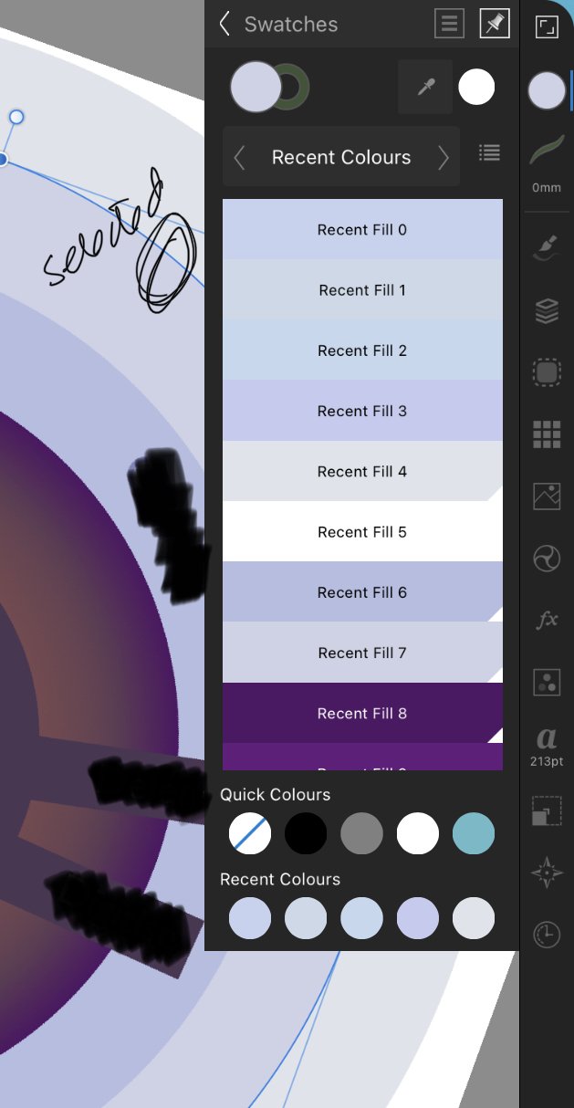
This is Designer for iPad v1.11.12. (I never bothered updating beyond this.) I filled the selected shape by touching Recent Fill 1. And left the object selected. (There are only 9 fills in the list, so you're seeing them all, btw) You'll see, below, the selected colour is NOT highlighted, in any way, in the panel. Not in the recent list at the bottom, and not in the swatch panel above. It's consistent across all the panels, including document swatches. Can anyone tell me if highlighting selected objects colour in panels now happens in Designer for iPad 2? Thank you.

-
Has V2 fixed Affinity's biggest issues?
AllAppsUser replied to Kal's topic in Feedback for the Affinity V2 Suite of Products
Hey @debraspicher. Yes, I beleive you're correct. Have to admit that for 'painterly' (raster-pixel) illustrations I use ProCreate. Even with 'flat' or 'flatish' coloured (vector) illustrations, the recent colour list contributes nothing. It's of limited use case - as-in: only when the colours are distinct enough to be able to discern one from the other, and relate them. I'd love to watch someone who uses the recent colours list a lot for coloured illustration work, to see how they get value out of it, btw. It's perhaps the number and complexity of colours in the artwork that makes the recent colour list useless. It perhaps proves valuable in 'graphic' pieces, though even then I've found - because Serif don't really get colour - you think you're picking a swatch you last used from the recent colour list. You check the colour and find it's not. I'm not sure how many people trust that it is and don't realise it's not the colour they thought they were picking. -
Has V2 fixed Affinity's biggest issues?
AllAppsUser replied to Kal's topic in Feedback for the Affinity V2 Suite of Products
No. If you re-read the scenario the mission is NOT picking the most recent recent colour. It is: Sure I should have then written - "hope it's the last most recent recent colour. Uh-oh, no. What now?" That would have been clearer. I'll edit it so it is clearer. When deciding a colour right at the beginning on the fly, you might go through a few shades of similar colours in quick succession, applying them to various objects to see the overall effect. That's before deciding which one to turn into a swatch. You then end up with several very slightly differing shades of the same colour. I'd challenge you to know which was which. The recent colour thing can work for a series of distinct colours, though even then there are draw-backs. For something more nuanced with several shades of a colour, it's hopeless. You don't state anywhere what kind of work you do and whether you create illustrations, or you're more graphics. So I don't know if the workflow I'm describing is familiar to you or 'another planet'. Though.... Meant good naturedly. If you can't take it with a smile, don't dish it out. -
Has V2 fixed Affinity's biggest issues?
AllAppsUser replied to Kal's topic in Feedback for the Affinity V2 Suite of Products
To be fair, I think there's an ocean of stuff they don't understand. I suspect the budget for paying truly professional level desigers to spend time giving them indepth feedback at their Nottingham office - if it's not moved and with all the complexities involved in our brave new hybrid working world - has always been, and is, too small. They also over relied on their history in PC apps, even claiming at one point that the microsoft ribbon was a great UI device - they so nearly went there. So their knowledge acquisition activity has been flawed. They're probably in firefighting mode right now and for the foreseeable too, so learning mode is a long-long way off, tbh. Nothing damages app sales like crashes which a lot of people seem to be experiencing. -
Has V2 fixed Affinity's biggest issues?
AllAppsUser replied to Kal's topic in Feedback for the Affinity V2 Suite of Products
While I was nodding along to the UI frustrations, the big thing I see Serif seem incapable of grasping is colour, which manifests most obviously in the management of swatches. During the apps early development - as soon as they added the utterly useless 'recent' colour feature, I knew they had no clue how important colour is to designers... Scenario that plays out again and again if you attempt to use it is: "ok, which of the last five shades of red sitting in the recent colour thingy is the red I actually used on that object? Errr, last one in the recent series, as in most recent? Hope it's the most recent recent colour. Uh-ho, no. What now, there's 4 really similar shades of red!!!" Yeah, there's lots of other things to do to overcome it, but that lives in to my point that there is little point to the recent colour thing. The colour features in the affinity apps always give the impression that, like so many in this world, they see colour as just a pretty, random, inconsequential thing designers and illustrators haphazardly muck about with, and they can't compute anything beyond that. When actually, colour is one of the most disciplined and important areas of designing anything. It does not surprise me that you report @kal that version 2 appears to demonstrate minimal improvement in their understanding. -
Has V2 fixed Affinity's biggest issues?
AllAppsUser replied to Kal's topic in Feedback for the Affinity V2 Suite of Products
Ah, the FreeHand thread, still going strong all these years later - says someting. I learned Illustrator first - then discovered the printer rip at work had all sorts of problems with illustrator files. So with much reluctance I set about learning FreeHand. I was gutted when Macromedia sold out to Adobe and FreeHand was binned. FreeHand is still an all-time best vector app, despite me becoming fond of Illustrator. The handles on vectors in Designer are pretty good it has to be said* - always an utter bane in Illustrator, and perfect in FreeHand. They were the one big thing to get right in a vector app. *I've not looked at Designer version 2 to see if Affinity have managed to trash the good bits, of course. -
@chessboard's is the pragmatic way to tackle it - assuming you can open and use the version 2 apps at all. You may find the files are changed on opening, and you might have to recreate some things such as artboard arrangements that I don't think are part of the svg spec for example. It may be the least painful path on balance though. Until an app has reached version 4, I would suggest always backing up your files, before opening any in the newer version. I know, hindsight is a wonderful thing. I learned the lesson the hard way myself many-many years ago, while technology was still a bit of a 'wild west'. It happens a lot less now, than it did in those days - though that's no consolation to you. It's painful, and I'm sorry you didn't know. Keep going, these things happen.
-
Not silly at all. It was my first thought when considering risking money and a tonne of artwork going for version 2. While apps are at such an early development (v1-2), upgrading is a deeply risky act. An app at version 4 has settled down in the fundamental structural ways, and is what it is. Earlier than this, and there can be big consequential structural changes. In my view, if the direction the apps have taken in v2 is still plagued by some big holes in Serif's grasp of professional workflows and concepts, then I go elsewhere. My decision is that I'm willing to back serif on a v1 to v2 leap, with high hopes the huge potential is being realised. BUT ONLY IF the risk of being without any access to the v1 files I've built up is zero. Thanks to @walt.farrell and @R C-Rthe risk has been clarified as zero, so I'm happy to support Serif one more time.
-
Span/Split columns
AllAppsUser replied to Eink's topic in Feedback for Affinity Publisher V1 on Desktop
THIS principle of being able to construct single objects rather than ending up with multiple objects applies more often than many-many grasp. It's what I refer to as 'efficient files' and it's the mainstay of design studio workflows (as illustrated perfectly above by @Eink). It will keep them locked-in to Adobe. -
Span/Split columns
AllAppsUser replied to Eink's topic in Feedback for Affinity Publisher V1 on Desktop
Text flow and Reflow.... See my signature... this is one of the many many things design studios need, need, need, and Serif don't have sight of. -
Well, I apologise for taking the time to respond to you. 10 mins responding to you or weeks drawing up evidence of what doesn't work. You've let yourself down somewhat with that comment.
-
There's a long list. I was contemplating the exercise this morning. 1) I don't have the time to invest in it and 2) I cannot see it'd be taken the slightest notice of. You're wondering because you're at feature level, and I'm speaking of philosophy level. The decisions being made as to what to develop, how to develop it, and what not to develop are shaped by a philosophy and clear sight of a target market. Both were stated by Serif when these apps were launched. Serif was very specific... and it's now untrue, or has changed. They didn't understand the target market (though I think they thought they did) is why. ------------------------------------ The dialogue screenshot is from the web. I wanted an InDesign shot that was more up to date than the InDesign version I have, that's all. It's only there to evidence what I was referring to.
-
Just fallen foul of this one.... There is no visual clue on screen that pasteboard visibility does not exist much above or below the page. (In other apps, there's a discrete rule/line.) This is admittedly only really a gotcha when: There's only one page in the file It's a zoomed out view of either the first or last page in the file Don't panic It's easy to casually lose something as a result of moving it up or down while 'in the moment'. Your object has not 'gone'. Select > select all or speculatively drag selecting still selects the object, allowing you to recover it. I'm not sure why it's not visible when the app clearly still has it plotted. I assume there's some programmatic mountain to climb to 'switch on' visibility in these areas. A simple line on the display would suffice as a visual reminder releasing brain space needed to remember this. My brain space is far from infinite.
-
When is it a 'habit' and when is it not, but a good well established (because it works) way of working that's not supported. I go back further than the beginnings of ID, unless you do mean PageMaker, so I'm fully aware of how applications progress. My beef happens when companies claim to be doing something that they aren't, which I think is the case here. TBH, I think the truth is that they've got themselves into a programmatic hole, or several holes, as I see it. Having made some flawed fundamental decisions early, it now means they've got huge challenges delivering what they promise. I predict that Affinity 2 will have some major rewrites in it, so it'll be a long time coming. Time will tell. There's a real danger of teaching folks bad habits through badly designed app features btw. Just like the abomination that is word has... and many will cry that it's great. And there are increasing numbers of alternatives out there, and while I love these apps, I'm not wedded. I swopped from Illustrator to Freehand and back again btw, so I like to think I'm adaptable. Something I discovered shortly after it was launched is an app called Procreate that I use incessently for what it's meant for (and it really does set the bar incredibly high). It's a dedicated highly focussed sketching/painting app, but It's actually a contender for replacing photoshop/photo for the less techie aspects of montaging and manipulating photos super quickly or ultra sensitively. Now how about that for an openness to workarounds!
-
That's an interesting way to tackle it. Unfortunately I need to be able to move the text boxes up or down, so they won't be a neat row, but staggered in some way to fit with other elements. I may have to play with the angle of the gradient. I've currently got 18 text frames - not all of them will be in the same gradient. There may be several gradients over varying numbers of text frames. And after the client looks at it, they all might change. I don't have a one object rule as such, I just like to keep complexity down. It makes editing when you've forgotten all about it easier, and for others too. But good idea. Thank you. Good one to know for when it'd fit.