angier
-
Posts
65 -
Joined
-
Last visited
Everything posted by angier
-
Loukash, thank you for your confession about your past font life. You're so right, discovering new fonts you think might work in a project never stops. I so wish Affinity would add a font organizer to their line of programs. They are putting so much work into Af. Publisher, having a complimentary font organizer would make the software even more desirable to a lot of people and companies.
-
Sulaiman, I don't have an ipad. I'm doing my best to keep my new computer clean. I uninstall fonts often so I don't have slow software loading issues. Still working on a new organization system for all my fonts.
-
I haven't tried Font Book yet. Thanks for sharing. I'll try it this weekend.
-
Mulder, my eyes aren't what they used to be and I get motion sickness when I have to scroll too much to find something. That's one of the reasons why I want more organizational tools. I want to get to where I'm going without having to scroll up and down a long list.
-
I made a simple example graphic of my software enhancement request. Check it out y'all. Affinity has really put a lot of work into the Publisher program. Don't you think adding some more typography organization features would be helpful? I hope something like this would be easy to add. I can't imagine the amount of work the software engineers have to deal with.

-
2ddpainter - Netflix started the video with Paula Scher saying, "Typography is my crack." Oh my, that was such a funny and awesome thing to say! Just started watching the video. Thanks!
-
I love you dcr!
-
Kenmcd, Thank you. I've worked with MainType but it felt messy. I'll download Proxima today. The program looks like it's going to be perfect to work with. And y'all I promise I'm not crazy!
-
Therapy? Yes! I agree. Here's the thing... A brand is your face to the world. Fonts carry a message. They speak to a lot of who you are as a company or as a person. The reason I organize fonts first by the author is because some authors have their own style and design quality. I look for designers who know how to build beautiful fonts with technical excellence. I can't tell you how many times I've loved a font but I've had to go in and fix it because of technical difficulties. And, if an author's style fits the brand or project I'm working on, I will go back to that author to look for similar fonts that will visually work with the brand. As a freelance designer, I've worked with all kinds of companies. Medical and aesthetic packaging to youth and children's ministry. I'm always looking for the right fit for things. There are days I'm in the mood to search the web and days I'm not. To tell you the truth, the library of fonts I've gathered over the years has helped me tremendously. My library has saved me countless hours from having to search the World Wide Web for the right font fit when a project is due. Just so you know, my font library is not stored on my main drive. I just purchased a new computer and I think that purchase has inspired me to take my organizational skills to another professional level. Creatively fonts have become so convoluted you can't tell what category you should place certain fonts in. Therefore, I've done a lot of research and have had to figure things out for myself, hence the "over the top" font category list! In other programs such as Ink Scape, you can link fonts to the software instead of having to install more fonts to your main hard drive. As you probably know, some Affinity projects can get quite heavy. Linking fonts and adding customizable organization folders to the character window will help keep the document size light and save us from having to scroll through fonts that can only be sorted by name. With all that being said, the title of this post, "Confessions of a Font Hoarder" was to get Affinity's attention. Yes, I was being dramatic but for a good reason! Mulder, thank you for your response to my post. You're the only one who responded to my theatrical attempt to gain interest in my software enhancement request. Your concern for my well-being is much appreciated. I'm hardly ever on this forum unless I need something but I hope our paths will cross again. Good luck with everything you create. Angela
-
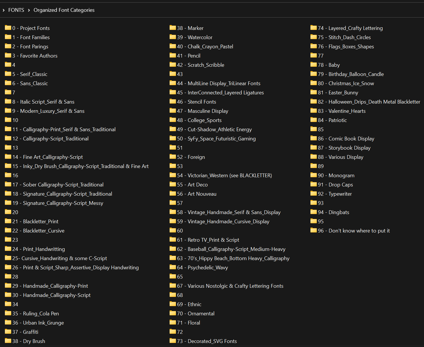
To be completely honest, I am a font hoarder but I AM DETERMINED to purge and organize my "font" life. I know I am not the only person in this world with this problem, so I'm asking for help for all of us who have too many fonts on our computers. Now, just so you know, I download fonts and keep them organized in folders titled by the Author's name. Now, I'm organizing those fonts into folders with appropriately named font type categories. (PLEASE SEE THE ATTACHMENT - it is a work in progress.) In some of the folders that you see on the screen capture, I have created sub-folders, for example: Serif_Classic a - Font Family b - Single Weight c - Multiple Weights d - Extended e - Contemporary_Modern f - Slab_Square g - Soft Round & Partial Round Terminals h - Condensed_Bold_Heavy_Black i - Unique To achieve my font organizing goals I am using FontBase. In FontBase I organize my fonts by: 1. Adding an author's folder. 2. Placing fonts from the author's folder into an appropriately named collection folder. 3. I then zip up the collection folder and export it to my document's folder. Here is my ask... The font "Favorites" folder has been very helpful but for a "font hoarder" it's not enough. One of my favorite features in Affinity is organizing graphics into ASSET folders. Would there be any way to add "LINKED FONT FOLDERS" to the Affinity ecosystem? I can organize my "font" life all day long but I turn into a mess again when I can't keep my fonts truly organized by "categories & collections" in the software. Oh my. I can't believe I have made this confession on a public forum. If you are a font hoarder, please commit below so I don't feel ashamed and alone here. Thank you for your support and understanding. Angela
-
Benfischer, Thanks for the response. Wish the bug wasn't there on the start and stop margins. oh well. We need a "start curve node here" button. I used to work in C4D. They had one so I know it's possible to add it.
-
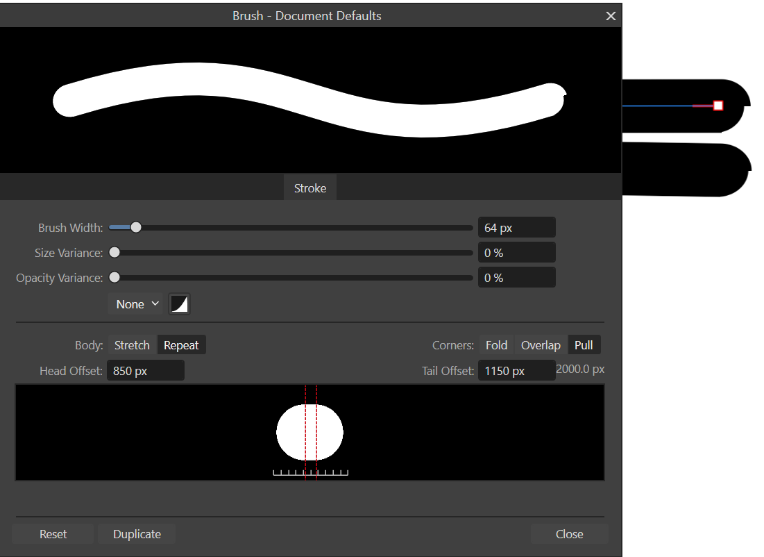
Hey y'all Does anyone else get this effect on plain rounded edge brushes in Designer? This brush ending problem is in both Designer 2 and Beta. See the attachments. The offset is set at 850 and 1150. Maybe it's just me??? Also, has anyone figured out what the perfect margins and alpha size is for AD? I have blurring problems with some of my brushes so I tend to make my alphas pretty big. Any suggestions?
-
DAN C. IT WORKED! THANK YOU! THANK YOU! THANK YOU!!!
-
Walt, you're always so good to reply. I installed a new EXE from the website onto the new hard drive. I probably shouldn't have done that before I asked someone what to do.
-
OK... This last Windows update went wrong on my computer and because I couldn't remember my password to reverse the update Windows locked me out. The only work around was to install a new hard drive and purchase a new Windows key. I kept the old hard drive but I can't get back my Affinity brushes. All that work is down the drain unless someone can tell me how to magically reinstall my brushes from my old Affinity user files. Ya know... something told me to export my brushes before that last update and I didn't do it. Thanks y'all for the help! Angela
-
Brush Rotation
angier replied to angier's topic in [ARCHIVE] 2.4, 2.3, 2.2 & 2.1 Other New Bugs and Issues in the Betas
EmT. Sorry for the late reply. I've working away from home. I'll do my best to make one for you next week. So sorry. -
Hi Sean. Thanks for asking me for more information. I have attached 1 - 2 Stack Black over White Brush. So... - Set your background color to black. - Set your brush color to black. - Stamp the Brush then make 3 test strokes with the sub-brush position set "at current nozzle", "behind current nozzle" and "at the end of stroke". Should we be able to see a white halo when the 2 alphas are the same size? I've really been pushing the limits of brush creation in Affinity. The halo effect seems to be kind-of "blowing out" the layer I have under a sub-brush that has been set at 100% luminosity. 1 - 2 Stack Brush Black over White.afbrushes
-
Create a 4 stack brush with round sizes large to small. 1. Test Stroke Parameters - Match each brush layer to a different PANTONE color. (See the attachment) On each brush layer: - Turn the Curve values all the way up for Hue, Saturation and Luminosity by moving the left bottom dot to the top of the box. - Change the Curve control to Pressure. - Import the "Hue Percentage Value with corresponding Number Value" Color Chart into your Assets panel. - Choose a PANTONE color. See the PANTONE HSL values in the Wheel or Slider panels. Change the brush control sliders to match. - Use the Color Chart for getting the Hue % value as close as you can to the PANTONE swatch. - Turn the overall brush color to black. Make a stroke. - If it's possible, please change the Hue Value slider to a Number value to make color matching easier. (See Recolor in Adjustments) 2. Test Stroke Parameters - Press the Force Pressure button and notice it only effects the foundation brush. 3. Test Stroke Parameters - Turn off Force Pressure. - Change each Sub-Brush position to "Behind the Current Nozzle". - Individually change the Size Jitter Pressure Curve of each brush. Make a stroke and take note of what happens. 4. Test Stroke Parameters - Do not change the Pressure Curves. - Change each Sub-Brush position to "At end of Stroke". Make a stroke and take note of what happens. 5. Test Stroke Parameters - Turn off the Pressure Curve of each brush. - Make the first Sub-Brush larger than the foundation brush and turn off Accumulation. Make a stroke and take note. THIS IS GOOD! - Close the Sub-Brush. Look at the main Sub-Brush panel and take note. The Sub-Brush is usable but the picture of the alpha is blank. - Can you make a place for naming the Sub-Brush Layers or show the Alpha names in this panel? 6. Test Stroke Parameters - Return the first Sub-Brush to its original size. - Make the size of the last Sub-Brush larger than the Foundation Brush. Turn off Accumulation. Make a stroke and take note. - Is there any way possible to make a Sub-Brush only effect the Sub-Brush of your choosing so it doesn't effect every layer? 7. Test Stroke Parameters - Return the last Sub-Brush to its original size. - Turn off Accumulation and Flow of the 2nd Sub-Brush. Make a stroke and take note of what happens. 8. Test Stroke Parameters - Turn on Accumulation and Flow of the 2nd Sub-Brush. - Turn off Flow in the Foundation Brush. See the new black box. Not good. - We should be able to turn off Accumulation and Flow in any brush layer including the Foundation Brush. Thanks for paying attention to all this stuff. I know y'all have a lot on your plate to deal with. Angela Color Range Chart - AR - 02232023.zip
-
Luminosity is causing a slight halo glow effect outside the boundaries of the alpha in the brushes panel which is causing some brush creation problems for me. Is there any other way to make a sub-brush color white without using luminosity when your base color is black? To see what I am talking about... Fill the background with black. Set the brush color to black. Create a round brush. Turn the Luminosity control to 100% so the brush color is white. Add a round sub-brush. Do not change the color. Test the brush at the set hardness of 80% and 100%. Thank y'all for paying attention to all my posts about brushes.
-
We need color control for the symmetry lines. Is there to add a "lock the brush stroke to a guide line" feature?
-
can't see symmetry lines
angier replied to angier's topic in Affinity on Desktop Questions (macOS and Windows)
Thanks! -
Can anyone tell me how to change the symmetry line color? The color controls are probably right in front of me but I can't see it. Thanks for the help y'all.
-
Only the foundation brush can be fully rotated with the arrow keys. Individual sub-brushes have to be rotated separately. Funny thing - I stacked two triangles and rotated the sub-brush 25%. When I pressed the arrow key it rotated the sub-brush just enough to place the alpha into it's original rotation position of 25% and no further.
-
Need Alpha Direction Stabalized
angier replied to angier's topic in Affinity on Desktop Questions (macOS and Windows)
NathanC, No apologies necessary. It will get worked out. Thanks for noticing my post. -
1. In the brush panel Hue control is based on percentage; therefore, color accuracy cannot always be achieved. The brush panel Hue control needs to operate like the Recolor "per-number" slider in the Adjustment options. 2. The alpha direction is consistent in Rope Mode but it is not consistent in Window Mode; therefore, in order to get a clean start to the brush stroke we have to use a round alpha. 3. The Distance Size Jitter is not consistent in Rope Mode. In Windows Mode the Distance brush length is about 94% consistent with mouse and pen control. 4. Please make the alpha direction and stroke length stable when using the Distance Size Jitter option in both Rope and Window mode . 5. Please lower the alpha Spacing Value in the brush panel so tighter curves can be achieved without looking messy when using alpha shapes that aren't round. 6. I have a ton of alphas in folders all over my computer system. Please reveal the name of the alpha brush nozzle so we can quickly locate the alpha for other brushes. 7. We REALLY NEED HANDLES and MORE LINES ON THE GRID when creating precise Curve values in the brush panel; as well as, a copy paste option to make accurate replication of a curve value easier and less time-consuming. 8. I really, really wish we could copy and paste sub-brushes so we don't have to recreate the values over and over. 9. Is there any way to duplicate a brush directly under the brush you are working with; as well as, automatically duplicating the name of the brush with a version number? Dragging an unnamed changed brush up and over 30 other brushes every time you make a change is a little bit of a pain. sorry. 10. PLEASE turn Wet Edges and Custom Curves on for Sub-Brush creation. Love y'all. Thank you so, so much for inviting us to the beta program!!!