World View
-
Posts
187 -
Joined
-
Last visited
Everything posted by World View
-

Export to PDF does not work - stamp sized pdfs created
World View replied to World View's topic in V1 Bugs found on macOS
I realized that with Photoshop and Bridge, thanks. What I am focused at now is how pdfs open up in Adobe Pdf viewer and Preview. Photoshop generated ones open full screen - a 1200x1600 pixel document opens about 24 x 17 inches large on the screen. Affinity publisher opens a 1200 x 1500 pixel document 4x5 inches wide (correct for 300dpi setting) No one I work with accepts such tiny screen views. Because someone kicked such a moodboard back to me as too small I started investigating this think. I would need the setting in publisher where pdfs are not restrained to their original size at 300dpi but open large like the Photoshop pdfs. -
Export to PDF does not work - stamp sized pdfs created
World View replied to World View's topic in V1 Bugs found on macOS
But it shows as 360x280 pixels on Bridge. The other pdfs fill the screen at 100%. How can I do that with Affinity Publisher? -
Export to PDF does not work - stamp sized pdfs created
World View replied to World View's topic in V1 Bugs found on macOS
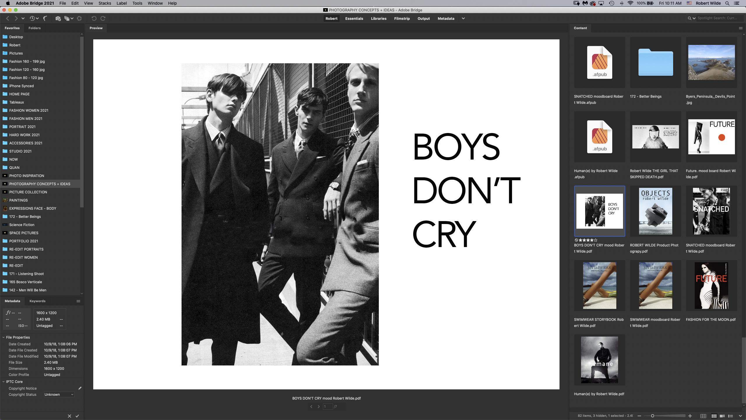
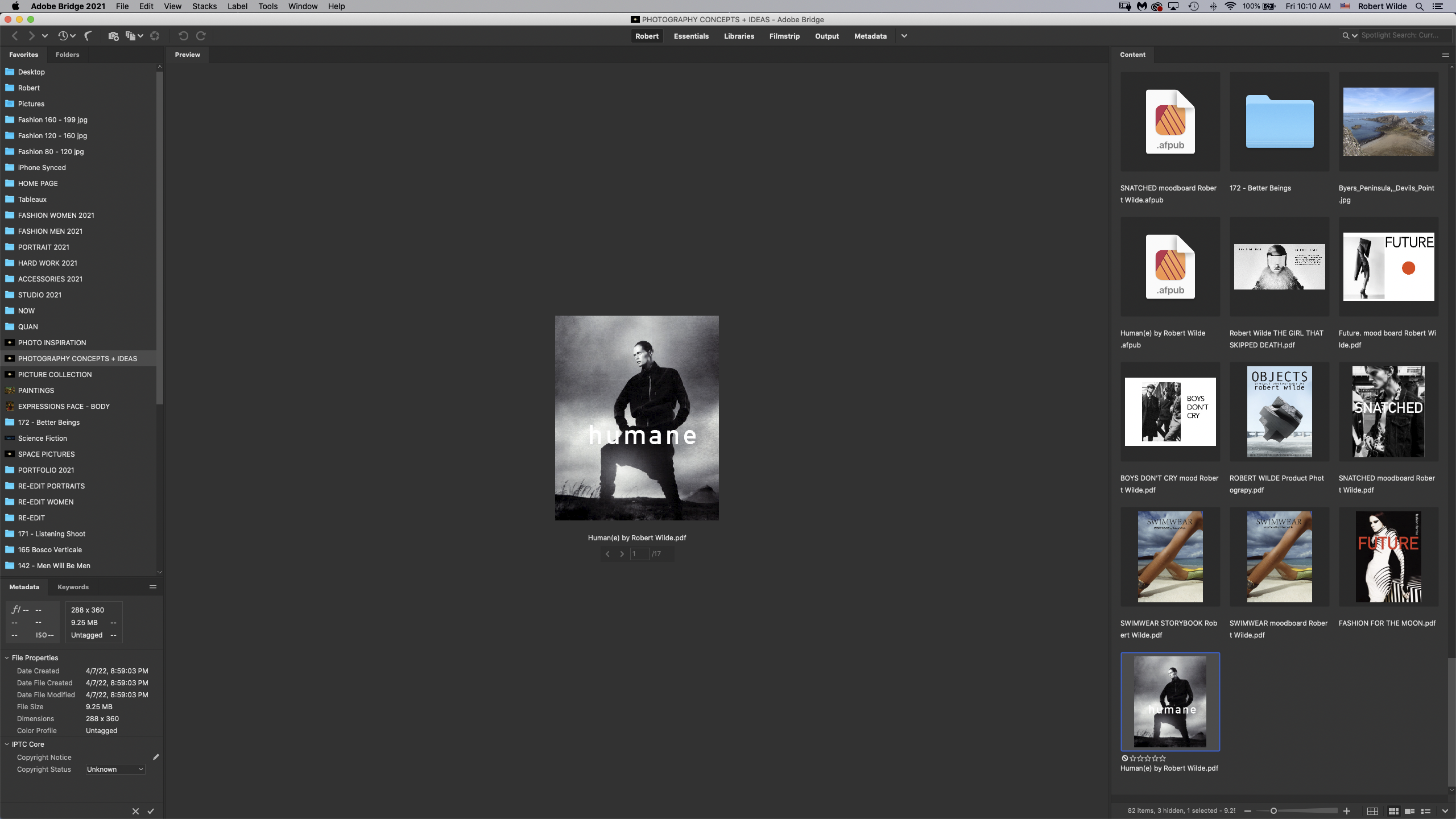
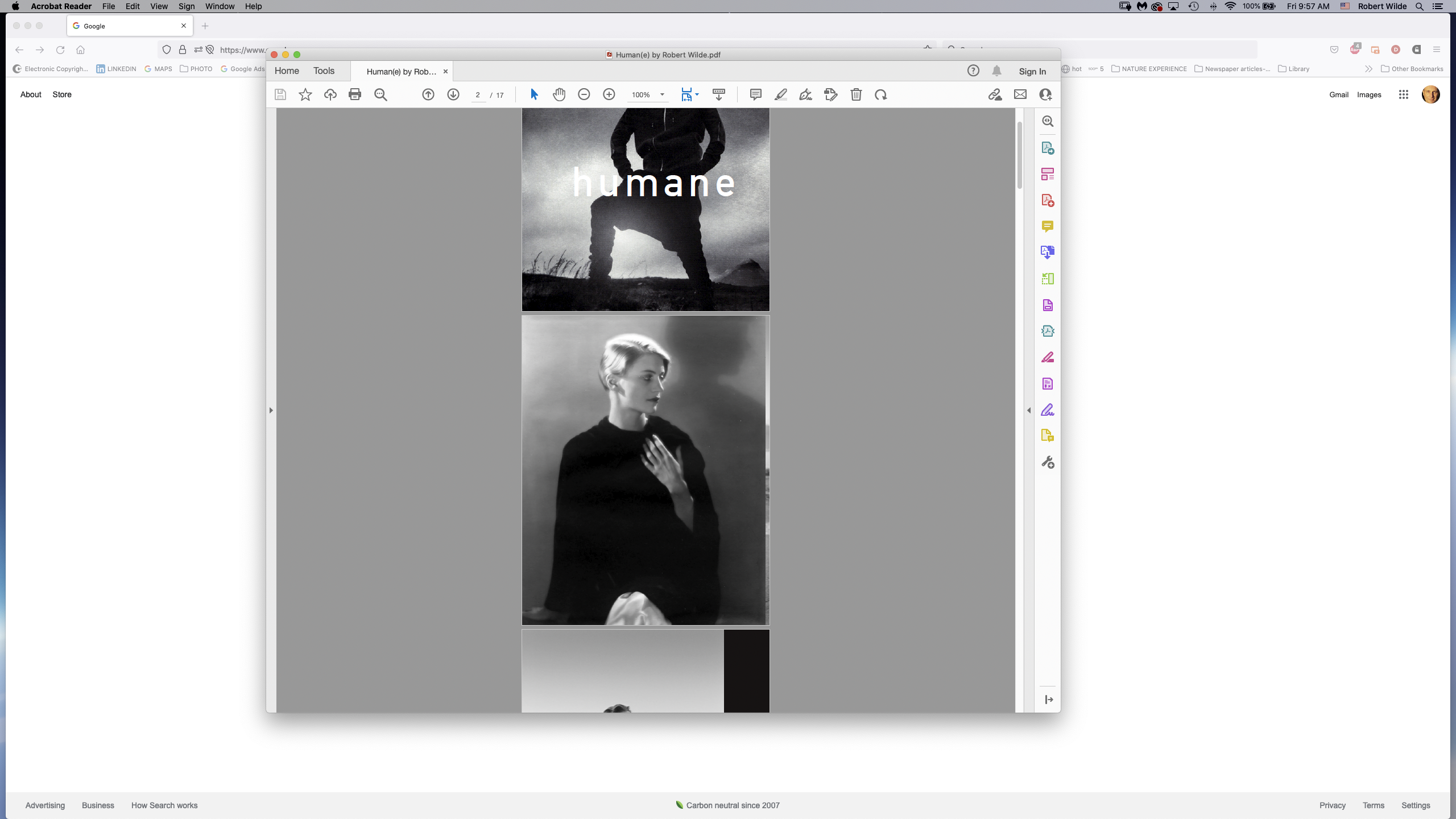
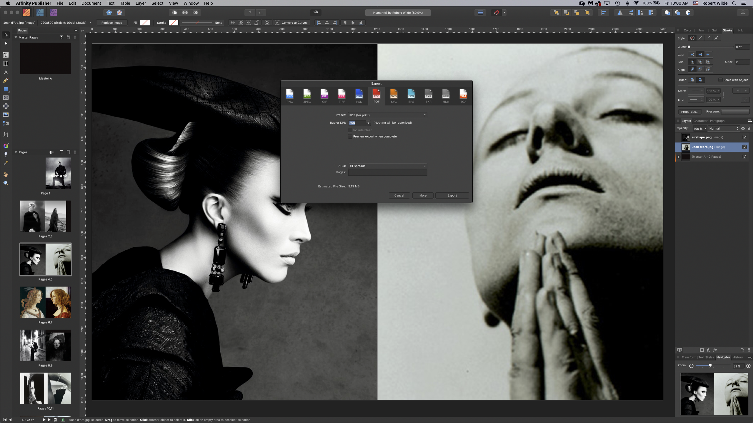
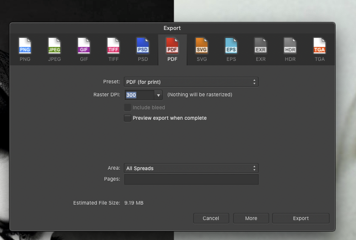
Thanks, Walt. I am attaching the exported pdf. I am also attaching the screenshot of this pdf in Adobe Bridge, 10 mb size, and you see how small it is. While the document says 5x4 inches, Bridge only sees 360x280 pixels. By comparison, a Photoshop created pdf with the same page counts and similar page dimension is full large and weighs only 2.5mb Human(e) by Robert Wilde.pdf
-
Export to PDF does not work - stamp sized pdfs created
World View replied to World View's topic in V1 Bugs found on macOS
Thanks, Garry. Yes, the document options say 5x4 inches but when you put the document on 100% it is tiny. I have attached the "more" options and and the full screen screenshot of the pdf on a 27" monitor. For comparison I have opened a Photoshop created pdf at 100% (similar pixel dimensions) and it fills the screen. but the dimensions in the adobe pdf viewer are something like 23 inches by 17 inches and also 300 dpi. I have done these mood boards for years, always approximately these pixel dimensions and at 300dpi and never got a super tiny pdf.
-
Export to PDF does not work - stamp sized pdfs created
World View replied to World View's topic in V1 Bugs found on macOS
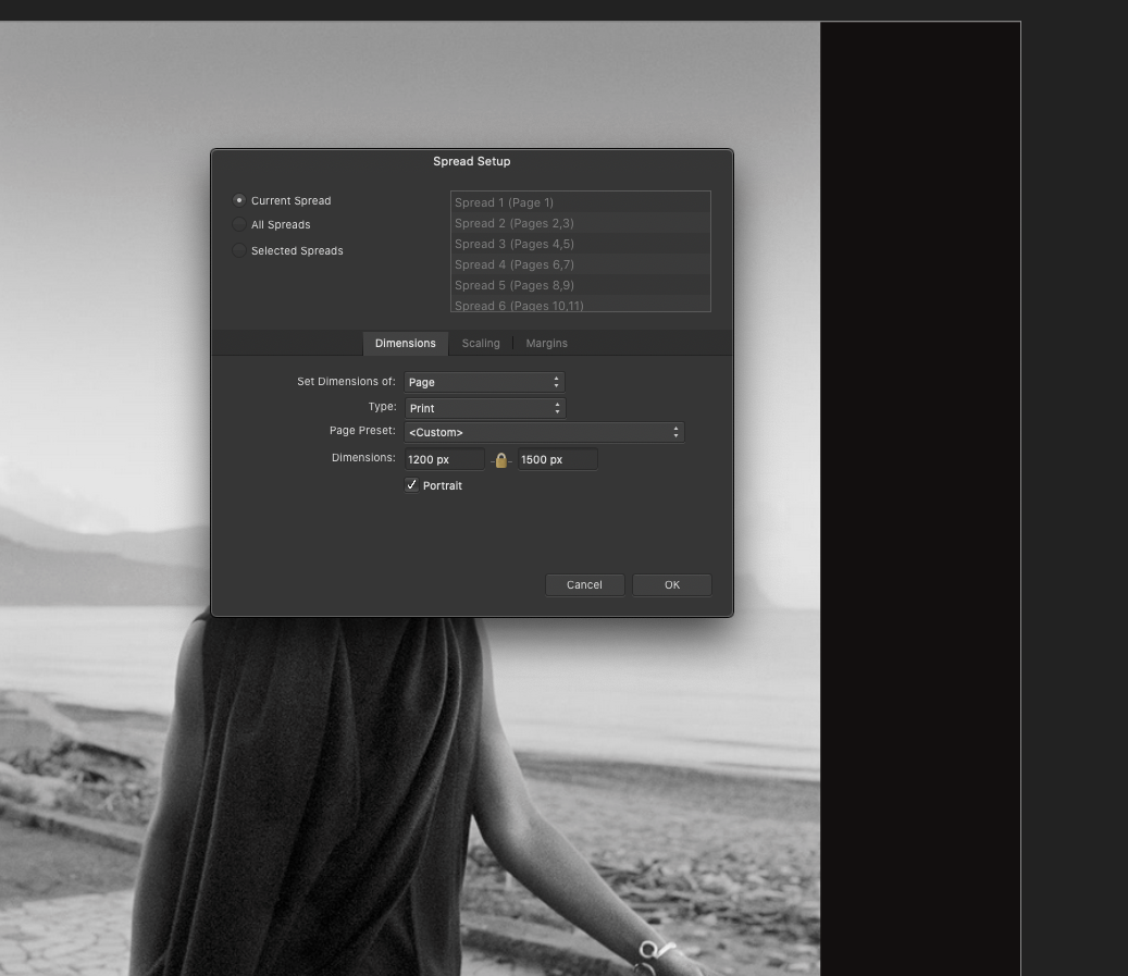
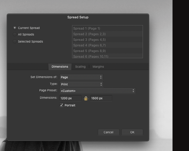
Thanks, EmT. I have the spread set-up set to pixels. Please see the attached screenshot.
-
Export to PDF does not work - stamp sized pdfs created
World View replied to World View's topic in V1 Bugs found on macOS
No, I used a 1500 x 1200 pixel document. It creates a gigantic size pdf of 10 MB and 360x288 pixels. ALL my documents get shrunk into this ridiculous size. Can't export anything out of affinity any more. -
Export to PDF does not work - stamp sized pdfs created
World View replied to World View's topic in V1 Bugs found on macOS
Another problem. A full size pdf in Photoshop has 2.5 MB. The tiny stamp useless pdf from Affinity has 10 mb. What the heck is going on with this software! -
Export to PDF does not work - stamp sized pdfs created
World View replied to World View's topic in V1 Bugs found on macOS
Actually, I tried to export other projects and ALL OF THEM get shrunk to this unusable stamp size. I cannot export a single one of my projects. Why does this not work? -
Export to PDF does not work - stamp sized pdfs created
World View replied to World View's topic in V1 Bugs found on macOS
(deleted, quote of another post did not work) -
Export to PDF does not work - stamp sized pdfs created
World View replied to World View's topic in V1 Bugs found on macOS
Yes, but it makes no difference. Exporting "all pages" leads to the same unusable stamp-sized 1,2 x 0,9 inch 360x288 pixels export. The export window has no controls at all and its settings leads to a whole list of features I do not need. But the export size, the key important export feature is not available. I cannot get any project out of Affinity. I already missed a deadline because the software has this bug. -
Export to PDF does not work - stamp sized pdfs created
World View replied to World View's topic in V1 Bugs found on macOS
It says 8x5 inches, 1 MB (Adobe Bridge says the size is over 9 MB) -
Export to PDF does not work - stamp sized pdfs created
World View replied to World View's topic in V1 Bugs found on macOS
Thanks, Walt. In both Preview and the adobe pdf viewer it shows at stamp size, the same for the preview in Bridge. -
Export to PDF does not work - stamp sized pdfs created
World View replied to World View's topic in V1 Bugs found on macOS
Yes, Walt, I am uploading the file below. It is a mood board I should have submitted yesterday but I can't submit it in this tiny format. I have two more such mood boards that also export in stamp size. I was able in the past to output the pdf at the same size as the document was. Strange behavior: the pdf first opens up larger and then snaps to the smaller format. Human(e) by Robert Wilde.afpub -
Export to PDF does not work - stamp sized pdfs created
World View replied to World View's topic in V1 Bugs found on macOS
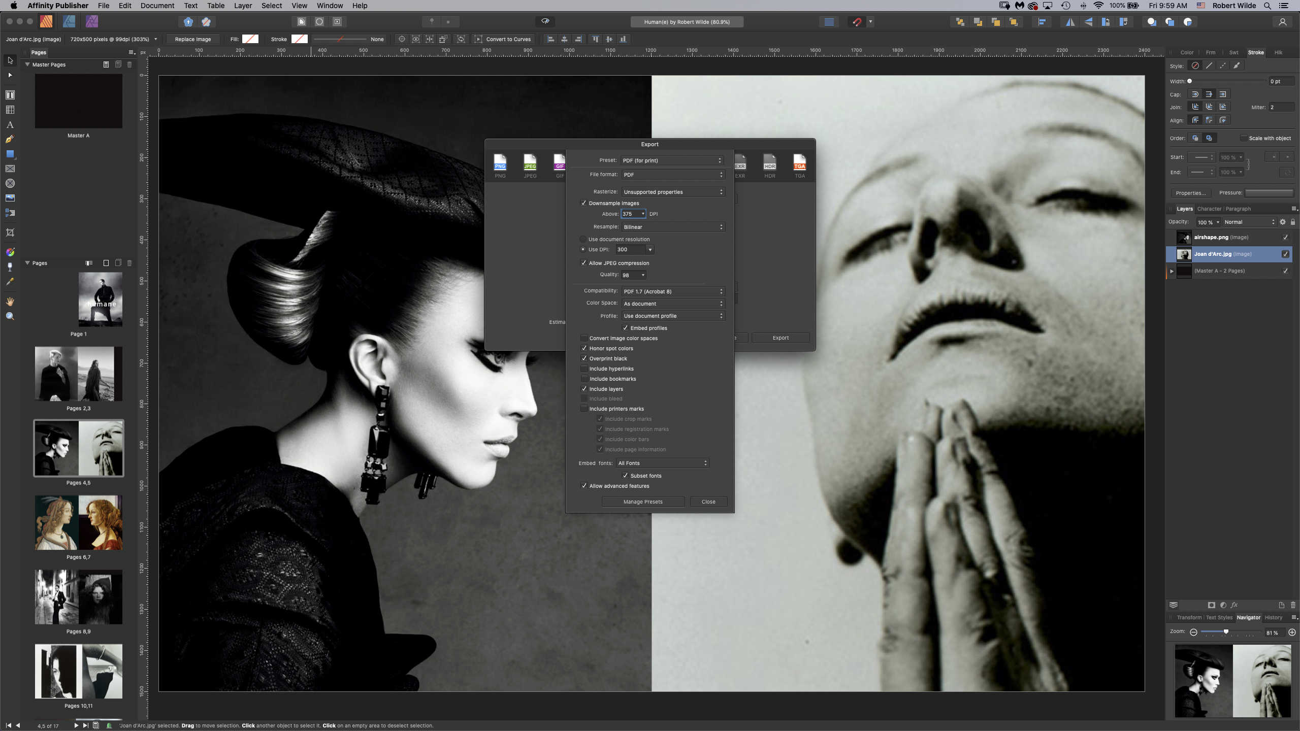
I am attaching the export interface and the spread set-up where you see that the spread is formatted to 1500 x 1200 pixels at 300 dpi The strange thing is also that the exported stamp-sized pdf has the size the 1200 x 1500 pixels document should have.
-
I can no longe export any project. Every document I try to export has a large file size but is only stamp sized. E.g. Original dimensions of 1500 x 1200 px downsized to 280 x 320 approx. Why does it do that? I didn't tell it do that. Cannot export any project to pdf any more. Always stamp sized. Totally stuck in all my work. Cannot find any way to get the app to behave properly. What is this bug?
-
Thanks, firstdefence Worked! I tried the stroke panel myself but I just saw one has to be careful to be sure the frame is selected.
-
deleted as I got a reply, thanks.
-
I would like to create a rectangle with a light gray. But when I use the rectangle tool it creates a frame around it, a black line. How do I get rid of that? The stroke panel doesn't do it, the rectangle tool has basically no controls?
-
Thank you, GarryP for this beautiful video - very instructive! Thank you Walk! I had for the short term done it with guides and snapped rectangles to the guides and then applied masks, but the method with picture frames is nicer and quicker.
-
I have done it the blunt way by creating guides. I just wonder if there is a way to do: 1. Select square selection 2. put in 640x640 pixels 3. Copy selection and move it over several times and let them snap to one another This would feel more elegant.
-
I am creating a website mockup file. For this I have to do the following - is this possible in Publisher? 1. Create 8 tiles 640 x 640 pixels 2. Fill each tile with a photo and be able to adjust the photo. I tried with Frames, but they cannot be adjusted to precise pixel dimensions. I was also not able to adjust the photograph inside once the photo was there it was frozen. Is there a way to do the two steps above? If yes, how? Thanks!
-
I like Varela - but isn't it a bit cinemascope. It would be interesting to see a font that is a bit slimmer, higher than wide in this same minimalistic design. I'm also looking into Bauhaus design typefaces. I just try to avoid overly "styled" fonts. For reading text, e.g. essays, longer texts like stories and novels, I prefer well balanced serif fonts. By the way, what are your favorite serif fonts? I'm using Georgia a lot, and Garamont, not sure why I don't use Times New Roman at all... an emotional thing?... can't remember getting a blackmail notice set in Times New Roman... which would explain it.
-
Hind Bold it is. And its lighter variants for the description. Rounded stuff in fonts gives me the Comic Sans Rash.
-
We have two candidates: Varela rounded and Hind Bold for the "ALEX" There are so many Google fonts that are very similar to one another. So could it be that "Varela Rounded" and "Hind Bold" are the pretty much the same?
-
Thank you Alfred. Yes, it's from the Alex Perry's site. Did you find it via the "Alex" dress google search?