Search the Community
Showing results for tags 'iphotos'.
Found 1 result
-
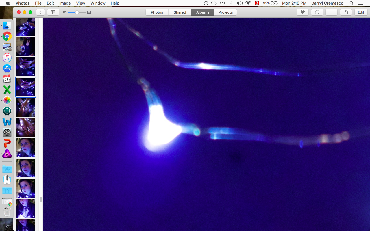
 Hey everyone, I'm continuing to enjoy the many versatile tools Affinity has to offer. I recently got into portraits and am using light strings in many of my photos. I've been editing pictures of a model's face or hand surrounded by bluish light strings. I am a Mac user. Today I noticed that the default image that Photos makes has been appearing superior when it comes to how it displays my lights. I find that the radiance from the lights are much more subtle and nuanced than anything I can do in Affinity. I even tried to recreate the same photo via Affinity but couldn't find that softness that Photos was producing just in its default. I am working with RAW files. Below are attached 2 images. It's a close up of one of the lights. The first is in Affinity and the second Photos. I also attached two images showing the model and the lights around her. I can't for the life of me figure out how to get Affinity to look the same. While it does display more colours and it seems there is a hardness to it that separates the little circular shapes in the light vs. blending them together naturally.