Search the Community
Showing results for tags 'indirect manipulation'.
Found 1 result
-
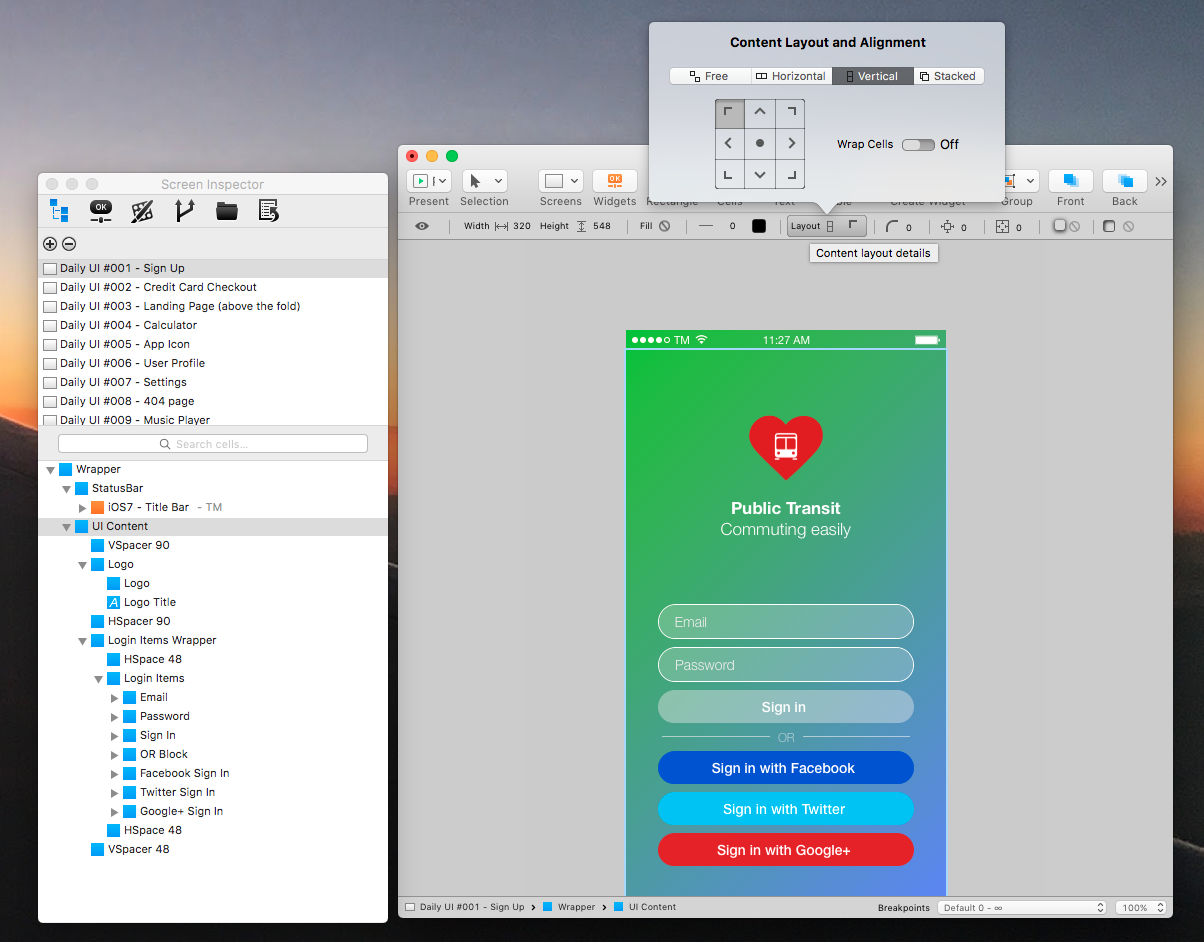
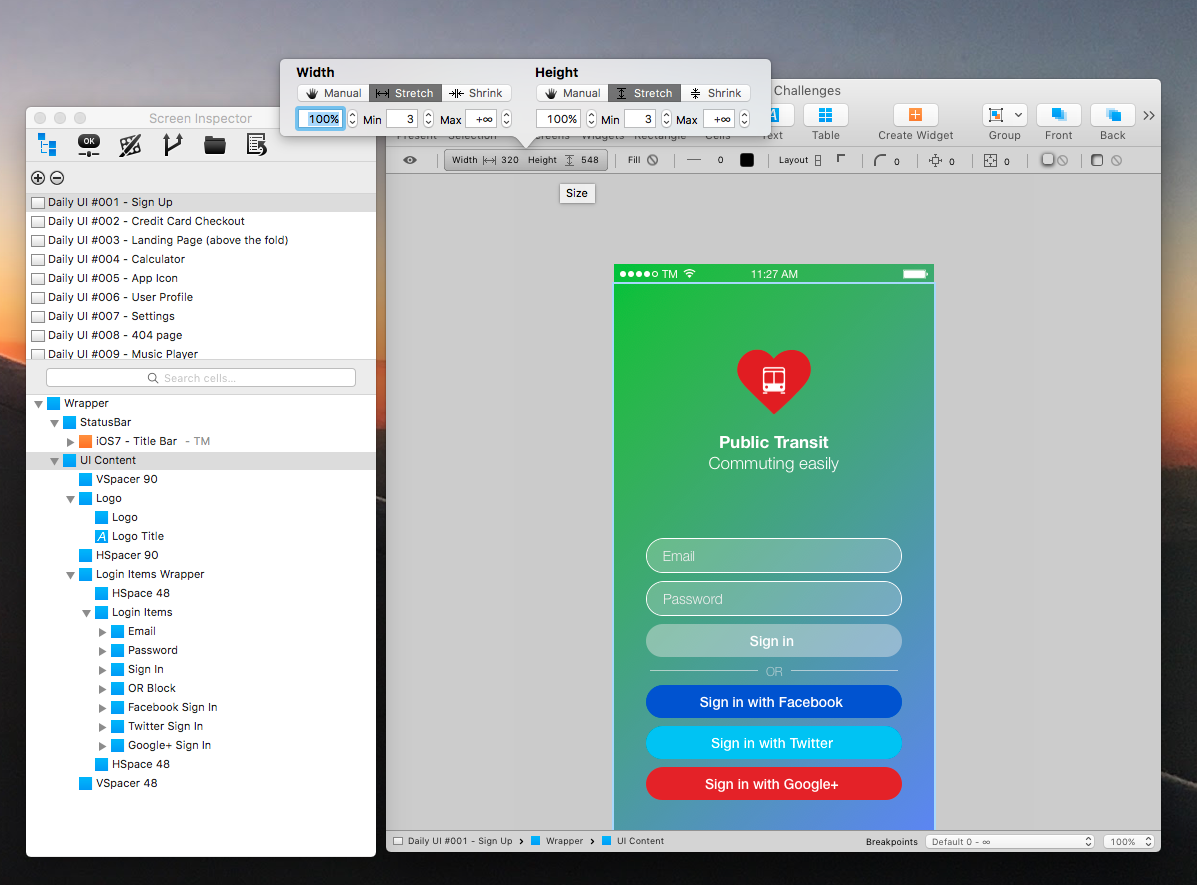
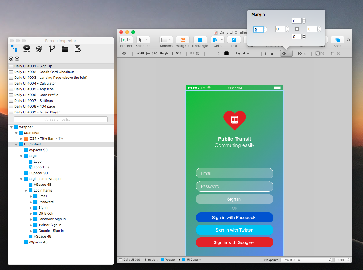
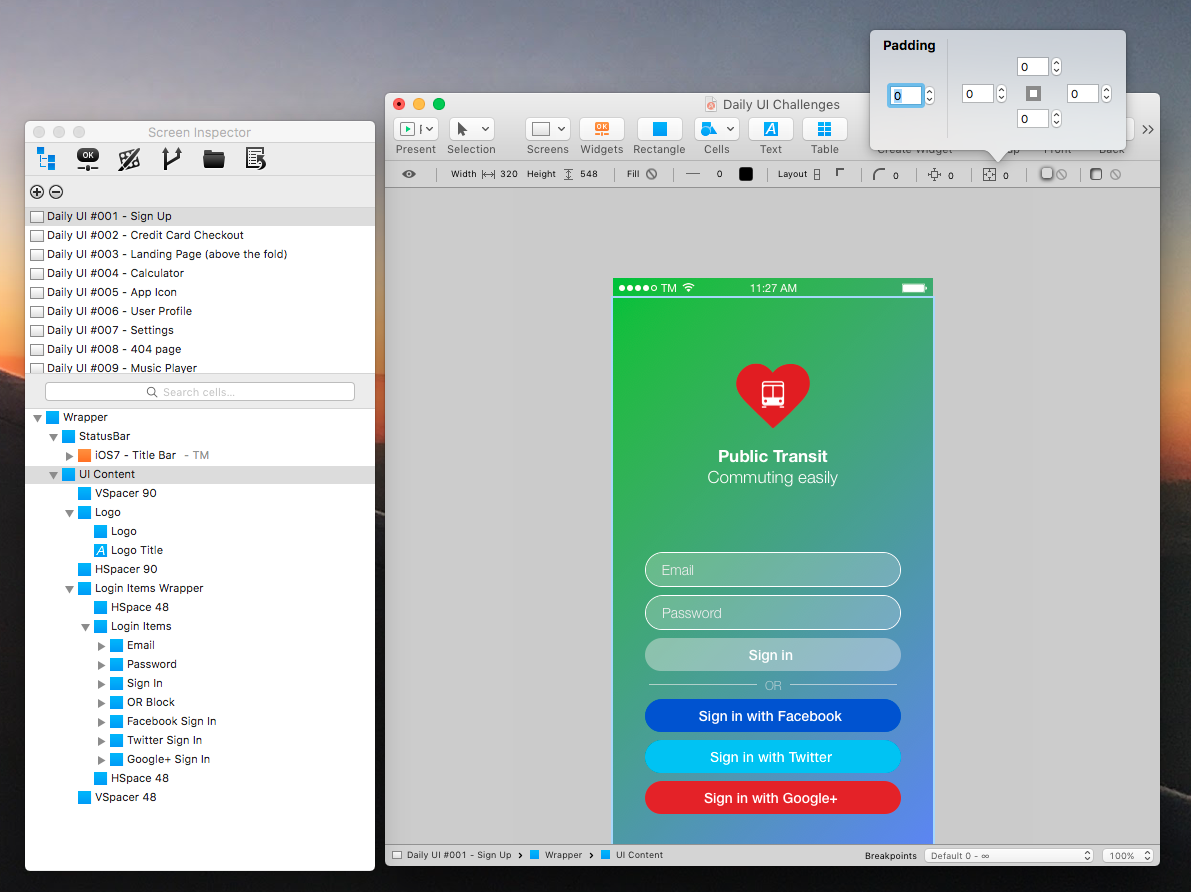
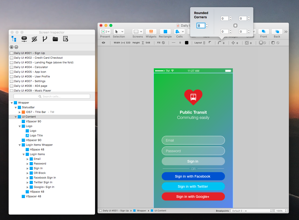
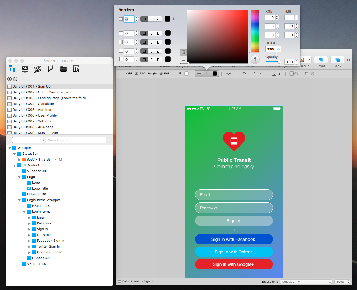
 Hi there, I've seen you've introduced the constraints feature in AD 1.5. But I don't like to align each element in the goddamn manual layout. Can you please add an option to start designing mobile or web applications using indirect manipulation using different kinds of layout? Vertical Layout, Horizontal Layout, Stacked Layout, Floating Layout. At the moment, as far as I understand, the layout used by AD is a Floating Layout (free layout), which is great for creative designers. Helps you to iterate better over those designs. But a professional UX/UI Designer doesn't want to loose his time dragging around stuff or creating grids just to can snap those elements to them. That's stupid if you ask me. And innacurate. Here is a UI scenario which is easily created with Antetype: 1 create screen 2 setup the grid inside the screen artboard: 2.1 add status bar for 20 px at top 2.2 add 3 elements with equal heights below status bar (100% height each, share the height space equaly) 3 add widgets inside those 3 grid elements 4 decided that I want the first element smaller 5 select it and make it 15% instead of 100% height (~33% because they share equal height) 6 the rest of the elements should be heigher (~42% each), while the first element should be 15% height now. Finished in 2 minute. Sent to the Client. This kind of stuff you can not do in AD. You have to constantly drag things around and you are not entirely exact. It is good, better than Photoshop but IMHO it's still Photoshop or Sketch. When you add these layout permitting to control an entire flow using mostly indirect manipulation magically aranging the other stuff around then this tool would be the best in the market. Until then, for me it's Photoshop, and I am loosing time while using it. I'm using AD only for Graphic Design stuff but I'll be glad to work with some Layout Managers in AD and move from Antetype. I've uploaded some pictures with the things that Antetype has but Affinity Designer doesn't which are a deal breaker for me. check their file names. PS: I'm to busy to set each and every constraint for a Rectangle and drag it around. :)