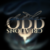
Father ODD Creations Posted February 14, 2019 Share Posted February 14, 2019 Re-designed my Clients Music Artist's logo for a stronger and yet simple feel. The old logo might still be here (www.soundcloud.com/HolySKITXO) Critiques and Compliments appreciated. VectorWhiz 1 Quote Link to comment Share on other sites More sharing options...
GarryP Posted February 14, 2019 Share Posted February 14, 2019 The old version of the logo was incredibly 80's but that might have been a good thing, depending on what sort of music they make. I like the new version but I have some concerns: * I don't know what the 'smoke' is for - it's a nice effect but I'm not sure why it's there; * The full logo is very tall which might make it difficult to scale for inclusion in landscape-oriented images, such as page banners; * The "SKITXO" text is difficult to read - at first glance it looks something like "SKITY" with a little blob after it (the old logo was similarly difficult to read as it looked like "Sloitixio"). All-in-all it's a nice image, I'm just concerned that it might not be easy to use in lots of different circumstances. Father ODD Creations 1 Quote Link to comment Share on other sites More sharing options...
Father ODD Creations Posted February 14, 2019 Author Share Posted February 14, 2019 @GarryP Thanks for the critique, yes he is going for a more calmed down energy with his future productions. the first one I created also so thanks for the compliment. As far as the smoke goes, its to bring depth and a dark mysterious vibe as hes and fantasy/scifi/horror fan. The smoke is a symbol for fog over graveyards, ghost, and for symbolizing mysteriousness. I tried just a plain black background at first but it was just boring on the eyes, as you can see I've purposely left out the Tron grid (since most logos referring to the 80s usually have it their art...trying to make it a little different i guess). Thats a great point on the length of the logo, and its safe to say that I actually have it covered, as when I created this logo, 'though it looks as one,' there is actually 3 versions of it in this set (I probably shouldve uploaded all 3 lol): The full version (Holy, Skitxo, and the Crucifix) The secondary version (Holy, Skitxo w/o the crucifix) Third Version (Skitxo, and the Crucifix): as the the crucifix on average universally stands for Holy and then skitxo across the crucifix. and the smoke in the background is only for this display, he will have the logo itself alone with future projects or however he decides to add it to his future projects. Im a really a huge fan of symbols, so I try to go for more logos that are memorable versus being politically correct. For instance the "Novant Health" logo, most people dont realize its negative space that creates the N and H but when explained, people finally understand (including myself, i didn't understand it at first until i stared at it LOL. I really appreciate the feedback mate. Thank you Quote Link to comment Share on other sites More sharing options...
VectorWhiz Posted February 14, 2019 Share Posted February 14, 2019 Powerful image. Father ODD Creations 1 Quote Home: https://vectorwhiz.com : : : : Portfolio blog: https://communicats.blogspot.com Link to comment Share on other sites More sharing options...
Father ODD Creations Posted March 14, 2019 Author Share Posted March 14, 2019 @VectorWhiz Thank you very much mate. Quote Link to comment Share on other sites More sharing options...
Recommended Posts
Join the conversation
You can post now and register later. If you have an account, sign in now to post with your account.
Note: Your post will require moderator approval before it will be visible.