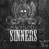
misguid3d Posted May 16, 2017 Share Posted May 16, 2017 After messing with photography, editing and a little bit of design work I finally got AD and I absolutely love it. I do a lot of marketing and design stuff for my band but there's a certain limit to what I can do before I have to source it out. I'm slowly finding my bearings and am looking forward to learning more and developing in the realm of an amateur graphic designer. Here's a couple of simple ones I recently did just to get a hand of a few techniques. Comments and criticism welcome! GarryP, MEB, AlinaLitLymnnaify and 1 other 4 Quote Link to comment Share on other sites More sharing options...
GarryP Posted May 17, 2017 Share Posted May 17, 2017 Nice.I only recently purchased AD myself and, apart from it missing some features that would make a real difference, it's so much easier to use than some other software I've had to wrangle with.I don't really have many comments but I would say that each one might look better with some kind of "gunge" background (unless there's a reason for the blank background). Or maybe, for the "Blackwood" one, a dark and/or blurred sepia photo background could do something? Might be worth a try as it's easy enough to do quickly in AD.Also, the "social club" illustration might look better with a mix of fonts. Consider the rodeo examples here http://bobcoronato.com/prints-for-sale/where the artist has "gone nuts" but it works very well. I'm looking forward to seeing more stuff like this as it might give me some inspiration for my experiments. misguid3d 1 Quote Link to comment Share on other sites More sharing options...
misguid3d Posted May 23, 2017 Author Share Posted May 23, 2017 Thanks GarryP! I do agree that they could use some grunge background as well. Like most of my other designs. But for these, I was just toying with t-shirt ideas possibly so wanted to stay rather basic. I also agree on possibly using a different font for the Sinners one. I love the designs you pointed me to as well! Killer work! Quote Link to comment Share on other sites More sharing options...
GarryP Posted May 24, 2017 Share Posted May 24, 2017 You're welcome misguid3d.I think they look nice as T-shirt designs. However, it might be good to see them overlaid onto some blank T-shirt images, just to get a better feel for how they would look in the real world.Also, I've never had anything printed on clothing before but I imagine there might be issues with how the designs work when draped over an actual human form.For example, the "Blackwood Sinners" version has a very wide logotype which would have to be seen in full across the chest (or back, depending on where it was printed) while the T-shirt was bring worn. This might mean that the whole thing would need to be shrunk to a point where some detail was lost. Also, the top "corner flourishes" (whatever the correct name is for them) might be warped in strange ways across the shoulders and therefore not match-up with the bottom "flourishes", if you see what I mean. It's a bit like designing a flat label to be wrapped onto a bottle; it might look great flat, but on the bottle it might look weird as the viewer can't see all of the label at once.If you really want to model what something will look like in real life then you could look at something like http://www.makehuman.org/but that might be taking things a bit too far. Like I said, I've never done this myself so I could easily be wrong. Maybe something to think about though.P.S. I agree that those rodeo posters are really great. I'd have a big grin on my face all day if I created something that was even just a tenth as good. misguid3d 1 Quote Link to comment Share on other sites More sharing options...
Recommended Posts
Join the conversation
You can post now and register later. If you have an account, sign in now to post with your account.
Note: Your post will require moderator approval before it will be visible.