Search the Community
Showing results for tags 'tab stop'.
Found 4 results
-
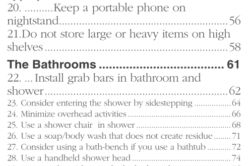
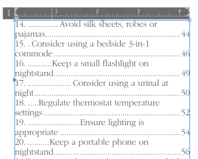
Hello, I'm not sure if this is a bug or not, but if you look at this image, you'll see that I increased the font size of items 20, 21, and 22 (it needs to be a large print book). Items 23 through 28 are the correct format, so I thought it would be okay to manually increase the size and then redefine the style. But when I did, it seems that Affinity Publisher added a tab stop between the the initial number and the description as well as between the description and the page number. If you look at the second tab stop image, you will see the text ruler with no indication of where the new tab stop starts/ends. Is there a reason for this? How do I remove it? Thank you for your help in advance!

-
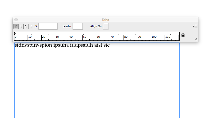
Feature requests 1. Stop Tab Ruler The current stop tab panel is rather frustrating, and often these things need to be designed rather than calculated. The same sort of thing as in Word, Illustrator, InDesign, Quark Xpress 2. Text box overflow Currently the text in a box flows out of the bottom of a text box. I read the reasoning why, however at concept stage (especially when using dummy text) I find myself having to delete lots and lots of Latin text, only to have to re-paste it in a few moments later once I've changed font size / box size etc. 3. Text box linking It would be really great if there was an option so that you could choose if the text flowed out of the bottom of the text box. Likewise the option of linking / flowing content between text boxes would be super-helpful. I know that these may appear more like options for a DTP package rather than illustration program, however there's often need, especially web concepts. Thanks
-
 I'm finding when laying out tabular data that it's a pain to add/edit tab stops only from the small text input field (some of the UX there isn't really good either, as I can't seem to scroll down the window when I have entered more than 5 tab stops). Being able to see the tab stops on a ruler (similar to InDesign) to be able to click and drag them to adjust would make viewing and adjusting the paragraph tab stops a million times better.
 -
 Is there a way to have decimal leader spacing between them-(tracking)? I find that the default decimal spacing is way too tight. Maybe a future version? Or custom glyph?