Search the Community
Showing results for tags 'retro font'.
Found 1 result
-
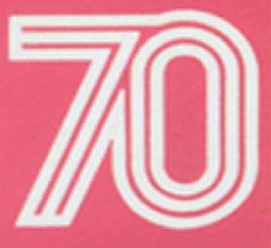
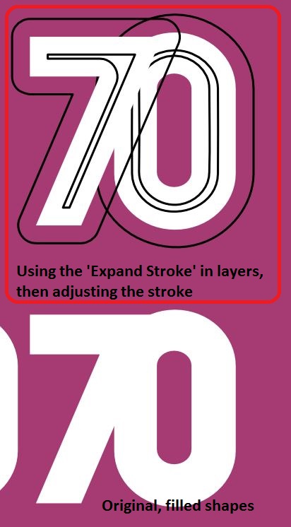
 I'm trying to figure out the best way to recreate this 70's font. The blocking out of the main white shapes is easy enough, but I'm struggling to find a way to accurate recreate the thinner black lines of this font. When I draw it free hand, it just looks off, as human error creeps in and the bezier curves just don't look right. I've tried expanding stroke, then adjusting the stroke on the expanded stroke layer, but it's still not right. Any advice?