Search the Community
Showing results for tags 'recreation'.
Found 7 results
-
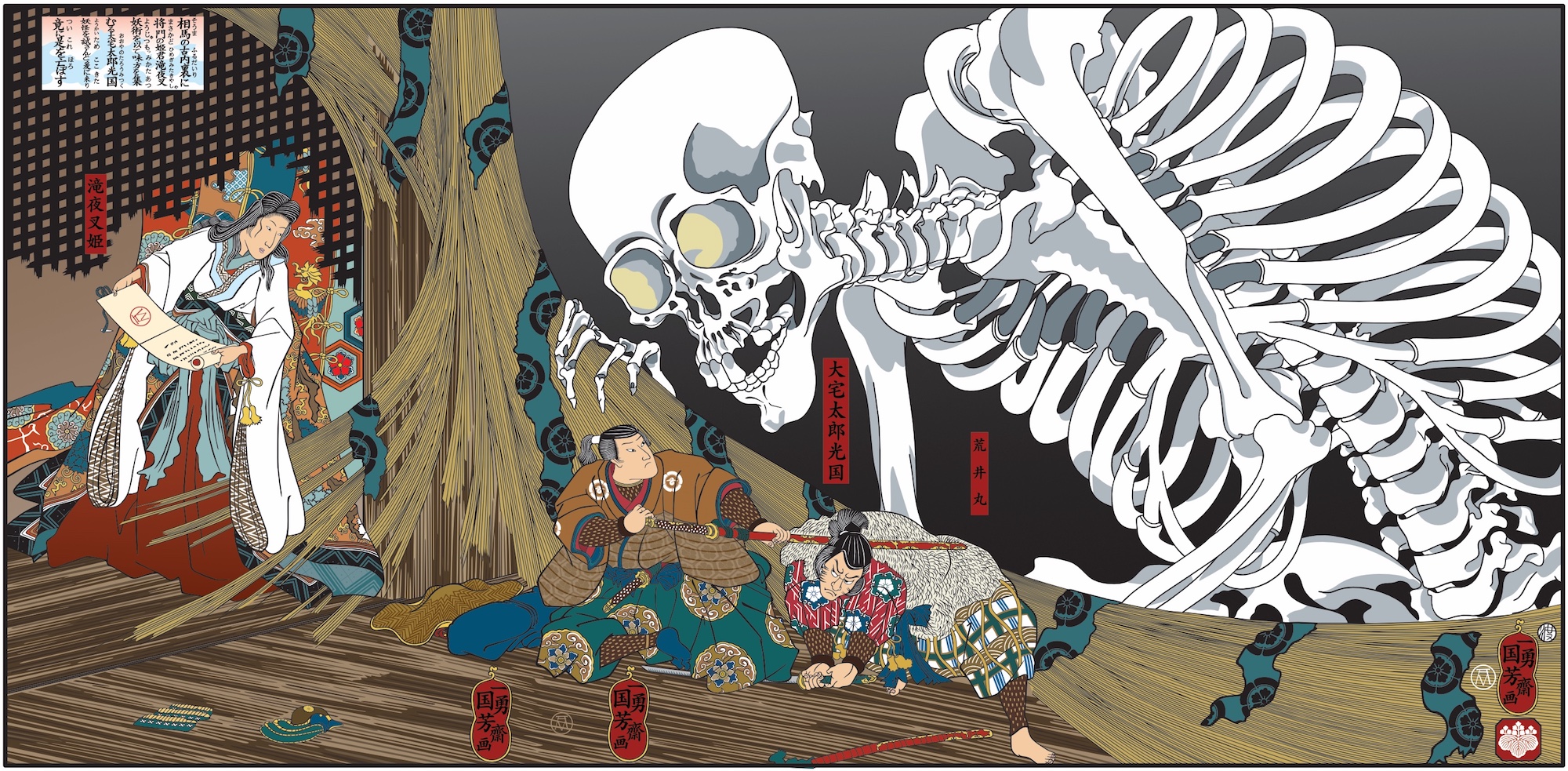
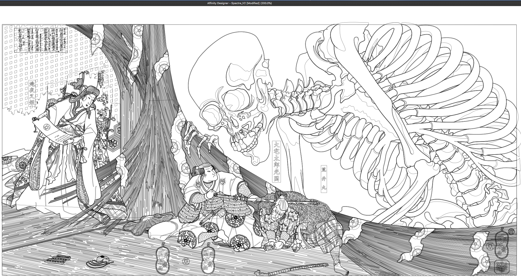
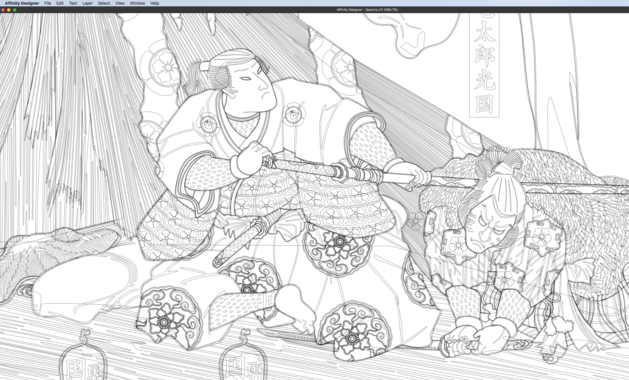
I made this piece as a part of a presentation that I had to make recently to a potential client. It is based on a woodblock print by Kuniyoshi and the original name of the print is Princess Takiyasha summons a skeleton spectre to frighten Mitsukuni. I've never seen an original print of this that was in good shape and I thought it was a shame because it is a very nice print so I decided to make my own version (with a few changes here and there). I hope you enjoy. Hokusai

- 19 replies
-
- 23
-

-
- recreation
- vector
- (and 3 more)
-
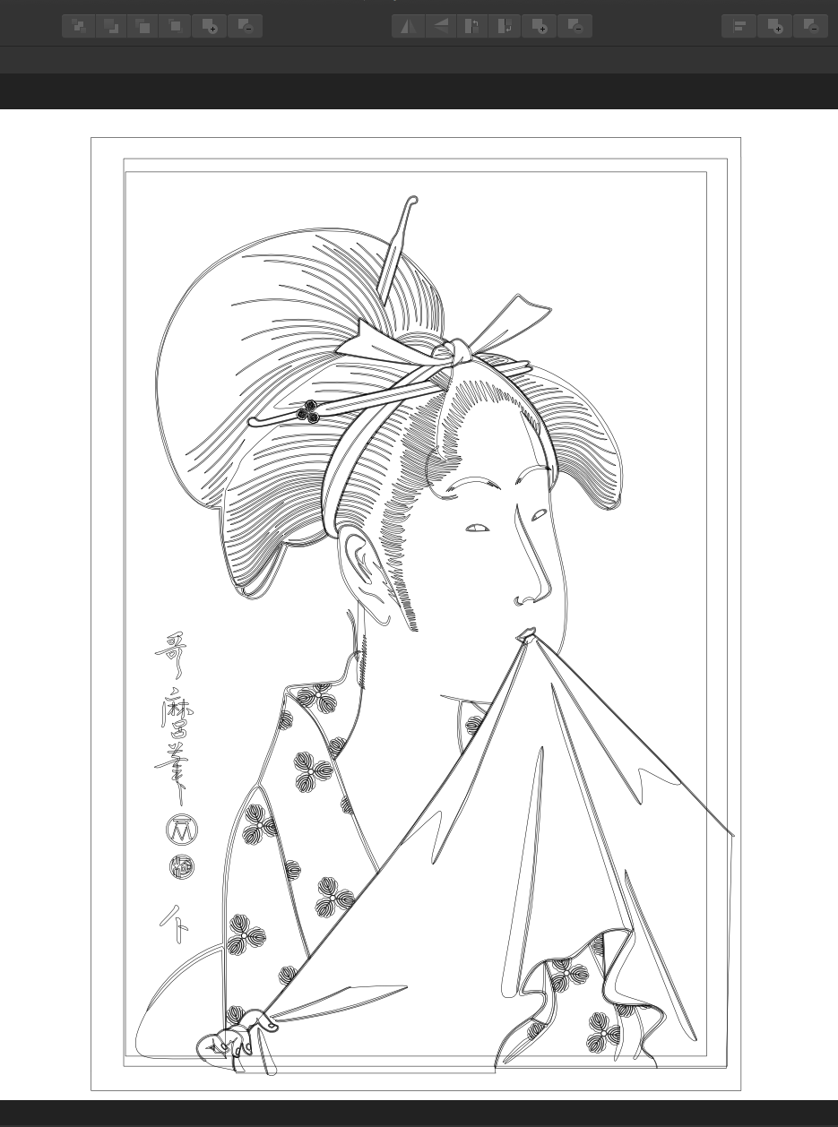
Thought I would share another Beauty of Edo. It was all done using Designer and it is all vectors (with some effects added). Thanks for checking out my work. Hokusai
- 9 replies
-
- 10
-
-
- utamaro
- recreation
- (and 2 more)
-
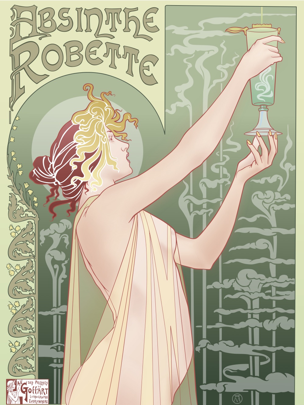
This is my second Art Nouveau piece (and probably my last as I'm ready to move on to something else). I based my version on a Henri Privat-Livemore poster from around 1896 or so. As I mentioned in my previous piece, I normally don't use the "effects" in Designer because I normally work only in pure vectors but the effects worked so well with shading on the skin in my last piece that I decided to recreate this piece as well adding my own little touches along the way. I chose this poster because I liked the composition and it had a lot of shading on the skin tones and I wanted to see what I could do with it using Designer's effects. I was very happy with the results. I hope that you enjoy. Thanks for letting me share my picture. Hokusai
- 17 replies
-
- 13
-
-
- absinthe
- art nouveau
- (and 3 more)
-
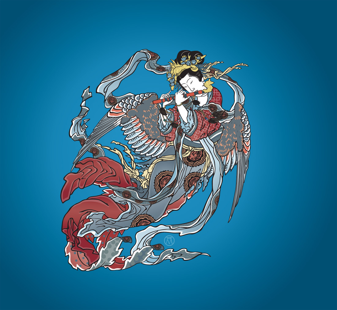
Just wanted to share my take on what was originally a Hokusai ukiyo-e print (Hokusai Katsushika, 1760 - 1849, not me). I'm sorry I can remember the original name of this print but I thought Siren was a good name for it (but keep in mind that is the name of my version and not the actual name of the print that mine is based on). I saw it somewhere on my travels and I snapped a shot of it but the print was not in very good shape so I decided to recreate it using Designer. While Hokusai is most famous for his "Great Wave at Kanagawa" he made thousands of prints and there are many that are just as incredible as the "Great Wave". Thank you for taking the time to look at my work, Hokusai (not Katsushika)
-
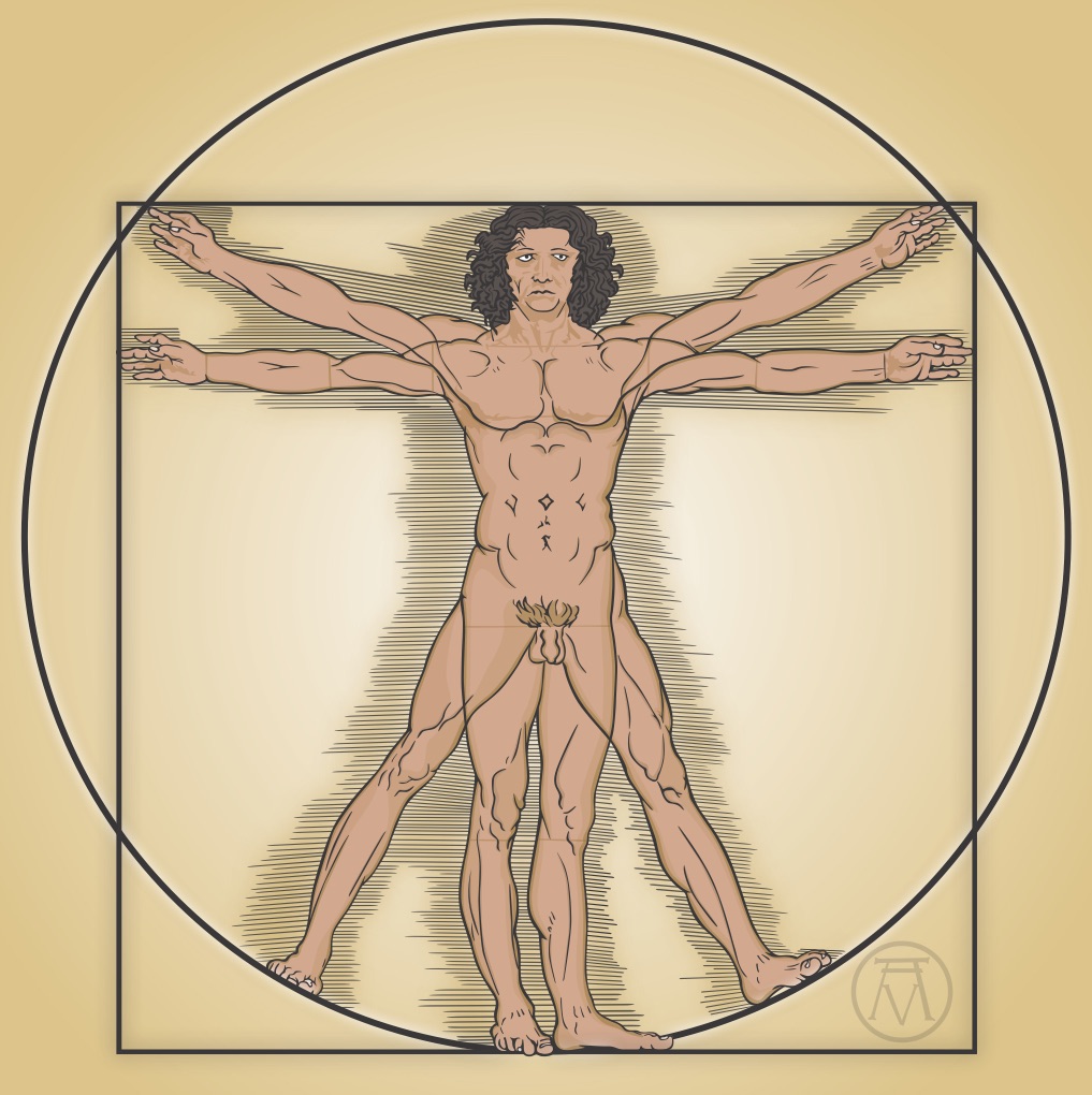
Here is my version of DaVinci's "Vitruvian Man". I have always thought that there should be a color version of it. It was all done in Designer and while I don't normally use any of Designer's "Effects", I decided to this time. I hope that you enjoy. Thanks for taking the time to view my work, Hokusai
- 6 replies
-
- 4
-
-
- davinci
- vitruvian man
- (and 2 more)
-
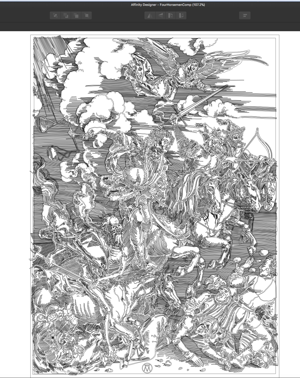
Just another drawing similar to the Don Quixote drawing that I posted recently but it is much simpler. This is a drawing that I had done probably not long after Designer was released and I forgot that I'd done it. I used this picture as my first real project to get myself used to using Designer. I am a big fan of Albrecht Dürer and I hope that you enjoy it. I've included the outlines as well. Hokusai
- 19 replies
-
- 17
-
-
- four horsemen
- albrecht dürer
- (and 1 more)
-
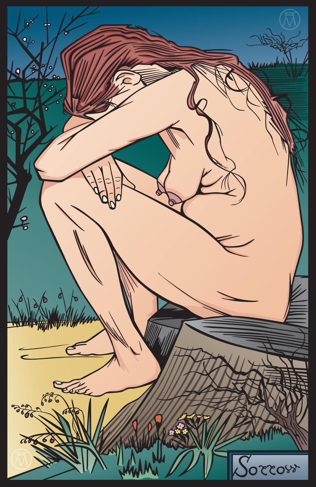
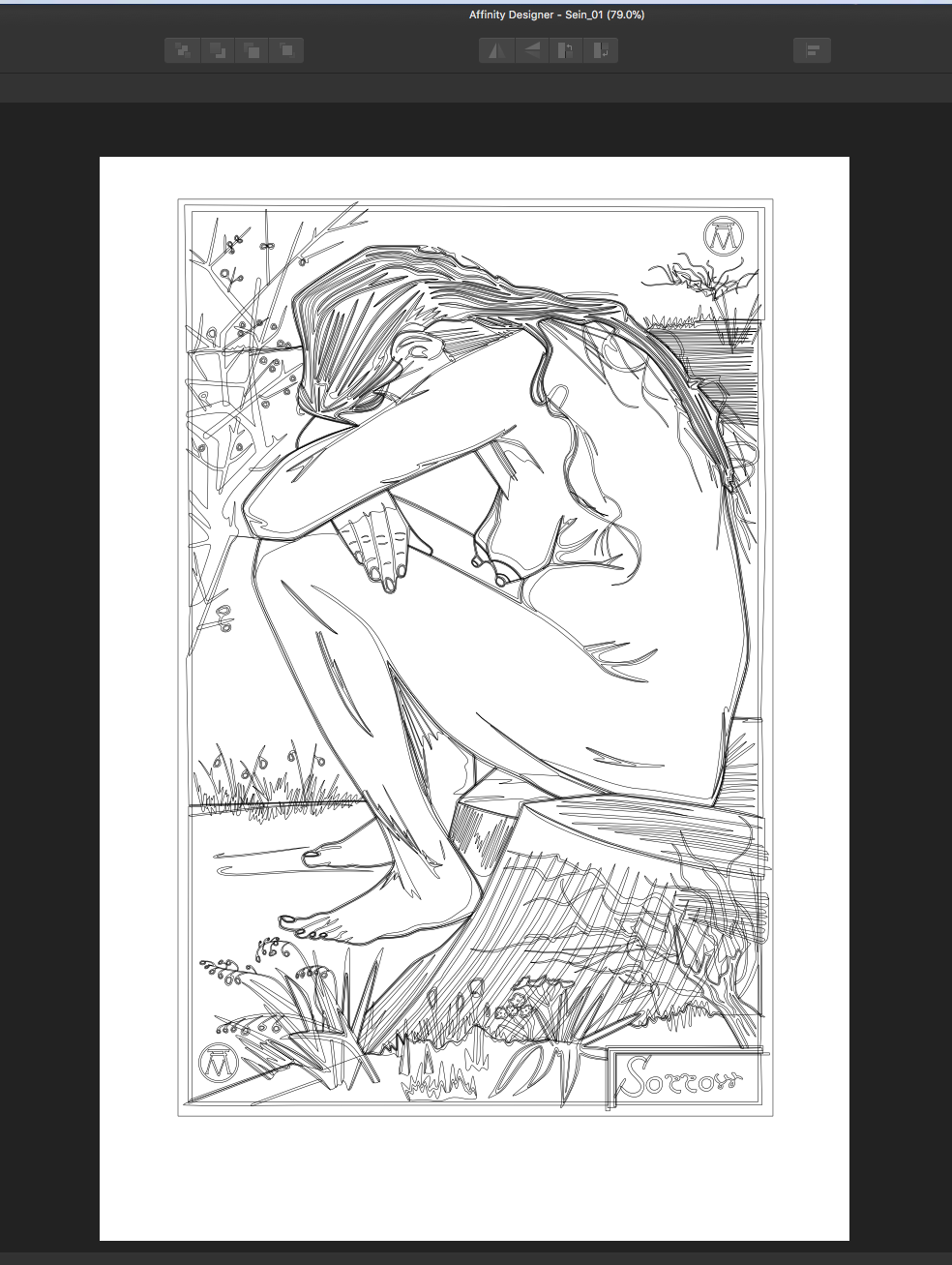
Just wanted to share my version of a Vincent Van Gogh sketch of Sien Hoornik titled "Sorrow". I saw this sketch somewhere and I thought that I should make a coloured version of it. It is a rather simple sketch but it was very difficult to get it looking just right, especially the colours. I redrew this numerous times trying to get it to look a certain way and this is the one that I settled on (although it isn't quite as I had pictured it in my mind but it is close). The hair was the worst part and it still isn't quite to my liking but it is going to have to do as I got tired of it and decided to move on to something else. I hope that you enjoy. Thanks, Hokusai
- 2 replies
-
- 10
-
-
- sien
- recreation
- (and 4 more)