Search the Community
Showing results for tags 'lights'.
-
Hi, I visited a guided Lost Place Tour and took a shoot of an old ballroom of a hotel. One of the difficulty ist the light, because there is no electricity. In this tutorial, I show how to edit such a photo. I wish you fun. Ciao Jack
-
- affinity photo
- tutorial
-
(and 5 more)
Tagged with:
-
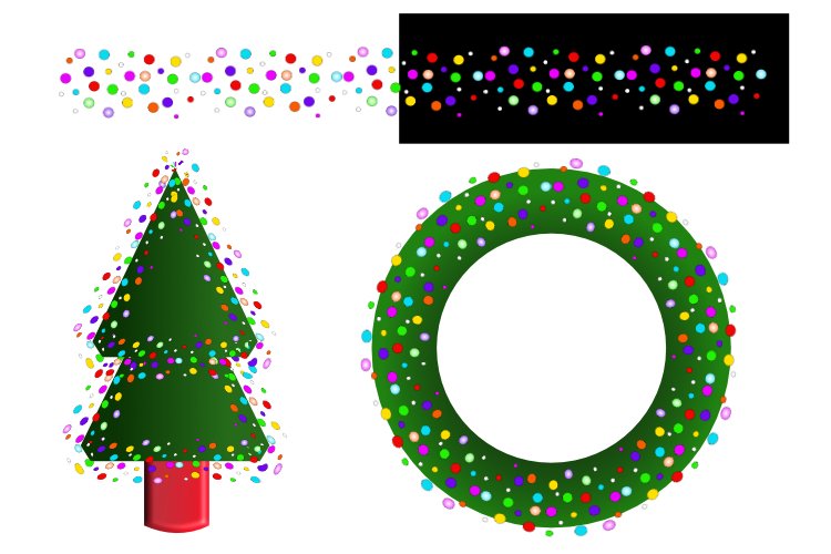
I was having some fun creating brushes and applied one to a circle. I then tried it over a green donut to make a wreath, and a tree using basic shapes. I'd love to see what you do with them. Ginettes Scattered Ball Brushes.afbrushes
- 11 replies
-
- affinity designer
- multicololoured
-
(and 3 more)
Tagged with:
-
Hey everyone, I'm continuing to enjoy the many versatile tools Affinity has to offer. I recently got into portraits and am using light strings in many of my photos. I've been editing pictures of a model's face or hand surrounded by bluish light strings. I am a Mac user. Today I noticed that the default image that Photos makes has been appearing superior when it comes to how it displays my lights. I find that the radiance from the lights are much more subtle and nuanced than anything I can do in Affinity. I even tried to recreate the same photo via Affinity but couldn't find that softness that Photos was producing just in its default. I am working with RAW files. Below are attached 2 images. It's a close up of one of the lights. The first is in Affinity and the second Photos. I also attached two images showing the model and the lights around her. I can't for the life of me figure out how to get Affinity to look the same. While it does display more colours and it seems there is a hardness to it that separates the little circular shapes in the light vs. blending them together naturally.
-
I have several shots taken late at night however sometimes the shots are ruined by a big bright street lights or a lamp of some sort. To crop them out would, in most cases, be useless so is there a way I can soften or dim the brightness down a little I was thinking of using a gradient, but perhaps there are other ways to tackle the problem any ideas hints or tips would go a long, long way ~ Fanks!
-
UPDATE: (Solved) Found it. Watched this tutorial: For those newcomers like myself, wait until he gets to the part with the woman, you’ll see how to dim lights, and setup lighting. (STILL NOT SOLVED - getting closer, YouTube, scattered google & affinity forums information slows process) Still searching for torch help, need to make that fire pop in the image below, also I need to know how to get the ends of the fire to look more like “strands of flame” and not that big gumbo of matted clump being shown. Wondering if I can somehow implement this technique: This attached image below is for a game of thrones medieval event this coming up this Tuesday. My vision for the photo: 1) get the orange words to slightly melt off the banner. 2) A portion of a dragons backside showing from the far left screen of the image, as if walking away. 3) the Knight holding the sword, the sword having some kind of fire effect emanating, 4) Ground underneath the Knight, having a scraped crevice, as if he scraped his sword alongside it, before brining it to the battle ready position he now wields it in. Never edited before, only cropping, going to be a long two days, unless some veteran on here responds, and helps shorten my learn curve with direction. ORIGINAL POST: Hello, iPad 10.5 Just created the following image. I’m trying to dim the surrounding area, with a medieval tavern type yellow warm glow, emphasize brightness onto the torch. Also, is there any fire effects or fire filters to make the fire pop out more? As of now the fire looks “matted” on and not natural (free flowing) any ideas? Potential, could it that while I was busy selecting the fire, in the selection persona, I left on an option called “matte” in the context box - could this be the reason for this ugly fire I have going on in the torch? Dear professionals, Please advise. Thank You!


