Search the Community
Showing results for tags 'kerning'.
-
 I'm typing in TW Cen MT in Affinity Publisher 2 on Windows, and I'd like to type the character a with a macron (ā), but the font doesn't include that character. However, it does include the macron as a separate character (¯). Is there any way I can combine a with ¯ by messing with the font settings? Alternatively, is there any way to add new glyphs to a font?
 -
 Hi all. I searched the Designer help for "kerning" and got zero hits. So that's the first major problem. I selected a line of text, and examined the Character properties panel. In the kerning drop-down, everything except "Auto" and 0 was greyed out. I also noticed the "Character" and "Paragraph" buttons in the toolbar. Clicking on them didn't appear to change the type of text I was defining. So why are they there? In other vector programs, selecting text with the node-selection tool lets you adjust kerning by dragging a control point on each character. Not in Designer. So is this functionality just missing? Thanks for any insight.
 -
 Hi, How to add space between words without adding space between letters in a whole paragraph ? Everytime I add space it also modifies the letters, I just want to add word spacing. Thank you letter spacing.mp4
- 17 replies
-
- 2
-

-
- space
- letter spacing
- (and 2 more)
-
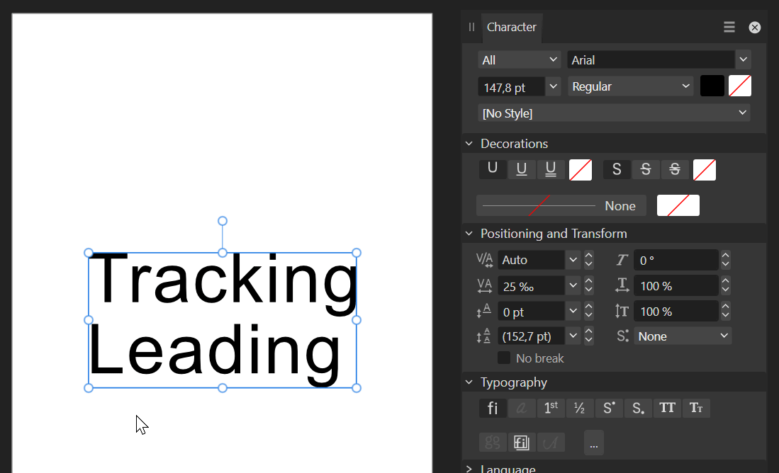
 Hey there! I’ve noticed a bit of a hiccup with the text tracking slider in Affinity Designer 2. It seems to be acting up and not working as expected. This isn’t a constant issue, but it does happen quite often. In fact, most of the time, it doesn’t work at all. This isn’t a new problem either. I’ve been experiencing this since V1. Tried restarting both the program and my laptop to see if that would fix it, but no luck there. For reference, I’m on Windows 11 22H2 and Affinity Designer 2.2.0. I haven’t tried reinstalling the program yet, but that might be my next step if this continues. Hope this helps!
-
I am really hesitant to change the spacing of my letters because it alters every usage of that font after that. This can't be the way this is supposed to behave. I only wish to alter a single instance of lettering to allow it to fit in the margins of a document. This happens when I am using the artistic text tool or a text frame. No matter what the font is it doesn't revert back to the default positioning of the characters. This seems very odd to me.
-
 In AD 1, you positioned the cursor between the letters, but it disappeared while you adjusted the kerning. This allowed you to closely see the adjustment being made. In AD2, the cursor instead remains. This obscures the adjustment being made.
 -
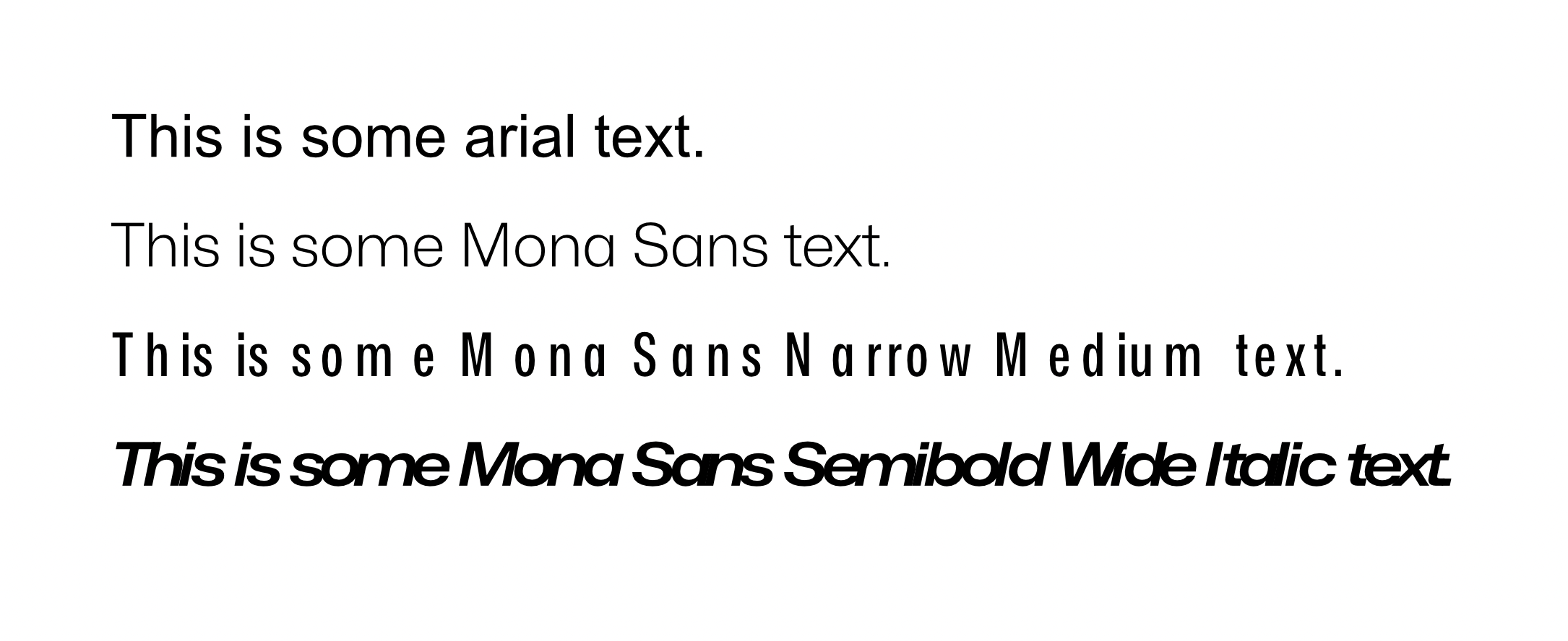
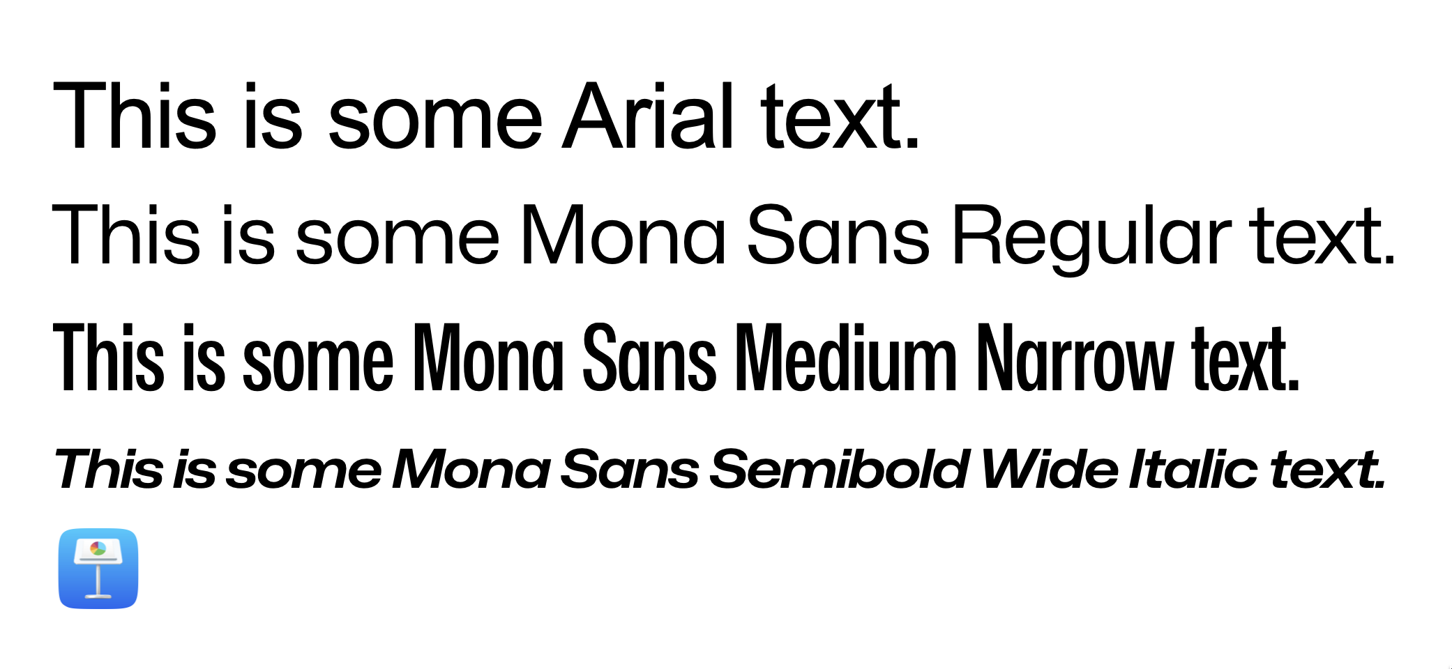
 Hi, everyone. Thanks beforehand for your time. So, basically my problem has to do with character spacing, no matter tracking, kerning, both or none. Affinity displays it completely wrong. Refer to the screenshots for more context. This first screenshot comes from a fresh new affinity document. I just wrote the text and set the font face. This is how Mona Sans looks against Arial, just to name an example. You can clearly see that the spacing for the Narrow Version and the Wide Italic version has been absolutely butchered. I can't tell if Arial and the Regular version for Mona have the same problem. To me, they look fine, but I don't really know what to expect after seeing how it reacts to very wide and narrow fonts. Second screenshot is how Keynote, just another app that deals with text, looks like. Font Book looks identically, as so does every other text app I have. Essentially, that's the spacing that the original designers had in mind. I am very aware of the ⌘ + opt + → command for setting this up manually. But, in this specific case, I am just writing a bunch of text. I expect the result to be like the second picture with no additional tweaking. Essentially, that's how the typeface was designed and I want to keep those proportions. For reference, I accessed the Character window and tweaked everything to be as default, or close to default as possible. That means, 0% everywhere. I went character by character, checking that the kerning for each pair was set to 0%. Question is: am I missing something? Am I doing something wrong? Or, on the other hand, is it a problem with Designer? Hope you can help me out. Lemme know if any other piece of info is needed. Specs: - OS: MacOS Ventura 13.0. This occurred in both an Intel machine and an Apple Silicon Machine. - Affinity Version is 1.10.6 Again, thanks much for your time beforehand.
-
Hi I create fonts with fontforge, at the testing stage, why for all affinity kerning family doesn't work, for testing at adobe, office, inkscape, everything is fine is this a bug? or just need advanced settings
-
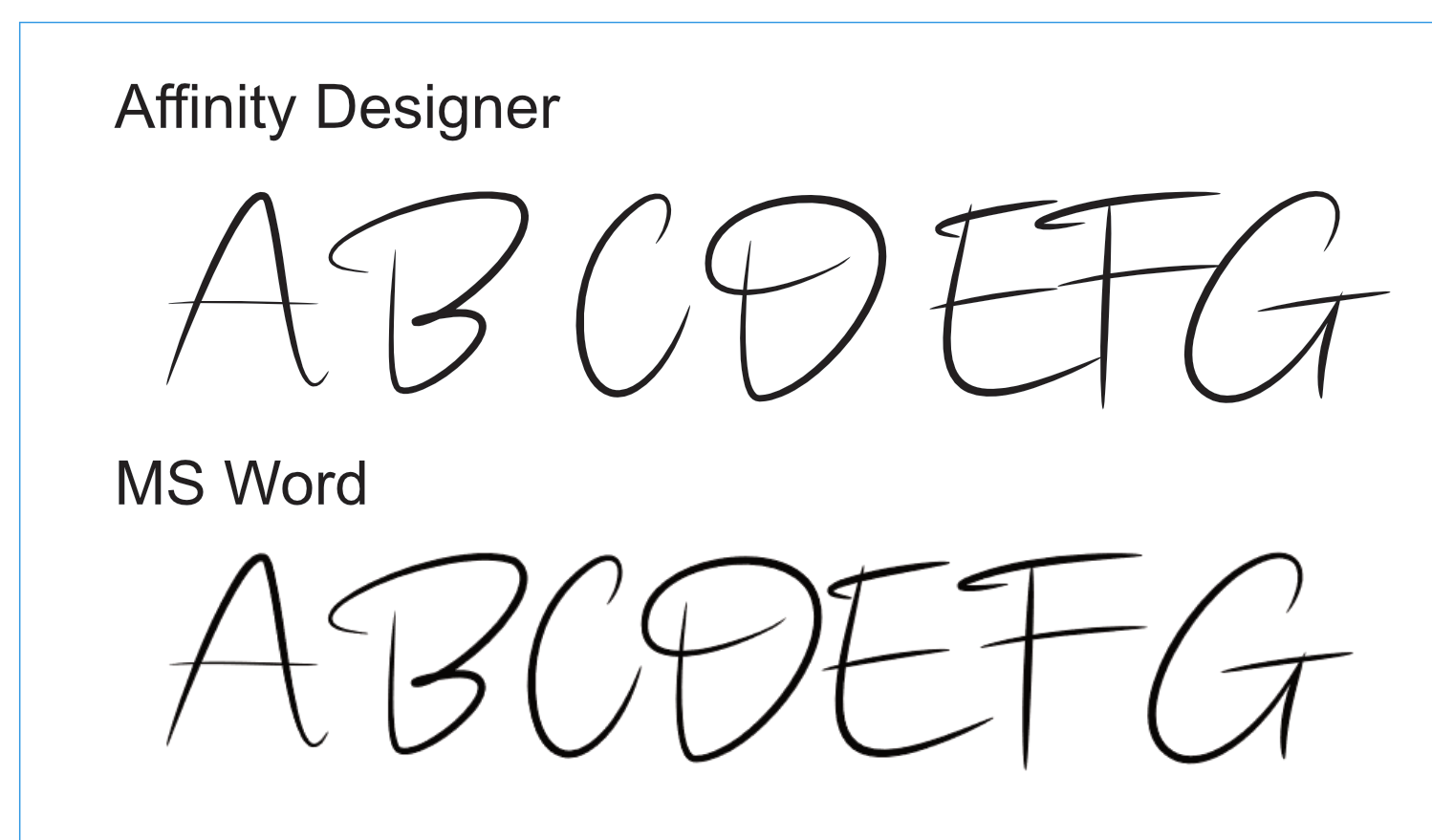
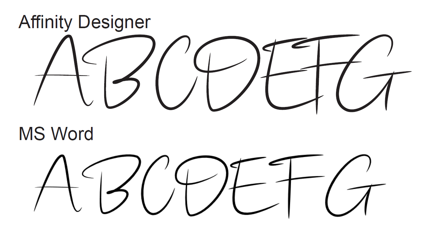
 Hi everyone, I'm using a font for a personal project that appears to have a kerning issue. The font is called onelove and is a script font with strokes that overlap character cells. It appears at first glance that AD is using some form of kerning however it appears poorly done. I then tweak it using my own values for the kerning and everything looks fine for any bitmap exports but the PDF export looks like the kerning values have doubled up. Converting the fonts to curves solves the problem but it isn't what I want at the moment while things are unfinished. As a test I used the same font in MS Word and the default look is very different and no kerning was required. Note: the MS Word text is a bitmap screen grab from Word pasted into an AD document for comparison. I've a suspicion that the kerning is somehow mangled and that the changes I'm making are not necessary, but appear to be required from the on-screen image I'm working with in AD, and these changes then appear as extra offsets in the PDF export. Here's what the above AD file exports to PDS as: There is definitely a lot of movement here. I hope I'm doing something stupid here but can't for the life of me see what it is. Any thoughts?
-
Would be nice if you could implement "palt" feature https://sparanoid.com/lab/opentype-features/#palt Additionally pwid/pkna/halt would be nice. https://sparanoid.com/lab/opentype-features/#pwid https://sparanoid.com/lab/opentype-features/#pkna https://sparanoid.com/lab/opentype-features/#halt East Asian Tetragrams (Chinese, Japanese, Korean) smpl trad tnam expt hojo nlck jp78 jp83 jp90 jp04 hngl ljmo tjmo vjmo fwid hwid halt twid qwid pwid palt pkna ruby hkna vkna Ultimately I would like you to add "Mojikumi" feature that's set of templates for kerning. https://helpx.adobe.com/indesign/using/composing-cjk-characters.html#change_mojikumi_settings
- 1 reply
-
- 3
-
-

-
- proportional
- japanese
- (and 2 more)
-
 I had finished changing the size of the background on an RSVP I was designing. I started to type the text when I saw that the space between words was at least twice what it was the last time I used that particular font. The space between the letters within the words was fine. I don't know how this happened. How can I fix it? I have Windows 10 and Affinity Designer 1.9.1.
 -
 Illustrator allows creation of a curved (or straight) path upon which one places text before selecting whether to use ‘stairstep,’ ‘gravity,’ ‘rainbow,’ or two other FX to affect its look. The effect I cannot find (or create) in Designer is VERTICAL text on a curved (e.g., arc-ed) path. It's easy enough to create a path and place text on it, but that appears to be endgame. Text then only follows the shape of the path, skewing left or right, depending on how and where the path curves. Yes, I realise I could convert the text to curves and straighten it manually, but then it's no longer editable. Question 1: IS there a way to create vertically-oriented text along a curving path in Affinity Designer? If so, how? If not, please consider adding it. I'm fairly certain I can't be the only one asking about this … Question 2: It would be nice to place the cursor next to a character needing kerning, hold the Option key, and use the arrow keys to bring them closer or space them farther apart. As is stands now, kerning is applied to the entire word (or phrase, depending), which is rather clunky and produces less-than-satisfactory results by throwing otherwise fine kerning at other positions in the text out of whack. Can we PLEASE have kerning between individual characters to adjust spacing? Note: If it's there and I'm just not seeing it, please let me know where and how to access it.
 -
 I am a newbie using Publisher to prepare practice grids for practicing Chinese characters, but I am having trouble aligning the characters within each box. Chinese character fonts are uniformly monospaced (no kerning option). Columns 1 and 2 are too far to the right, and column 3 is just right (3D needs a very slight nudge to the right). Columns 4 and 5 are also very slightly off (4D and 5C need to be slightly nudged to the left). When designing the grid, I left a small horizontal space (1.2 mm) between boxes. I set my text size to 110 pts, which seems just right (at least for column 3). Anything above or below 110 pts causes more problems. I hope I can avoid making microadjustments to every single box. The character menu doesn't seem to have any useful options, and neither does the paragraph menu. "Spacing" seems like the obvious place for making adjustments, but that doesn't work either: leading doesn't work; left indent and right indent move everything over. Maybe I should just jam all the boxes together? Advice would be very much appreciated.
-
 Nowhere in Affinity Designer can I find character-level letter manipulation anywhere. I don't mean the Character - Positioning and Transform table. This is suitable for normal kerning, although still a very clumsy and slow way. I want the possibility of horizontal and vertical shift of the character in Artistic Text Tools. Just like I show in the video. Is this possible in AD? And I don't mean conversion to curves. Because if he can't make such a small change for a few seconds, I'll do it relatively uncomfortably and for a long time. The source is from Corel and I understand I'm soaked with it (25 years of work). Affinity has many perfect techniques and ways, but I haven't worked out this basic technique for me. Thank you very much for your guidance and answers. Video example from CorelDraw:
- 6 replies
-
- 2
-
-
- affinity designer
- kerning
- (and 1 more)
-
 Hi,how do I adjust the letter kerning in Photo? I'm editing a PDF and the letters looked a bit cramped.
 -
Hi! Using Art Text tool there's problems with some kerning pairs (Ta, Te, Ti, To, Tu, Va, Ve, Vi, Vo, Vu... for example). Also, using the same tool, if you try to enter two lines, the letters from the second line overlap the first one.
-
Kerning toggle tool not working as usual in iPad app, instead of adjusting the letters it just sort of twitches around 0%... anyone else having this issue?
-
 In the "help" file, keyboard commands are given as: To loosen spacing, press . option - right arrow To tighten spacing, press . option - left arrow For even looser spacing, press . option - command - right arrow For even tighter spacing, press . option - command - left arrow Nowhere, that I can see, is a description of how many 1/000ths of an EM is "looser/tighter spacing" and "even looser/tighter spacing" • What are the numerical increments of these vague semantic descriptions? • Are the basic increment units and the multiplier/divider modifier (command) user customizable in a measurements preference? • Do the kerning key commands produce the same increments when one selects a line, paragraph, column or story to track for fit? thanks, lettergothic
 -
 Can I kern between a tab and a character? Or only character/character? I have a string of numbers I want evenly spaced over [oh, maybe I should just try justifying the text and not use tabs] my flower icons. I used a tab stop of about 36 pt to repeat, but some of the numbers still don't fit just right. I thought I could then go in between the tab and a number character and adjust the kern pair, but that doesn't seem to make a change. What's going on? My af file is too large to add here, so I'll add to dropbox shared with me earlier today on another topic. File name "Kerning with Tabs" Karen Kerning with Tabs not working
 -
 I’m loving everything Affinity is putting together. Also will there be an addition of type controls (leading / tracking / kerning )with the hot keys( option key + arrow keys) for ipad. Option plus left and right controlling the tracking and kerning. Option plus up-and-down controlling the leading like adobe hot key. once learned this hot key in the adobe its been tough on ipad trying to keep ip my type placement speed with out it.
 -
 Hello! Does anyone know if it's possible to remove all added tightening/loosening of horizontal space manually applied between letters of words? I'd like to go back to a "clean," unaltered version of the original text. Thank you!
 -
Hi. I would like to see all of the Affinity products have optical kerning similar to what Adobe Illustrator has. Thanks. P.S. I'm going through the process of switching to Affinity from Adobe. CM
-
 For me publishing is all about typography and setting beautiful text, whether that's artistic display type or vast amounts of body text. Here are some things I'd like to see Publisher get at some point (but maybe it's just me so I'm interested in people's comments): 1. Font info: In the Font selector show as much information about each font as practical (ideally let the user configure which attributes are shown), and provide a "get info" function to display all available details. Attributes of interest would include licensing flags (embeddable, etc.) existence of Kerning pairs, OpenType features of interest, western language support, CJKV support, etc. 2. Basic Font management: I'd like to be able to organize fonts into groups (potentially having one font in multiple groups). I'd like to be able to attach some notes text to a font that would be viewable as a tooltip say, or an attribute in the font info described above. 3. Optical Kerning support: I've always been a fan of Optical Kerning in InDesign as it eliminates a significant problem when exploring for interesting and special purpose fonts, and the ability to leverage the insane number of free fonts (of wildly varying quantity of course) that exist today, some/many/most/virtually all of which do not include kerning pairs. I suspect many font designers take the attitude that "kerning is a pain in the butt and people can just turn on optical kerning in InDesign so really there's no problem if you don't do the work to create them". In playing with Publisher I've been disappointed to find out just how many fonts I like will be problematic in Publisher due to lack of kerning support. The Affinity response so far is: "We provide kerning based on tables in the font file. As these are pretty well supported by fonts, doing anything more isn't a priority at the moment." ( https://forum.affinity.serif.com/index.php?/topic/65653-tooltip-fix-and-optical-margin-align/&tab=comments#comment-342380 ) which is disappointing. I hope they'll consider it in the future.
- 12 replies
-
- 10
-
-
- kerning
- optical kerning
- (and 2 more)
-
 I have been using Designer to edit a pdf document exported from an Apple DTP program. The text in question imported OK as paragraph text. (Some text had imported as curves.) I would like to increase the spacing between the '7.00' and the 'pm' in the time. I select Artistic Text, I place the cursor between the '0' and the 'p', then select the Character panel. In the Kerning entry, I click the down-arrow and all the kerning options are set to zero. I have also tried selecting the adjacent characters, with the same result. John
 -
 I create a kerned text name (single line or double line) in Affinity Designer (AD), either via Art Text or Frame Text, and then use AD's very handy "New From Clipboard" in order to export an SVG. These problems, however, occur. (I do take a snap of the placement of the original text so that I can duplicate the SVG placement.) 1. The kerning in the original name appears to be ignored, i.e., the letters have none of the original kerning. How can I preserve the original kerning in the SVG. 2. Although I keep careful track of the x/y and w/h numbers in the Transform box of the original (non-SVG) text, when I apply these exact same numbers in placing the SVG text after importing it back into the document. However, the text appears just below the original text in my doc (x is correct but not y). My top-right choice in the Transform box (of the nine possible choices) has not changed. I have tried both "Place" and dragging the SVG, but the wrong placement remains.Is this normal? How can I be assured that the numbers of the original text, if applied to the SVG, will bring the SVG i precisely to the correct y position? Any thorough discussion of the above would be much appreciated.


.png.51ccf1004592a9a802629bbd8dd9d5ab.png)
.png.08be0786db0ca44ee054f07c4a60e351.png)
.png.487158ecd8e3c7f83919cd1caad2a9d0.png)


