Search the Community
Showing results for tags 'initial word'.
Found 2 results
-
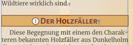
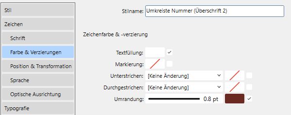
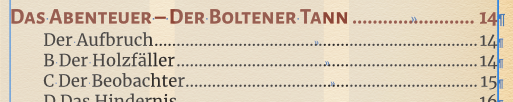
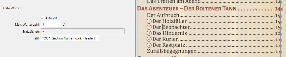
 I guess this is an oversight by Serif: I have some headlines which use the Numberpile font to have a marker in front of them (which matches the ones used on a map on another page), which looks like this in the text: This is basically an additional "Headline 2" style which uses the "Initial words" option to use the Numberpile font for the initial word (which in this case is just a "B", which matches the number "1" in a circle in that font, the two colour effect - the character in Numberpile as such would just the white circle with a transparent "1" in the middle - was done by using a 0.8pt border for the character, in case somebody needs to do this, too ). This worked just fine in the text, but in the TOC, it of course shows up as a "B", since the TOC entry uses the same style for the whole line (besides the number, for which there is an additional TOC character style): Not a problem, since I can change the "Initial words" option for that TOC style here, too, right? Well, actually YES, it is a problem, since you cannot create additional character styles when working on TOC styles, the icon is greyed out and not clickable: So the only character styles available to use in TOC styles are the ones for the different TOC numbers for the TOC levels (or styles to list you turned on). As such, those are the only character styles you can use in the "initial word" option of those TOC styles, too. Right now, I am using a workaround to get my desired result (I simply changed one of the TOC number styles which don't show up in my TOC, because I'm not using the dark section names in this document, to the Numberpile font with the border and then used that character style for the initial words), but this is of course for obvious reasons not ideal: Is this a bug/oversight/missing feature, or did I miss something myself here?
-
I am running Publisher 1.7 on Windows and have been trying to set up style sheets for a magazine. I have successfully created a body type style (9pt Roman, 3mm indent on first line, text justified) and a first paragraph style (Firstpar) with no indent on the first line. I have also set up a character style (Capword) which capitalises words in the body text. But when I added it to Firstpar to cap up the first word, the first word appears at three times its normal size, although Publisher claims the word is only 9pt. I can switch off Initial Word to format a first paragraph then cap up the first word using Capword separately but this is tedious. The magazine has a lot of listings and I need styles that will enable me to cap up and change the fonts of first words where necessary.