Search the Community
Showing results for tags 'feature request'.
-
 Just revitalizing this huge thread from the 1.x version since this crucial (but rather complex) feature still has not made it into Publisher. 😢 The original discussion is here.
- 15 replies
-
- 7
-

-
- layers
- feature request
- (and 1 more)
-
 Version 1.8 of OpenType was released in 2016, it included Variable fonts. The feature is mature and widely used nowadays. It would be great to have support for variable fonts.
- 239 replies
-
- 49
-

-
-

-
- variable fonts
- feature request
- (and 1 more)
-
 I always use the Inpaining and Patch tools with the "Current Layer & Below" layer setting. I must always set this manually from "Current Layer" which is the default. I could not find an option to change this. It'd be great if there was the possibility to configure this.
 -
 Would love to see Brushes gain the ability to scale X and Y independently in Dynamics. Independent sizing would allow me to create a round brush, where brush pressure makes it into an oval. Locking Y to X would make it the current Size Jitter. Unlock Y and they could scale independently. Keep up the good work!
 -
 Hi y'all! So I'm currently working on my thesis layout via publisher (going great, btw). One of the aspects is accessible design in printing. So I was wondering - wouldn't it be great to be able to test-view the document in different color-blindness modes? Or even visual-impairment? I know there is workarounds for this. I just believe preparing good tools in-software to produce accessible design shows how much the company behind the tool values or at least acknowledges these principles. What do you think? Linda
 -
 All the way in 2021 @yitzaklr asked for something similar as feedback to Affinity Designer 1. I just posted there not realizing it's an old thread so I'll copy that here. It depends on the Color Space model used to interpolate the gradient. Ideally we'd have an option to choose from multiple color spaces and newer Color Appearance Models (CAMs) such as OKLAB and CAM16, but even just CIELAB would be a great improvement over RGB. This should also be an option for transparency interpolation. Also Adobe has offered this functionality for a while.. The steps to compute this from an RGB base are roughly: Convert the gradient RGB colors into the new CAM space Linearly interpolate between the CAM colors to fill in the gradient Convert those new CAM colors back into RGB space Affinity already has HSL sliders so it should be easy to at least implement HSL gradient interpolation. Hope to hear back about this!
-
 This is a feature that has likely already been requested to be added, but I searched the forums and didn't notice anyone posting this same sort of request. In CC 2019, a REALLY nice gradient feature got added to Illustrator called the Freeform Gradient. The way you use it is you add different points for the gradient to follow. You can make them different colors, make gradient paths using points, and even adjust how much those colors spread from those points. Unfortunately, Designer doesn't have this feature yet and I would really like to see it implemented soon because it seems like such a nice way to make gradients. There are also gradient meshes, but it seems like Designer doesn't have these either, even though these seem a bit harder to work with on average. I don't use Illustrator currently, but I have in the past and I think Affinity Designer lacks some of the features that Illustrator does. There are a couple more things that I can think of that I don't see an option for in Designer, but there is one for in Illustrator. I can make 1 or 2 separate posts about those, though.
- 5 replies
-
- 4
-
-
-
- gradient
- illustrator
- (and 6 more)
-
 Currently when resizing a selection, the selection resamples the nearest neighbor outside the selection. The result is that a resized image that has edged that have been feathered or blended into a gradient due to the algorithm used to resample when stretching the image. I'd like to suggest that the move tool gains an option to select the type of sampling algorithm used, with one option be none, to permit the creation of variegated flood filled rectangle based upon selection without the feathering/blending effect or utilizing a different sampling algorithm. This feature would be applicable to Photo or Design where pixel selections can be selected and transformed. The need for this feature goes as far back as early V1 days - I've found numerous reports of this problem with no suitable solution implemented.
 -
 The pen too is what I use most. When using the pen too over an image, the default (and only color, to my knowledge is BLUE) and sometimes it's just inconvenient. I've searched in the settings but I can't seem to be able to change the bezier curve color to something else (sometimes). About 80% of the time, blue is fine, but that 20% of the time bothers me and makes my work more difficult. If it's possible, how can I change the color? if not, it doesn't seem too difficult of a request.
 -

Designer - Appearance panel
North88 posted a topic in Feedback for the Affinity V2 Suite of Products
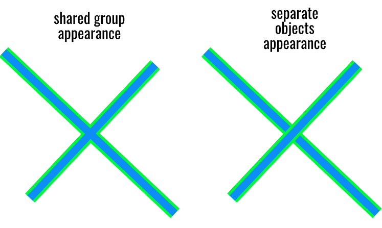
At the moment, the appearance panel does not work very well for groups. I think it would be useful to be able to give a hierarchy for strokes and fills for the whole group. For example, the ability to display strokes for all objects on one hierarchy level, instead of one above the other.
-
 Hi, Convert to Art Text and Convert to Frame Text are present and very useful in Designer and Publisher. Please can they be added to Photo, as it's basically the same text engine, surely, but the lack of it is a real pain! Literally couldn't believe it wasn't there since its in the other two. Thanks, Chris
 -
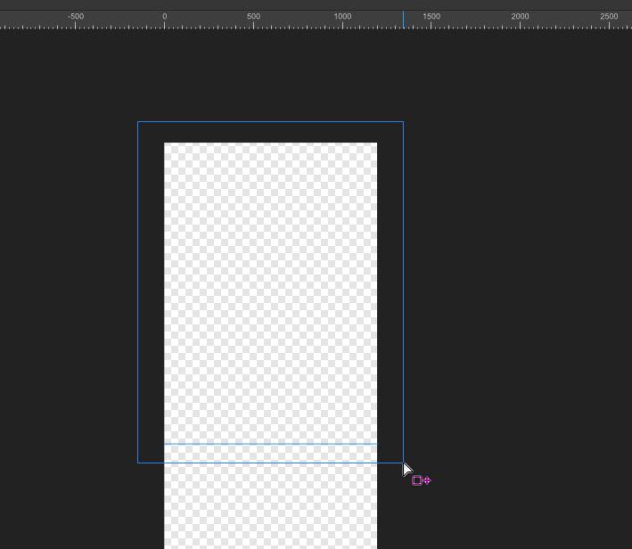
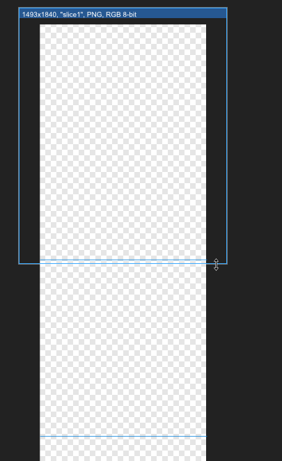
 Problem description I'm using Affinity Designer 2 Export Persona feature. I want to crop a long screenshot and export it. I divided them using guide lines and then went into the Export Persona panel. However, it failed to automatically capture my guides. This is very inconvenient. Expected result I hope that Export Persona can refer like Photoshop slicing tool, automatically identify my guide lines, and provide a quick cutting and export method without requiring me to manually cut the image. Thank.
-
 Reported and requested by serveral customers since v1. Could the grey page border and what not be hidden in at least preview mode in Publisher. More history:
-
- 1
-
-
- feature request
- suggestion
- (and 1 more)
-
This is an old need, since the publisher beta version was released, almost 5 years ago, with 10 pages of comments here on the forum, how long will the affinity team ignore users on this issue? I created this new topic so that the other one does not continue to be forgotten, since it is in the feedback archives of version 1, but it remains a necessity in version 2.
- 5 replies
-
- 5
-
-
- feature request
- text frames
- (and 1 more)
-
Hey Serif staff I've had good use of the knife tool and I almost always use it with guides. Unfortunately, the line that the knife tool cuts along is drawn with the exact same blue colour as selected objects and the default colour of the guides, so I think you should change the knife tool colour to... red maybe. And before I suggest it, yes, I know you can painstakingly change the colours of the guides from document to document; that's not the essence, it's that I'm suggesting a usability improvement that always benefits everyone. 📐🤙🏻
-
 Nice job on Affinity 2.0. I already purchased all apps. FEATURE REQUEST: It would be nice to see a type of VECTOR ERASER in Affinity Designer 2 that would allow us to quickly erase INTERSECTING LINES. This can dramatically increase productivity with illustrations. See attached video. Thanks!!! I am enjoying 2.0 !!! vector eraser demo.mp4
- 13 replies
-
- 7
-
-
- eraser
- vector eraser
- (and 4 more)
-
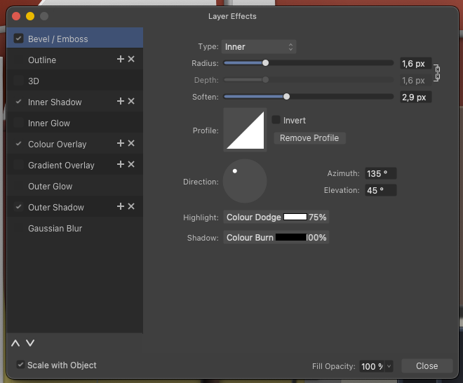
I spend a huge amount of time over the year and even over a working day changing defaults in the FX window. The assumption of the user interface is obviously that this is functionality only used occasionally by the customer, but the opposite can very much be the case. For example, I change the Bevel & Emboss type from Pillow to Inner every time I use it. Thousands of times over time. This makes using Designer on the iPad a particular pain in the arse. Could it be possible for this dialogue to have a menu with options such as Set as default and Reset to defeaults (in a suitable place on the iPad as well). Then you could perhaps also save Scale with object as default. 🙂 I know about workarounds, styles etc. but am looking for a non-workaround based solution. Thank you for this. 🙂
- 4 replies
-
- 1
-
-
- feature request
- suggestion
- (and 1 more)
-
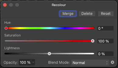
I've used the recolor layer to use copies of some objects (groups with several objects or bitmap objects) in areas of the illustration with a different colour or hue, I just had to fine-tune the colour to the new surroundings and to my surprise, the starting point is, for example, HSL 0.100%.0 = glowing red: Can we please get a colour picker in this dialog so I can quickly select the colour I want to recolour the selection to - or use the colour picker somewhere on the selected object so I can use the object's own colour as a starting point instead of the glowing red default colour: It will be a quick fix that can shave some silly wasted seconds off an otherwise trivial workflow. Thank you. And maybe the default colour in that dialog should be neutral - HSL 0,0,50 / RGB 128,128,128?
-
I edit a lot of gradients on a lot of objects, either after copy styling to a new object or I do it on a lot of duplicates, to either vary a tiny bit from each other to give an illustration a more natural look, or simply to adapt a copy of an element to different lighting conditions or give it a colour cue to fit into the part of the illustration it has been moved to. I miss the ability to adjust hue or saturation or lightness for ALL gradient stops by simply dragging the slider for e.g. hue when the object is selected. Could also be great if it worked on a selection of objects with gradients (could even then apply the change to the fill on objects with no gradient). Couldn't this be an option with a modifier, Command + drag slider, whatever? It would really be a life saver for me. This might be of most value in scenarios where some nuance or saturation errors around a design need to be corrected on a number of objects, perhaps even close to deadline and under pressure. Technically, it must be doable within reason, and therefore perhaps a low-hanging fruit. 🙂
-
 I know I'm not the first person to request this; apparently a couple requests were made back in 2015 and it still hasn't been implemented. In Adobe Illustrator, when you export to SVG, all of the various hidden layers are exported as well, with display="inline" and display="none" being put on visible and invisible layers, respectfully. Part of my HTML5 game is built around showing and hiding various layers of an SVG, using css classes to show different layers at different times. The build pipeline for the game takes Illustrator's odd converting of layer names into pseudo-html-safe strings and reverts them to be used as class names on the elements, and I was happy to redo that bit to function with however Designer outputs its SVG and re-prepare it for use in my project. But Affinity Designer just removes the hidden layers, period. There's no option to NOT have it remove the layers, there's only an option to remove additional layers for some odd reason. I get the reasoning behind wanting to optimize SVG for the web, but that should be an option left for me to decide, not have it dictated to me by the program. I have an SVG optimizer already in my build pipeline, and its tailored to my needs, meaning it doesn't remove the hidden layers I want to keep while still allowing me to remove bloated pixel data that might be left over. Why is turning off this unwanted optimizing not an option in Designer? And more importantly, why is it still not an option after apparently five years of it being requested? And before it's suggested again, no, just unhiding all the layers is not a suitable work around. It's tedious to have to make sure every nook and cranny of a complex SVG is unhidden just so it will export, and couple that with the fact that I have several of these SVGs, and it's just not worth the hassle. Plus, it's nice that the SVGs inherently look correct when viewed outside the game window because their initial hidden/shown properties are kept, while still being able to work correctly. I was recommended the Affinity suite as a cross-platform replacement for Adobe's suite (I'm basically using a decades-old version to avoid the subscription stupidity). But this behavior (coupled with the lack of support for opening AI files natively - though I can understand why for that) is a major deal breaker...
 -
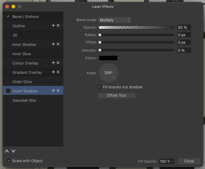
I suggest a Reset/Clear/remove all effects button in this dialog. It's tiresome to start over for example when the object is a copy of an object with several fx you don't need in the copy. As there is no OK Cancel options in this dialog a confirmation dialog is mandatory.
-
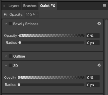
I use this dialog constantly, day in and out - it can float above my illustrations and updates to show FX for the currently selected element which is awesome. Unfortunately it takes up quite a bit of screen estate so I often close it only to reactiveate it minutes later. Can it be modified to function as a collapsible element that can be reduced to just the title bar and folded in and out as needed? Just like panels. This may be what you've tried to achieve with Quick FX, but the settings I need are always hidden, so it's not so quick to use. No good:
-
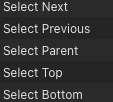
I'm a little surprised that all blending modes have shortcuts, when some of the more common operations don't have shortcuts on the iPad, which I use non-stop with a keyboard when I'm not in the office, because it's so time-consuming and interruptive to use the tablet interface, so here's a suggestion - as an example: Select commands! Especially Select parent - a life saver when I have selected a child element by accident - and in many other scenarios. Firstly, it will make it easier and faster to use an iPad Pro with a keyboard - and even better, it will enable you to take your work routines and muscle memory from the desktop with you when travelling, visiting work, on planes and in public transport. And just focus on working - not stumbling around in user interfaces. And, please, as suggested seperately, add a "Select all on current level" (fx nested under an object" - I use this very often when I have modified an object inside a group or nested inside an object, and need to quicly select the rest of the objects and paste the style or FX. Thanks! 🙂
-
Hi Serif staff Since the beginning of Affinity, the icon for converting to curves in desktop applications has looked like this: In other words, both an icon that tries to illustrate the functionality - and then a very wide text description on top of it. This is a rather extensive and unnecessary waste of screen space for a functionality that is presumably mostly used by experienced customers who can make do with less, and who most importantly understand a simpler and smaller toolbar button. On top of that, the icon as I remember it looks different in the iPad applications, here it is just an icon, but a completely different icon with a triangular symbol. I didn't realise until late that the triangular icon was actually convert to curves, and this confusion is natural when different icons represent the same functionality. I therefore suggest that you reduce the toolbar button to just a square graphical icon with no text and standardise the icon between the desktop and iPadOS versions of Affinity.
-
I think there is too much manual labour in inserting content in picture frames and that one of the options for inserting content is hidden in the left menu: I recommend that double-clicking on an empty picture frame activates the insert file dialogue I recommend that you consider a small row of small icons over a selected content element, where an empty picture frame could have two or three small icons (not just in this frame - use them as a general UI concept) 1) Insert or replace image (if one is already inserted) 2) Paste image as content icon (currently only in the right-click menu) 3) Clear Picture Frame icon For me, this would be functionality that would make work faster and easier, especially on the iPad. As a bare minimum a bit more context sensitive options in the right click menu.