Search the Community
Showing results for tags 'dark UI'.
Found 4 results
-
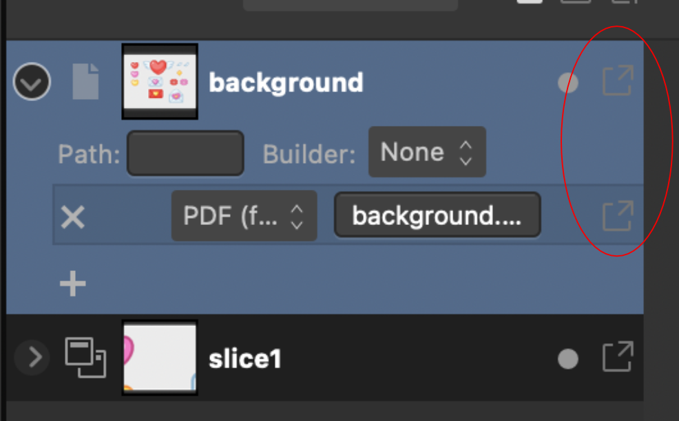
 Please fix the icons to contrast when the menu item is highlighted in blue. The icon will disappear. On the screenshot is the most painful place in ui, but wherever there is a blue backlight, the icons do not change their state, because of this they are hard to read
-
 Some brushes and assets are really hard to see on the dark ui on iPad. Anyone know how I can make them more visible?
-
 Hi, Today ordered a copy of Affinity Photo afterall while I was close not to (contradicting my usual Serif support: update = buy without checking if I would need the new features). Have been a loyal Serif supporter for quite a while (actually an active one sometimes on other forums and email lists). So far I was always very pleased with the Plus series despite some issues here and there. Even bought additional products like kits and books just for the sake of supporting Serif financially to help keeping them in business. Affinity betas and apparently the final releases of Designer and Photo haven't shown (much?) improvement in long startup time. Together with the horrible dark UI it turned out I always was reluctant to run Affinity rather than Plus. Don't think that reluctance will change, though. Other than that so far Affinity seems to be an affordable treat. Even Photoshop Plugin support seems to be better than in PhotoPlus which is awesome. I understood a light UI is being worked on or at least on the to do list. Not sure if startup time CAN be improved much with the bloated .net dependency of Affinity for Windows. Both issues are real game spoilers for me. Initially decided to wait with buying until a light UI is included but somehow I wanted to stick to support Serif ... for now. Will wait and see what happens but considering my reluctance to starting up an Affinity product todays purchase might be a waste. I hope Affinity DTP won't have the dark UI as well! That would be totally insane although I find a dark UI for a constantly used tool the worst idea in general anyway. Good-looking, totally unpractical and only useful for things that are occasionally looked at. For constant use it's eye-straining with the high contrast between project and UI around it as well as low contrast between UI background and hard to recognize tool icons. Same for the dark hardware hype: 'cool looking' black keyboards, video recorders, telephones, car dashboards etc. with white tiny letters on them (or blue light emitting!): white text on dark background can be read if you focus but black text on white or light grey can be read from further away or even if you don't totally focus on the text. What's next? red keyboards with orange text on them? Serif, developer of an outstanding piece of DTP software: PagePlus ... is straying away in several areas as it seems. E.g. the -cool looking- website: huge, I mean HUGE screen filling USELESS images in the background as well as foreground with here and there text in between or put over, which can be found if you browse 10 screens down (after you first click the '>' button on the main page which on itself contains no info at all. There's no visual overview to perceive; there's no way to go quickly where you can find the info you need. Serif, DTP guru's totally missing the point: what's the holy main rule in DTP? It's that content, true information is the main focus and that images should ONLY be added if they supplement the content while use of images should be as less as possible. Definitely no use of too many images and images that do NOT any value to the text. Yes, today we have the means for stunning effects and exciting electronic entertainment. But old websites, movies and educational books are BETTER: they supply information, content in efficient ways leading to more effective use of time, information and perception of the message trying to be shared. I don't know what Serif is up to. They tend to stay humble and focus on practicality: (customisable) well thought effective UI layouts, well thought-through tools, avoided bloat, strived for consistency between products and , All highly aimed at workflow efficiency, productivity and even affordability. Now they seem to stray away from their initial highly appreciable professional principles with going for aesthetics over efficiency. Anyway, I'm excited they started from scratch with Affinity, that it supports PS plugins, disappointed in it's bloaty .net dependency, still humbly waiting and see what happens with Affinity but I cannot deny the fact I don't like where Serif seems to be going. Hate the fact AGAIN switching file format after having switched between brands over the years and finally satisfactory set myself with Serif. Don't really mind their website but it's interesting to see how Affinity is developing. Once there's a light UI I might like Affinity better eventhough I already like the recognisable tools and improved tools in it as well as the smooth UI performance (so far). Not having used it much yet no idea how stable it will be (forum bug reports can give a frightening impression but that applies to any forum about bug reports: Plus series also isn't nearly performing as bad as the forum messages imply). I still am not sure already to switch to Affinity (perhaps stick to Plus but how long will plus be able to install?) for my more important projects (file format): it kind of sucks file formats come and go over the years: old projects I can't open anymore at all due to old software not even installing anymore and due to price increases I several times switched brands. Everything digital seems temporary and not lasting. Glad txt, csv, tiff and jpg are still in business; wish there was a lasting image format supporting layers. I don't really trust on lasting pdf because it is Adobe: they act too commercial. Roberto
 -
Hello, Is there an option to switch to Light UI colors? I have not purchased a program yet, I can't find a demo, so it's hard to tell what the program has to offer. I bought Pixelmator a while back and I HATE it's dark UI. It's just plain horrible. So I don't want to end up with another software where the contrast is not good enough between UI icons/text and I have a hard time seeing it. If there's no such an option, hope you guys will consider it.