Search the Community
Showing results for tags 'cosmetic'.
Found 4 results
-
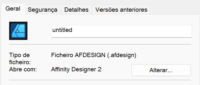
 A purely cosmetic bug, but document icons have a black border around them. It seems like the black area should be transparent, but instead is black. Happens in all Affinity apps. They are installed from the Microsoft Store, that bit of info might help track it down. Also, a better file description beyond "AFDESIGN File" would be nice. Thanks!
-
Small cosmetic item: The help system shows the Swatches Panel with two ICONS of traditionally-shaped painter's palettes - one for current color and another for current fill. Using 1.7.2 on Mac OSX 10.13.6. Instead of the traditionally-shaped palettes, there are two "strange" box-like icons. They function, but it took me a bit of close looking to finally realize that these had been substituted for the painter's palettes. I like the palette shapes much better than the square boxes. I suspect that this is a small cosmetic inconsistency with the program icons/help system.
-
There's an odd and ugly "floating" circular "close" element on some of the info panels in Affinity Designer. Visually it doesn't even seem to belong to the info box (see screenshot, the black thing with the cross behind the window). Personal Opinion: Why are there two separate elements offering the same function on such small panel? Wouldn't the normal and proper "Close" button be enough?
-
 Cosmetic, I believe. At some point, AFPUB will underscore in red any words that it does not have in its dictionary. If you, for example, go into edit mode and simple erase an errant character, the red line disappears only under the one letter (next to the erased one) - leaving a split red line under a word. What should happen, I think, if the word is now correct, the red line should be entirely removed - showing a correctly spelled word. The red line might disappear when you run through a full document spell check, but I haven't checked that yet.