Search the Community
Showing results for tags 'art nouveau'.
Found 3 results
-
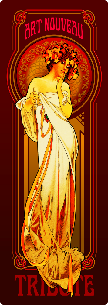
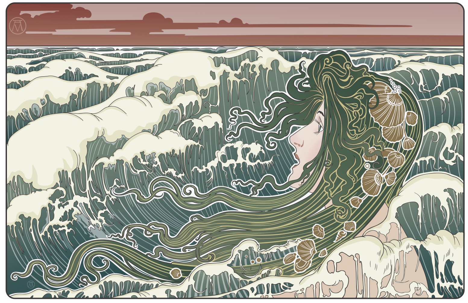
I've always been attracted to Art Nouveau imagery, particularly that of the brilliant Alphonse Mucha, who is largely accredited for starting that appealing type of graphic art. I wanted to wrap my mind around the specific aspects of the craft of which this practice drawing is the first attempt. I plan to do more Art Nouveau all vector drawings in the future, unlike this image that contains both vector and bitmap embedded files. Technically this image is some sort of blend of Art Nouveau and Art Deco, the latter being the successor of the first art movement, I guess. More on Mucha and Art Nouveau in my portfolio blog: https://communicats.blogspot.com/2022/11/art-nouveau-practice-drawing-01.html

- 12 replies
-
- 27
-

-

-
- art nouveau
- vector
- (and 1 more)
-
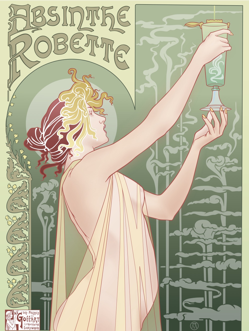
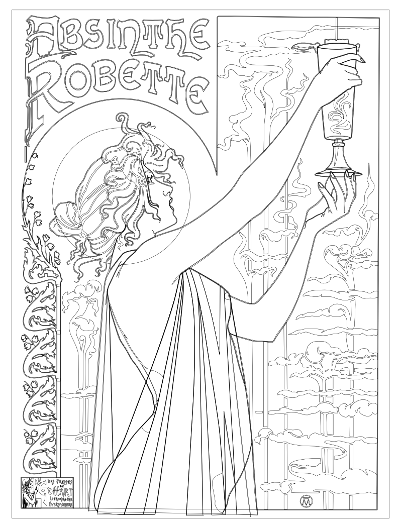
This is my second Art Nouveau piece (and probably my last as I'm ready to move on to something else). I based my version on a Henri Privat-Livemore poster from around 1896 or so. As I mentioned in my previous piece, I normally don't use the "effects" in Designer because I normally work only in pure vectors but the effects worked so well with shading on the skin in my last piece that I decided to recreate this piece as well adding my own little touches along the way. I chose this poster because I liked the composition and it had a lot of shading on the skin tones and I wanted to see what I could do with it using Designer's effects. I was very happy with the results. I hope that you enjoy. Thanks for letting me share my picture. Hokusai
- 17 replies
-
- 13
-
-
- absinthe
- art nouveau
- (and 3 more)
-
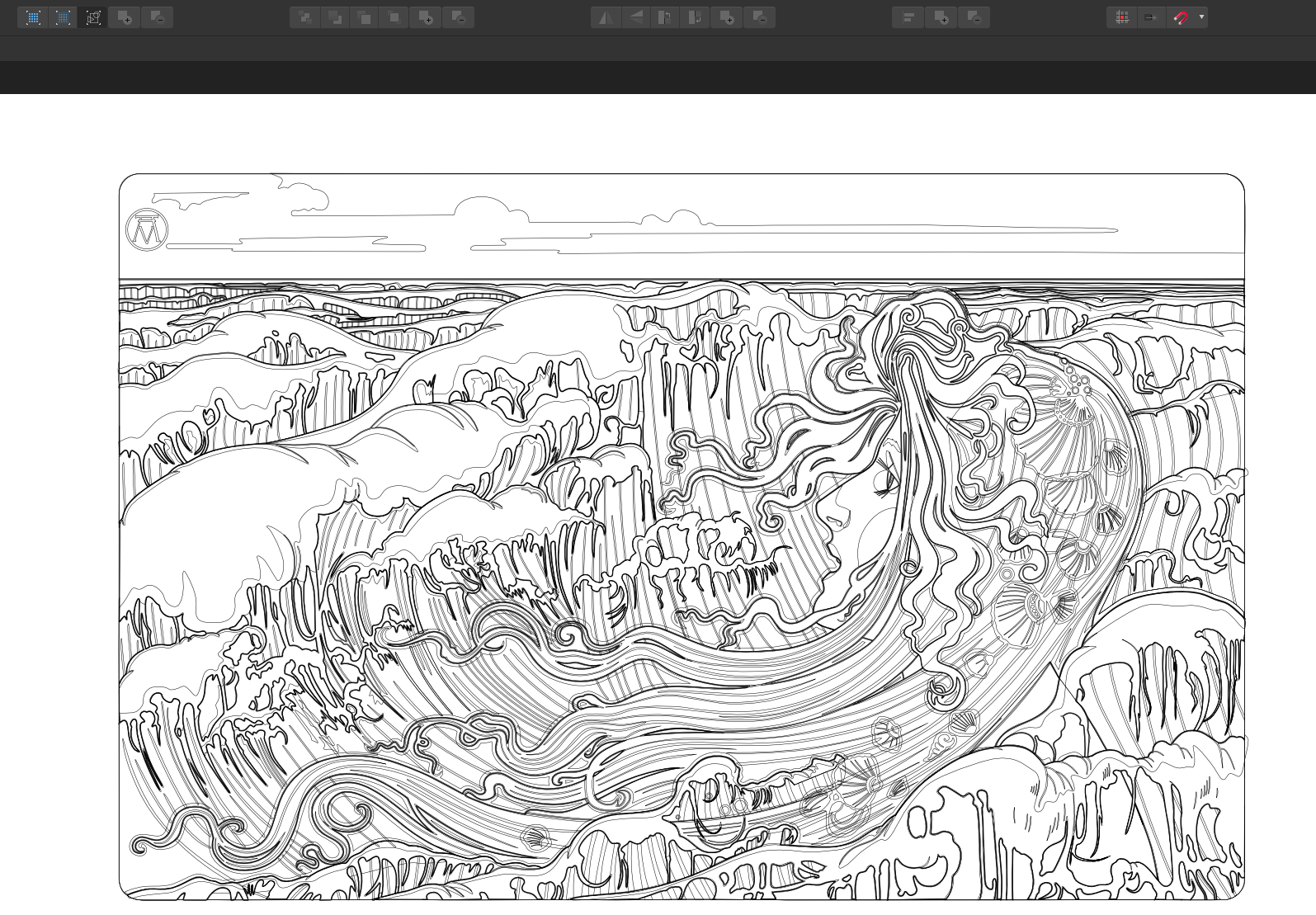
I have been wanting to do my own version of an Art Nouveau piece for awhile and I just happen to come across an old poster that was originally created by Henri Privat-Livemont and I thought it would be a good one to recreate with vectors using Designer. I added quite a bit more shading and some other minor things here and there. I normally don't use any effects in my work as I prefer to keep things purely vector but with this one I used two effects to help soften the colours on the face. The effects can easily be removed and it doesn't take away from the picture much but in the end I decided that it looked better with the effects. I've also included a view of the outlines that were used.
- 6 replies
-
- 10
-
-
- art nouveau
- vector
- (and 1 more)