Search the Community
Showing results for tags 'afd-3988'.
Found 1 result
-
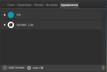
 I've noticed that the Add Stroke and Add Fill command labels at the bottom of the Appearance panel appear blurry whenever a text or group element is selected, and the commands are inoperable. However, for regular shape or curve elements, the Add Stroke and Add Fill command labels at the bottom of the Appearance panel are crisp and legible, and the commands are operable. (See screenshots below.) Not sure why this is. Perhaps the UI designers are trying to overlay a 'grey' version of the command labels over a 'white' version when the commands are meant to be inoperable? If so, then the apparent blurriness may be due to misaligned 'grey' and 'white' versions of the command labels. Please fix. Thanks.