Search the Community
Showing results for tags 'Pantone'.
-
 I would like to know where the pantone libraries are stored under Affinity apps V2. My thanks in advance for what may be possible.
 -
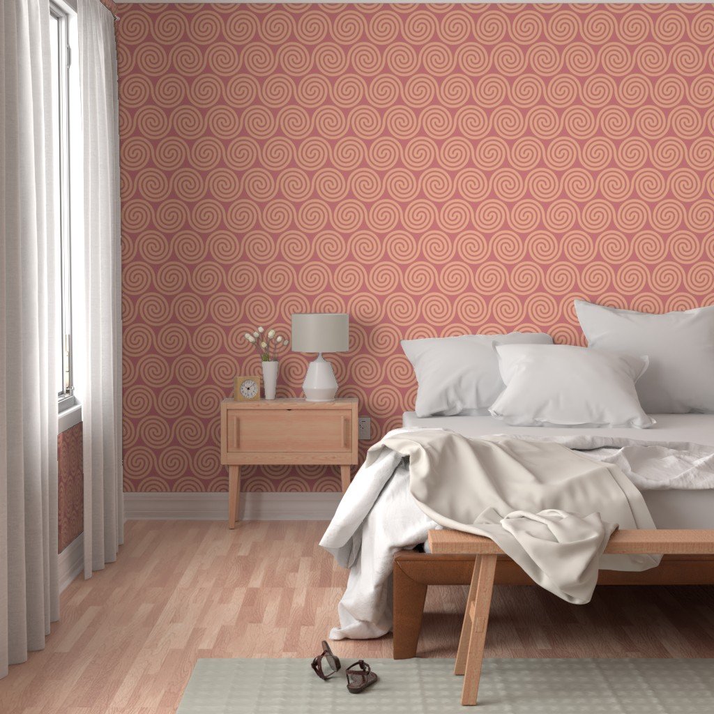
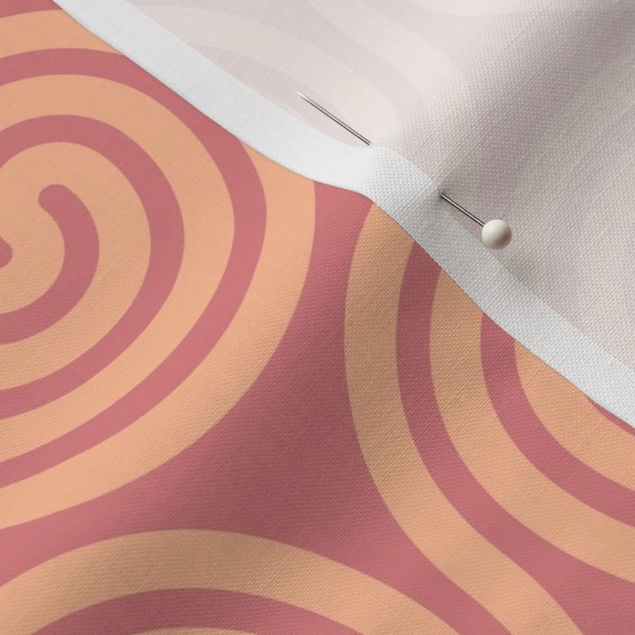
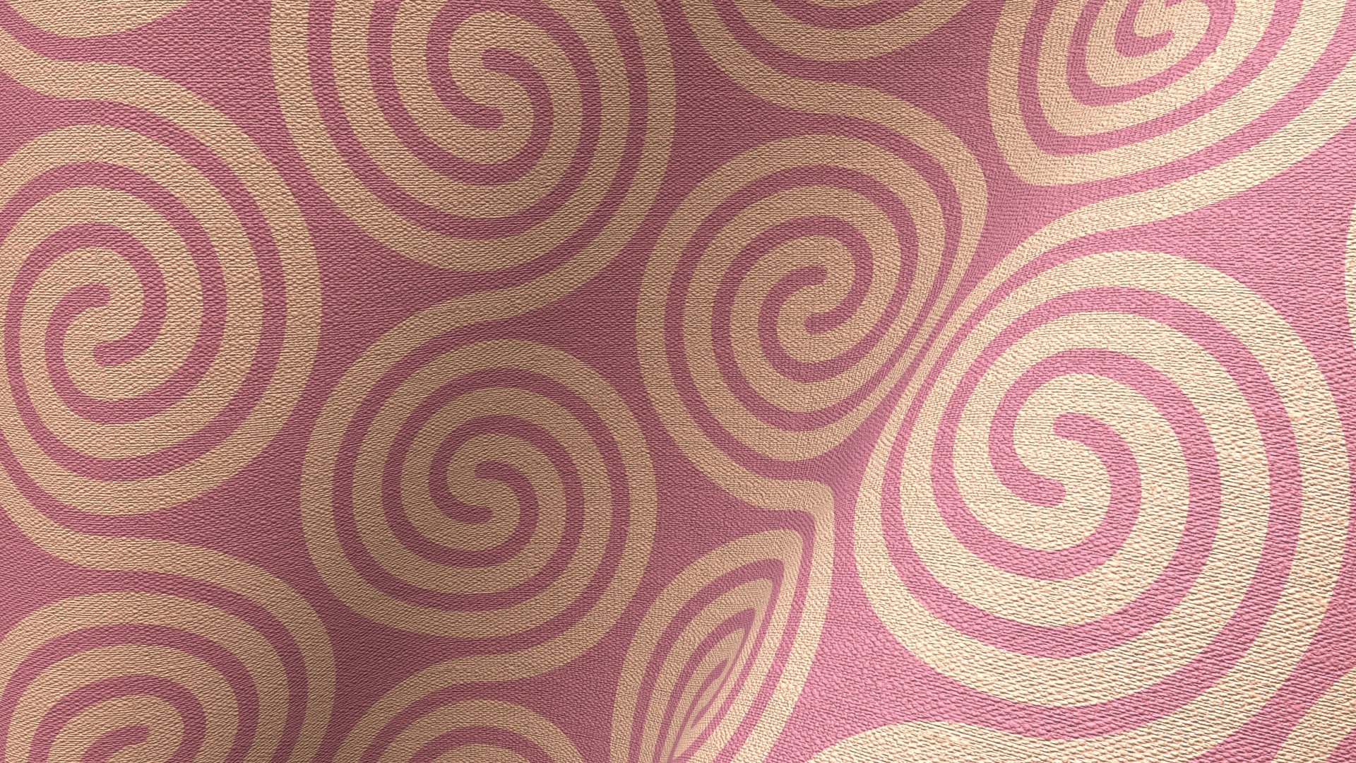
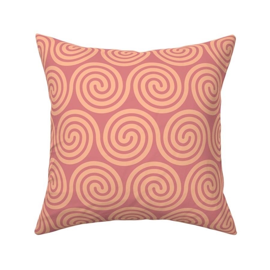
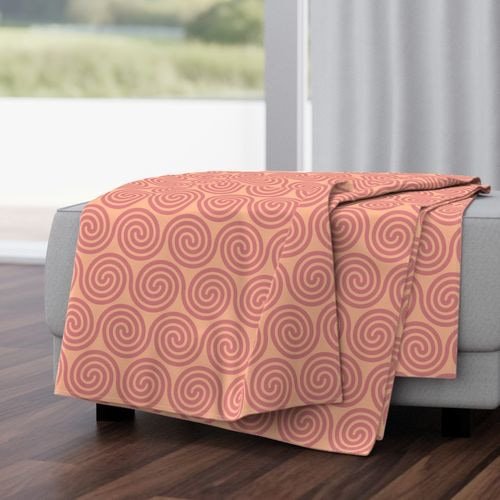
 I thought I'd take Affinity Designer's amazing new spiral tool for a spin in a recent Spoonflower competition. Spoonflower is a print-on-demand service for anyone who wants to buy printed fabrics and wallpaper. These spirals incorporate Pantone Peach Fuzz and Peach Blossom. Peach Fuzz is the 2024 Colour of the Year. The image above was rendered in Cheetah 3D. The remaining images are Spoonflower mockups. These patterns can be bought printed on demand; not just on fabric and wallpaper, but also as ready-made duvet covers, pillow cases, table cloths and napkins. https://www.spoonflower.com/en/collections/796023-spirals-by-geometrical_design?productType=FABRIC I'll be adding more spiral patterns to this collection over the months to come.
-
 I'm in need of converting a PMS colour to CMYK. Can't find how or any forum posts which solve this issue.
 -
 Nel menu "Campioni" di Designer 2 sono disponibili alcune tavolozze con molte grazazioni di colore. Tra queste tavolozze, solo una contiene le sfumature (i gradienti) dei colori bianco e nero. Dove si possono reperire le tavolozze con le sfumature degli altri colori? Grazie.
-
 Honor Spot Colors in the export options seems to be not working with the Pantone swatch. How do I export a Pantone color to PDF?
 -
 Following the recent shenanigans between Adobe and Pantone, are there any news or concerns we should be aware of regarding Affinity support of these colour libraries? Many thanks in advance for any response!
-
 I found the following video. https://www.youtube.com/watch?v=xbOWrk300CI 3 minutes 14 seconds It starts about Pantone colours and then uses an example using an Adobe product. I have tried to find that colour using Affinity Designer, but without success. Yet I am new to this. So can it be done please, and if so, how? William
 -
 Hello, can any of the Affinity applications make a monotone photo using a specific spot colour? The documents are always printed CMYK (offset or digital) or just viewed as PDF, but I would like to be able to make the original in the client's PMS colour. Since time began (when 2 colour printing was still a thing – ha, ha, am I that old?!) I've made these by converting the original pic to B&W in Photoshop then dropping into QXP and adding 100% of a colour to the image and whatever a percentage (depending on legibility requirements) as a background. I'm hoping one of, or a combination of Affinity apps can do the same. Thank you. PS. Example photo section attached Monotone example.pdf
 -
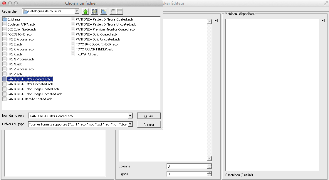
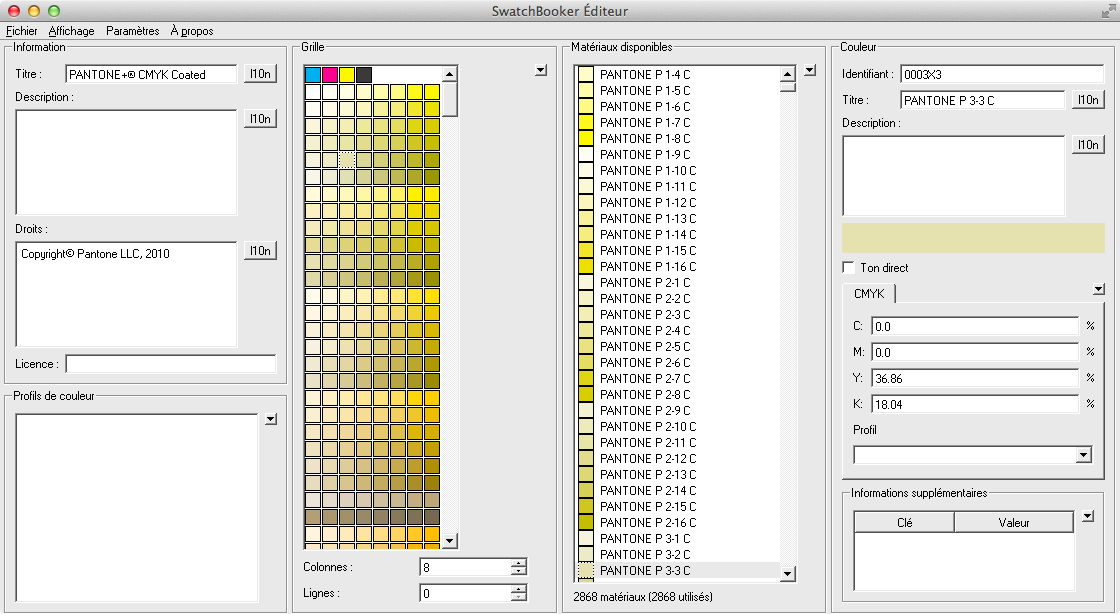
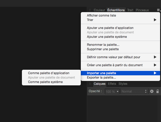
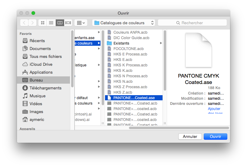
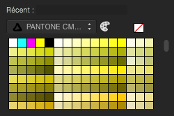
For those of you who needs Pantone colors support in Affinity Designer before the Serif team release an official support in it, here is a trick you can do. Firstly, you need an Adobe Illustrator licence to be able to do this, or install a demo version of Illustrator. Then you need to install SwatchBooker. http://www.selapa.net/swatchbooker/ Or you compile it yourself to get a Mac version, or you use it under Linux, or use it with Windows. Personally, I installed the Windows version into a CrossOver bottle and it works out of the box. Launch SwatchBooker Editor, in the File menu, select Open and choose one of your Pantone library in Illustrator. Then in the File menu, select Save as and select *.ase for the file format. Launch Affinity Designer and go to the swatches panel, click on the menu and choose import palette, as system or software, as you want. Select your exported *.ase color library. And that's it, you have loaded in Affiinty Designer your Pantone colors library.
-
William
-
A link to an article linked from a circulated email that I received from Pantone today. https://www.pantone.com/articles/colors/electric-pastels William
-
 Hi! I am working on a book design and got to a strange issue. I have a text set in black and have an illustration in two colors. Each color (black and Pantone) is a separate grayscale image. But when I try to export my project to pdf, either I get the composite black on the text, either lose my color separation on illustration. I've attached sample files and hope somebody can help me find a working solution. colortesting.afpub colortesting-pdfx1a2003.pdf colortesting.pdf
-
An email from Pantone links to the following. https://www.pantone.com/articles/colors/colours-of-vitality So, I decided to try to produce some artwork using the colours in that palette. It seems to me a good idea to make the design of the same size and resolution as needed to produce a greetings card at the Papier facility so that if I produce a design that I like, then I can order a greetings card and all being well, frame it. The palette lists Pantone graphics colour numbers and I rather like the Pantone 7697 C colour, so I thought that I would try to produce the design using the Pantone colours in Affinity Designer, even though export to a jpg file will lose the Pantone codes. So I searched for 7697 in some of the Pantone palettes in Affibity Designer, omitting the C at first, but all I have found is a deep teal colour, very different from the colour shown in the web page. So can anyone explain this and how, if at all, I can get the colour shown in the web page please? William
-
Does anyone here have access to the Pantone metallic chips book please? https://www.pantone.com/uk/en/metallic-chips-book If so, could you possibly say something about the general look of Pantone metallic inks when printed please? For example, is the effect almost like a mirror, or is it more like a gold effect car, not some gold plated car out of a movie or the like, one of the metallic cars that are production models in everyday use. Is the effect like gold leaf on a manuscript, or is it more like the gold blocking on the spine of a book? Does the range include gold, silver, bronze and copper please? If so, could you possibly quote a few numbers please so that I can look at them in Affinity Designer please and try to include them in some experimental artwork? William
-
Affinity Designer includes support for Pantone metallics in its swatch collection. Separately, not using metallics, I have been producing artwork for greetings cards and sending files to a specialist business and receiving hardcopy prints in one-off quantities, by paying a relatively small fee. https://forum.affinity.serif.com/index.php?/topic/138654-artwork-for-greetings-cards/ If I want to get a hardcopy print of a design that uses metallic ink, does anyone know how that can be done, or is it enormous quantities only in practice? William
-
Can one save a file and retain Pantone spot colour information please? Say from Affinity Designer. If so, which file type or types please? I would like to try to produce some artwork with a Pantone spot colour. In fact a metallic, but the question is generic. I know that I might not be able to get a print using the spot colour at present, but I would like to produce such a file for the experience and as chance favours the prepared person, if a chance arises I would have something ready. William
-
 I want to use the color PANTONE 10101 C, this color should be in "PANTONE+ Metallics Coated" swatches but it isn't there
 -
 I've seen a number of discussions, but somehow they never really "solved" it, as it seems. The problem I experience is that when using a PMS color as a SPOT and OVERPRINT color in a separate layer, the export fails to retain this. Not only is the layer renamed, but also the PMS color (the actual PMS, not the layer) is lost. When importing the pdf, the PMS color (layer) is converted based on CMYK. This happens both in Photo and Designer. What did I do? I've added the color (PMS 803 U) as a Global color, with SPOT and OVERPRINT selected. I have selected the item, filled it using the bucket and then renamed the layer. I've saved it using Export >> PDF >> Preset PDF/X-3:2003. Here I kept everything standard, including: overprint black and honour spot colours. Then, when testing, I see that the two layers are there, but the PMS color seems to have been changed. The printer says this isn't possible with Affinity, but I hope it is. Would hate to have to go back to Adobe... Any help is highly appreciated!!
 -
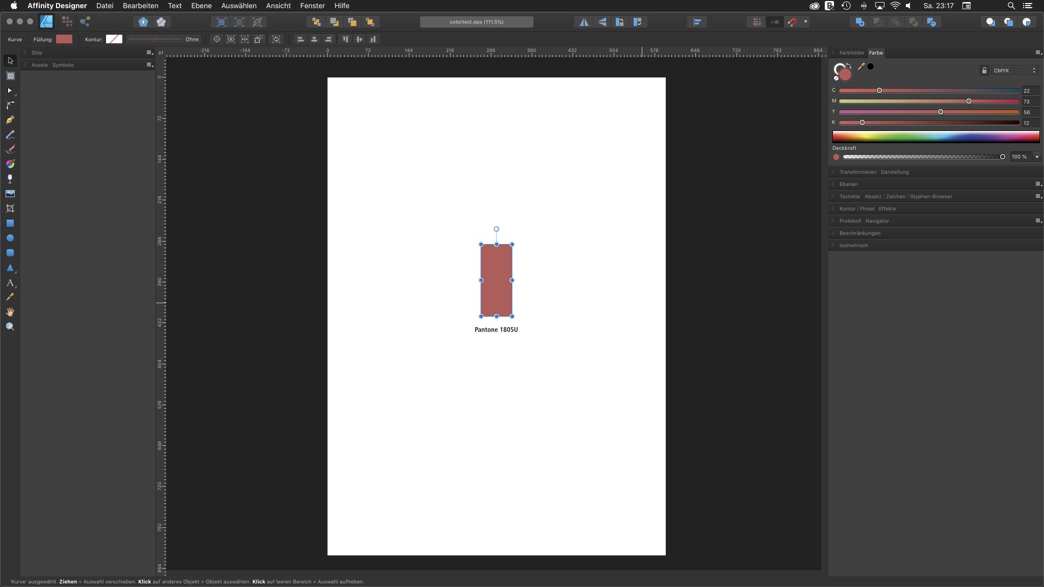
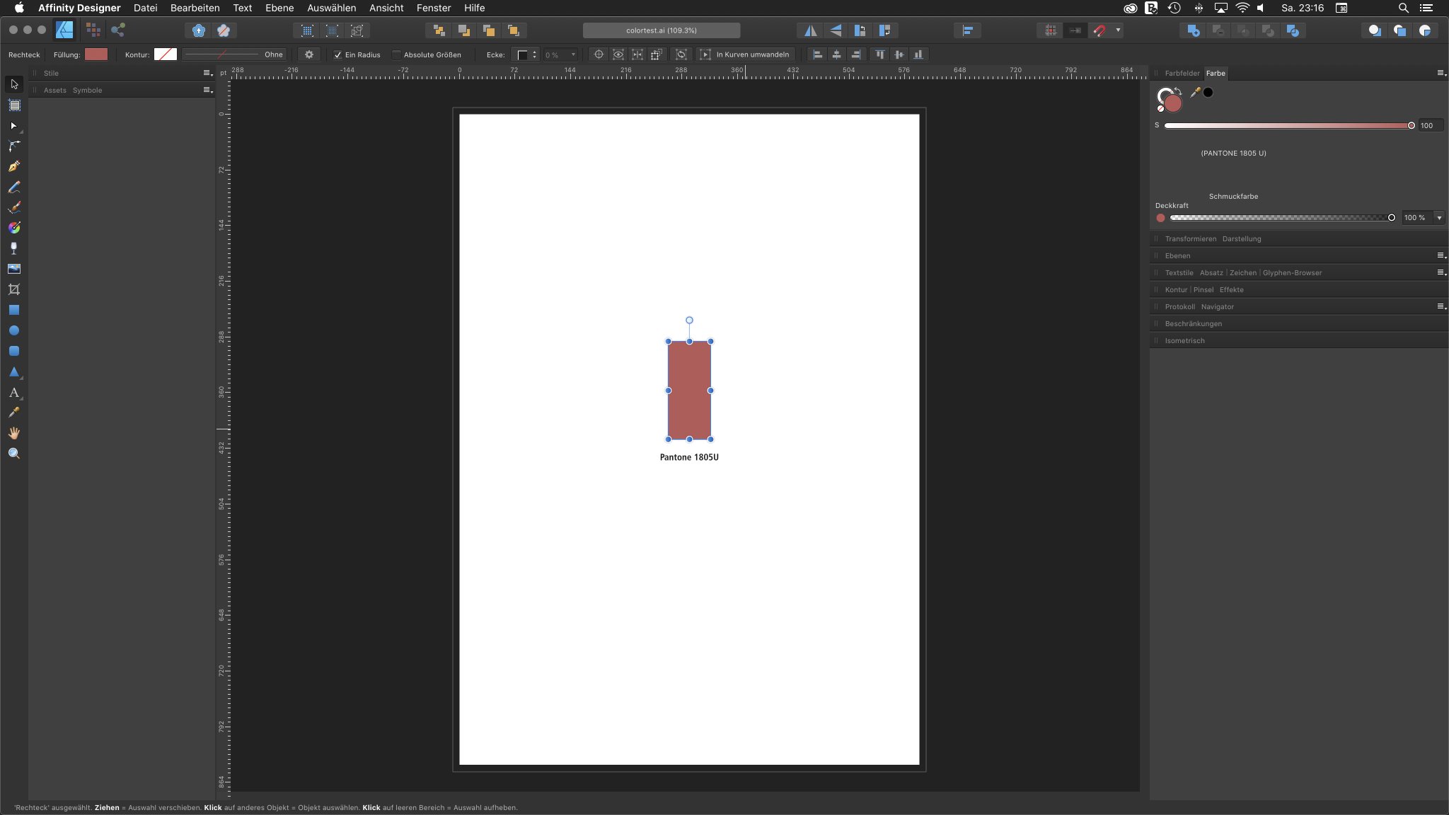
 Hello. When opening Illustrator files in Affinity Designer, i would like to keep the spot colors. If i open an Illustrator-.eps file in Affinity Designer, the Pantone color is automatically changed into cmyk. When opening an Illustrator-.ai or -.pdf file in Affinity Designer, the Pantone color is maintained as spot color. Does this have something to do with my color settings or is this a general problem with .eps files? Thanks in advance for advice.
- 2 replies
-
- 1
-

-
- conversion
- pantone
- (and 1 more)
-
 Hi there! Quick question. I started making global Pantone colors for my doc. I marked only two of four colors as spot colors. When I select "edit global color" to switch them to spot colors, the option isn't in the little dialogue box that pops up. Is there somewhere else in the program that I can edit that option? Thanks in advance for any help with this! Stephen:)
-
I’m showing a client designs for a logo by screen sharing using zoom but when I send her mockups she is seeing a different colour from what she sees in zoom. I’ve tried viewing pdfs, jpgs and png files on various screens in different software and I’m seeing the same colour with slight variations as you would expect. When I show her the pdfs on my iPad using zoom she sees the same colour as when I show her Affinity on my iPad. She really wants the colour she sees on zoom. I’m using a Pantone and have all the details for that Pantone. I realise this isn’t really an affinity issue but this is the first logo I’ve designed using Affinity for iPad so I don’t know how close the Pantones match to print. Does anyone have any suggestions on how to see what the client is seeing and give them a closer colour match?
-
 I can't get the search field in the Pantone palette to find anything. Anyone else have this problem?
 -
 I've exported a document with a spot colour and selected "honour spot colour" in the export panel, but the swatch does not display in the colour bars in the PDF?
 -
 Hello everybody, I have designed a logo in Affinity, chosen PANTONE colours and exported the file into PDF. My client is having troubles with it as he says printers are opening the file in CMYK, PANTONE colour don't exist anymore. What am I doing wrong? How can I export or save my file for a final art for printers? Thanks for your help.