Search the Community
Showing results for tags 'ux/ui'.
Found 9 results
-
 Coming out of this discussion I noticed that when exporting to PDF/X-3, the checkbox "convert image colour spaces" has no effect on the result. Image colours will always be converted, whether the box is checked or not. Is this a bug or is this by design? In case it's by design, could you make it clear what's going to happen with the colours? Maybe having the box checked and greyed-out (inactive) would show that this will always apply? If you change the box, please also do the same with the PDF/X-1a option. Right now, the box is disabled but unchecked there, which is giving the wrong impression that there won't be any conversion applied. BUT I'd rather this is a bug and it would be possible to have RGB images alongside CMYK in PDF/X-3 files. ☺️
 -
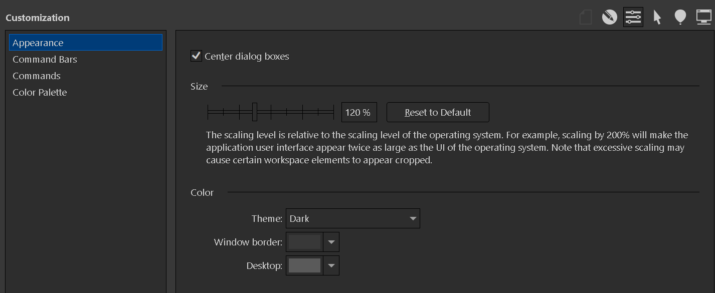
 CorelDraw design suite there is a global setting for adjusting the scale of the Ui (see screen cap attached), in addition to modification of the tool bars, small, medium, large icons, et cetera. When I look in Affinity Designer Customizations' menu, there are extensive ways to tweak the tool bar as well, but I can't find a global setting where I can adjust the scale to compensate for use of a large display. The tutorial focuses more on getting right into drawing technique and work flow, but if there's a primer on customizing the interface, I've somehow looked right at it and not seen it. Help, please.
-
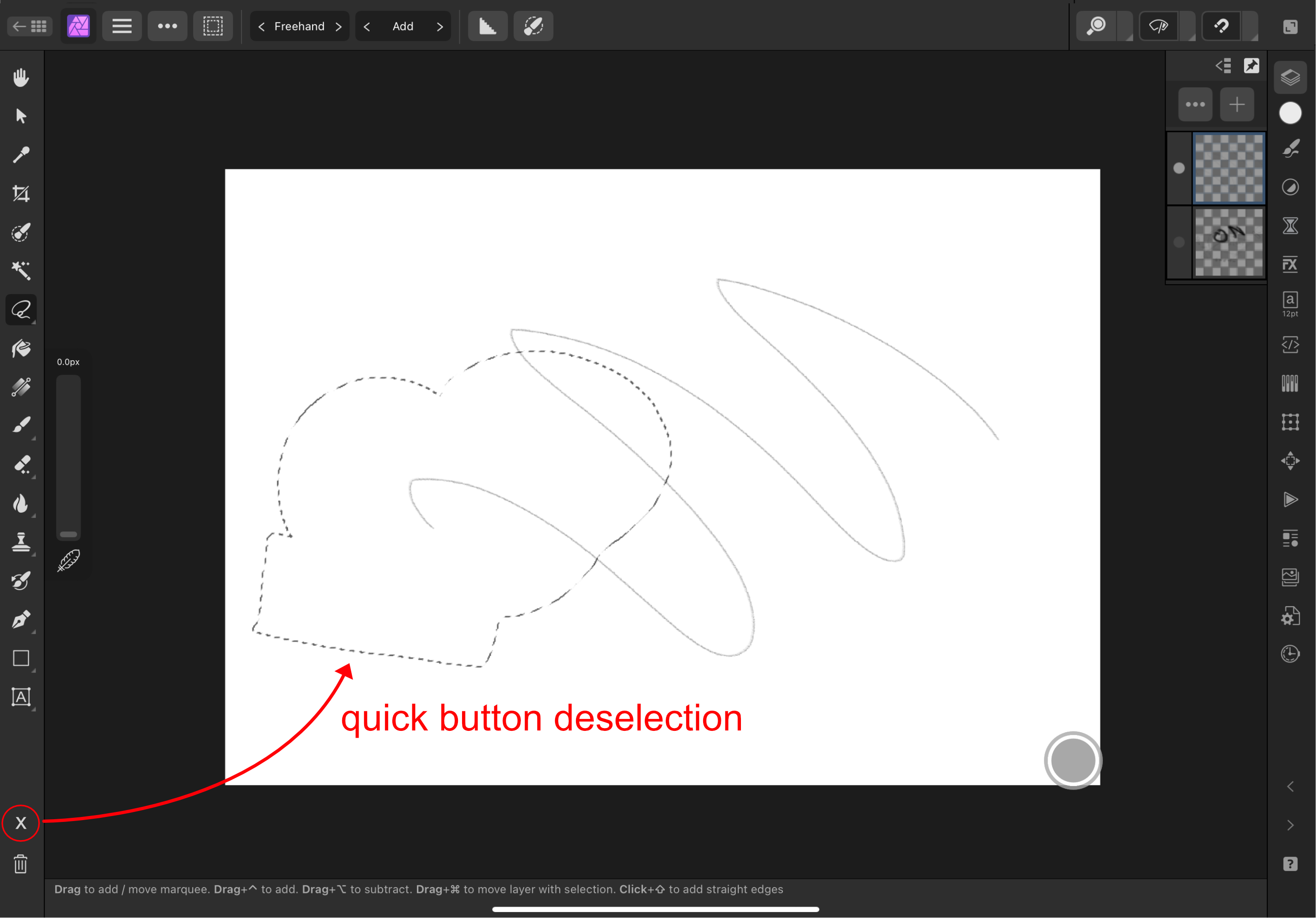
Hi, I congratulate the work that has been done in afinity, I am a user since version 1, I like it a lot, in the last months I have been testing the use of the ipad version, and I have found a couple of things that I think could be improved, here I share some images. quick deselect button paste inside, front and back less clicks preview circle for gradient and transparency preference to turn off rename layers more quickly
-
 Hi, As mentioned in the title, Affinty suite should include support for "density-independent" pixels (also known as 'DP') that are primarily used during Android/ Material Design development. The specification can be found on this website, but essentialy they are similiar to Apple's 'points' (pt) which is already supported, and very similair in function. 'dp' varies by using 160 pixel/inch base instead of 163: Android presets for phones such as the Google Pixel would be a welcome addition that use this new unit. This would really help me out as currently I struggle with asset creation / UI design for Android and always messing up the sizes when exporting. Since points are already supported, I would image adding this unit shouldn't be too much of a hassle (hopefully 😁)
 -
Hello Affinity, I would like to give you my money NOW. I really don't want to pay Sketch or Figma or inVision or Adobe XD or Framer X or Protopie or Webflow or UX Pin. I would love to buy a software from Affinity that enables the prototyping feature. Maybe a merge between Personas with added plugin to buy. OR maybe call the software Affinity Prototype or Affinity Interactive or Affinity Hybrid. I have been creating lots of Websites and User Interfaces, but I can't quickly prototype it to get my idea across. I have been working collaboratively with a multidisciplinary team of 50 designers/developers/business analysts. And when it's time for me to pitch I have to manually go into my Visual Studio Code Editor and create it from scratch using CSS and JavaScript. Still waiting for release date, Thank you
- 2 replies
-
- 4
-

-
- prototyping
- prototype
- (and 8 more)
-
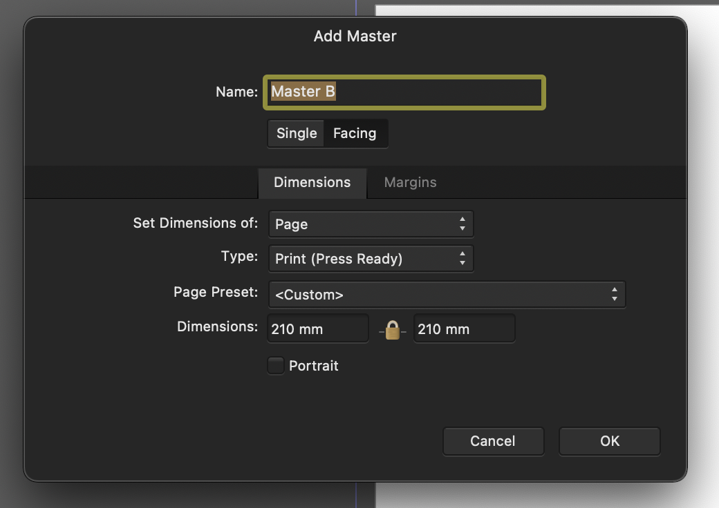
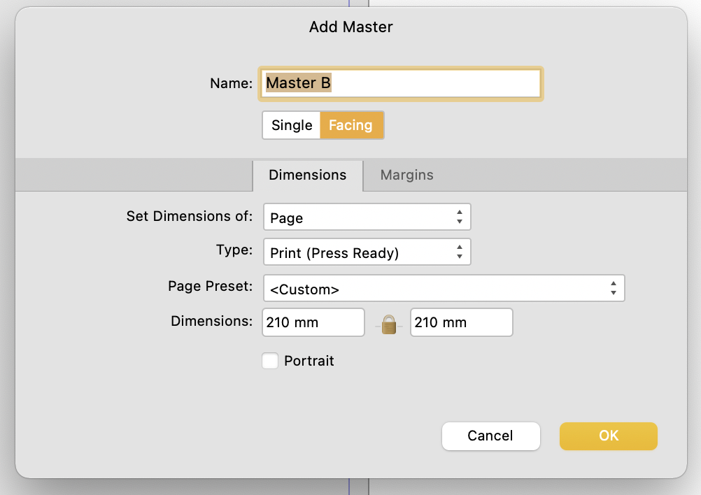
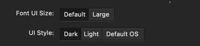
 I noticed this a couple days ago and thought it was a bug. So raised it in the bugs sub forum initally, but have since removed it. I first came across this in the New Master Page Dialog when you have dark theme on MacOS selected either in app or at an OS level. The visual feedback for the selected state of Single or Facing page toggle is ambiguous with the dark theme, but is reinforced through OS accent colour in the light theme. Dark theme: Relies on pushed button metaphor, yet the control - to me at least - looks/looked like a segmented control, suggesting that Single is highlighted. The context informed my opinion as the Dimensions Tab below is lighter and selected. I assumed that Lighter = selected. This "pushed button" metaphor is fine where there are more than two options using it and where one option has more than two choices. As seen in the preferences pane (below) the control with three options shows clearly which is selected. Not only does the wording of the context help but the selected option is the odd one out. From this I can infer which choice is selected in the control above which only has two options. However, when light mode is enabled (see below) ambiguity is reduced as the selected choice is reinforced through accent colour. TLDR: Could the colour accent used in the light theme be applied to the Dark Theme too please?
-
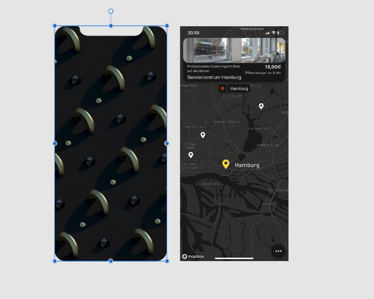
 Hi everyone, I'm new to affinity designer and have a question, that may have been answered before, but bec. I don't know the right terminology couldn't find. What is the most effective and easy way to shape the right picture like the left one? Thank you so much for your help! - Julius
-
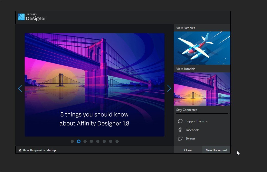
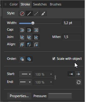
 On thing that I lke the most of using Affinity Designer is the Gradient Tool. Is by far one of the most satisfying tool to use, However, I think one minor change on it's behavior could greatly improve the workflow of using the tool. The gradient tool don't suport the color picker tool. That's very anoying when coloring, because some times I want to pick a color from a place and this reset the Gradient Tool. Other minor changes would be related to the Splash Screen. Why not have a open Document here too? And make the open Document or recent documents listed here, also having bigger buttons as well. Finally my last suggestion would be having a option to turn "Scale with object" default.
-
 Hi, I will like to see a slice tool feature that will allow me to slice my my designs and create html table. This will allow me to create html contents from my images/designs and also create hyperlinks. Where every slice will be a row or column in a table(tr/td). and each section of the slice can hold a hyperlink and more. It will now introduce export for web, which will create a html file with an inline css export to use for development. This will stop me from switching apps and will take AD/AP/Publisher to the next level to support web and see a good feature to support ux/ui design in prototyping And maybe later add a responsive feature to the slices made. Thanks Affinity team Please look at this. @MEB @Mark Ingram @stokerg @Sean P @TonyB