Search the Community
Showing results for tags 'ui'.
-
 I tried finding this question posted but couldn't seem to find exactly what I was looking for. I'm trying to modify a Mobile UI Mockup that I did in another application, I want to place it on top of a screen on a phone at an angle which involves screwing the imported image in Affinity Designer. I know you can get this effect using 'convert to curves' with a vector shape but I can't seem to find anything equivalent for imported JPEG or PNG images. I included pictures in a couple of links, as an example of what I'm trying to accomplish, in case I'm not being very clear. Any help with this would be very much appreciated! I'm sure I saw this being done in Affinity Photo but can't figure it out in Designer unfortunately. http://designshack.net/wp-content/uploads/iphone-mockup-psds-24.jpg http://visionwidget.com/images/2016/0123/Isometric_Perspective_MockUp.jpg Thanks very much!
 -
Hi guys, Latest project made entirely in affinity. Except the gif animation. https://www.behance.net/gallery/33966100/FoodJunky-Application-Design-Concept Cheers, Vlad
-
Hello At this moment, the input fields in the Affinity programs behave in a way that is not native to OSX. I don't know if this is a deliberate choice, but I feel like it would be nice if they behaved consistent with other OSX apps. I also noticed that not every input field behaves the same in Affinity. An example in the Transform palette: - When hovering over an input field, the cursor should transform to the text-selection icon. - Clicking in an input field yields the expected behaviour; you can start typing where you pointed the cursor. This works perfect. - When using the tab key to jump from field to field, I expect the content of that field to be selected so I can immediately start typing thus replacing the previous content. But right now, if I start typing, my typing replaces the quantity while the units (i.e. px or mm) stay put. I get that you designed the input field this way because in most situations, the designer wants to adjust the size in the same unit. But when this is not the case, a few extra actions are required to clear the input field. Often I want to use the expressions in those fields like "sh" or "sw/2" (which are terrific by the way!). So if I jump to the height input field and type "sh" and press enter, nothing happens because it keeps the px unit and thus the expression is incorrect. In my opinion, this wouldn't be a problem if the whole content of the input field was selected on tab-jumping to it; if I just wanted to change 200 px to 400 px I could type "200", and Affinity would automatically append "px" (as it does now), but if I wanted to use expressions, I wouldn't be hindered by the sticky unit. I'm looking forward to hear your opinion! Bauke
-
(not a feature, a simple change) I LOVED that affinity assumes you don't want to screw with typography during transforms, so that shift isn't required to constrain XY during transform. But then it blows that by being inconsistent on shape or curve transforms, which does my head in. This would be a simple change to make consistent across the board, and I can't see any good reason to not. Thanks again for this great app.
-
I have been using Affinity Designer for all my design-related tasks since may 2015. So here is just a current piece i'm working on - its a newsletter for government. But i also love to use AD for illustration and digital drawing and painting. Just because it is totally cool :)

-
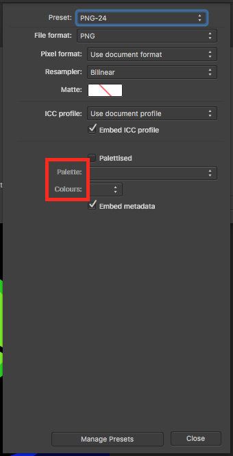
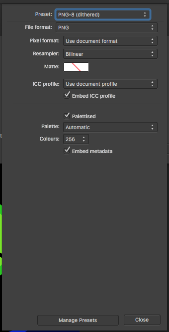
 Compare the below images from Export PNG "More" dialog: aliased text (when option unchecked) antialiased (when option is checked)
-
 Dearest Affinity Team, been using and loving Affinity so thanks heaps for that. One thing I feel could be improved is the way the colour palate states are displayed. When I work with swatches of colours, it would be great if, when selecting a colour, the colour palate always showed the last used state. For example, if I have used the swatches palate for selecting a colour, the next time I select a colour, the swatches palate is the one that is displayed. Or if I have selected a colour using the HSL colour picker, then the next time I select a colour, the HSL colour picker displays. Currently, I seem to be having to choose the swatches palate every time I choose a colour for a line or fill because the colour palate seems to default to one of the colour pickers. The eye dropper works well, but I think you could save people time by activating the colour upon selecting the colour. So rather than selecting a colour with the eye dropper and then activating it, selecting the colour also activates the colour. That's the convention for eye dropper UX. Thanks for everything, Dallas
 -

Please go back to the previous arrow style
Jilly posted a topic in Older Feedback & Suggestion Posts
I really dislike the new layer arrows. I find them incredibly ugly and distracting. Please go back to the previous style. It wasn’t broken and didn’t need fixing. -
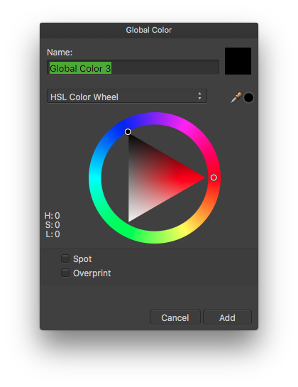
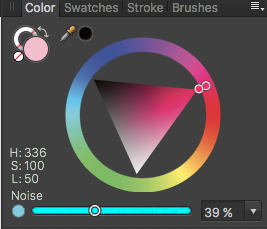
 Really excited about Global colors! Just a few notes: 1. The new Color Picker which pops up when selecting Add Global Color from the palette's hamburger menu is oddly sized, too wide. Also the color well is a rectangle while everywhere else in the UI it's circular. 2. The color of the noise slider doesn't match the selected color: 3. Also, the type on my non-retina mbp is blurry in the button labeled Edit Global Color, which appears under the new Tint slider in the Color palette.
-
Here's something to consider to enhance UX on Affinity products: Current situation: Currently all objects have 2 ways to be rotated: the blue handle at the top of the bounding box via hovering near a corner handle. Currently there exists no way to adjust a shapes Stroke attributes directly on the object itself. Idea: Remove the rotation functionality, since it is redundant, and turn the top handle into a UI control for setting Stroke weight, or perhaps a pop-up for any number of Stroke or even Shape attributes, DIRECTLY on the canvas object. Benefit: Working directly on the object and not having to rely on palettes makes the workflow much smoother and quicker, specially on mobile devices with smaller screens, where physical size is still a limiting factor, as well as for editing while in full screen, hidden studio palette mode. As professional creative apps transition into a multi-touch and stylus enabled operating systems (iPad Pro, ahem), users will be expecting to interact with objects directly on screen, not via abstract palettes. This setup will be friendly for Pencil input. However, this same directness of on-canvas edibility while on limited screen real estate is of benefit on current laptop workflows as well with traditional mouse and Wacom0style input as well. Thanks for your consideration.
-
The padlock icon is ambiguous, - in default unlocked state it, it could be locked. LOCKED it gets a background. Now that I look at ai and ps, the're not much better - they toggle between nothing (hiding the function) and a lock. This may seem trivial but I'm constantly am confused as to the state of my layers / elements. Best I think would be: unlocked: Dimmed 'open shank padlock' icon locked: solid 'locked shank padlock' icon Thoughts anyone?
-
 Hi, All week, since AP came out of beta and into the Mac App store, I've been seeing how many of my normal Photoshop maneuvers I can accomplish in AP instead. So far I've been able to do what I needed. (I know there are plenty where I will still need PS for though, but that's not a bummer, just room to grow.) One thing I have to do A LOT is take a photo of a framed artwork and crop it to the exact edge of the frame. As you can imagine there is often a bit of warping / distortion that needs to be adjusted. Often I have to do a Transform>Distort where I am making a one or two pixel width distortion, and in Photoshop I can View > Hide Extras to temporarily hide the selection edges and the transform box edge highlights. This allows me to make those very minute adjustments without the transform box edge overlays obscuring what I'm trying to discern. So far I have not figured out how to do this in Affinity Photo. At best, the transform box edges disappear when panning the zoomed in document view, but this requires a lot of funky moves and memory based estimations, rather than the very exact method described above. So all of that is a lengthy way of saying: Can you make a Hide Extras feature similar to Photoshop? And I just want to say I've been waiting for a true PS competitor for a long time and AP seems to be the thing. I just recently uncoupled my comic book project from a monthly subscription into purchased software. Thank you very much.
 -
 Here’s a little but important one, in my opinion: If you click an input field in the UI it should highlight the entire current value that’s there so that you can type immediately to overwrite it. Currently, if you click into an input field, it just sets the cursor in the respective position and you have to either do another double click or even a triple click (depending on the value present) to highlight it, or do more or less complicated keyboard actions to delete the value. This annoys the hell out of me. I want to click once and type a new value.
 -
 Hello guys, Do you have any plans to do like Adobe and go the UI design + Prototyping way? http://blogs.adobe.com/creativecloud/introducing-project-comet-a-new-tool-for-designing-and-prototyping-user-experiences/ Although Adobe is clearly looking in Sketch's way by doing this, bringing prototyping directly inside UI design is a very nice approach. This looks like something that Affinity Designer could eventually do. Or maybe Affinity Publisher... or both. What are your impressions?
 -
 Hi all, Check out this brand new tutorial where I show you how in less than 30 mins you can go from creating and designing a website in Affinity Designer to Prototype for your client. https://youtu.be/z2z9G5KQfaw Allan.
- 2 replies
-
- 2
-

-
- affinity designer
- photo
- (and 8 more)
-
 Hi looking to purchase Infinity designer , Just curious does it come with pre made templates for iOS design, so i can do all my design work with in them?
 -
 It would be great to have it as a palette instead of a modal. I also noticed that sometime I'm Cmd+T and start typing a font size (42pt) and the selected text changes to "42" - It's almost as if (it is) that even though the Text Modal is visible the text selection takes precedence. This seems like a focus issue. I just tired to replicate the issue and the sollution is to double click the text modal input field BEFORE typing. That extra click is killing me. Cmd+T Should yield a IN FOCUS text modal (please make it a palette) with the font weight selected. Ideal Steps: 1) Type some copy 2) Select all Cmd+A 3) Cmd+T to reveal the text modal 4) Input "42" 5) Press return 6) Text Updates.
 -
I’d love it if panel menus popped in the direction in which they have adequate space to display themselves, rather than only popping down, forcing the user to scroll, as seen in the pic. In this case, popping up, instead of down. http://d.pr/i/15X8N :)
-
I'm not asking Serif to copy Adobe, but if Affinity is going to keep up with the pack, they'll need to add Artboards. Sketch, Illustrator, and Photoshop2015 have Artboards. this is critical for designing interfaces, and far more efficient than Layer Comps.
-
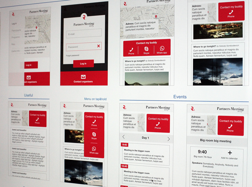
I am working on the iphone app for an event. Users will be able to interact through it, find out new people and also easily navigate the places related to the event.
-
Hi, I would highly appreciate the implementation of savable views. In Mischief there is feature called Pins, where you pan and zoom the view to your liking and then create kind of a bookmark for this view on the document. These view states are saved in a palette for easy access: New View and the Views submenu can be used to recreate this to a certain extend, but an implementation more like Mischief does it, would be very useful for detail work in Designer and maybe even the other Affinity applications, in my opinion. Thanks for an already awesome product and keep up the great work! Polaris
-
 After seeing quite a bit of demand for long shadows in Affinity Designer, I took it upon myself to throw together a basic tutorial to get you guys started with flat icon design in Affinity. My example isn't perfect, but it should be enough to get you going. You can view the tutorial here. Let me know what you guys think!
- 2 replies
-
- 4
-
-
- long shadows
- flat icon
- (and 5 more)
-
 Can the shape transform and text transform controls be the same or similar at least? e.g. When selecting a corner point and moving mouse to change the shape/transform size etc: For shapes: Hold shift+cmd, move mouse = For Text: Hold Cmd, move mouse For shapes: Hold shift, move mouse = For Text: Hold nothing, move mouse So when I'm selecting an shape and fixing it, then a text, it gets a bit confusing sometimes. I accidentally use text transform protocol for shape transformation vice versa. It feels disorienting like getting used to working in one program or OS, then trying to do the same thing in another program or OS.
 -
A suggestion: It would be neat if unused tools would grey out. I think this would make it easier to navigate the interface by way of reducing choice. For example, when using Quick Mask: grey out everything that isn't a brush. Or even go a step further: after selecting Quick Mask, automatically engage the brush and make the color white. Thanks!
-
Hey guys, it would be great that when selecting any shape tool and hen clicking on the canvas brings up the Transform Panel and selects the Width input field so the user can insert the required dimensions and shape properties to build a shape to a specific size. It's a great UI shortcut for power users or CAD applications where the user can avoid wasting time creating a shape to guesstimated size and then having to enter the exact dimensions in the Transform Panel. Thanks for your consideration and congrats again on Photo... looks like it made it to Editor's Choice in the App Store already... that was FAST! UPDATE: Additionally, it would be great if the Transform Panel would update the X, Y, Width and Height fields WHILE the user is drawing out the Shape's to have live feedback on dimension and position coordinates.