Search the Community
Showing results for tags 'ui'.
-
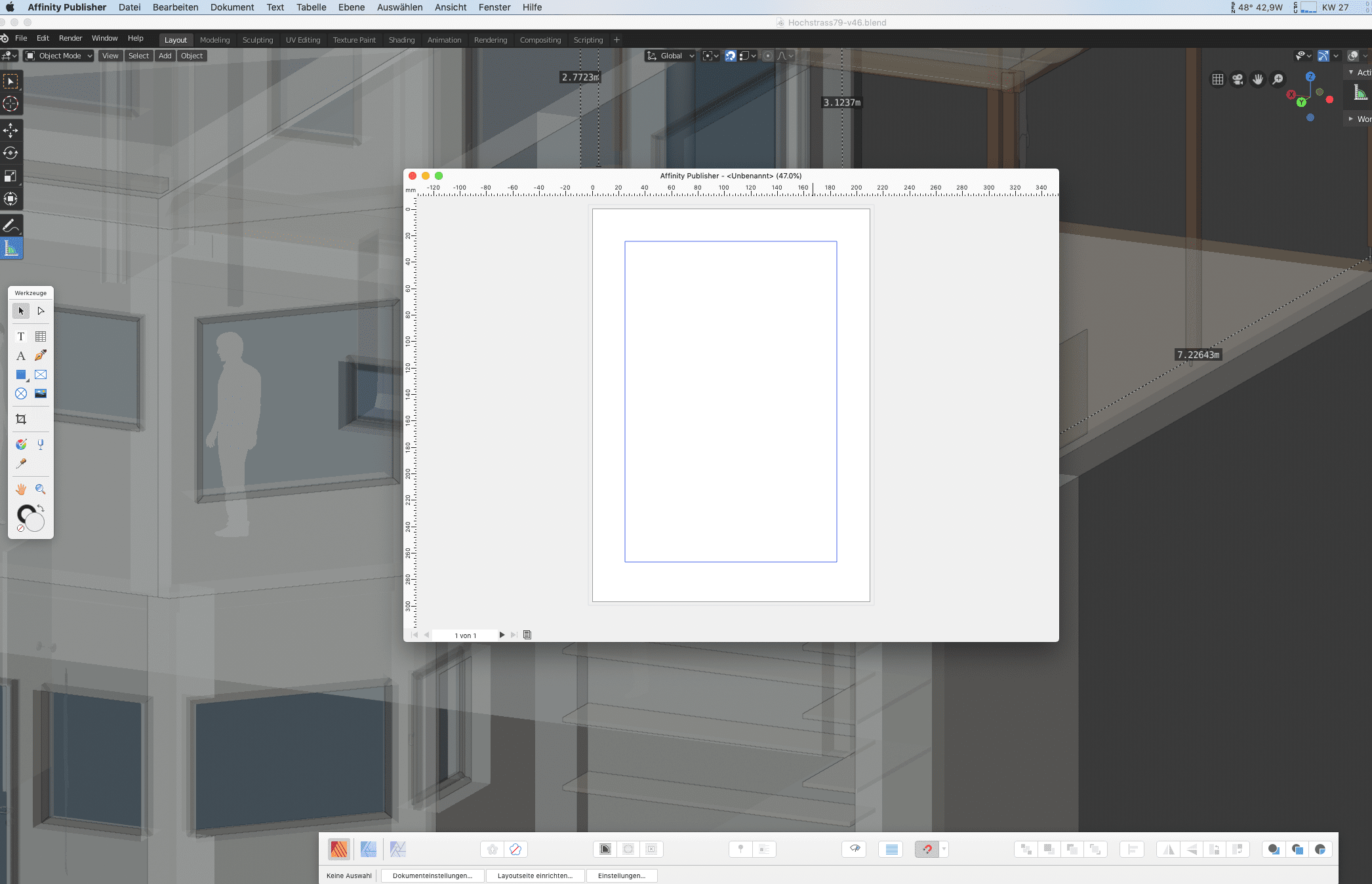
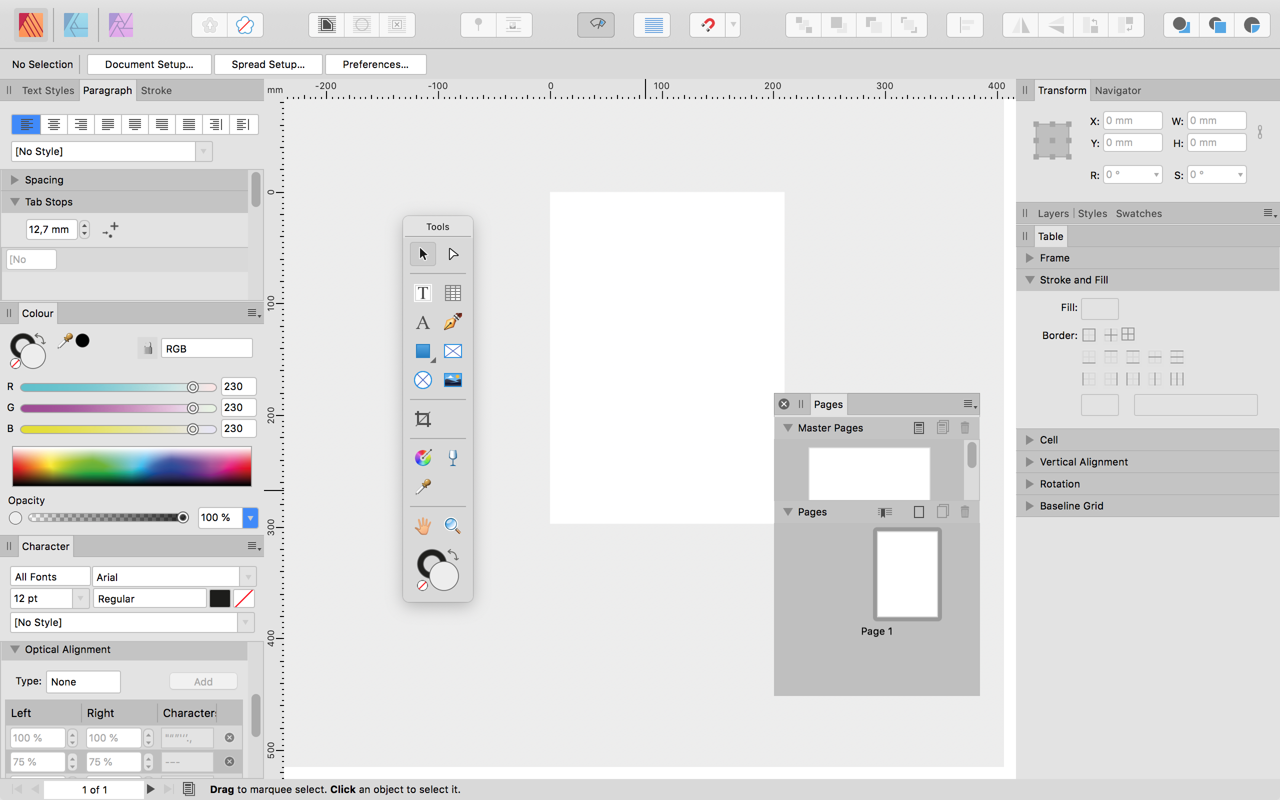
 Every time I create a new document, the size of the window is very small and not using the available screen-space. Why is that and how can I permanently change this to a "reasonable" size? MacOS 10.14.5 I'm working in separated mode I have two displays attached (both are way bigger, 27" and 21,5") if I resize the window and save this document, this particular document opens again in the right size. But not every other "new" document. Edit: No, it doesnt...
-
If I perform the following steps, all previously active toolbars (except one) disappear, and I have to activate them all again individually: - Hide all toolbars by pressing the tab key - Press command-T to display the text panel - Now, if I press the tab key again to show/hide my toolbars, only the toolbar on the right side appears and disappears. I have to manually activate every other toolbar again for them to show up. The easiest fix would probably be to show all toolbars instantly after pressing command-T (as if the user pressed the tab key). The bug is reproducible in Affinity Photo 1.7.1 (macOS 10.14.5). It happens every time, even in empty documents.
-
Some thoughts on Personas, Sudiolink, and Edit In… commands. It seems to me there is room for improvement in the approach to publisher’s implementation of personas and the studio link feature as well as the edit in photo and edit in designer menu items in both affinity publisher and affinity designer. I believe publisher’s personas need to be addressed. Instead of a designer icon persona, it would be a vector persona icon. Instead of an affinity photo icon for the persona, it ought to be something akin to designers pixel or raster persona. I think reserving the app icons exclusively for the studio link feature would be wise. It may be a good idea to have a separate studio link section on the tool bar, before the personas, as a shortcut to the edit in command that usually sends the file from one app to the other while closing it in the originating app. In addition, this leaves a possibility for publisher to develop or host new personas, such as a preflight persona, an extensive resource / font / hyperlink manager persona, an export persona. some of these may be shared across apps like the export persona, if one owns the hosting app, As publisher currently does with designer and photo. affinity might want to open up the persona as a plug-in platform of sorts, but much more powerful than anything offered in competing suites. Of course it would be beneficial to manage the personas through an app pref pane, to disable and enable what suits one’s workflow. An approach like this might yield a very flexible and customizable set of tools and modules that interact with each other, specifically tailored to an individual’s process. Just some ideas...
-
- 4
-

-
- persona
- studiolink
- (and 2 more)
-
Hey everyone! When choosing monochromatic UI, the icon for indicating snapping activation is still blue: https://www.shushustorm.com/_Uploads/Serif/iOS/1_7/UI_Monochromatic.PNG Best wishes, Shu
-
In the text panel alone there can be found two different icons for linking values. And in the transformation panel there is another variation to the icon. Also I did not recognise the icon next to the word gutter as a button. See screenshot attached.
-
 Hey everyone! This feature request is for macOS as well as for iPad. It's great nested symbols is implemented now. I have a suggestion that would make things easier to see what's going on: It would be useful if there were different symbol indicator colors depending on symbol nesting depth. For example: Normal symbol: Orange Symbol that holds symbol(s): Yellow Symbol that holds symbol(s) that hold(s) symbol(s): Green ..... Blue ..... Pink ..... Purple ..... Red Best wishes, Shu
 -
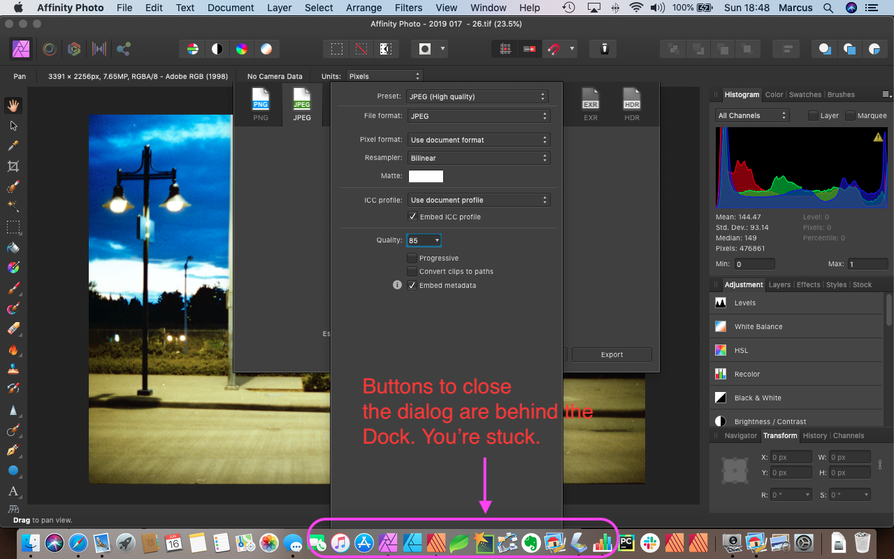
 With a 13" MBP mid-2012 and the Apple Dock anchored to the bottom of the screen, there is a window combination where you would be required to Force Quit or go to Preferences and change where the Dock attaches. Example:
-
I think it would be very useful to have a way of scaling the tools size. I have a laptop with 1920x1080 pixels resolution and the Affinity Photo looks as shown in the image attached. You can see that the last items in the Dock Tools: Artistic Text Tool, Mesh Warp Tool and the Zoom Tool are not visible, for they do not fit in the screen. I think it would be very useful to be able to scale the ui, so that everything would stay in perfect order on all kinds of screens.
-
Hey everyone! When snapping some windows together and snapping them to the left or right, their vertical arrangement gets inverted. I am using 1.7, macOS 10.13.6. This happens for both Designer and Photo. Best wishes, Shu
-
This may have been mentioned by others. One of the obstacles facing Photoshop users wanting to migrate to Affinity is that Adobe users find it difficult to locate corresponding tools, palettes, and menus. Possibly Serif wanted to avoid similarities because of real or supposed copyright issues. I come from a software development background. If Serif could allow users to customize their own interface, that might help. I'm thinking in particular of bespoke 'skins', where an encompassing Photoshop-like UI filters commands from the user to the underlying Affinity program. It would take a burden off users.
-
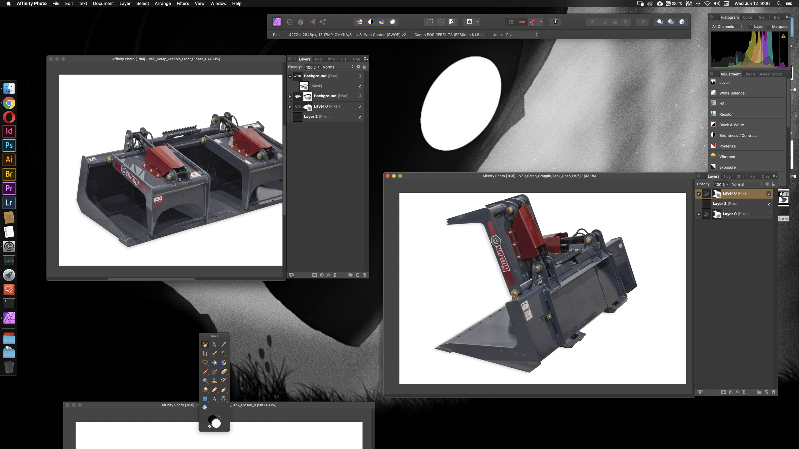
 It's not anything that I think has been done in an image manipulation program before. I'm currently demoing Photo for work, as we're going to probably drop our CC subscription, and I was just thinking, as I go back and forth between multiple photos of the same object that I'm editing for our website and product books, how nice it would be if the layers tab could be addended or part of the individual document windows so one could compare what has and hasn't been done to each photo. Would probably look something like the attached image.
-
 Hello. I request the addition of UI size scaling. That item should be added to the user interface page of the preferences. The current default UI size is too small for display on WQXGA or 4K monitors. (Especially text such as menus)
 -
.thumb.png.1182385d428e0ead61b38b83605a4298.png) I have grown to like many of the features of Affinity Designer (and Photo and Publisher). And I think that the interface has improved (or I have gotten more accustomed to it). But... I still am not a fan of the flatness of the UI elements. I think a 3d-look is more usable. (Even Microsoft has found its way back to a more 3d-oriented UI with Office 2019, compared to Office 2016 which was very flat.) For example I think that studio palettes should have drop shadows like for example the tools palette has, when it is not docked. And I think that each palette should have some kind of border or some other way of showing what belongs to it and what not. I can work much better if I can quickly and easily see what belongs to a particular palette and I do not have to take a second look or look very carefully. That is particularly important when many palettes are grouped so that they appear as tabs. A 3d-UI-look could make it immediately clear what is a tab, what is the active tab (i.e. active palette), what is a subgroup inside the palette and where the next tab/palette group starts. Also I think that the page should have a border (and/or a small dropshadow) so that one can make the artboard white as well without losing the information where the page starts and ends. For comparison: 1) This is the current UI in Affinity Publisher: 2) This would be the UI with drop shadow (rough sketch):
I have grown to like many of the features of Affinity Designer (and Photo and Publisher). And I think that the interface has improved (or I have gotten more accustomed to it). But... I still am not a fan of the flatness of the UI elements. I think a 3d-look is more usable. (Even Microsoft has found its way back to a more 3d-oriented UI with Office 2019, compared to Office 2016 which was very flat.) For example I think that studio palettes should have drop shadows like for example the tools palette has, when it is not docked. And I think that each palette should have some kind of border or some other way of showing what belongs to it and what not. I can work much better if I can quickly and easily see what belongs to a particular palette and I do not have to take a second look or look very carefully. That is particularly important when many palettes are grouped so that they appear as tabs. A 3d-UI-look could make it immediately clear what is a tab, what is the active tab (i.e. active palette), what is a subgroup inside the palette and where the next tab/palette group starts. Also I think that the page should have a border (and/or a small dropshadow) so that one can make the artboard white as well without losing the information where the page starts and ends. For comparison: 1) This is the current UI in Affinity Publisher: 2) This would be the UI with drop shadow (rough sketch):
-
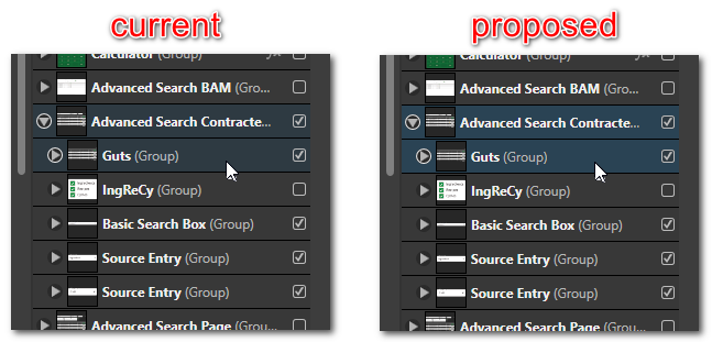
 I have a very difficult time visually scanning for a group that includes a selected layer when using the dark mode UI. To my eye, there's not enough of a difference between the gray background and the dark gray-blue highlight color, and I often miss it. I think it would be an improvement even if you brightened the highlight by a marginal amount as proposed below. Ideally, it would be great to be able to select my own highlight colors, but this would at least address the problem I have. Thank you.
-
Hi, there is a mismatch between the titlebar colour of the preferences window and the background colour of its toolbar as you can tell from the attached screenshots. Congrats for the release by the way!
-
 In the past couple days, the Studio palettes on the righthand side (Affinity Photo for Desktop on MacOS Mojave) have been randomly resizing: sometimes much wider and sometimes much narrower than the default. As there seems to be no means of manually resizing their width, I'm assuming this is a bug of some sort. Has anyone else encountered this? - Brad, Icecastles Photography
 -
 Part of my workflow for doing flat fills on comics and the like is to do a magic-wand selection and then to consistently grow my selection by a fixed amount to "bleed" into the line art, usually by 3 px or so. Every time I open the 'grow / shrink' menu it's reset back to 0, however. I would love a way to always grow by the same amount, either by defining a macro that does it by a specific amount or by having the last amount stay active in the dialog box which comes up. Additionally, it would be nice if I could use the tab key or similar to change the focus within the dialog box; currently tab just toggles the UI visibility.
 -
 I'd like to change the keyboard shortcuts for how I cycle through tabs. I've been looking for a way to change the keyboard shortcut for it within the app but I haven't found it yet. Am I missing it somewhere? Perhaps it's called something I didn't expect?
 -
 Hello! Affinity Designer on mac for a very long time. I liked everything. Now I installed Affinity Designer on Windows. And I cry with bloody tears, I don’t understand why such “delays” are “glitches”. The canvas moves smoothly, but all panels (for example, layers, stroke) work very slowly, especially if they are “disconnected” from the interface. It is also difficult to move the panels, jerks and delays. By the way, in beta version 1.7 there are almost no such problems, everything works smoothly. Except for the layers panel PC configuration: intel i7-9800X CPU@3.80GHz GPU 1080 Ti 32g RAM Windows 10 pro Affinity Designer version 1.6.5.135 (downloaded from site) Can this problem be fixed?
 -
 Hi, just wondering if it is better practise to create assets for use again as veftor or raster?
 -
Hi! As many of us, I'm used to the UI of adobe – although we may not like every behaviour – much of it has proven to be at least consistent and practical. I encourage the affinity-team to experiment and try new ideas for a workflow optimised UI that's fun and easy to use – it does not have to stay the way adobe settled. But what I'm essentially missing is a way to keep all the _different_ panels arrangements I need per usage - so called "Workspaces" in adobes parlance: Maybe that is what the "Personas" are for, which is an interesting approach, but I use workspaces to quickly fill my screenS(!) with all the relevant panels and to close the not relevant ones for the job I'm doing right now. It's not always just "Exporting" and "Drawing" like the personas allow me to use – sometimes I need e.g "Screendesign", "Typesetting"or "27 + 21,5inch Monitor maximized" "13inch Laptop minimal" (I'm speaking of the separated mode, of course) Second use-case is to be able to move my Workspaces to a different computer or a new system-installation. I already have to arrange the panels on the 3 Affinity-Apps times 2 (beta) on three machines (3*2*3=18) which is not fun to keep just roughly synchronised... Is there a way to manually get the .plist-file and put it on the new machine, I'm not sure where the panel-positions are stored.
-
 For most fonts selected, the rendering of the font features is unhelpful and just looks bad. To reproduce, open the 1.7.0.249 beta version of Publisher, pick a font, and click the Typography button. I see the following on Windows 10 Pro 1803.
-
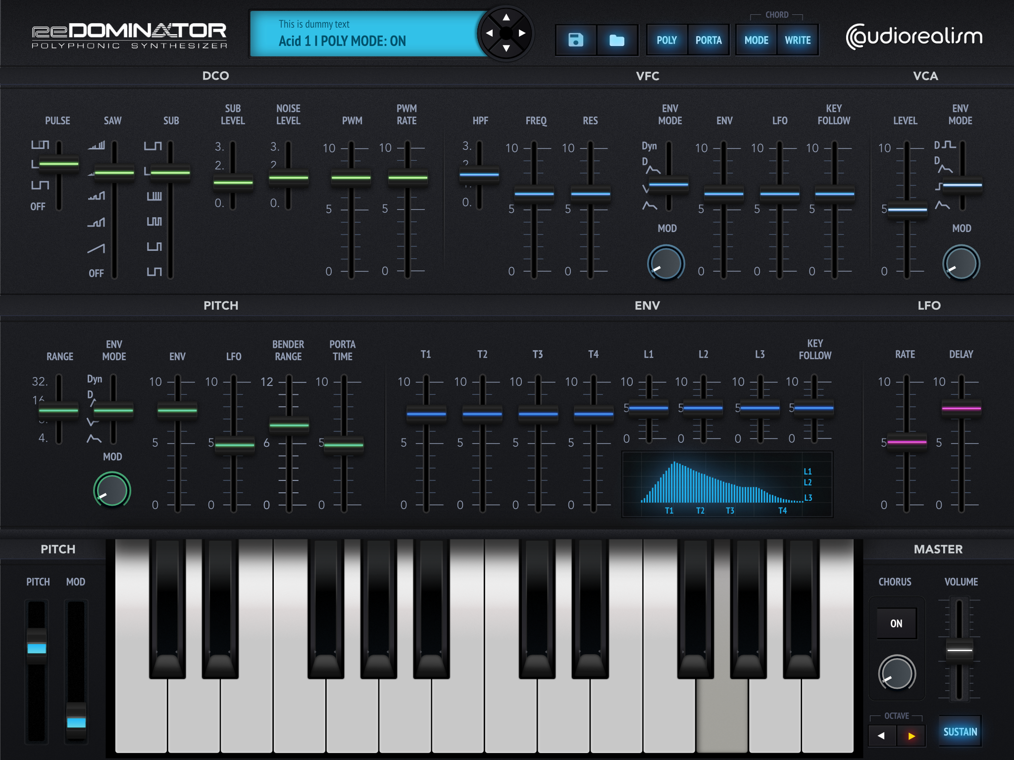
 This is a 2017 project I was not yet able to showcase. It was a fantastic project to create and design the iPad version ( plus a UI for the plug in version) from the polyphonic synthesizer Redominator (Audiorealism) that finally was not released due to business reasons out of my control. However, it was nearly finished both from design and dev points of view, and I'm showcasing it a couple of years later, so I can tell you that back in the day, apart from a couple of little bugs moving things with the cursor keys and some issues I had with the slicing part, the whole experience overall was lots of fun and I loved it, as much as the result. This is a preview of the interface. You can see many more details and a test demo video on this link: https://www.behance.net/gallery/75938293/UI-deisgn-Redominator-(Polyphonic-Synthesizer)-iPad-Air?
-
 Greetings, I am re-suggesting this to encompass all the Affinity products, especially Affinity Designer and Affinity Publisher. For the most part, Affinity cursor and tool icon shapes are very clear to understand and the cursors match well with their tool icons, except for the Move Tool. When switching between the Move Tool and the Node Tool with keyboard shortcuts, the two cursors are so similar they are quite visual ambiguous. I suggest changing them so they are consistent and clear for the user. My suggestion below is not the only solution— you may have a better one. I really hope you can reduce the user interface ambiguity and increase the consistency.
-
Looking for a little guidance here using Affinity Designer on Windows 10. My issue is the highlight color used to indicate the active layer when the interface is in dark mode. That blue gets lost in the rest of the UI for me. It's just too close for my eye at least. I checked the other forum topics, and I found other similar complaints from Mac users, but not from Windows 10 users. It appears that I don't have a way to change that highlight color, either through the program or through the OS. Or do I? Am I missing something? Thanks for any help you can give me.