Search the Community
Showing results for tags 'ui'.
-
I'm going to purchase anyway so you get my support but really, address the lack of UI scaling as a priority please. Even if it means taking two steps back to take a step forward. You can do it!
-
 It is hard to explain...Just like offset,distance between side and side is the same.but it seems that there is no offset function in AD😂
-
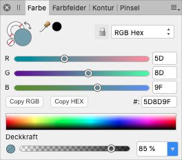
 It could be that this has been discussed in the past already, I don’t remember, but in the colours panel you can select the sliders view, and then there is a select field for RGB and RGB hex with the only real difference that there is a hex value field below the sliders. And I’m thinking: is it really necessary to have two views? Couldn’t they be combined into one with the RGB numbers being shown next to the sliders and the HEX field below? This also applies to colours in the fill and border panels on shapes. Also, there is so much empty space next to the HEX field that could be used for two buttons to copy the HEX or RGB values quickly (see attached mock-up). That would be better than the current hidden option behind the button at the top right.
-
 The Protect Alpha option is hidden on small screens. It is very counterproductive to have to click the arrow each time in order to reach it (My screen is a Wacom Cintiq 13 HD touch). Sometimes I also forget that it is selected since it is hidden. Please make more space so that it isn't hidden or convert some of the options to icons (eg lock, mirror, symmetry). I ignored this for months but it really disrupts my process. The padding on some of the percentage selectors could be less to make space. Eg Opacity, flow, hardness all have pace to the right of the percentage. Thanks.
-
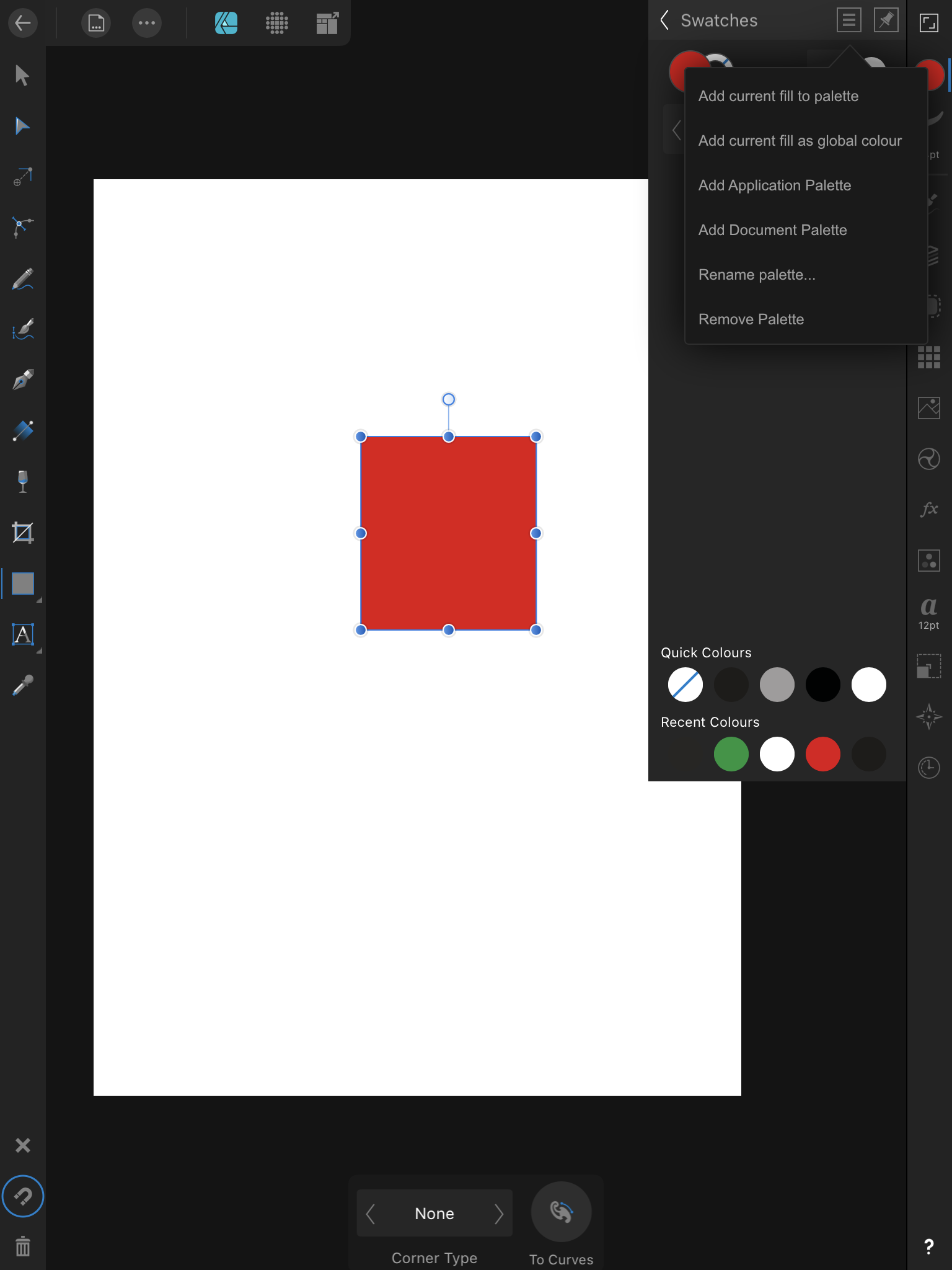
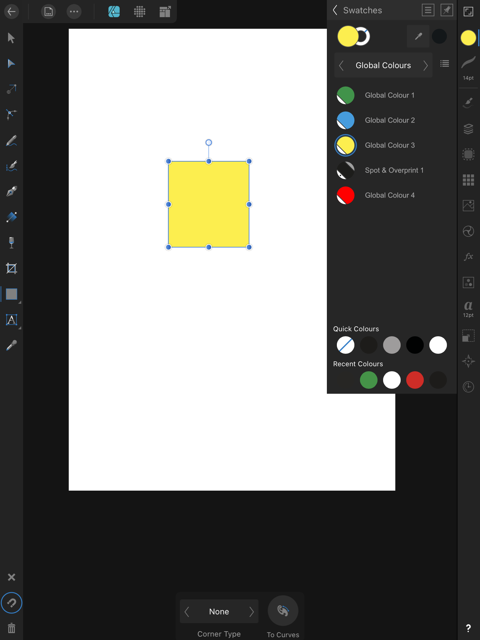
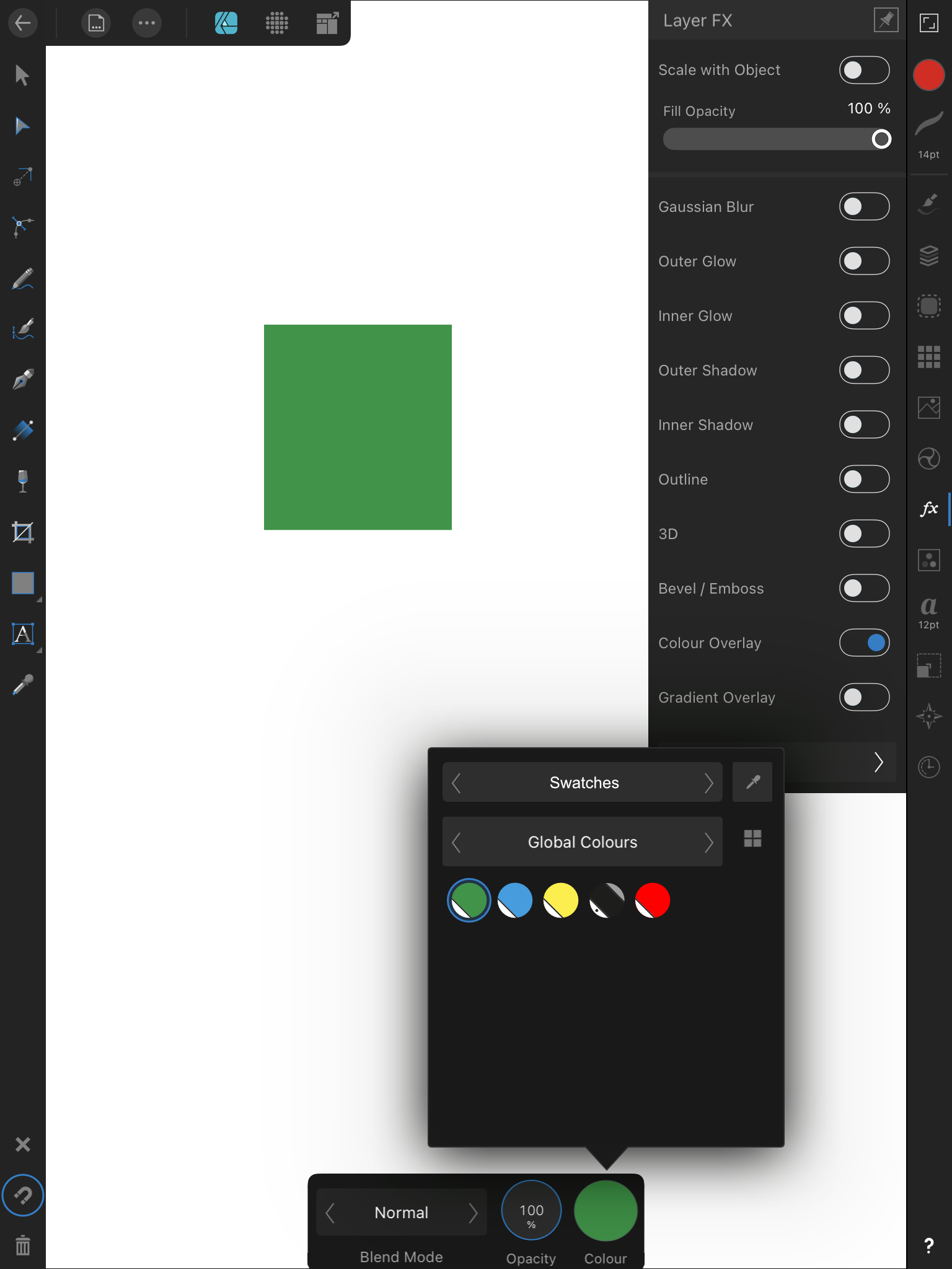
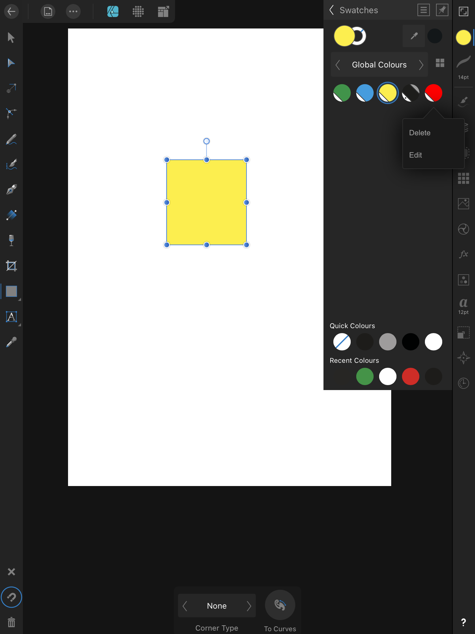
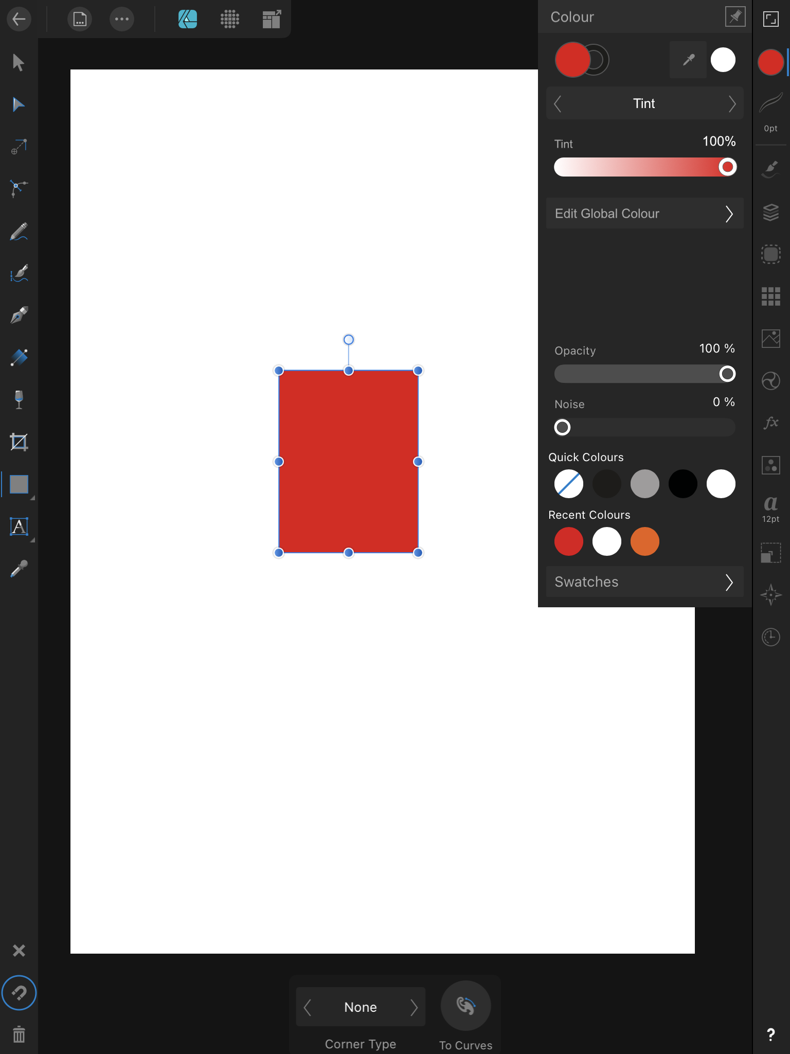
 I was waiting for the actual 1.9 beta to come out before posting this, but since it doesn't look like it's coming any time soon, I might as well post it in advance. Even if work in the UI has already started, I still think it's relevant to post this. If for nothing else then to make sure you avoid doing the global colours editor UI in the same disastrous way Adobe did with Illustrator for the iPad released today. To avoid the above you must understand one thing, the whole point of global colours is to finely tune the colours of our illustrations, in real time. This means you must see the colours change within the illustration as you tweak the swatch. As such you must do your best to avoid obscuring parts of the canvas, no full screen editors please. Another point with these mockups is to create them reusing as much of the existing UI as possible, so the amount of work needed to create this is reduced. This is a critical feature that has been missing for way too long, let's not delay it any further by requesting unique UI elements just for it. With that out of the way, let's get started. 1. The first step in editing global colours is to actually have some. For that you need to have a way to add them to the colour palette. A simple 'add global colour' entry on the existing flyout menu will do. The swatch will be further tweakable down the line, so this is enough or now. 2. Now that global colour swatches exist, you must be able to apply them. For that you'll need an indicator showing the swatch is applied, a simple blue circle around the swatch will do. This is the same colour as used in many other controls throughout the app. On the next point I'll show these swatches as a grid instead of a list. 3. We must be able to apply global swatches to things beyond simple shapes. Right now we're not able to apply any swatches, even regular ones, to things like layer effects. For global colours to be maximally effective this must change, we need a UI to select and apply swatches to things other than shapes. Here I'm showing how this would look when applying a global colour to a colour overlay layer effect. 4. Now that global colours are applied, we need to edit them. This is where I ran into a possible UI inconsistency issue. What makes sense to me would be to long press a swatch, choose 'Edit' from a popup, and be taken to a panel for that effect like shown in point 5. The thing is, I don't think there's any instance where a popup menu like this takes us to a subpanel? And like I said at the start, if I want to minimize UI changes in order to deliver this as fast as possible... ... so if the above is an issue, then another solution can be used. Instead of long pressing the swatch, we could instead head to the Colours panel and have it behave in a way similar to the desktop version. That is showing a tint slider with a button linking to the colour editor. 5. Time to tweak the actual colour values Independent of the design option chosen above, you'll end up on this panel to edit your global colour. You'll be able to tap the swatch name to change it, and more importantly change the colour values while you keep the canvas in sight at all time. Once you're done you can simple back out into other panels or tap away to close it. Add... that's it. I'm open to take any feedback, and I'm sure the developers would like that too. However, remember that we must reuse as much of the UI as possible, so this critical feature can be delivered as soon as possible. Thanks!
-
- 3
-

-
- global colours
- ui
- (and 1 more)
-
 As I found in this thread, very useful feature of both designer and photo is off by design. And when it's off it works partially, just enough to work as broken. I understand there is group of people who wants this off (I imagine huge imported technical documentation or something like this) But as a user more focused on UI /UX /illustration with quite managable hierarchies I propose to turn on this by default. Just a thought.
-
<RESOLVED! - look at next post> I will start from usual - love Photo Designer. Love it and use it on daily basis. It is one of a things that make my work in it so much less fluent: this is when I click on group - exactly what I expect, group is lighten up on layer mennu, just as it should. but I need something deeper. So I clicked more (on screen, because I see my object and I want to move it to another group, or see where it is hiding. Aaaaand... nothing, no idea. Sometimes it gives pale blue hue to parent group, but not always. Even if - it is bit too delicate to see. Should it or should it not open hierarchy and expose an object will be debatable (I wish it was, but think some people can disagree, but stronger feedback will be welcomed. Thanks!
-
Hai I want to share some of my works. Icon design. Created in affinity designer. another my works : Behance.net/andrigraphic Instagram.com/andrigraphic Youtube Andrigraphic Thank you
-
 I am right handed and have a 21 inch screen and I have to reach all the way across to the left side of the screen when I need to select tools. Is there anyway to move the Tools Bar so that it locks to the right side of the art board? Like the mock GUI pictured . . . thanks
-
 First of all I wanted to say thank you for your amazing products. After trying your apps I can no longer use other design apps. It would be very cool to have another application in the Serif StudioLink specifically for design and prototyping. Affiinty Designer is so cool but it has no function for prototyping and animation. Thanks for attention)
 -
Tell me if the designer will develop in the direction of UI/UX or his main direction of illustration?
-
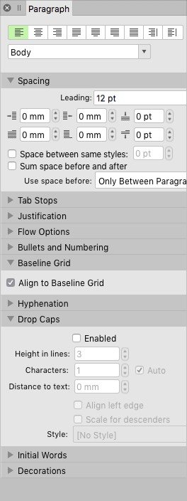
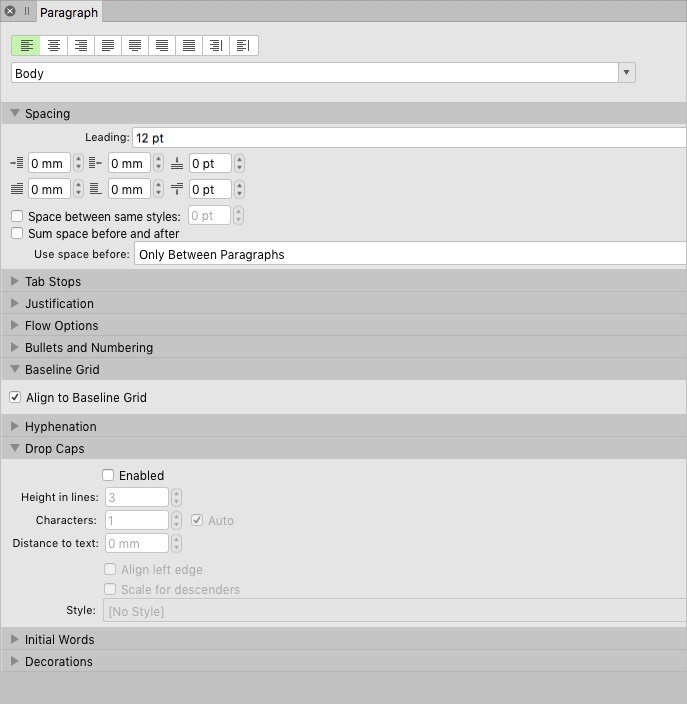
The drop-down menu on the Spacing section of the Paragraph tab/panel isn't resizing, so it disappears under the RH side of the panel. Compare the two screenshots. In fact, I have to stretch the panel to almost full screen width to see the drop-down. This is a bit of a pain. Please fix. Or is there an easy fix? Delete p-list? Thanks. Thanks.
-
Hello World, Here's what I have done so far by creating a design system using Affinity Designer. I also have attached my Affinity Designer source file. Feel free to download and play around with it. I have developed a UI Design based on this using HTML and CSS. If you are interested you can sign up with the coupon code Here is the link: https://www.udemy.com/course/uxdevelopment/?couponCode=UX-DEVELOPMENT Regards, Hossein Finance App.afdesign
-
 It seems like we get something like one post per week where the user has ‘lost their tools’ which, usually, is caused by them pressing TAB accidentally. Since: * it’s so easy for someone to press TAB accidentally; * it’s not something that all users would expect to happen; * there is no on-screen indication of what has happened or how to undo what’s happened... … I would like to recommend that some kind on on-screen indication is given to the user to tell them how to get the UI back. On Windows this could be achieved by having some simple wording in the window title bar, such as “[UI has been hidden - press TAB to reveal it]” (see attached mock-up) but I don’t know if this can be achievable on OS X or iPad. Alternatively a message akin to the Assistant pop-ups could appear. The message could have a ‘close’ icon (which has to be pressed to remove it since the user may not see a message that goes away by itself after a second or so as they are ‘in a panic’ because everything has disappeared) with a ‘Don’t remind me again’ checkbox for more experienced users, or something similar. I’m sure there are other alternatives, and I don’t really have any preference to which is used, but I do think that the user should be given more information about what has happened and how to get the UI back as it can be disconcerting to have things disappear and not know what to do about it.
-
Hi, Channel packing method in Affinity photo is a bit hacky please make it easier to implement (i.e. copy and paste mask directly into the channel). Also, I cant seem to export a tga file with an alpha channel. I use channel packing heavily for creating RGBA masks/textures for UE4. Thanks, Iby
-
 Win 7, Aff Photo, v 1.8.3.641, LG W2442PA I used to use the Light UI but have switched to the Dark UI. With the Light UI I could easily tell from the Context Toolbar which file I was working on when I had two files up with identical images. With the Dark UI it is nearly impossible for me to tell at a glance which file I have up. It makes no difference if the ambient light in my studio is high or low. Could you make the Context Toolbar of the file that's on the screen in the Dark mode a significantly lighter shade of grey? That would be a great help, even more so when I am mucking around with three or more files open.
-
 Hi all, TIA for help, and really appreciate the product and this community... I'm a new user trying to make a smoother transition from Adobe to Affinity. The biggest hurdle I keep running in to is understanding WHERE to find things. I know there are keyboard shortcuts (as well as the tips on the bottom of the Navigator), but that's not what I'm looking for. I know there are a ton of video tutorials, but I don't have time to sit through them with eyes plastered so as not to miss the one cursor movement I need. What I can't find is a simple way to see how to interact with the UI to access features, even those discussed in the HELP document. Let me provide an example. I have a photo, and want to adjust the Contrast in Affinity Photo. I look up Contrast in HELP, and I find a section addressing it -- but that section doesn't explain, or show me, where it is, how do I get to it? (Yes, I did try command-L, as a Photoshop habit, but that's not where Contrast resides). So I inevitably spend a TON of time looking everywhere, googling, etc. to just try to figure out where Contrast is buried in the user interface. I still don't know. This happens to me over and over again, and is incredibly frustrating when trying to retrain to a new UI, especially so when all that is needed is a "breadcrumb" or some kind of visual that shows a person where to find that feature (or command or what not). If I'm missing a resource that lays bare the UI in such a way, please let me know. Otherwise, Serif, can you please add breadcrumbs (eg. File > Edit > ) to the HELP section ASAP? That oversight is without a doubt the most disorienting yet easy-to-fix hurdle I have with all Affinity's apps. Thanks, again. - joanne
 -
 Hello everyone! Can someone tell me what happened to the Colour Format menu? I know it used to exist as seen in the attached screenshot but I cannot find it.
-
Hello Affinity, I would like to give you my money NOW. I really don't want to pay Sketch or Figma or inVision or Adobe XD or Framer X or Protopie or Webflow or UX Pin. I would love to buy a software from Affinity that enables the prototyping feature. Maybe a merge between Personas with added plugin to buy. OR maybe call the software Affinity Prototype or Affinity Interactive or Affinity Hybrid. I have been creating lots of Websites and User Interfaces, but I can't quickly prototype it to get my idea across. I have been working collaboratively with a multidisciplinary team of 50 designers/developers/business analysts. And when it's time for me to pitch I have to manually go into my Visual Studio Code Editor and create it from scratch using CSS and JavaScript. Still waiting for release date, Thank you
- 2 replies
-
- 4
-
-
- prototyping
- prototype
- (and 8 more)
-
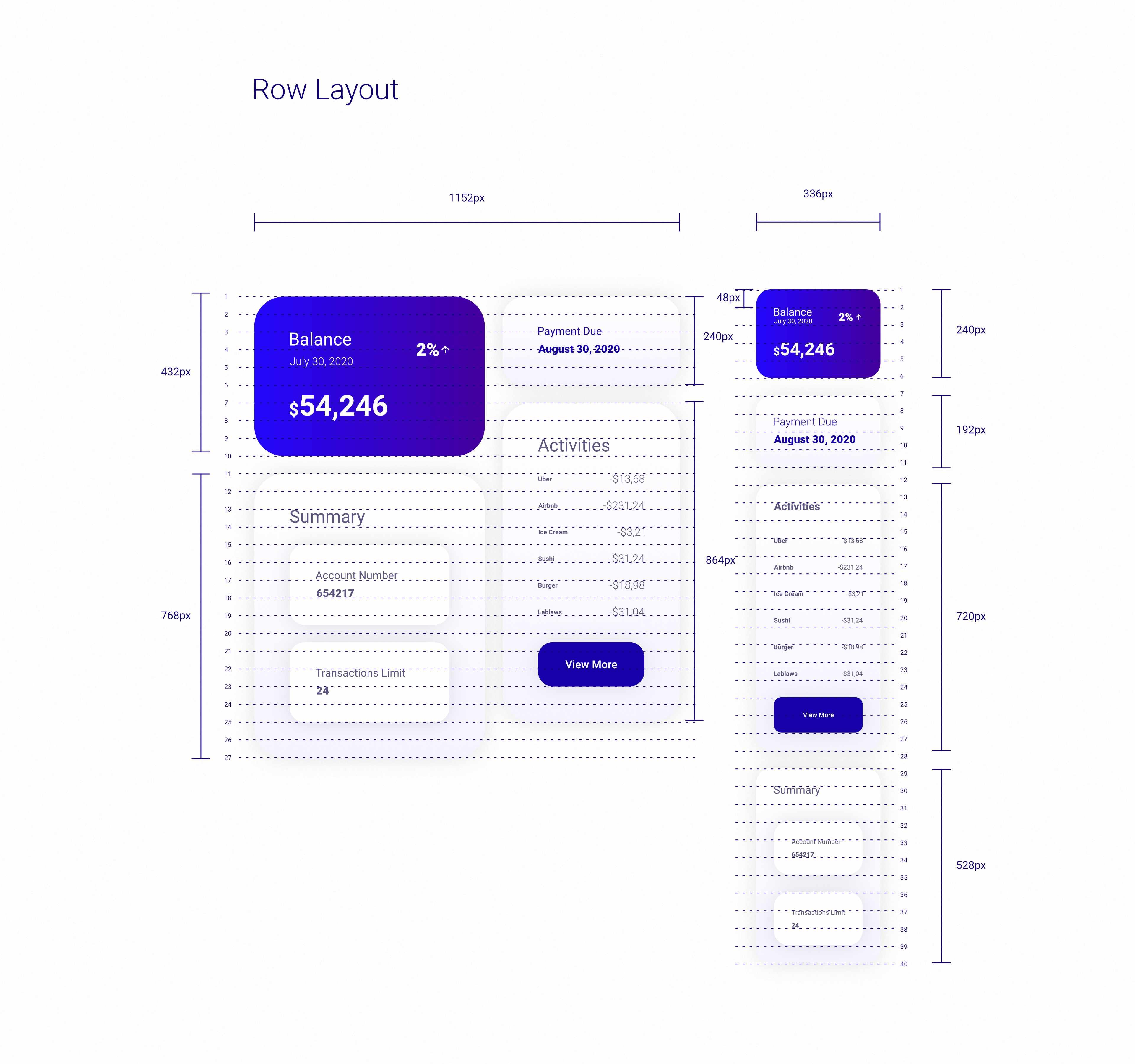
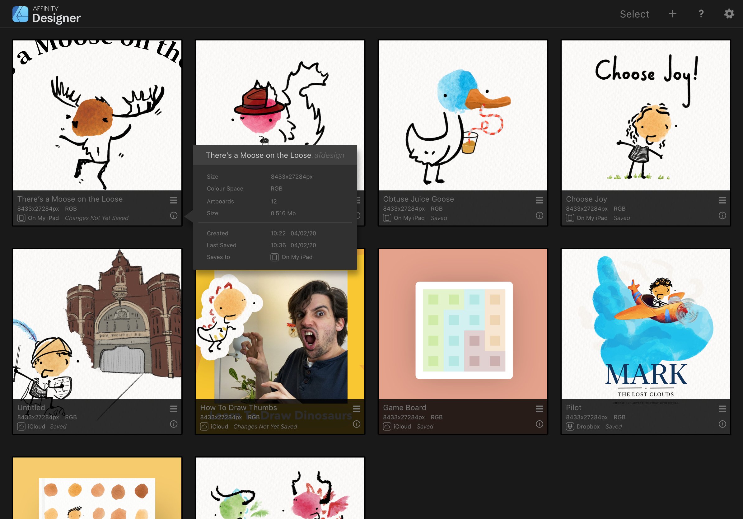
I love Affinity on the iPad. The toolset, capabilities, and support is incredible. I would love to see the document browser improved though - I think it’s the main part that slows down my workflow, or causes confusion. The way Affinity stores it’s files feels unintuitive to me, I think it’s because it tries to be too smart. These are the primary issues I’ve identified that affect my workflow 1. I forget where a file is saved - mainly because of the Import vs Open from cloud options. 2. I forget whether a file is saved (linked with no1 - where it saves to upon hitting save because files do not auto-save upon returning to the document browser) 3. I have to open a file to export 4. I cannot bulk select, import, or delete files. To solve some of these, I’ve created the mockups below. Without too change to the core functionality of the browser, I think the best way to solve the issues above would be to reveal a little more meta data to the user through an info panel. No too obtrusive, and revealed upon pressing an ‘i’ button. The key meta data that helps solve no1 & no2: an icon & path showing where the file will save to & whether the file has been saved through pressing the Save button. If a file is new and hasn’t been saved yet, then Last Saved and Saves To can be NA. Being able to see these at a glance enables me to see what I can and cannot safely close, and locate from the files app. A little extra detail like file size helps prepare me for long load / save times. I know no one asks procreate for this kind of metadata, but then again procreate offers a different kind of experience by making all files save inside the app. I know where everything is. With Affinity, I never quite know whether changes are saved, and where my files are (because I forgot). Also multi select for bulk save, import, and close would just be ace! Open to thoughts and suggestions on how this affects your workflow!!
-
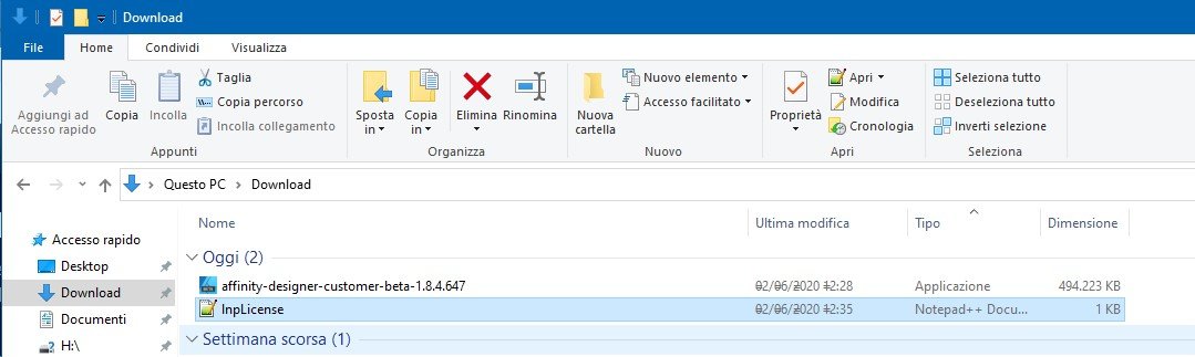
Hi, latest Designer 1.8.3 on Windows 10 platform (version to 1909 and 2024 tested) has a serious bug regarding User Interface (UI). After the program loads, the Windows interface become buggy and not readable (see attached screenshots). I've also checked another thread on this forum that advice to do a SFC check on windows components, but that isn't a solution ( neither a workaround too) and in any case the situation revert to normal after a simple reboot. On my system there are other graphic software that run smootly (Rebelle 3, PS 2019, Krita, AI 2019); I've checked know incompatible programs and I don't use any of the listed apps. Side note: I've tested 2 beta version to see if the problem persist, and this is what I've found: Designer Beta 1.8.4.647 - the problem persists; Designer Beta 1.8.4.650 - the problem is NOT present. It's interesting, because in the release notes there's nothing regarding the UI bug, so It's worth to analyze it further to understand what's causing this bug. Hope that you find out! Thanks! The system is a Mac Mini Late 2012 with BootCamp running Windows 10 latest build 2004, in Italian Language (tested also on previous build 1909); graphic card is integrated Intel HD4000 with latest drivers from Intel (Version10.18.10.5129, Date 21/01/2020).
-
 Hi there! One Affinity photo feature that is dearly missing for me is a keyboard shortcut to increase and decrease opacity of the currently selected layer. I would need this, so I could map this shortcut to a MIDI controller and be able to quickly set a layer's opacity with said controller. Since there is an ever increasing number of people who use MIDI controllers as quick input devices for the graphic softwares, I believe I am far from the only one who would benefit from such a feature. Currently there is only the possibilty to use the up/down arrow keys (+ shift optionally) to increase and decrease the opacity once I have set the focus to the opacity field. This does not really help me all that much as I would always need to focus this field first, before i can start to change the opacity. It would be great if there could be a global shortcut for this as well, preferrably also with the possibilty to use shift optionally to increase the increments to 10. I would not care if it is an obscure shortcut or if it is even turned off by default, as soon as there is any shortcut for this MIDI users could make use of this and map it to their controllers. Thanks! trych
 -
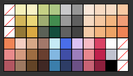
 Would it be possible to append the swatches and brushes palettes akin to the assets category? This would allow sub-grouping and make organisation much cleaner when dealing with large assets. Also including an 'add from selection' fill/line for swatches would be welcome. This could possibly facilitate sub-categories being auto-created and named if the selected swatches are already grouped (see Swatches2.png). My lo-tech solution (adding extra No-fill swatches in Swatches1.png) to get logical colour-grouping is time consuming and i often resort to just creating a specific layer for swatches, then having to cut/paste into a new document if i want that same palette again.
-
Dragging symbols from the symbols pallete onto the canvas does not work. When a symbol is created, it appears in the palette but cannot be dragged from the palette to the drawing. Just nothing happens and the symbol is not placed on the canvas. AD 1.8.3.641, Windows 10
-
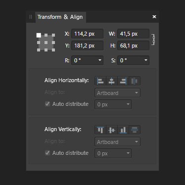
Hi, I've been working with Affinity Designer for a few weeks now. Coming from Adobe Suite CS6 there's is a lot I like about Affinity Designer, but also a few things that would make working in AD just that little bit better. One of those things is that Align and Distribute doesn't have its own panel. Maybe it Align and Distribute could be combined with the Transform panel (see image) ... or just could have a panel on it own. greetings, Ivo