Search the Community
Showing results for tags 'ui'.
-

hide Left/Right studio pane
Clavote posted a topic in Feedback for the V1 Affinity Suite of Products
Hi It would be very useful to improve the UI of all Affinity Apps by giving us: open/close left studio panel and open/close right studio panel as a keyboard shortcut C -
 I am really liking publisher so far, and can imagine working with it professionally in the future. I am using indesign cs5.5 at the moment and one thing I would like to see in publisher which is in this program is collapsible panels. I like to have some panels open all the time, like character, paragraph, pages and color. This already fills my workspace pretty much, but I would like other options quickly available too, but not take up space all the time, f.i. the text frame option, the text styles and stroke options. Having some way to group a couple and minimize them would be very helpful.
 -

The gray(t) Affinity Wall
Joachim_L posted a topic in Feedback for the V1 Affinity Suite of Products
First of all, sorry for the bad pun in the title. But this is my feeling, when I start e.g. APu. Working area on the left monitor and most needed tools on the right monitor. The overall gray appearance between the panels makes it sometimes hard to distinguish them. We have three applications which have a "brand" colour of their own. Why not using these colours inside the applications? E.g. orange headers or orange overlines for the panels in APu? Just a thought. P.S.: I know I can use the Dark Theme, but personally dislike it. It is a matter of taste and I am used to it for over thirty years now.
-
When trying to rename a style category it takes the one before in the list. Same on delete style category. Affinity Designer 1.8.1 OSX 10.13.6
-
 Greetings friends, So there is this bug which I have not been able to go around for a week or so. Whenever I try and use any of the already made assets that you can use on Affinity Designer, the program stops responding and I am left with a black screen on the program window. I have tried many solutions recommended such as uninstalling and reinstalling the program, I have tried deleting the program files, and have tried deleting the App Data files. Nothing worked. Honestly, this is not something I can find a solution for, so if anybody has any solution or have encountered this previously, then please do share it. Video: Have a great evening/morning/afternoon.
 -
 The UI presentation between masking and clipping layers needs to be improved. The difference is too minor and too similar. When working with a lot of layers, this becomes even more difficult to see.
-
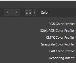
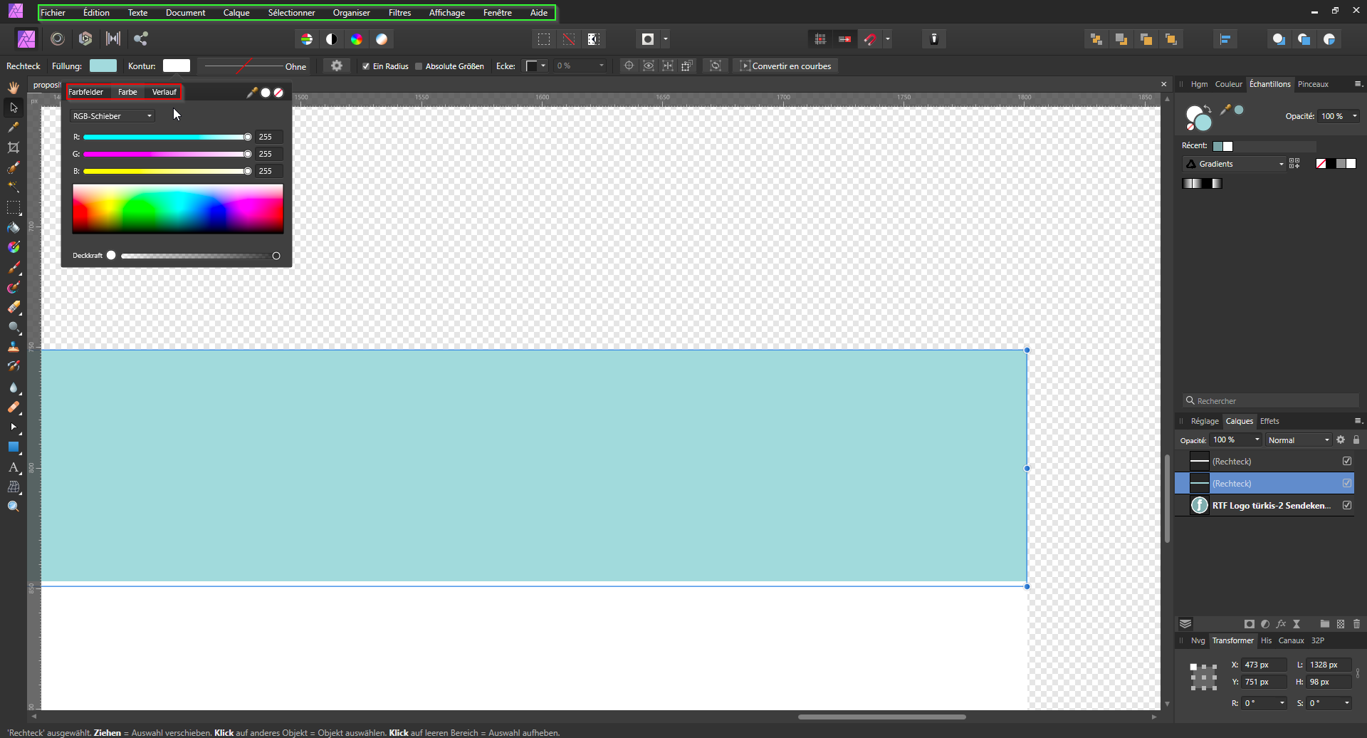
UI text color on radio selection is inconsistent with the rest. See image below. This occurs both in 1.8.1 and beta 1.8.2.
-
The UI default font seems too thin and the spacing clunky when the UI "big" font is used. The UI default font seems too small even when set to "big" (using 2560x1440 resolution on a LG 4k monitor)
-

Improve Measurement Tool in Designer
veddermatic posted a topic in Older Feedback & Suggestion Posts
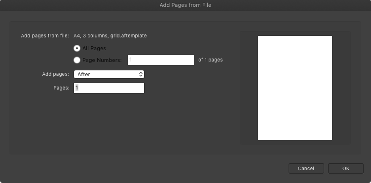
Two related requests: 1. It would be nice to be able to read measurements using the Measurement tool without having to zoom in to 1600% all the time. 2. It would also be nice to have measurements be visible on blue objects. Sketch does this very, very well. Attached is a screeenshot of the same objects at 100% in both apps with measurements displayed using the default measurement tools (Option-hold in Sketch, CMD-hold in Affinity Designer). I recolored the background in the AD for a second screenshot to highlight that the text on measurements should probably change when the background is near the same blue as the default font color.
- 3 replies
-
- 4
-

-
- designer
- measurement
- (and 1 more)
-
There is a bug in the navigation of the "preferences" UI. The arrows "left" and "right" are not working properly. The "right" one is not working and the "left" one is taking you back to the main selection.
- 3 replies
-
- 1
-
-
- preferences
- ui
- (and 1 more)
-
I am sure this has been mentioned but I find the document loading feed back on the trio of the application very poor. Can you please consider using the progress bar dialogue you use when exporting, also on opening documents? At the moment it is very poor. Apart from that loving Affinity products and to hell with Adobe!!!
-
 I'm new to Affinity Designer, coming from Adobe Illustrator. Still a learning curve, but the transition has been pretty smooth so far, so that's awesome. One thing that I'm missing however is the flexible tabs/windows, so the ability to drag the windows from the tabs. So for example when I open 5 different vector files for, it creates 5 tabs. Each file sits in it's own tab. In Photoshop or Illustrator, I could just mouse click and drag each one these tabs out, so they create a free floating windows. I could then just drag the artwork elements from one window to another. In Affinity, this doesn't seem possible. So the tabs stay tabs and the only way to place artwork from one tab to another is to copy and paste as I can't drag the artwork between the tabs. Or is there a way to do this? Also Adobe has a feature called 'Paste in place'. So when I copy an element from one artboard, I can paste it into the exact same spot of the other artboard (if the artboard is of same specs of course) Is there anything like this in Affinity? Thanks
 -
 I usually work in separated mode on my Mac. I have two huge displays to view my document in full screen AND put most of the expanded panels on the other. There are gaps between them becaouse I like to temporarly put eg. the brushes near the center of my main screen for fast access. Afterwards I put it back. So I don't fill the second screen completely with the panels, and the underlying Finder-windows are not very easy to tell apart where you click. A mac-typical shadow around the panels would help here. I compared it to Indesign and there is no shadow too, but it is more visible. Maybe we just need a darker outline/border in Light Mode? Publisher LightMode: InDesign CS5
-
 I've used Affinity Photo for several attempted projects, and the one issue I'm having is the ability to move a selection. I am logging this as a bug because if I make a selection with the rectangle tool I can press the SHIFT key and it will lock into being a 1:1 square, so the action of the shift+drag+select=1:1 square tool works as it does in Ps. Now if I need to move that selection around on the screen, I would normally just hold the SPACE bar and it would enable me to move the selection. Can you point me to adjusting the quick-keys to work in this way, or if this is a bug that can be fixed?
 -
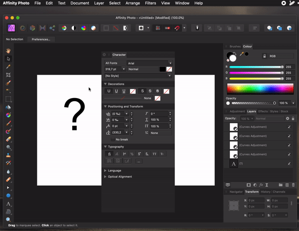
 Quite often I encounter problem where the toolbox with the measuring distance is hidden behind the anchor of the bounding box of the object. See below the image for details . Even simple zooming out doesn't help to show the numbers in the toolbox. To go around it it is always necessary to zoom out to very small zoom ration and then the toolbox will appear - see 2nd image. I know this is just UI tweak and probably the measurement toolbox should be displayed next to the anchor. Does anyone encounter this?
-
 While working on a file, having both the "Colour" and "Swatches" panels open, I thought both offer a fair amount of wasted white space. Secondly I thought "why are these two panels separate anyways?". Both utilities compliment each other, complimentary colour pun intended, and it would clear up the UI a bit more for users with preference for minimal opened panels and/or smaller screens. Why not split the revised Colour panel into two columns: colour wheel/meters/editing components on the left-hand side, and the swatches on the right. I've made a quick, rough mockup of this as attached.
-
Hello Affinity, I was wondering if you guys are going to include a Prototyping Software for UX. I have purchased Affinity Designer and I loved it. I just wanted to know whether you guys are planning to add Prototyping Persona or maybe lunching a Prototyping software for UX since the User Experience industry is booming. I have created this UI in Affinity Designer and I would want to add interactivity to it. Like add transition effects, design overlays, clickable buttons to go from one artwork to another and record the whole process and render it as a video for user testing. I have also did a mini project and attached it in this form so it could give you guys an idea. Thank you
-
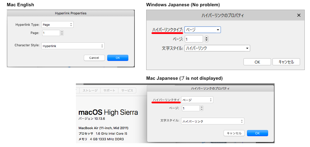
Version 1.7.3 HyperLink Property Dialog in Mac Japanese Edition, "Hyperlink Type" translate "ハイパーリンクタイプ". Some text is not displayed. Maybe it depends on the Mac OS version.
- 1 reply
-
- 1
-
-
- mac
- japanese edition
- (and 2 more)
-
 A number of apps allow me to set the font size of the text in the UI (for example menu and other section headings) Is this possible with Affinity? If not how do I request the feature?
 -
 Hi! I just jumped into Affinity Designer for iPad. I immediately found two things that disappointed me a lot. Table changes color after adding a new artboard. For someone who spends 16+ hours daily behind screens for a living, having a dark mode or the ability to select a darker scheme is a must and most of the times, a dealmaker. I loved the dark UI but why does it needs to change to light gray after I add a new artboard? In the desktop version there’s an option to change that behavior but not in the iPad version. So far the solution is to create a huge black vector square, lower the opacity, lock the layer and create everything on top of that. The artboard names are always on display. I would make them appear only when the user activates the artboard tool. So far, everything else has been working like a charm. Greetings!
 -
Dear Affinity team, I'd like to ask if there's an option to customise the UI of Affinity Designer for iPad, namely to reposition the contextual tools. I'm considering buying an iPad to use it with Affinity, siding with an 11 inch model, but the contextual tools as they are now take up a lot of space, plus having tools on all four sides seems a bit messy to me. I haven't used the app on iPad yet, but from the videos I've watched it seems to me you could enhance the UI significantly if you gave users the option to make one of the other toolbars wider and accommodate the contextual tools there, leaving at least one of the sides free. Thank you! V.
-
 Preconditions: - Affinity Photo 1.7.2.471 running in French - OS: Windows 10 Home, Version 1903; 18362, System language: German Error Path: - Open Affinity Photo - Create new project - Drag and drop a png file into the workspace - Open the Contour Pannel Misbehavior/Error - Parts of the software are displayed in German (see attached screenshot) Expected Behavior - The software should be completly displayed in French Error Recovery: - Restart the software
-
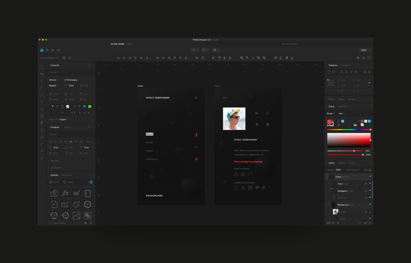
Hello. My name is Vitaly, I am UX/UI designer from Russia. In my free time I decided to redesign my beloved Affinity Designer. What I did can be viewed at the link below. What do you say, colleagues? View on Behance
-
Affinity Photo 1.7.3 - macOS Catalina 10.15.1 1. The panels are always on top. panels are covering the export window. 2. When the application is minimized, the panels are still in place. 3. The panel scrolls upward when the export keyboard shortcut is pressed repeatedly. 4. The scroll bar covers the x icon in the "Keyboard Shortcuts" window.
-
The one thing that stops Affinity Designer from being the perfect tool for UI design for me is the lack of an ability to set up a guide layout. There is almost this functionality in the grid set up options, just without the ability to make grid tiles the full height of the artboard and add a default margin on the left/right/top/bottom independent of the gutter. The ability to save a guide layout preset in the Guide Manager and load it up in future documents has been mentioned previously, and this is potentially another great way to solve the problem, so +1 to that idea too. My issue is just that when setting up a new document I need to be able to quickly set up the bootstrap grid as guides before I start. My current workaround is to set up the guides in a document and use that as a template for any web UI work I need to do. Please consider adding a Guide Layout feature and/or Custom Guide Presets (honestly the Guides Manager is currently brilliant, it just needs extending). I'm so very close to being able to replace PS/AI with AF. Cheers