Search the Community
Showing results for tags 'ui'.
-
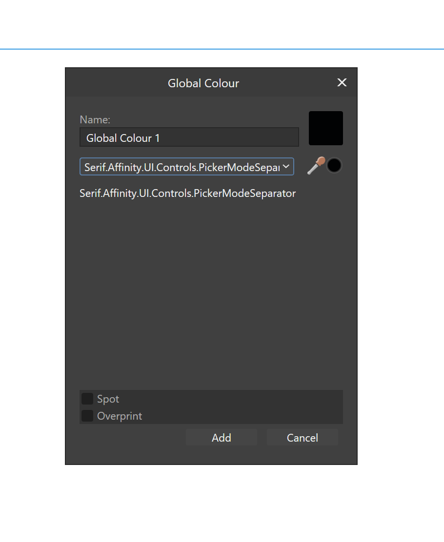
 I'm listing this as a Designer bug, but it happens in all 3 apps. How to trigger: Open/show the Swatches panel On the panel dropdown menu select "Add Global Colour" Once the dialog box opens, press the Tab key on once your keyboard The colour mode dropdown should be selected Press up (or down) key on your keyboard Instead of the next colour mode, the list separator is selected as shown in the image below This only works until you select a colour mode on that drop list with your mouse. Once you activate this drop list with your mouse, the bug can no longer be triggered until you close (and reopen) this dialog box. Thanks!
-
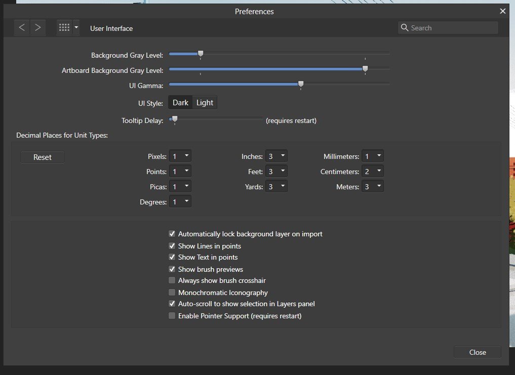
 macOS 12.6.3 Affinity Designer 2.0.4 Hello I keep my UI window filling the whole screen. I often find the window shifting out of position, which is very annoying, hiding the menus, scrollbars, etc. Especially working with tablet & pen it is very easy to accidentally move the app window when pressing any of the top menu bar icons. Please fix this. When pressing into button area, moving the window should not be possible. Untitled.mov
- 1 reply
-
- 2
-

-
- affinity designer
- cursor
- (and 1 more)
-
 Input boxes have changed their behaviour in V2. When I change image or canvas size, or when exporting, the first input box used to be ready for entry. Now you have to click on it. That's backwards UI design for me. And Tab should cycle through all the available input boxes. Legibility of icons has got worse e.g. the unlock/lock proportions chain link icon: it's very hard to see the difference. Also tools on the toolbar are less legible e.g. the burn/dodge/sponge tools are hard to distinguish on a laptop screen in light mode. I'm having to work in dark mode when my preference is for light. I haven't felt any gains in upgrading, so with these small but irritating niggles, I am feeling a little regretful.
 -
 Please fix the icons to contrast when the menu item is highlighted in blue. The icon will disappear. On the screenshot is the most painful place in ui, but wherever there is a blue backlight, the icons do not change their state, because of this they are hard to read
-
Here is my experience with the Global Colors problem. Created a Document Palette. ‘Upon adding a Global Color to the palette, I can’t add another one. Why not? I’m in my newly created palette… Wrong. Menu says I’m in my created palette. I’m actually in Recents. I need to switch to my created palette, that the menu says I’m already in, in order to add more Global Colors. ‘I’m going to go ahead and call this a bug. Who’s with me? RPReplay_Final1670441685.mp4
- 6 replies
-
- 1
-
-
- global colors
- document palette
- (and 2 more)
-
 There it goes, my inspiration that is, out of the window, and I lost it trying to change who knows what shortcut key... again. As a professional in video, animation, 3d and audio I have used many many applications over the years, and find Affinity package a real refreshing leap forward. However, I must admit that the preferences window across all three Affinity apps (Photo, Designer and Publisher) is one of the most useless I have ever encountered. I am not afraid to switch and learn applications and am ready to customize the new ones I learn to my own best practices, and the preferences window is my friend or it should be, but Affinity's is not at all. Please let me try to explain what I find is wrong with and suggest some changes which I did not think a lot about, but seem much simpler to use. Let's start: 1. The preferences window uses a unique visual paradigm, completely different from any other dialogue I have encountered in the rest of the application. It has a header with Back/forward buttons, "home" button (with an odd icon and a drop-down menu) and search bar. No other panel, toolbar, manager, assistant or any other window in Affinity uses this paradigm or at least my humble knowledge of the app does not bring any into the mind. I doubt that this is good. For instance having tabs, like some other windows would do the trick no need for back/forward buttons, no need for home button, no need for drop-down menu, just 7 simple instantly accessable tabs. 2. search bar is a sneaky red herring! It is in fact dangerously useless! I'd like to change a shortcut for brush size in pixel persona? typing any of these terms does not help me to find where to do it. It seems that this search bar is good for searching only a couple of dozen words which does not make any sense at all, either you make every single preference item that can be change searchable or get rid of the search bar because the way it is now is frustratingly useless. 3. I will not go in depth on my thoughts about "General", "Color", "Performance", "User Interface" and "Tools" pages as I do see some benefit of "bite sized" preferences pages even if some items on them seem to belong to another page, and the number of these pages could actually be decreased. (for instance half of the "Tools" preferences could easily belong to "User Interface" tab) 4. Checkboxes, since they have really powerful results would benefit from tooltip help with a more verbose description of what they do. 5. "Miscellaneous" could easily be renamed to "factory resets" or something on that line, as that is what it does. 6. And now I come to my nemesis, the "Keyboard Shortcuts" page. Where to start?! a) there is a search bar on the upper right, that is as we said a sneaky trap, and a red herring. It does not help us here, and will take us "home" probably finding nothing of interest. b) we need to use these two fiddly drop-downs. The first one could easily be replaced with beautiful Draw, Pixel and Export icons cutting the number of actions for picking persona to edit to only one click (or even better none.. read on). The second one is really unintuitive as its items partially overlap in different personas. It took me a while to get the idea that this second one is contextual to the first one (as the list changes "behind the curtain")... I got it only after learning my way a bit around the app so I recognised that some items belong to some personas. c) a quick overview of other buttons and check boxes in this upper region of Keyboard Shortcuts page; "Apply to all" -what? to all what? I had to dig through the manual to see what it does, and all it would take to fix it is to call it "apply shortcut changes to all personas" without this information there is no way to know that there actually are some connections possible between personas. As if the for instance, brush size in pixel and draw persona must be separate. "Ignore Modifier—Lets you create shortcuts using a single letter designation instead of using keyboard modifiers." says the manual, and I still do not get it. Does it allow me to pres only the letter in application without modifier keys and get what I want? No, as Ctrl+S is stil "save" and "Ctrl+Shift+S" is stil Save as. Does it filter out the input of Modifier keys while assigning new shortcuts? No. So what does it do? Maybe a better explanation in manual would help, and a more verbose checkbox title or tooltip. "Load/Save" what? it loads and saves what? a file obviously, but what does that file contain? All shortcuts, or only those in focus? Maybe "Load Shortcut configuration" or something on that line would be better. to be continued...
- 44 replies
-
- 22
-
-

-
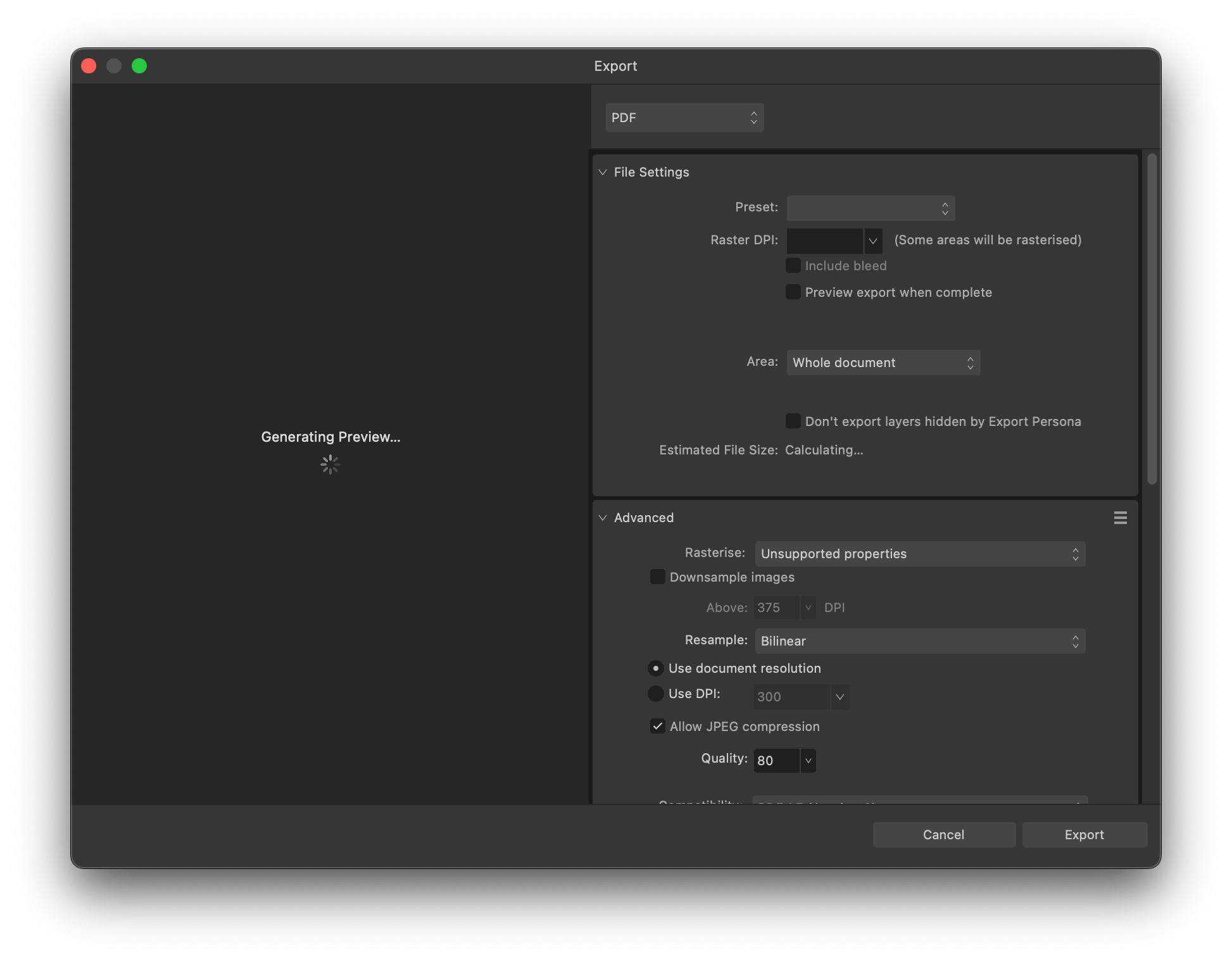
I would like to bring to discussion the Export screen in the V2 of the Affinity Suite. For complex projects it takes ages to upload the file preview, and in mostly occasions I don't even see it. IMO I don't see any advantage of having quick preview feature versus the having the beautiful icons of quick file type selection of the V1 (those icons V1 was much intuitive and had a different UI compared with the Adobe Suite). So I would like to see the V1 UI back for this screen, or at least quick file type selection of the V1 added to the V2. Thank you, Artem Toderian ---------------------- Included files: Image: EXPORT FILE UI – V2 Image: EXPORT FILE UI – V1
-
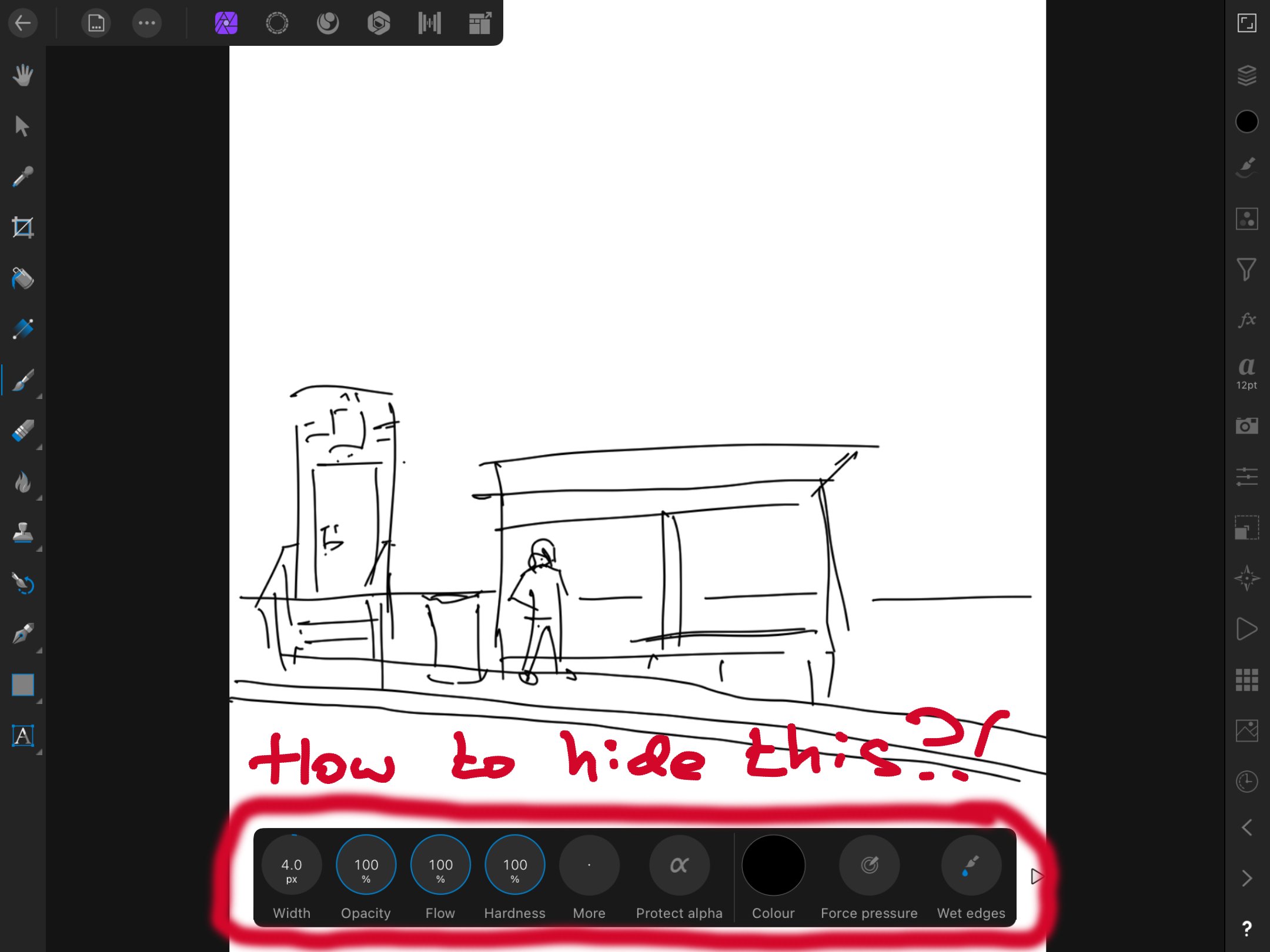
 In Affinity Photo on iPad 8th generation I find the extra menu at the bottom very distracting when I don't actually want to use it. Is there any way to hide it? I can hide all the other toolbars, but that box is always visible, and it's driving me nuts. Thank you for helping me out. - Rora
-
 I already have the alignment buttons in the regular toolbar, so duplicating them in the context toolbar makes no sense to me. It's a waste of UI space for those who already have access to these buttons (which I believe are in the toolbar by default). Instead, it would be possible to use the screen real-estate for other UI items.
-
Using iPad Pro 11 “ v2 iOS 16.1.1, when 3 sliders for properties then they go outside screen. Also some options pages do not fit.
-
 So in Photo and Designer bitmaps scale proportionally if the "shift" key is held down but for vector images it's the exact opposite. A mixed group scales proportionally if the shift key is not held down. Anyway it's weird and makes no sense. Why not choose one and make it consistent (happy for it to be different to PS, but should be consistent in the same app).
 -
 In the Right Studio area, each panel cannot be resized. (Vertical direction) The same panel can be resized in the Left Studio area. Affinity Designer v2.0.0 Windows 11 Pro 21H2 Hardware acceleration is ON (same when turned OFF) NVIDIA TITAN RTX (Studio Driver ver 517.40) Monitor: EIZO EV3237 (4k monitor)
-
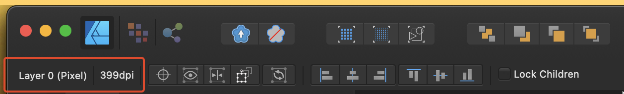
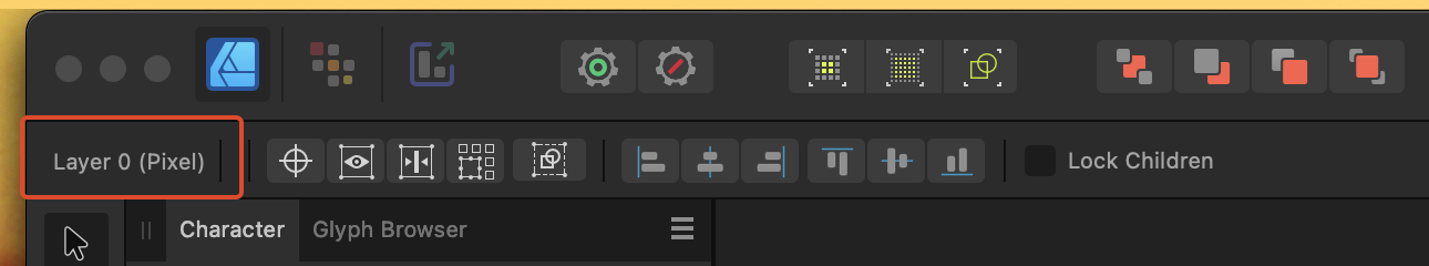
Hello, everyone. I noticed that in V2, the current DPI of selected bitmaps is no longer shown. Would it be possible for this feature to make a comeback? Here are some screenshots to illustrate the issue V1: V2: Have a great day!
-
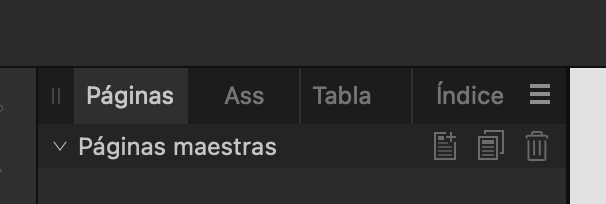
In the Spanish translation, the Assets panel shows "Recursos" when expanded, but "Ass" when contracted. It should be "Recur" or something similar.
-
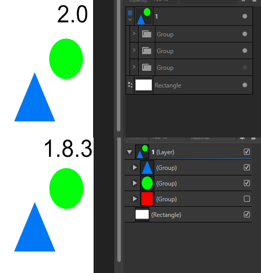
Not sure if this is a bug or intentional design, but groups no longer show thumbnails. Example screenshot to demonstrate why this might not be a helpful change. The new visibility marks are also unintuitive.
-
Other than Capitals option are not shown. try major fonts such as Arial or Helvetica. Not sure since when this problem started. I confirmed this on Monterey.
-
 At least one person asked for UI scaling two years ago (after a short search online). Still nothing implemented. I can understand that if you hadn't thought about that requirement initially, it may be hard to code up for the entire UI. Can we at least get the brushes panel to scale the images previews of brushes and can we have text names inline also instead of having to scroll through thousands of brushes to find one or make new sets of brushes from old ones every time we need a new specific style. The colour swatches allow for text which helps a lot in some circumstance. They can also me made different sizes so I know it cannot be that hard to do for the brush panels. Worry about full UI scaling later.
 -
 Hello, it would be really awesome if AD could add a simple, generic Batch Builder that can export coordinates for Artboards and Slices and basic information for exported object layers to either JSON or XML: Any slice Coordinates Slices created from objects Stroke: Thickness, Color & Alignment Fill: Color Slices created from text frames (assuming a constant style for the entire frame) Family Weight Size Alignment Bonus points for any additional properties (everything in the contextual context toolbar and the effects panel may be of interest) That would dramatically increase the usefulness for UI design in collaboration with development teams! We're currently trying to use the Spine JSON-Export to automatically create design specs for our dev team, but the proprietary structure (origin in bottom left, anchor at center of any object, no text support) makes it kind of finicky. It's awesome that it's there, but a few more attributes would make it much more useful for us. If it's too time intensive to make a pretty JSON/XML-file, I'd also settle for Batch Builder that prints a parsable ToString()-Dump of the document tree .
- 3 replies
-
- 3
-
-
- ui
- batch builder
- (and 3 more)
-
 I prefer how this tool is in Affinity Photo, all of the shapes are contained within the one tool button. I can add the individual shape tools, but I like to have my tools as consolidated as possible.
-
This is how i would like to have my UI arranged in Affinity Photo: I do this because i find it difficult to find panels if they are crammed behind other tabs somewhere in the default area on the right. Also, by giving them their own column, they have more space and are better readable. Unfortunately this takes a lot away from the canvas area, so if i want to have a proper look at my image, i have to hide the UI by pressing Tab. But then everything is hidden, including the Toolbar and colour picker, which i constantly use. The only half-decent solution to this is dragging the panels out and using them as floating windows, which allows me to collapse them: 2021-09-11-12-39-10.mp4 But this also is far from perfect: - It doesn't follow the main window around, so moving Affinity Photo to my Wacom display is a pain - The click detection feels buggy, sometimes it requires two clicks to collapse a panel area. - It looks unfinished, and is difficult to see on a busy project. I think Affinity needs some way to collapse these areas to the side, while still beeing connected to the main Window. Adobe CC had a system like this for years, where panels can be reduced to a small button (By clicking the two arrows on the top right), that can be dragged around or stay docked to the side. Autodesk Maya also has a very good implementation of this, where windows can be docked as slim vertical tabs, that you can toggle with a single click and even scroll through with the mousewheel.
- 12 replies
-
- 3
-
-
- affinity suite
- ui
- (and 1 more)
-
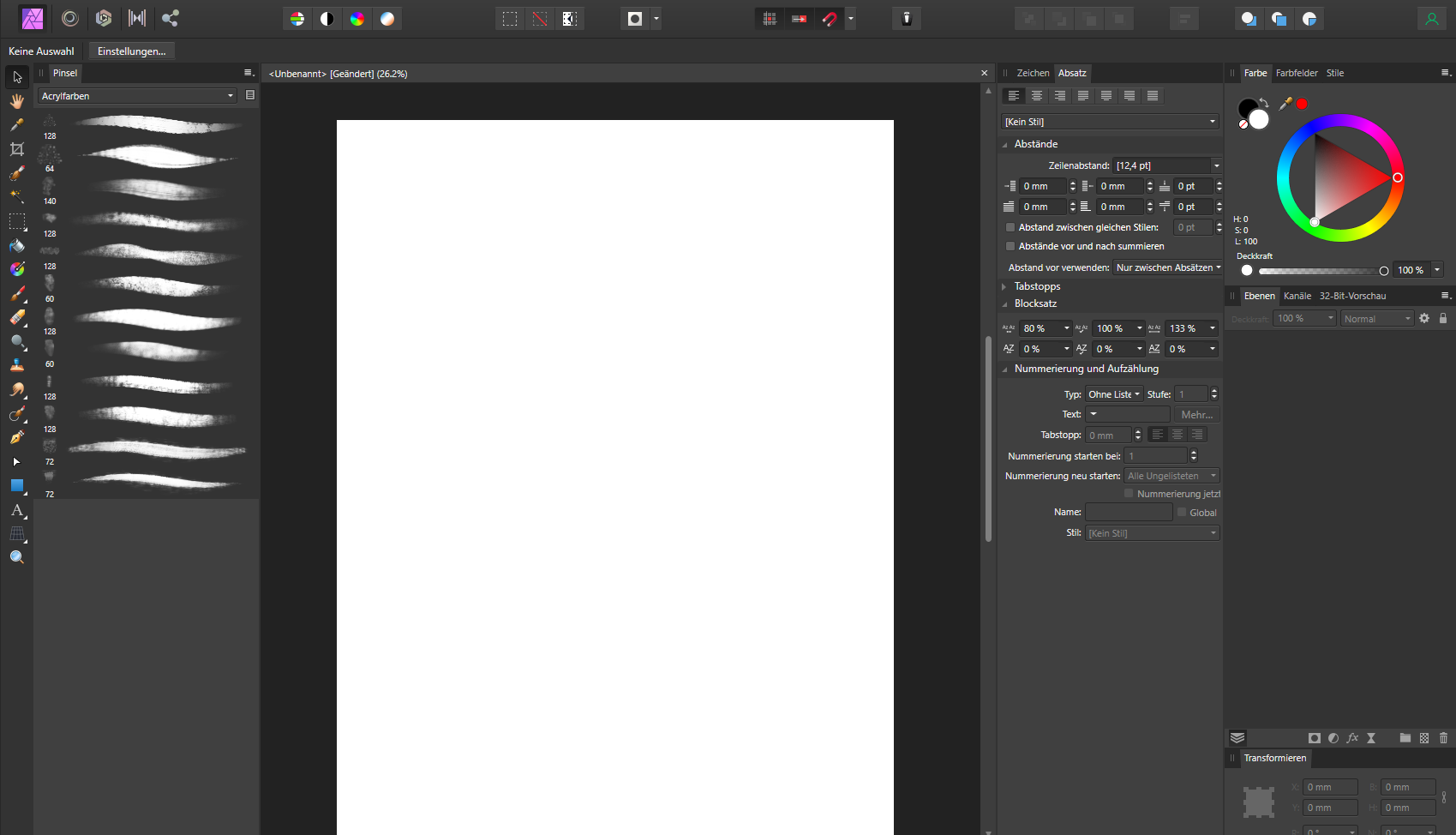
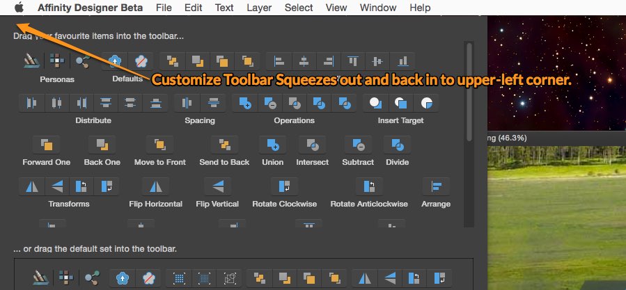
 In Seperated Mode, my Toolbar appears to be offscreen. I can't see it at all, even after toggling off and on, and when I choose Customize Toolbar... the customize panel squeezes out in in to a location above and to the left of my main display (I use two displays). I've tried repositioning my displays but that doesn't work. Reset Studio doesn't work, either. MacBook Pro 15" Mid-2012, 16GB RAM, OS X 10.10.3 Affinity Designer Beta
-
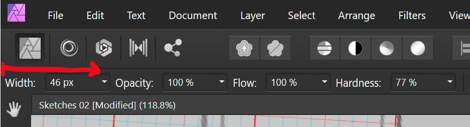
I like that I can drag on the text for width to resize my brush. But since its aligned to the left hand side of the screen, it is not possible for me to reduce the brush width, as I cannot drag towards the left. Perhaps other checkbox settings could be moved to the left of the width setting or it could have an empty margin that can be used to drag over.
-
 Hi there! One Affinity photo feature that is dearly missing for me is a keyboard shortcut to increase and decrease opacity of the currently selected layer. I would need this, so I could map this shortcut to a MIDI controller and be able to quickly set a layer's opacity with said controller. Since there is an ever increasing number of people who use MIDI controllers as quick input devices for the graphic softwares, I believe I am far from the only one who would benefit from such a feature. Currently there is only the possibilty to use the up/down arrow keys (+ shift optionally) to increase and decrease the opacity once I have set the focus to the opacity field. This does not really help me all that much as I would always need to focus this field first, before i can start to change the opacity. It would be great if there could be a global shortcut for this as well, preferrably also with the possibilty to use shift optionally to increase the increments to 10. I would not care if it is an obscure shortcut or if it is even turned off by default, as soon as there is any shortcut for this MIDI users could make use of this and map it to their controllers. Thanks! trych
 -
 Total noob, just getting started. Using Designer on Windows laptop and I want to enlarge the screen fonts and tools. I searched help and read: To change the UI font size: Choose Affinity Designer>Preferences. Choose Edit>Preferences. Click the User Interface label. For Font UI Size, choose either Default or Large. See screenshot - that option is missing. Thanks.
-
In Preferences/Keyboard shortcuts in all Affinity apps there is 'Ignore Modifier' checkbox. What does it actually do? Help documentation defines it: Ignore Modifier—Lets you create shortcuts using a single letter designation instead of using keyboard modifiers. A mystery. So, I tried to discern it's effect on one of the commands. In orange are marked results I find unexpected. With 'Ignore Modifier' ON 'P' is assigned as 'P'. (that is uppercase 'P'; why unexpected? Please see the reference below to @walt.farrell's experiment), 'shift+P' is assigned as '⇧P' (again, refer to Mr. Walt's experiment; furhermore, here, 'shift' is not considered a modifier?), '⌘+P' is assigned as 'P' (I guess ⌘ is ignored somehow, but to what purpose?), 'alt+P' is assigned as 'π' (I guess 'alt' is ignored, resulting in conventional π), 'ctrl+P' is assigned as empty (!) but with an option to remove it. (see image below, is this normal?). With 'Ignore Modifier' OFF 'P' is assigned as 'P'. (I understand this is something 'Ignore Modifier' should make possible but here it is, working fine with 'Ignore Modifier' OFF), 'shift+P' is assigned as '⇧P', '⌘+P' is assigned as '⌘P', 'alt+P' is assigned as '⌥P', 'ctrl+P' is assigned as '⌃P'. 'Fn' key is skipped here since I own Logitech keyboard, not Apple. Now, referring to Mr. @walt.farrell 's experiment where pressing key labelled 'P' with 'Ignore Modifier' ON assigns 'p' (lowercase P), while 'shift+P' assigns 'P' (uppercase P): In all things 'Affinity' I trust Mr. Walt first... So, is it possible that my shortcuts preferences file is borked? Or is there a finer idea underpinning 'Ignore Modifier' checkbox that my measly braincells fail to grasp? Am I alone in this?

.thumb.jpg.1bb6d5a69b910621016ec95681d19348.jpg)


.png.255de33cd491c204ae880d5ea4ebd232.png)