Search the Community
Showing results for tags 'ui'.
-
 Hi, As a long time Adobe Flash user, I'm used to make quick selections and modifications on vector shapes just by selecting a portion with the default cursor (see image). Also in Adobe Flash not every shape is automatically placed in its own seperate layer, instead shapes are automatically added to existing layer or shape. Vector shapes are rather added or withdrawn depending on their color, shapes of the same color are merged into one, while shapes of different colors are divided. I know this way of editing is not for everyone but I would very much like to have the option in Affinity Designer. regards, Ivo van de Grift Grootlicht Interactive Design
-
Hey, I've recently started using Affinity Designer (on Windows) for UI design, coming from Photoshop. While I think it's much nicer to work with overall, there are a couple of things that I think make the program very frustrating to use (at least on Windows). One big thing I find annoying is that when I ctrl select a layer, it doesn't select the layer in the layer panel (or at least expand the group it is in). I can see some people maybe don't want that, so I suppose giving the user the choice would make sense in this case. The second and most annoying thing for me is the double click rabbit hole I need to go into when working with nested groups. Usually for UI design you end up having a lot of nested groups. While there probably isn't a better way to handle it, I think some work needs to be done about when it exits a group. It's very frustrating to go into this 5 level deep double-click loop and then a misclick (or the program not understanding your intention) brings you all the way back to the top. One specific thing that does this is deleting a layer. It should leave me at whatever hierarchy level I was at. A third annoyance I find is using CTRL to zoom. Not just because it is ALT in Photoshop, but also because CTRL is at the same time assigned to the deep selection. When I'm moving around the document, I use panning and zooming. Sometimes this leads to moving a layer unintentionally. This is maybe more a performance issue though, almost feels as if the keyboard is not being polled often enough to detect when exactly a button has been pressed. In any case, I would like the option to remap zooming to ALT+scroll. Other than this and a couple of small things (why can't I enter a number for opacity in strokes or fills? why cant I use pixel values for strokes?), AD is fantastic and certainly the best tool available on Windows. Thanks
-
 Small icons and color combo on the iPad pro user interface are difficult for visually impaired. Difficult to see gray on gray or black. The colors on the Mac interface are great! This would be a great improvement. Thanks!
 -
I would like to ask you to add Czech language interface to Affinity designer. And to Affinity Photo too. I will make the translation, if you tell me, how.
-
 Hi, is it technically possible to let the value-lists of the comboboxes of the tool bar hover over the floating windows, to be able to use the list? To choose between all values? This would allow to continuously work. No need to "Esc" the combobox, move the floating window away and start over. Cheers, Stefan. AD_Improvement_ToolComboBoxOnTop.mov
 -
 Hi there, how to you best work with helpers? I.e. you multiple layers. One is for the image contents, one is for background stuff, etc. etc. you need to place for example helpers one one layer to help adjusting come content to them. But when you also adjust parts of the background, on another layer, to the helpers, they are not visibel as they are linked? to the other layer?... Or is there a hidden setting i have not discovered yet? How could you place helpers on layers or make them visible to all layers? Thanks a lot.
 -
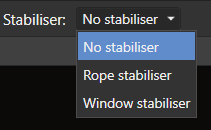
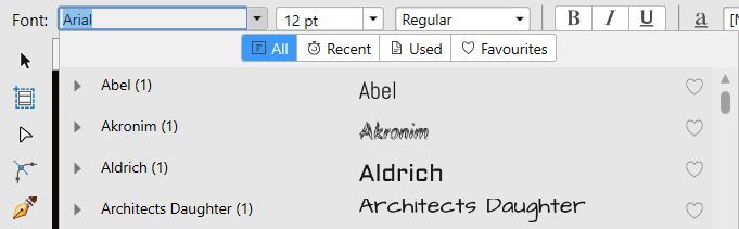
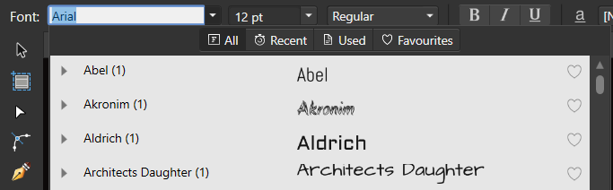
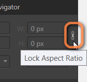
Thanks for update to 1.6, but contains minor discrepancies. a) Stabiliser is perfect tool. In Pencil Tool, Vector Brush Tool, Paint Brush Tool, etc. is controlled by checkbox/buttons with tooltip (good way). In other tool (Blur/Sharpen/Erase Brush Tool, etc) is controlled by combobox without tooltip. Why is different? b) In Pencil Tool is Controller before Stabiliser, in Vector Brush Tool is at the end of toolbar. These are unnecessary discrepancies, which make the operation more difficult. c) Font listbox is perfect. In Light theme is light, in Dark theme is .... light? d) Lock and Unlock Aspect Ratio has the same Tooltip. "Lock/Unlock Aspect Ratio" would be more appropriate, but the lock symbol is not very obvious.
-
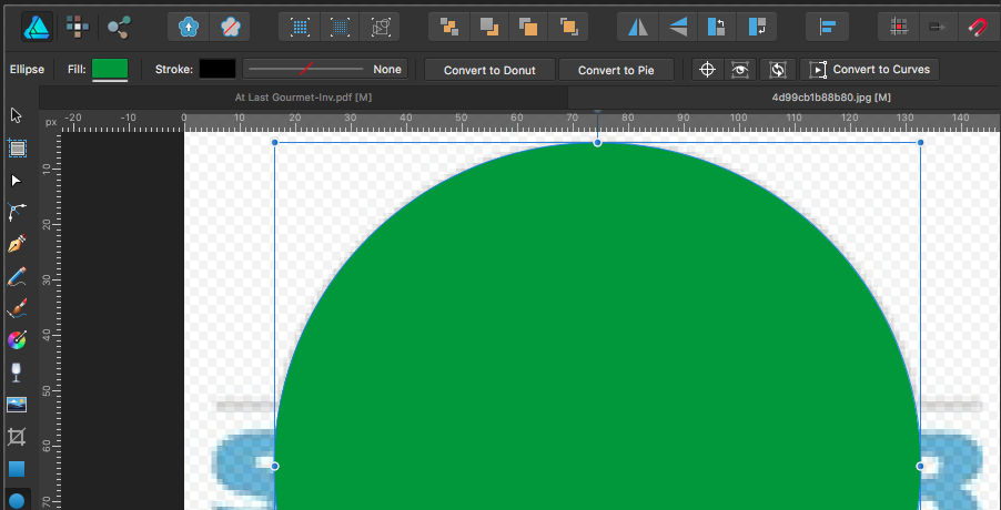
Hi all. Thank you for your work on Affinity Designer. 1. Let's imagine that I am creating some vector art (see screenshot, below). 2. My goal is to remove the selected object's Fill color. The problem is that if I want to use the "/" hotkey (to remove the color) or "x", "/" (to switch from Stroke to Fill and then remove the color) ... I don't know whether the STROKE or the FILL is currently "Selected". (A**** Illustrator solves this by always showing the Stroke and Fill in the Tool Bar (see screenshot, below)). In my case, I have to first take my hand away from the keyboard to move my mouse, then open the Color Panel, to find out whether the Stroke or Fill is selected. This creates an extra 2-3 second, unnecessary step in my workflow. My recommendation might be to add a "Selected highlight" around the Fill or Stroke color in the Context Toolbar which is displayed far more frequently than the Color Panel (see screenshot, below). Thank you, again, for your work!
-
Hi, this is a small but important issue. I would like the tab at the top of the image clearly defined when it is currently selected. It shows as a lighter grey colour as opposed to a dark colour when images aren't selected and every time you have to stop and think which tab is currently selected. Also, the same problem occurs when masking. When in selection mode the current mode is black/charcoal. The UI needs to be consistent. I am not suggesting bright pink but it would work better than what it is currently. I would suggest something like a fine red or yellow outline around the selected tab or button, something that instantly recognisable.
-
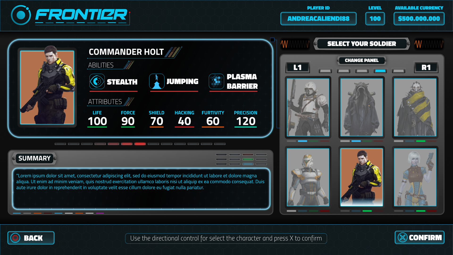
This was a test for a game company one is totally with affinity but the drawings are just sign places from the web. and here you can find also another animated version half with affinity and half with illustrator, more futuristic, minimal. the text is bold and near to the border of the buttons because they have some elements of the sci-fi films of 60s with also the minimal style of the moodboard provided. Hope you like it, and if anyone is interested, I'm actually available for game companies <3
-
 Hello, I just upgraded in the latest version and I lost my customization of the panels in designer, I have looked around if there is something to save to avoid losing it again (and in upgrading photo) but I couldn't find anything. Is there a way to save this so I can restore it in each update? Thanks
 -
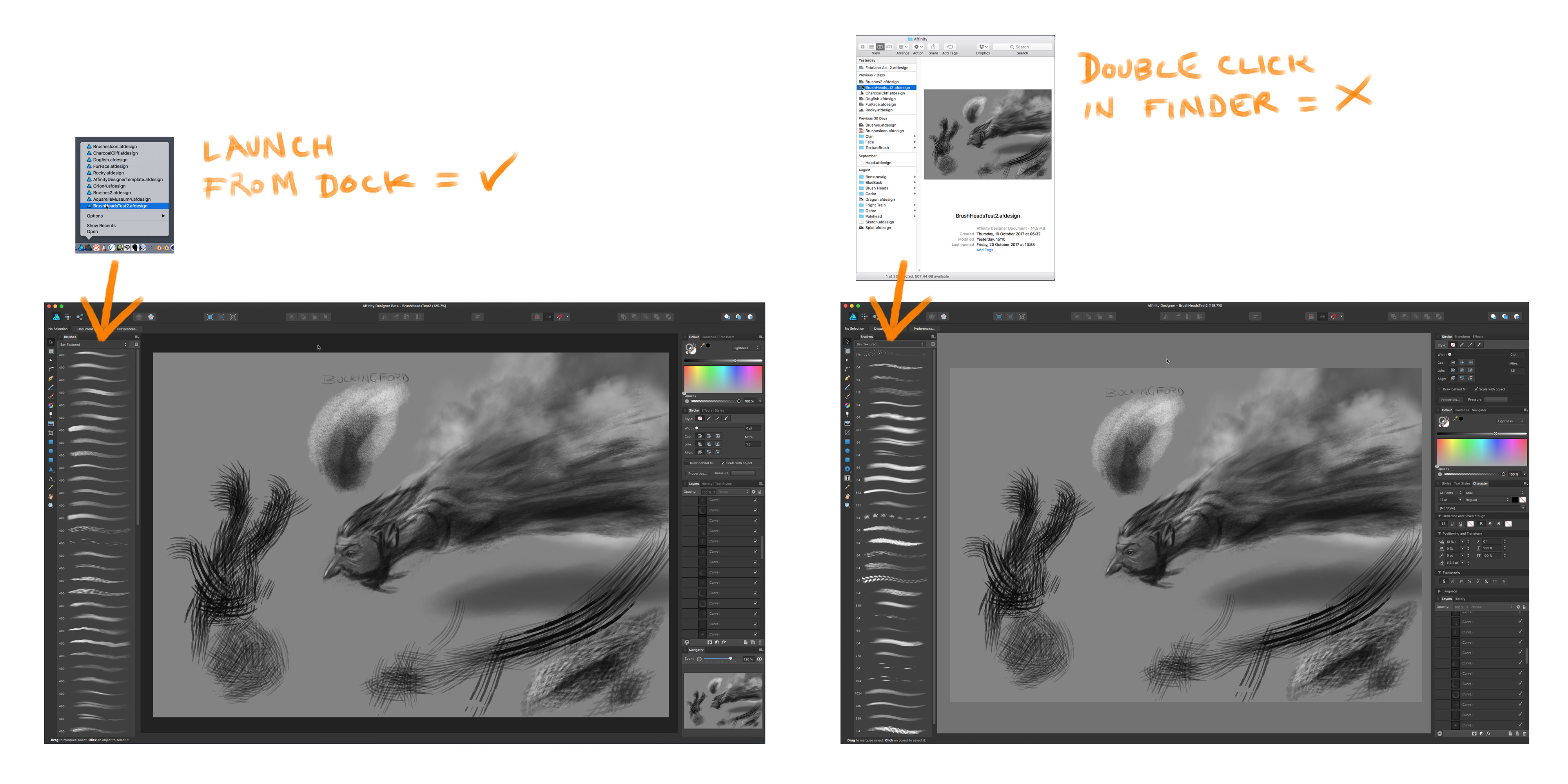
Hello I'm still pretty new to Designer so I'm not posting much to the beta list yet, but this little anomaly seems like a UI bug. When I launch Designer fresh, my brush list rearrangement is honoured. When I choose a recent file from the dock, the brush list rearrangement is also honoured. But when I double click a file from the finder, the brush list rearrangement gets messed up. I'm not sure how but it's not alphabetical. Perhaps double clicking displays the original order brushes were made. Thanks.
-
 Hi peeps, I leave here a tut on how to create an skeuomorphic volume knob. I'd say this kind of simple pieces is how I started learning how to "read objects" in order to reproduce them in a realistic way. It is pretty simple to follow through even for newbies and results are quite nice. Hope you enjoy it, and if so, comment, like and subscribe for more. Thank you all. Isabel.
- 4 replies
-
- 5
-

-
- affinity designer
- tutorial
- (and 6 more)
-
 I have installed Affinity Photo 1.6.2 on my home PC with Windows 10 recently and cant work without pain in my eyes. Fonts are pixelated, thick. The look ugly. My display is LG 22MP65 with 1080p resolution hooked up to ASUS N73SV laptop. I have no problem with any other software but Affinity Photo. How to fix Affinity Photo UI fonts on Windows 10?
-
 Hey guys, Some months ago I saw a redesigned Apple Music, I liked the idea, so made my own. To check out all the story behinds it, I made a huge publication on medium, with images and screens all made on Affinity Designer and Photo. would love to you guys check it out! https://medium.com/@gustavoantoniogonalves/i-saw-a-redesigned-apple-music-so-i-kinda-redesigned-it-again-8b3dfb5c5abf?source=linkShare-92ff1568a988-1507110699
 -
 Hi there, I'd like to see a lighter/brighter mode for the whole UI. Sometimes it's much better to work in a lighter/brighter UI as in a dark mode (which I also like much!). I think your UI is a lil bit to dark. I like more the dark-look of the native Apple Pro Apps. It feels a lil bit better :)
- 232 replies
-
- 16
-
-
 Recently I have not been able to see the document that I am working on or any of the following at the same time: * Toolbar * Tools * Context Toolbar *Studio I can tab to toggle the UI on and off. When UI is off and I can see the document if I use the View menu to see any of the above then the document disappears from view. I have tried resetting all the default but this does not solve the problem. I have the same problem with the beta version. I am running Windows 10.and experienced other problems (with restarting) after Windows updates were installed on 12-13 September; the latest Windows update has fixed this.. This may be a coincidence but AP worked fine before (I am not sure of the exact date but certainly after 1 September). After the Windows updates I did not try AP until a couple of days ago. Have I accidentally changed something? Has anyone else ever had the same problem? Update 30/09/2017 I have found the cause of the problem as the settings for AMD Radeon™ R5 Graphics card. The drivers for this card were updated with the Windows updates and the new driver appears to have either caused the problem or changed the settings. The setting for the Affinity Photo now default to "Unassigned". If I change these to "Power Saving" the problem disappears when I restart AP but reappear if I select any other setting.
 -
Hello! During the use of the Affinity Designer, I noticed some difficulties in the work and would like to describe them. 1. It would be great if you could change the name when creating / editing a document. 2. The left toolbar can not be edited and configured directly from the preview window. The need for viewing - setting tools. And the top toolbar can! 3. Export all settings to a separate file. 4. One checkbox turns the normal search into a hotkey search and all menu functions. Give people the opportunity to set up a modal window in height! I have a big screen, but I do not see all the hot keys on the screen! 5. Make the gradient a separate modal window and add it to the studio. This will speed up the work several times!
-
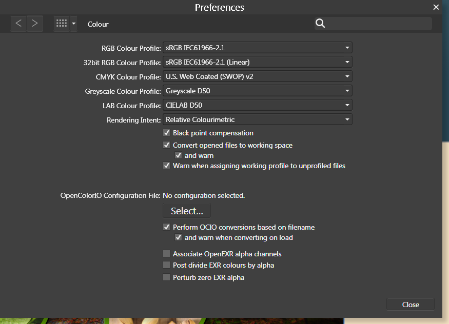
 For some reason, the AFD interface is scaling to beige where it should be scaling to white. This doesn't affect any final renders, but while it substitutes white for beige in the interface, I can't make any accurate design judgements involving colour. So this is happening on my new computer. I booted up my old computer with Designer and it doesn't have the same issue. Whites are white. I open up the same files on my new computer and whites are now beige (see attachment). Note in the toolbar where fill and stroke should be a red line in a white box, its a red line in a beige box. I tried changing the renderer from my GPU (nvidia) to WARP but this has had no effect. I am running Windows 7 on both computers and I have attached my Nvidia information file for more details. I have not noticed this problem in any other applications running on my system. It is not a monitor calibration issue. I have no idea what colour profiles I should be selecting in preferences. I have attached a screenshot of my colour settings. NVIDIA System Information 01-05-2017 09-51-49.txt
-
Hi! It would be great to be able to hide artboad labels. For instance, if you want to zoom out and look at your artboards, the labels are overlapping and don't look good at all. Plus, hiding the labels gives you a better idea of what the design looks like.
-
 See attached. When in portrait mode and there are lots of layers, I can't scroll down to the bottom the list. If that glitch is active and I rotate to landscape it will persist. The only fix is to close the layer group, be in landscape, open the layer group. I can then scroll all the way down until I do some other manipulation, after which I may be restricted again. iPad Pro 9.7", iOS Public Beta 7, Photo beta v1.6.5.59 27D1BBC0-D580-416C-973F-4F76D6E19AE3.MP4
- 1 reply
-
- 1
-
-
- layers studio
- layers
- (and 2 more)
-
Its in the image...
-
In Affinity Designer, it would be nice to be able to export the color palette in json format, so that it can be passed to developers. Maybe Affinity is already doing it but I have not found it. Thank you for your help
-
I would find the ability to import and export swatch palettes incredibly valuable. Furthermore, the ability to re-arrange my swatches by drag and drop would be very useful when working with large palettes so I don't have to be mindful of the order I add them in. Finally, is it really necessary to ask the user Are You Sure you want to delete this? Especial;lily considering I've already had to tap and hold on a swatch, only to be presented with a menu which then asks me to pick between rename and delete. Is the modal pop-up Are You Sure needed? - Along those lines, when in swatch list mode, a double tap on a swatch to start renaming would be appreciated. Little details which I hope would help make the management easier, fun and swifter. But especially swatch import please.
-
Please refer to the attached photos of the Channel Mixer Adjustments settings in both portrait & landscape. The adjustments settings fall out of range in portrait mode. Affinity Photo 1.6.4.49 on iPad Pro 9.7” iOS 11 Public Beta 3