Search the Community
Showing results for tags 'ui'.
-
 This sounds silly but makes a very big difference to the feel of the app. When dragging & dropping I frequently don’t know if I’m actually doing it. Issue 1: I don’t know how long to hold the layer for. I need to know when I can start dragging a layer - however, Affinity offers almost no visual feedback Everywhere else in iOS, the item you’re holding ‘pops’ off the screen so you know the item can now be dragged, rather than scrolling your list. See the GIFs attached and let me know if you can spot the moment the layer goes from held to draggable. It’s possible in affinity, but so much more obvious in Procreate. Proposed solution: Have the layer ‘pop’ off the screen the moment it is dragable. Issue 2: I have a long list of layers, and I’m on a multi-touch device, I would normally hold the layer with one finger, and use my other fingers to scroll through the list to find the new spot for my held layers - but that doesn’t work here. (Try it in the files app, or procreate for comparison.) Proposed solution: make the layers palette respond to multi-touch.
- 1 reply
-
- 1
-

-
- touch
- multi-touch
- (and 4 more)
-

Digital Drawing in Affinity Photo
petr0m posted a topic in Feedback for Affinity Photo V1 on Desktop
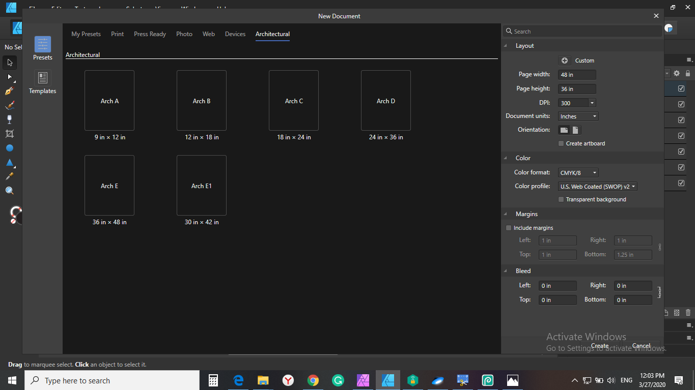
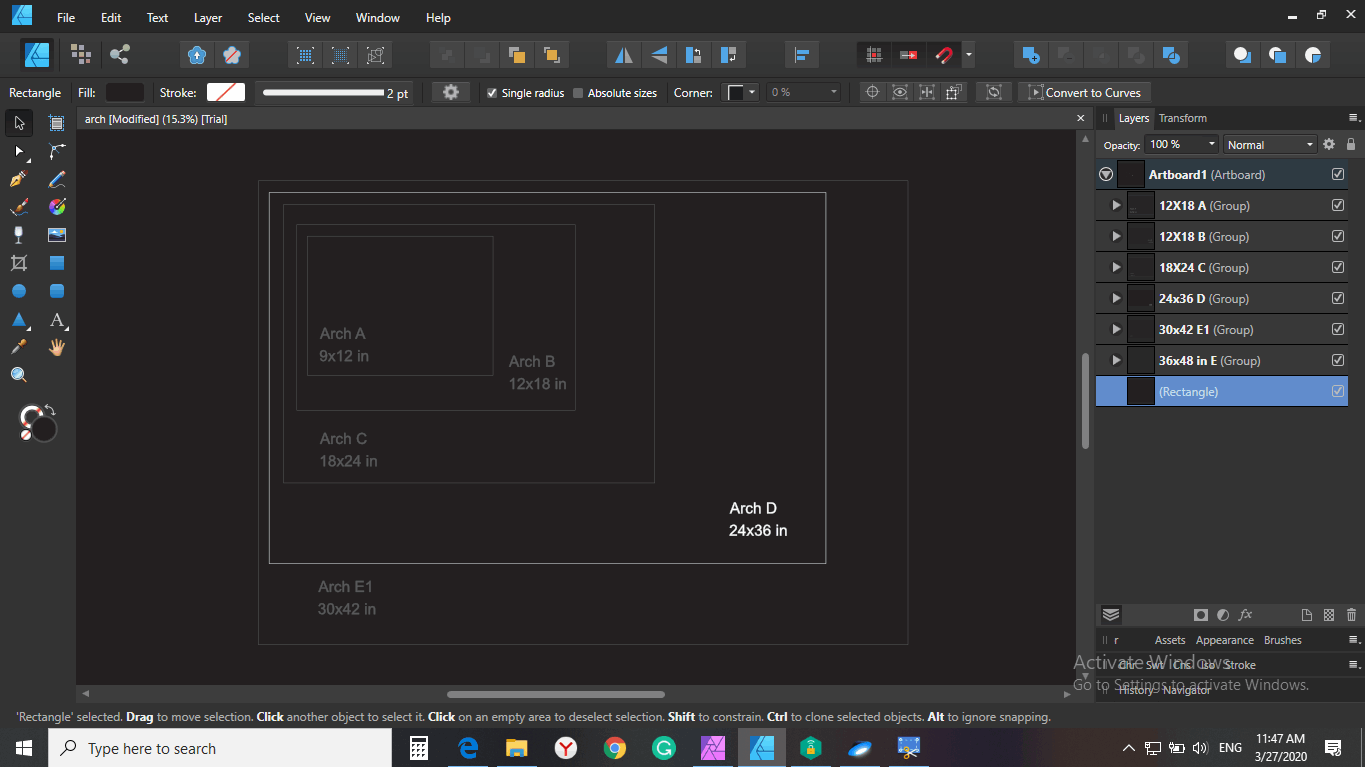
First off I mostly enjoy drawing in affinity photo. I would want to supply a small list of features which is holding my work speed back tremendously and which I find would be great additions to the affinity apps: Hover Option for the eye dropper color pick: It would be great to have an option to enable a hover color pick without clicking on the canvas after pressing alt for picking up a color. It just needs to much timing and coordinating when painting fast to press alt (assigned to stylus keys) and then click the canvas. Sometime the canvas is hit first ending up to redo one step to try to choose the color again. I would want an option to always pick up a color as soon as alt is pressed and that click and dragging then opens up the more precise view for picking colors. Color wheel of the box version: It would be great to have an additional rectangular color wheel option. Quick solution to rotate workspace: button and drag to show a compass/indicator and rotate the workspace Straight lines for brush tool by dragging a line preview: option to draw straight lines with the brush tool at the actual recorded pressure level. The line should be previewed so that the drawing angle can be adjusted until the additional button for drawing these straight lines is released, would be immensly helpful for fine lineart, as the resulting line can be previewed and adjusted. Would be a great addition to the current draw from dab to dab. Direct slider option for width, opacity, flow and hardness in the brush toolbar: Option display the sliders without the need of clicking the drop down option to display the sliders Scale slider for the UI: Something I have noticed on the work with high dpi-monitors, is that the UI is appearing pretty small. That would be very helpful also if these apps are used on high dpi smaller monitors like a surface pro. Re-sizeable dockers: More flexibility to set up your workspace Brush performance improvements Photoshop Plugin Compatibility for photoshop panels
- 7 replies
-
- 2
-
-
- ui
- color picker
- (and 1 more)
-
 Hello. I would like to propose a feature that would give the user an option to male the blue line guide in pen tool be hidden and only the actual stroke be visible. This feauture would be useful on siuations where the stroke width is very thin like 1px to 5px. The proposed feature will look something like this with the only difference where the blue line guide is not visible.
 -
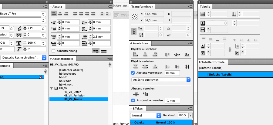
 Hello, I recently noticed that version 1.8 presents a user interface that is difficult to understand about (new) document formats. Here I present a proposal about the user interface and would like your feedback. Thanks Thanks
- 4 replies
-
- 7
-
-
- ui
- affinity designer
- (and 4 more)
-

The gray(t) Affinity Wall
Joachim_L posted a topic in Feedback for the V1 Affinity Suite of Products
First of all, sorry for the bad pun in the title. But this is my feeling, when I start e.g. APu. Working area on the left monitor and most needed tools on the right monitor. The overall gray appearance between the panels makes it sometimes hard to distinguish them. We have three applications which have a "brand" colour of their own. Why not using these colours inside the applications? E.g. orange headers or orange overlines for the panels in APu? Just a thought. P.S.: I know I can use the Dark Theme, but personally dislike it. It is a matter of taste and I am used to it for over thirty years now.
-
When trying to rename a style category it takes the one before in the list. Same on delete style category. Affinity Designer 1.8.1 OSX 10.13.6
-
 Keyboard shortcut entry is missing in Publisher Beta 1.8.2.603/Preferences/Keyboard Shortcuts/View ... table. Other studio panels can be assigned very handy shortcuts. This is not the case with Preflight panel.
 -
UI text color on radio selection is inconsistent with the rest. See image below. This occurs both in 1.8.1 and beta 1.8.2.
-
 Greetings friends, So there is this bug which I have not been able to go around for a week or so. Whenever I try and use any of the already made assets that you can use on Affinity Designer, the program stops responding and I am left with a black screen on the program window. I have tried many solutions recommended such as uninstalling and reinstalling the program, I have tried deleting the program files, and have tried deleting the App Data files. Nothing worked. Honestly, this is not something I can find a solution for, so if anybody has any solution or have encountered this previously, then please do share it. Video: Have a great evening/morning/afternoon.
 -
The UI default font seems too thin and the spacing clunky when the UI "big" font is used. The UI default font seems too small even when set to "big" (using 2560x1440 resolution on a LG 4k monitor)
-
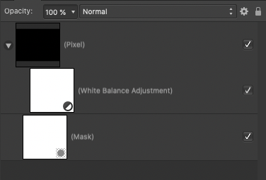
 The UI presentation between masking and clipping layers needs to be improved. The difference is too minor and too similar. When working with a lot of layers, this becomes even more difficult to see.
-
There is a bug in the navigation of the "preferences" UI. The arrows "left" and "right" are not working properly. The "right" one is not working and the "left" one is taking you back to the main selection.
- 3 replies
-
- 1
-
-
- preferences
- ui
- (and 1 more)
-
I am sure this has been mentioned but I find the document loading feed back on the trio of the application very poor. Can you please consider using the progress bar dialogue you use when exporting, also on opening documents? At the moment it is very poor. Apart from that loving Affinity products and to hell with Adobe!!!
-
Hello, Fellow UI designer here, just wanted to suggest a few tweaks to the layers panel, 1. Add an even smaller thumbnail setting and maybe even a no thumbnail setting (Not for me but I think some people might like it). The UI is already scaled quite bigger than I'd like and wastes a lot of space from the actual view window. 2. Add the ability to copy paste things from the layers panel, for example: If I hold down CTRL and drag a layer it should let me make a copy of it. It's different than duplicate because it allows me to put the copy anywhere I want directly. 3. Lock icon in the layer itself, it's annoying having to click the layer and then going up and click the lock icon, I already use the shortcut to lock thing but still, annoying. Maybe make the icon appear alongside the checkmark icon as you hover the cursor on top of the layer? I hope you address this in the upcoming updates! Thanks.
-
 This may seem like a small detail, but it constantly trips me up when opening new documents that the top default tool in Affinity Photo is for some reason the View tool (Hand, for panning around) and not the arrow pointer Move tool. This is different for some reason in Photo, whilst both Affinity Designer and Publisher follow the convention of most other tool-based graphics software that have move/select tools as the first default tool and the view/pan tool placed by the zoom tool. Seems extra strange since the View tool is probably the one tool I never use as it's so easy to pan around with middle mouse button or space bar. So if you don't have any good reason for this, please change the default top tool to the Move tool and move the View tool down like in your other software.
-
 I'm new to Affinity Designer, coming from Adobe Illustrator. Still a learning curve, but the transition has been pretty smooth so far, so that's awesome. One thing that I'm missing however is the flexible tabs/windows, so the ability to drag the windows from the tabs. So for example when I open 5 different vector files for, it creates 5 tabs. Each file sits in it's own tab. In Photoshop or Illustrator, I could just mouse click and drag each one these tabs out, so they create a free floating windows. I could then just drag the artwork elements from one window to another. In Affinity, this doesn't seem possible. So the tabs stay tabs and the only way to place artwork from one tab to another is to copy and paste as I can't drag the artwork between the tabs. Or is there a way to do this? Also Adobe has a feature called 'Paste in place'. So when I copy an element from one artboard, I can paste it into the exact same spot of the other artboard (if the artboard is of same specs of course) Is there anything like this in Affinity? Thanks
 -
 I usually work in separated mode on my Mac. I have two huge displays to view my document in full screen AND put most of the expanded panels on the other. There are gaps between them becaouse I like to temporarly put eg. the brushes near the center of my main screen for fast access. Afterwards I put it back. So I don't fill the second screen completely with the panels, and the underlying Finder-windows are not very easy to tell apart where you click. A mac-typical shadow around the panels would help here. I compared it to Indesign and there is no shadow too, but it is more visible. Maybe we just need a darker outline/border in Light Mode? Publisher LightMode: InDesign CS5
-
 I've used Affinity Photo for several attempted projects, and the one issue I'm having is the ability to move a selection. I am logging this as a bug because if I make a selection with the rectangle tool I can press the SHIFT key and it will lock into being a 1:1 square, so the action of the shift+drag+select=1:1 square tool works as it does in Ps. Now if I need to move that selection around on the screen, I would normally just hold the SPACE bar and it would enable me to move the selection. Can you point me to adjusting the quick-keys to work in this way, or if this is a bug that can be fixed?
 -
 While working on a file, having both the "Colour" and "Swatches" panels open, I thought both offer a fair amount of wasted white space. Secondly I thought "why are these two panels separate anyways?". Both utilities compliment each other, complimentary colour pun intended, and it would clear up the UI a bit more for users with preference for minimal opened panels and/or smaller screens. Why not split the revised Colour panel into two columns: colour wheel/meters/editing components on the left-hand side, and the swatches on the right. I've made a quick, rough mockup of this as attached.
-
 Quite often I encounter problem where the toolbox with the measuring distance is hidden behind the anchor of the bounding box of the object. See below the image for details . Even simple zooming out doesn't help to show the numbers in the toolbox. To go around it it is always necessary to zoom out to very small zoom ration and then the toolbox will appear - see 2nd image. I know this is just UI tweak and probably the measurement toolbox should be displayed next to the anchor. Does anyone encounter this?
-
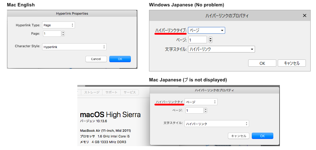
Version 1.7.3 HyperLink Property Dialog in Mac Japanese Edition, "Hyperlink Type" translate "ハイパーリンクタイプ". Some text is not displayed. Maybe it depends on the Mac OS version.
- 1 reply
-
- 1
-
-
- mac
- japanese edition
- (and 2 more)
-
 Hi! I just jumped into Affinity Designer for iPad. I immediately found two things that disappointed me a lot. Table changes color after adding a new artboard. For someone who spends 16+ hours daily behind screens for a living, having a dark mode or the ability to select a darker scheme is a must and most of the times, a dealmaker. I loved the dark UI but why does it needs to change to light gray after I add a new artboard? In the desktop version there’s an option to change that behavior but not in the iPad version. So far the solution is to create a huge black vector square, lower the opacity, lock the layer and create everything on top of that. The artboard names are always on display. I would make them appear only when the user activates the artboard tool. So far, everything else has been working like a charm. Greetings!
 -
Dear Affinity team, I'd like to ask if there's an option to customise the UI of Affinity Designer for iPad, namely to reposition the contextual tools. I'm considering buying an iPad to use it with Affinity, siding with an 11 inch model, but the contextual tools as they are now take up a lot of space, plus having tools on all four sides seems a bit messy to me. I haven't used the app on iPad yet, but from the videos I've watched it seems to me you could enhance the UI significantly if you gave users the option to make one of the other toolbars wider and accommodate the contextual tools there, leaving at least one of the sides free. Thank you! V.
-
new documents in tiny windows
woefi posted a topic in Feedback for the V1 Affinity Suite of Products
Im having a problem with tiny document windows on mac. All my new documents being created (in any affinity app) are initially displayed in a window circa 1000 by 700 pixels on screen, although I have an iMac 21.5 (1920x1080) and my main screen is an Apple Thunderbolt 27" Display (2500something) I can't remember since when I had this, but maybe forever? I never bothered to mention it, as I was testing betas, but now, as I am beginning to dip my toes deeper into affinity-life these first-world-problems come up again... It happens only in Separated Mode, which I'm using 99% of the time. Maybe it has something to do with my migration from a MacbookPro. I really want to avoid resetting my apps to factory-defaults, as there is no easy way to restore the previous settings if that does not help... <feature-request plug: please add saveable and loadable settings and panel positions> Can somebody help me, ideally from the affinity-team with inside knowledge or somebody who has successfully fixed a similar problem? -
Affinity Photo 1.7.3 - macOS Catalina 10.15.1 1. The panels are always on top. panels are covering the export window. 2. When the application is minimized, the panels are still in place. 3. The panel scrolls upward when the export keyboard shortcut is pressed repeatedly. 4. The scroll bar covers the x icon in the "Keyboard Shortcuts" window.

.gif.15857e269b74da3c18ed06440a639ac4.gif)