Search the Community
Showing results for tags 'ui'.
-
 It's mildly annoying to be unable to control the stroke pressure exactly in Affinity Designer; wanting to somewhat align how thick the stroke is on two objects along a certain point is pretty much impossible. However, I've realized that there's a preexisting design paradigm for controlling properties of objects that exist within shapes but which have their own node points: that of the controls used for gradients by the Fill tool. As such, I'd like to suggest that, either via the stroke options in the context toolbar or as a tool in the regular toolbar, there should be a way to control the stroke pressure of a shape with a node-based system, operating as follows: With this tool active, each selected curve or other shape has a line surrounding it, representing the stroke's path. This line has nodes along it, each setting what the stroke pressure should be at that point along the line; this is shown as the width of the node's square shape perpendicular to the line, and can be adjusted either by placing one's mouse just to the side of the node and "pulling" on the symbol that pops up or by clicking on the node and manually typing in a value for the stroke pressure. By default, curves have just a start and an end node, which for closed curves is represented as a "fused" node, where half the node is the start-size and half the node is the end size; an arrow symbol might also be useful for matching this to the existing stroke pressure control system. As for how this works with shapes that have an inner portion cut out or distinct shapes that have been combined via the add operation, I feel that if a shape contains multiple distinct stroke portions, those should be controllable separately (admittedly, this is functionality Affinity doesn't yet offer even via the already-extent stroke pressure control method), and thus should have their own line with nodes.
- 1 reply
-
- 1
-

-
- stroke
- stroke pressure
- (and 2 more)
-
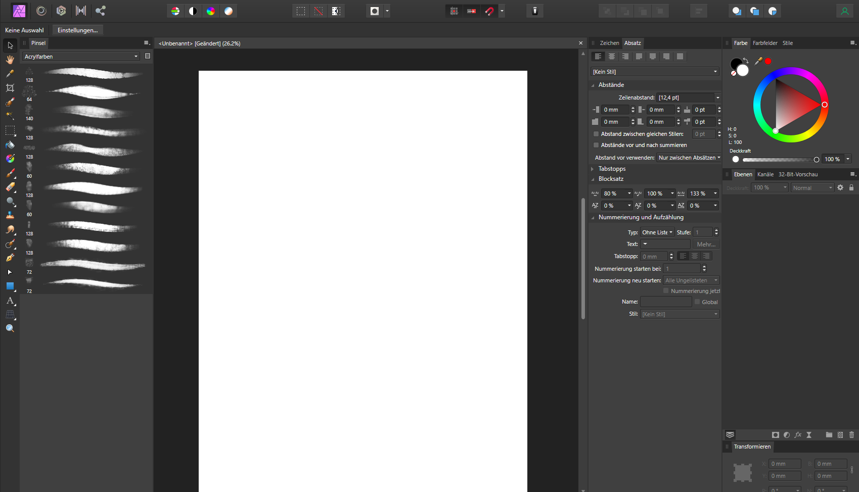
This is how i would like to have my UI arranged in Affinity Photo: I do this because i find it difficult to find panels if they are crammed behind other tabs somewhere in the default area on the right. Also, by giving them their own column, they have more space and are better readable. Unfortunately this takes a lot away from the canvas area, so if i want to have a proper look at my image, i have to hide the UI by pressing Tab. But then everything is hidden, including the Toolbar and colour picker, which i constantly use. The only half-decent solution to this is dragging the panels out and using them as floating windows, which allows me to collapse them: 2021-09-11-12-39-10.mp4 But this also is far from perfect: - It doesn't follow the main window around, so moving Affinity Photo to my Wacom display is a pain - The click detection feels buggy, sometimes it requires two clicks to collapse a panel area. - It looks unfinished, and is difficult to see on a busy project. I think Affinity needs some way to collapse these areas to the side, while still beeing connected to the main Window. Adobe CC had a system like this for years, where panels can be reduced to a small button (By clicking the two arrows on the top right), that can be dragged around or stay docked to the side. Autodesk Maya also has a very good implementation of this, where windows can be docked as slim vertical tabs, that you can toggle with a single click and even scroll through with the mousewheel.

- 12 replies
-
- 3
-
-
- affinity suite
- ui
- (and 1 more)
-
 iPads do not have any UI that is used to surface features of the tools you’re using, unlike the bottom bar that surfaces commands on desktop. AD is powerful but many users could miss features without better surfacing by the UI. For example, I know I can do shear transforms on objects with my iPad but it is incredibly difficult to figure out how. In contrast, shear transforms are very easy to figure out on desktop largely because there are tooltips which tell you how. Additionally, holding the ? does nothing to help clarify what the small buttons on the bottom toolbars do. A different but related topic, concerning the lack of tool descriptions on iPad: https://forum.affinity.serif.com/index.php?/topic/62451-ipad-description-of-all-tools/&do=findComment&comment=602824
 -
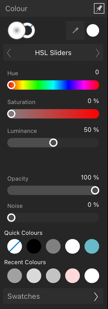
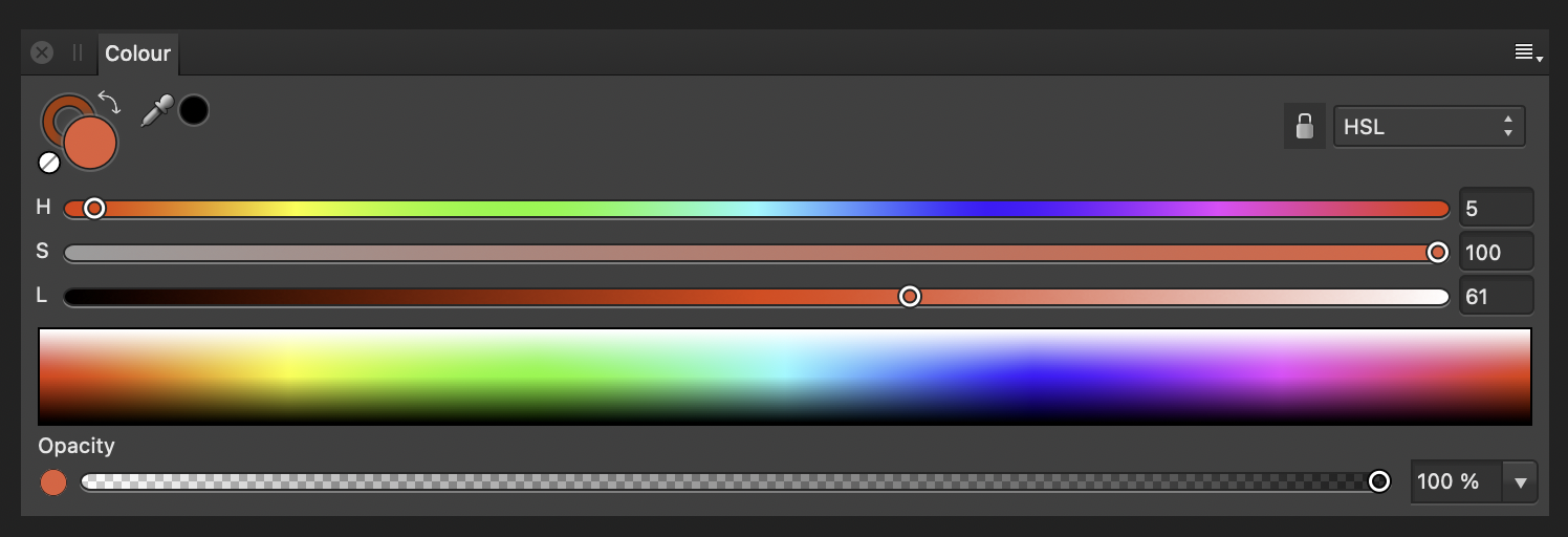
There are instances when you want to have better control over the tools that you have at your disposal. e.g. Colour selection, sliders, stroke weight, typography, history, layer properties. I suggest a button to extend the panel into a larger and/or wider interface for more precise control. Just for consistency's sake, both images are of the HSL Slider UI in the colour selection tool – but this can be applied to more UIs like stroke weight. Ideally, hitting some button would expand the panel from: Into something like:
-
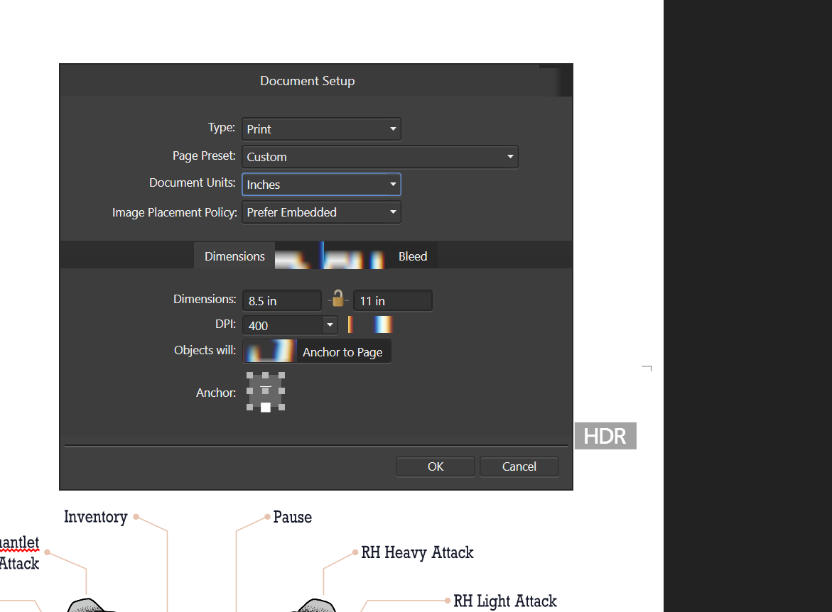
 After installing version 1.9.2 of Affinity Photo and Affinity Designer, I began experiencing UI display issues when interacting with UI controls. Attached are two images showing some of the issues encountered with Affinity Designer 1.9.2 on Windows 10. The display issues only occurs when interacting with UI elements containing text labels, such as menus, select lists, etc. The issues first presents when the UI element gains focus. Once focus moves to another UI element, sometimes the display is restored, other times it remains in a corrupt state (see second Document Setup Dialog image). The issue only occurs with Affinity Photo and Designer. I have not tried Affinity Publisher. The issue has not occurred in other Windows applications such as MS Excel, MS Word, JetBrains PhpStorm, Windows 10, or Adobe Acrobat. My OS is 64-bit Windows 10 Professional version 20H2 (OS build: 19042.1165). The issue does not occur with Affinity Designer 1.9.3 or Affinity Photo 1.9.3 on Mac OSX. I uninstalled version 1.9.2 and reinstalled the prior Windows versions and the problem now presents with the older versions as well. I thought it may be a Windows UI font is missing or corrupt, but I have not been able to identify which font(s) they may be. If I knew which fonts were used for the Affinity applications, I could check/test those fonts and reinstall them if missing/corrupt. Any other recommendations on resolving the issue would be appreciated!
-
 Hey mates, i have a problem with the Affinity suite (Designer, Photo, Publisher). There are graphical issues (as seen in the video) and i tried a lot to fix it. unfortunately without success... Also some UI elements disappear when hovering over them (e.g. the "File-Edit"-Header menu). I have not yet found such a problem here in the forum. I have these errors since version 1.9. Installed is the latest version 1.10 (same problem). PC components: - AMD Ryzen 5 3600 - Gigabyte RTX2060 Super 8GB with latest nvidia Studio driver. - 64 GB DDR 4 RAM Windows is also up to date with 21H1 (Build 19043.1165). This kind of errors I have unfortunately only in the Affinity suite with which I work very much. A reinstallation has unfortunately brought nothing. Does anyone have any idea how these errors can come about? I'm running out of ideas.... graphical_issues.mov
 -
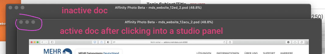
 Hi, Photo tries to combine two document windows into a single tabbed window, but fails to clean up the blue overlay afterwards. You have to quit the app to remove the blue box. It even stays on top of other apps! Also, the implementation is a bit annoying as this always happens by accident, I never really meant to combine windows. I think there should be a little bit more of a "threshold" before it attempts the combining so you can move the windows freely around. Somewhat related: there is no optical distinction between an "active" window and the other ones which don't have the focus. (the traffic lights disappear as soon as you click on a studio panel... (macOS Mojave, metal, magic mouse) Bildschirmvideo AfPhoto.mp4
- 1 reply
-
- 1
-

-
- window management
- ui
- (and 1 more)
-
 I have tried everything from uninstalling/reinstalling to reinstalling drivers for my RTX 2070. please help. Processor Intel(R) Core(TM) i7-9700K CPU @ 3.60GHz 3.60 GHz Installed RAM 32.0 GB System type 64-bit operating system, x64-based processor Edition Windows 10 Pro Version 21H1 OS build 19043.1110 NVIDIA RTX 2070 8GB Affinity Photo 1.9.2.1035
-
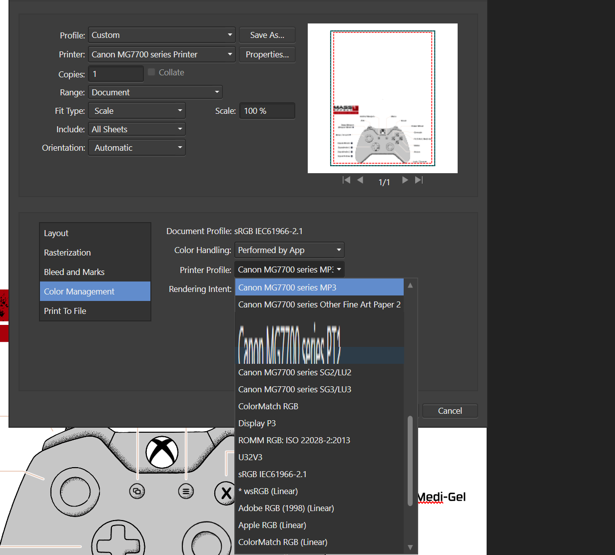
I know this is old, but can someone please get to this already (or especially, because it's an old issue) One feature of the separated mode is: You should have the freedom where you put your panels or context-bar, but: dialog boxes are drawn underneath these and therefore you always have to make sure you dont have them on the potential spot where the dialog would appear... The "save as" dialog is a "sheet" which means it is fixed in its position, leaving a strange gap beneath where it should dock as a sheet. -> please make a floating dialog out of it, like the open box. The "place image" dialog is also a sheet... The "open" dialog is a free floating window, which you can drag out of the way after the fact, at least... The "export" dialog is the only one truly in front of the UI (just happened in a recent update) Please make them all appear OVER the rest of the UI (which should be standard practice...after all) Although I somehow understand the intend: the save dialog is "attached" to the document window to reduce confusion when several docs are open where it belongs. whereas the open dialog is "free" and does not belong to any doc, yet. Please, correct this! Also: why do new documents sometimes appear on the wrong (secondary) display, and therefore are buried underneath all my panels? I therefore place all my panels with a "gap" to click through
-
I'm not sure by which parameters the scale is calculated in the pages panel, but In my case, the difference between small, medium and big is not very balanced. I'm happy to have a "very" small icon view plus labels, but for most projects (4 to 16 pages) I could use a little bit more detail. And the "middle" size is way to big and not very different from the "big" one... I would need a size between small and middle, but really more at the side of small. just two times bigger and keep the labels.
-
Problem: I find it difficult to quickly see the hierarchy of nested/grouped objects, especially if I assigned a colour label to a layer. Solution: I would suggest highlighting the belonging objects by darkening (light UI) or lightening (dark mode) the background colour in the panel. This would bee seen whenever you open a group. Maybe also let the colour of the label shine through: (see Mockup) Also, I think at this state the colour labels are not really well thought out if combined with the rest of the UI (especially in light mode) blue system tick boxes are barely visible on blue background... yellow and orange are rather brown and have little colouring effect, only darkens
-
This happened to me multiple times and I cannot quite reproduce it, but: Sometimes pressing cmd+a selects all text in the textbox and sometimes it switches the focus to the layers panel and selects all objects instead. I believe it has to do with speed, meaning if you work on a project you double-click on a textbox to enter new text but the UI is not ready yet for textinput and so the "select all" command selects objects... I'm not sure. What I know is text input has always had a lag in affinity... So I think this is a what a programmer would call a "race-condition" – only this time between the computer and the user... -unnecessary little rant follows, please ignore- I like the Affinity Suite and have very high hopes, but there are many unusual slow situations and other non-native things happening. For example I use the system command HIDE (⌘H) very often to switch programs which I usually do by ALT-clicking a tiny gap from the desktop. In a native mac-app this is instant, but in publisher, with 4 to 5 open documents the panels and windows are disappearing one-after-one, so I have the suspicion they are doing some weird cross-platform/non-native stuff with the document windows. Also, dragging a panel from one place to the other sometimes drops docked parts of it... and while dragging, some panels move over or under the other ones...
-
 Recently I had to open an Adobe account for work reasons. The biggest thing I noticed while making the move is how much thought has went into the UI of Affinity products. Simple tasks are a lot easier in Affinity and overall it's a nicer platform to work in. Affinity does lack in features, especially Vector warping, distorting, etc. Overall Affinity continues to impress and I think it wont be long until they catch up. In terms of working experience, Affinity is already ahead.
 -
 One little thing that might enhance usability would be to add some indicator with every colour swatch to show what kind of colour it is (CMYK, RGB, Greyscale, Spot). This could be a small symbol like in the Adobe products, or a letter or short word. It should be visible in the list view, there's enough space for something like that. In the compact view I don't see a way to add this info, except for the tooltip. Also, I would love to be able to see the (current) numeric values of swatches more easily. A swatch should show these after their name, maybe in parentheses, or italics: "Logo Red (CMYK 0-80-40-10)" or "Logo Red CMYK 0-80-40-10". If the swatch doesn't have a name, the current values could be shown on their own. Showing the numeric values does of course solve the issue of not knowing if a swatch is RGB or CMYK, so that no other indicator would be needed. A related issue is #77313 Color Numeric Value in Swatches, but if I understand that correctly, it deals with the CMYK/RGB approximations of Library Spot colours.
 -
 This is a pain point whenever doing an export, that allows a mental load to be added to the process, of simply having to take a few seconds to think about which is width, and which is height. A simple addition of "W" & "H" next to each box would be a HUGE weight-off-mind and ease of usability change.
 -
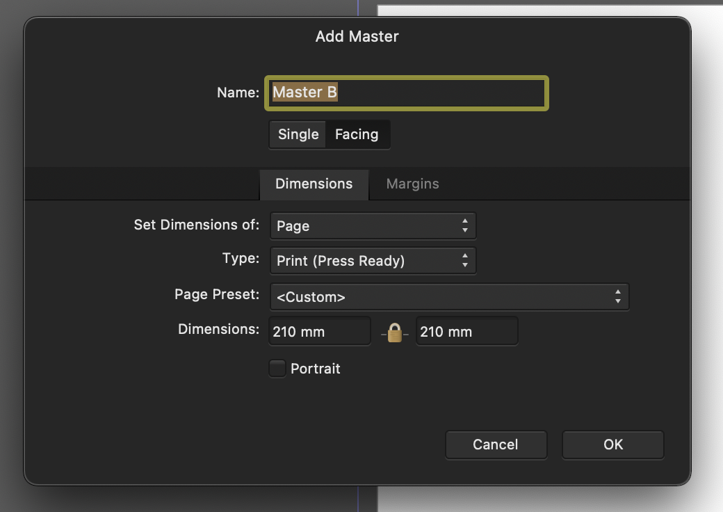
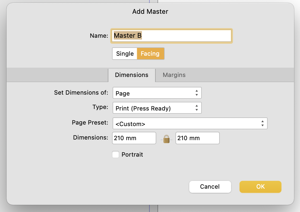
 I noticed this a couple days ago and thought it was a bug. So raised it in the bugs sub forum initally, but have since removed it. I first came across this in the New Master Page Dialog when you have dark theme on MacOS selected either in app or at an OS level. The visual feedback for the selected state of Single or Facing page toggle is ambiguous with the dark theme, but is reinforced through OS accent colour in the light theme. Dark theme: Relies on pushed button metaphor, yet the control - to me at least - looks/looked like a segmented control, suggesting that Single is highlighted. The context informed my opinion as the Dimensions Tab below is lighter and selected. I assumed that Lighter = selected. This "pushed button" metaphor is fine where there are more than two options using it and where one option has more than two choices. As seen in the preferences pane (below) the control with three options shows clearly which is selected. Not only does the wording of the context help but the selected option is the odd one out. From this I can infer which choice is selected in the control above which only has two options. However, when light mode is enabled (see below) ambiguity is reduced as the selected choice is reinforced through accent colour. TLDR: Could the colour accent used in the light theme be applied to the Dark Theme too please?
-
Hi, I would like to be able to see intensity waveform, RGB parade, and Vectorscope chart simultaneously in my studio. This way, when I make an adjustment, I can see the impact on all three of them at the same time then having to toggle back and forth between each chart on scope panel.
-
As per subject - would be good if Preview mode removed all non-output elements from the page / spread. Finding it distracting when trying to work with cross-spine artwork, or bleed to the edge when there's white, or black hairlines that aren't actually part of the artwork, and don't show up in the output, but show in the application. For example, InDesign's Preview Mode switches off every guide and UI element on the spread, so what you see is only the canonical output.
-
Hi, Is there a way (setting) to disable the spine / centre line in spreads? Also, disabling the hairline around the edge of pages / spreads? Thanks,
-
 I changed the UI elements style to Dark, got the message it needed restart, agreed. The app hung, then crashed. See the crash report. Affinity Designer_2021-02-06-065736.crash
 -
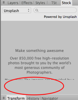
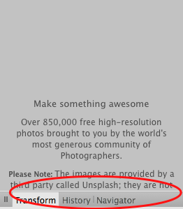
In Stock panel the filler text not scrollable in non-full-screen mode and cut off at the bottom. The second picture is when I swipe down to scroll up.
-
 Hi guys! Can you add the ability to create panels with two columns? (Like Adobe InDesign, Photoshop, Illustrator) Beg you very much 🙏
-
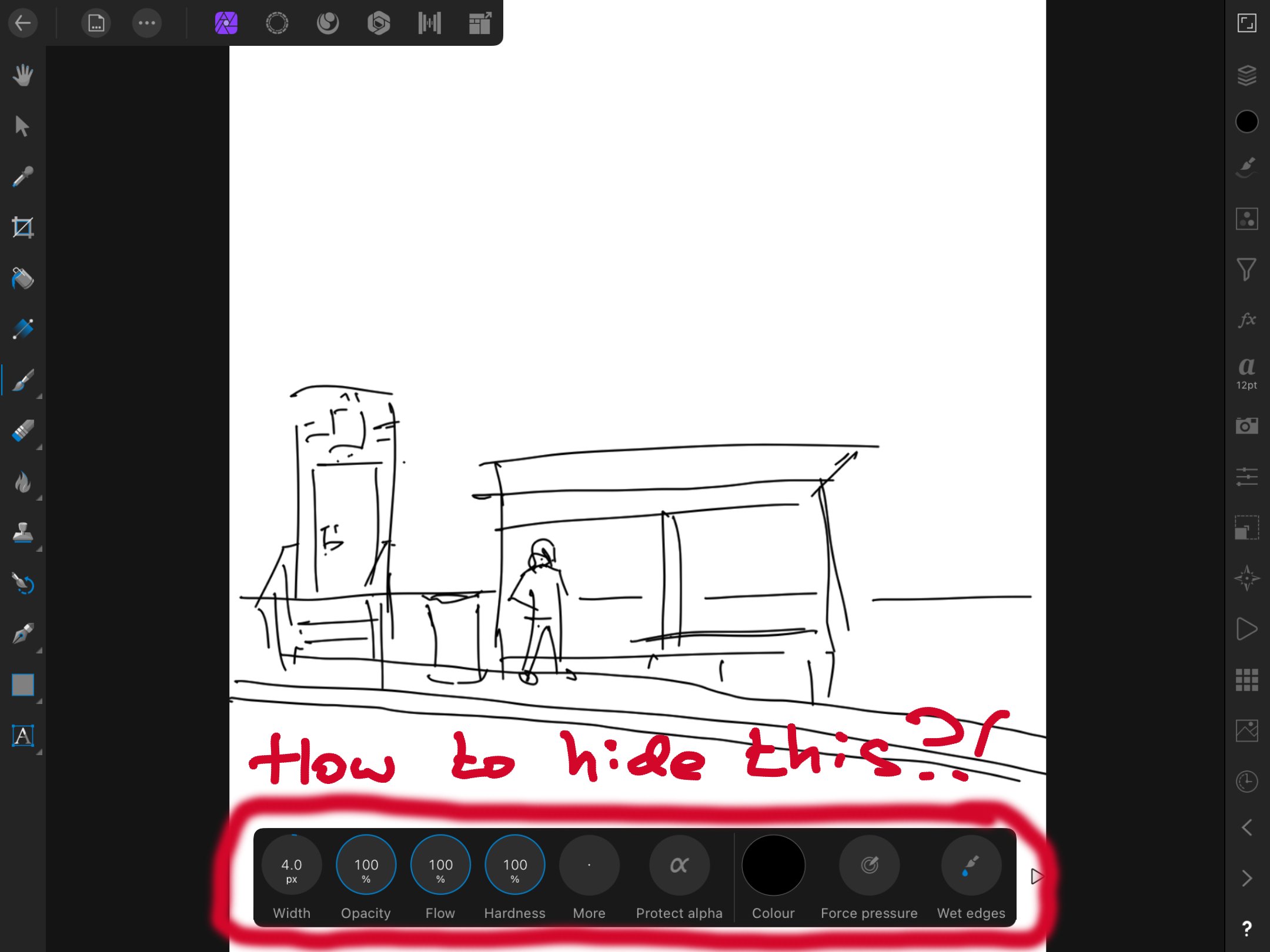
 In Affinity Photo on iPad 8th generation I find the extra menu at the bottom very distracting when I don't actually want to use it. Is there any way to hide it? I can hide all the other toolbars, but that box is always visible, and it's driving me nuts. Thank you for helping me out. - Rora
-
 Is there a modifier key, preference that can be changed, or something else to bring placed files (or files dragged in from the Finder) centered? It's a fairly small thing, but anytime I bring a file into an existing file, it's off-center because I don't click or drag quite the the middle. I can't think of any circumstance where I'd prefer my placed and drag-imported images not to be centered in Photo—my initial clicks and drags aren't going to be precise enough for that to save me time positioning later in the rare cases where things I'm bringing in won't be centered.
 -
 It has been a while, and I have seen this as a request here and there. Please, consider adding this to the Mac version, for the sake of my sanity as well as for feature parity of the two platforms. With very seldom exceptions, I can't stand floating palettes and was really happy that, in Windows at least, I could snap and stack them horizontally, i.e. in columns that are part of the main window. Now that I am back on a Mac I'd love to finally see this resolved. In the Mac version, there is the one main column, and if I want two columns of palettes I end up with a couple of floating ones, which I can't stand.