Search the Community
Showing results for tags 'ui'.
-
 I frequently use my iPad with the folio case which props it at a slight angle. Interestingly Affinity Photo AND Affinity Designer seem to be reacting to this angle when trying to place photos. The whole interface flickers strangely and taps aren't always registered. The video demonstrates it in Affinity Photo but the behavior is also the same in Designer. Previous to 2.0 I noticed other features in Affinity Designer such as keyboard visibility that were delicately affected by the slight angle. I haven't determined if these are still issues but I haven't seen any other iPad app that has had issues with this angle. You'll notice the flickering only occurs while the iPad is at the slight angle, but not when it is upright. This is an 11in iPad Pro M1 running iPadOS 16.2 (a). I have noticed this in previous versions of the OS IMG_5679.MOV
 -
Using iPad Pro 11 “ v2 iOS 16.1.1, when 3 sliders for properties then they go outside screen. Also some options pages do not fit.

-
I choose the large UI text feature due to my poor eyesight, but the container does not adjust height so the text is cutoff. It's sort of still readable, but likely a trivial fix. Device: Apple M1 Ultra 64GB Ventura 13.0.1 Apple Studio Display
-
 Hi there. When UI text setting is set to large font, the descendants of the letters got clipped on same panels (as in example, the layer panel) The issue appears in all three apps. Not terrible, just a little annoying.
-
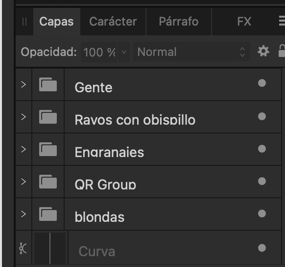
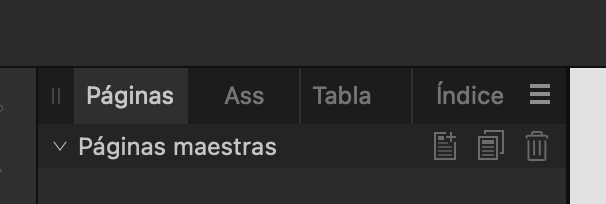
In the Spanish translation, the Assets panel shows "Recursos" when expanded, but "Ass" when contracted. It should be "Recur" or something similar.
-
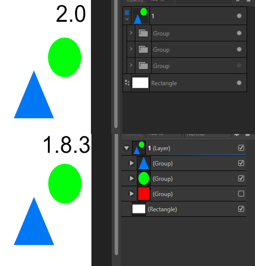
Not sure if this is a bug or intentional design, but groups no longer show thumbnails. Example screenshot to demonstrate why this might not be a helpful change. The new visibility marks are also unintuitive.
-
 In the Right Studio area, each panel cannot be resized. (Vertical direction) The same panel can be resized in the Left Studio area. Affinity Designer v2.0.0 Windows 11 Pro 21H2 Hardware acceleration is ON (same when turned OFF) NVIDIA TITAN RTX (Studio Driver ver 517.40) Monitor: EIZO EV3237 (4k monitor)
-
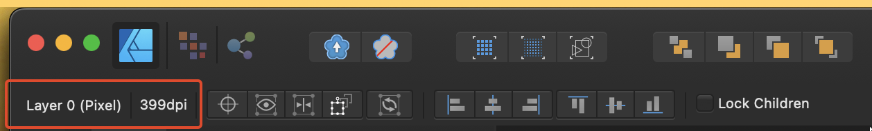
Hello, everyone. I noticed that in V2, the current DPI of selected bitmaps is no longer shown. Would it be possible for this feature to make a comeback? Here are some screenshots to illustrate the issue V1: V2: Have a great day!
-
Other than Capitals option are not shown. try major fonts such as Arial or Helvetica. Not sure since when this problem started. I confirmed this on Monterey.
-
 At least one person asked for UI scaling two years ago (after a short search online). Still nothing implemented. I can understand that if you hadn't thought about that requirement initially, it may be hard to code up for the entire UI. Can we at least get the brushes panel to scale the images previews of brushes and can we have text names inline also instead of having to scroll through thousands of brushes to find one or make new sets of brushes from old ones every time we need a new specific style. The colour swatches allow for text which helps a lot in some circumstance. They can also me made different sizes so I know it cannot be that hard to do for the brush panels. Worry about full UI scaling later.
 -
 I prefer how this tool is in Affinity Photo, all of the shapes are contained within the one tool button. I can add the individual shape tools, but I like to have my tools as consolidated as possible.
-
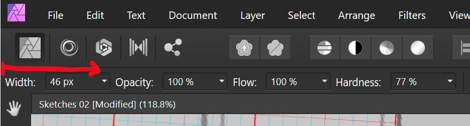
 I like that I can drag on the text for width to resize my brush. But since its aligned to the left hand side of the screen, it is not possible for me to reduce the brush width, as I cannot drag towards the left. Perhaps other checkbox settings could be moved to the left of the width setting or it could have an empty margin that can be used to drag over.
-
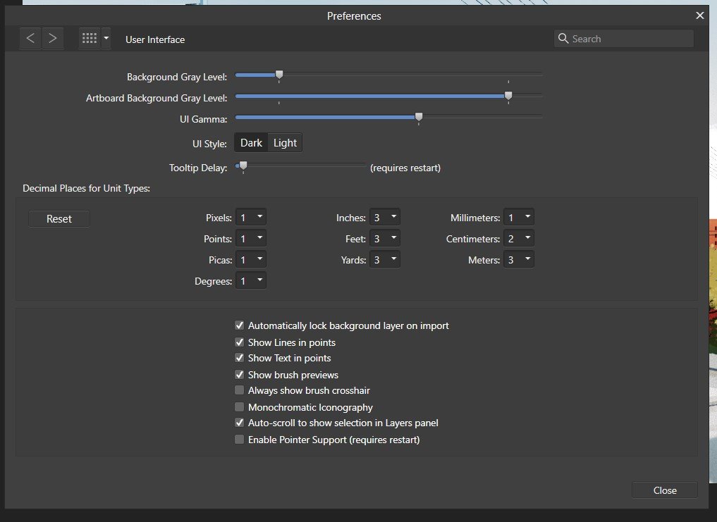
 Total noob, just getting started. Using Designer on Windows laptop and I want to enlarge the screen fonts and tools. I searched help and read: To change the UI font size: Choose Affinity Designer>Preferences. Choose Edit>Preferences. Click the User Interface label. For Font UI Size, choose either Default or Large. See screenshot - that option is missing. Thanks.
-
 Hello amazing people! Adobe does this, in Illustrator desktop… I’m getting older, and working on a smaller iPad… it would be truly great if Affinity would consider a way to do this and enlarge the UI/icons/interface, to some extent. I find it’s difficult to see, but also repeatedly missing when selecting certain UI functions. Is this a possibility on iPad??
 -
In Preferences/Keyboard shortcuts in all Affinity apps there is 'Ignore Modifier' checkbox. What does it actually do? Help documentation defines it: Ignore Modifier—Lets you create shortcuts using a single letter designation instead of using keyboard modifiers. A mystery. So, I tried to discern it's effect on one of the commands. In orange are marked results I find unexpected. With 'Ignore Modifier' ON 'P' is assigned as 'P'. (that is uppercase 'P'; why unexpected? Please see the reference below to @walt.farrell's experiment), 'shift+P' is assigned as '⇧P' (again, refer to Mr. Walt's experiment; furhermore, here, 'shift' is not considered a modifier?), '⌘+P' is assigned as 'P' (I guess ⌘ is ignored somehow, but to what purpose?), 'alt+P' is assigned as 'π' (I guess 'alt' is ignored, resulting in conventional π), 'ctrl+P' is assigned as empty (!) but with an option to remove it. (see image below, is this normal?). With 'Ignore Modifier' OFF 'P' is assigned as 'P'. (I understand this is something 'Ignore Modifier' should make possible but here it is, working fine with 'Ignore Modifier' OFF), 'shift+P' is assigned as '⇧P', '⌘+P' is assigned as '⌘P', 'alt+P' is assigned as '⌥P', 'ctrl+P' is assigned as '⌃P'. 'Fn' key is skipped here since I own Logitech keyboard, not Apple. Now, referring to Mr. @walt.farrell 's experiment where pressing key labelled 'P' with 'Ignore Modifier' ON assigns 'p' (lowercase P), while 'shift+P' assigns 'P' (uppercase P): In all things 'Affinity' I trust Mr. Walt first... So, is it possible that my shortcuts preferences file is borked? Or is there a finer idea underpinning 'Ignore Modifier' checkbox that my measly braincells fail to grasp? Am I alone in this?
-
 Hello everyone, recently my computer was updated to WIndows 11, when trying to use Photo, I realize that the letters and font of the UI are unreadable, I leave a screenshot. I already reinstalled Affinity Photo with no changes.
-
 I recently got a 4K 32” external monitor for my laptop and this obviously caused me to work differently than using my laptop display, namely, as screen size increases, one must sit back further from the display. Doing that, the Affinity UI is barely legible to me. I feel like I’m trying to tap on a grain of sand using a needle. I already have the UI Font preference set to Large but it’s not nearly enough. I don't want to use Display Scaling resolution in system prefs as that negatively impacts performance and I want to use the maximum number of available pixels. I know this is not a trivial thing to address, but I’m hoping / praying the AMAZING devs fundamentally address the UI in version 2 of the Affinity Suite in terms of functionality and customization, and this would include being able to resize the entire UI, including font, it's size and letter-spacing (critical for legibility), as well as icons, Studio panels' buttons and icons. Please consider engineering a responsive UI just like modern websites which can resize any and all elements based on the device used for viewing via CSS. That way users can create profiles for desktop and laptop UI preferences. Larger displays can use an enlarged UI and laptop displays can use a more compact version. Thanks for your consideration and all you do. Happy new year and God bless and heal the world!
 -
 Hi, I’ve got a strange graphical issue on mouse hovering (more precisely happening when the mouse goes out of the button) and I can't figure it out! OS : Windows 11 PC is a Dell G5 5000 (Intel(R) Core(TM) i7-10700F CPU @ 2.90GHz 2.90 GHz // Nvidia RTX 3070) I've got a similar issue with one other software (Wally from ZSA, a keyboard flashing tool for QMK), which seems wierd I've got the same issu in Affinity Publisher I'd be glad if you'd had any idea 🙂 2021-12-27 13-48-46.mp4
 -
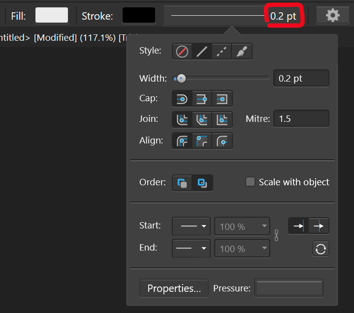
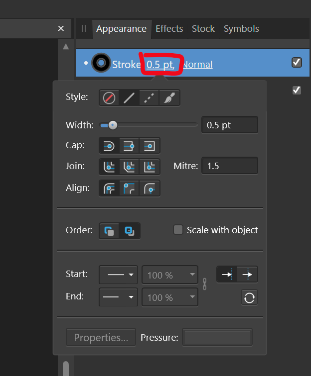
Problem Currently, changing the stroke weight is a two step process, where you first have to click to activate the dropdown to actually change the settings. There is plenty of space in the UI to access the stroke paramter directly, see below: Stroke settings.mp4 Proposal Therefore, I propose to make the parts of the UI that display the stroke size (highlighted in red) a value box. That way, it takes one click to change the settings. When doing so, the dropdown should still be displayed to get access to the additional settings. I could even see the stroke preview box becoming a slider (just like you can click drag on top of text boxes for feather and opacity in the pixel persona), because it wouldn't hamper its ability to serve as preview pane: Stroke settings slider.mp4 The stroke weight settings need to be accessed more than the other stroke settings and it is much quicker to input the size directly and avoids mousing over to the other input box. I also find it annoying to see the value that I want to change being displayed, with no immediate access to it.
-
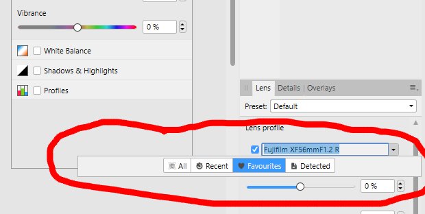
 If this is intended or looks like a feature request, feel free to move or hide the post. When I am in the Develop Persona and select a lens profile the window stays open, even after I selected a profile, which means another click. I would expect that the window closes after my selection. And is it correct, that it looks that way (screenshot), when I clicked Favourites or Detected before and there are no Favourites / Detected? When I hit the arrow on the pulldown only this tiny window appears. lensselection.mp4
-
Please, Please add a progress bar when opening a document/saving. I don't understand the logic behind having the words on the top right corner instead of having a modal window in the middle of screen with a progress bar showing the progress of the task. Your UI/UX logic baffles me...
-
 Can Affinity Designer be used for Website Creation UX/UX like Adobe XD? "Adobe XD is a vector-based user experience design tool for web apps and mobile apps, developed and published by Adobe Inc" I am using Wix Editor X and I am looking for quick preparation of assets to import to Wix. Similar to this: Thanks!
 -
Just discovered this little issue with Color Picker UI being showed with approx. 1s delay after click. Be it called from Context Toolbar or Character Panel or somewhere in Layer Effects – Color Picker always shows up with that delay now. Seems to be introduced in 1.10.4 (Designer, Photo and Publisher are affected) as I never noticed this before. It was always just as instant as any other UI controls. The only barely noticeable and subtle delay that I ever experienced, was switching between Personas in Affinity Publisher. But I can completely understand this as the whole UI needs to be rearranged. But Color Picker alone...
-
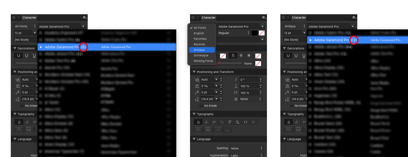
 Let me start by saying that I absolutely love this wonderful feature in Affinity apps: to be able to filter typefaces according to how I organize them in Font Book by collections. However, there's a little bug. Here's what I discovered. In Character panel, when "All Fonts" option is active (by default), every typeface in the list shows up with correct number of fonts in the family. Once any other collection from Font Book, available in that list, is selected, every typeface now shows with two times more fonts. Every weight is being duplicated in the list. So I have two Regular, two Italic, two Bold and etc. I believe there's something with (re)sorting/(re)appending items to lists/arrays and it's just a very small cosmetic issue. But anyway, it would be great to see this fixed, as the feature itself, it is really great and very helpful. Bug persists across all three apps. Versions 1.10.1 and 1.10.4 on macOS Catalina, Big Sur and Monterey.
-
 On a dual-monitor setup in separated mode, it is still very confusing that so often you wonder, where the heck did the newly opened document window spawn, when it just hides on the secondary display - but (rightly so) underneath the panels. For the document at least the z-order is correct, but every modal dialog box should be drawn on top of the rest of the UI and of course on the primary monitor. This should be common sense, as dual monitor setups exist since the early nineties (...of the last century). I respectfully ask, does nobody at Affinity use dual monitors or the separated mode for his panels? I mean we got saveable studio setups which indicates that they would, so...
- 3 replies
-
- 1
-

-
- separated mode
- ui
- (and 1 more)


.png.255de33cd491c204ae880d5ea4ebd232.png)