Search the Community
Showing results for tags 'ui'.
-
Currently the vector scope isn't scaleable, it's quite small. It's been my screwup meter for years and in Photo it's just damn hard right now to see things close to the centre because it's so small. While at it. Once the scopes are bigger, they could be used to mask colour ranges. Just draw a selection on the scope with the selection brush (or regular brush) and the colours within their ranges are masked.
-
Hello! I'm quite stoked that Affinity Photo 1.5 now has batch processing. Working on a mac, I quickly went to test out this feature. It's great except that the Batch/Job UI could use a bit more love. It doesn't seem to like drag-and-drop a whole lot. I was hoping I could drag a folder or separate files into the task list but nothing threads up. I can only do by clicking through the file loader dialog. It would also be nice to have a batch process bar somewhere to get some kind of visual feedback somewhere, even if it's just a thin line or animated clock-sweep icon somewhere. All in all, great job, devs! I absolutely love your products and hope to see these improvements continue! Thanks!
-
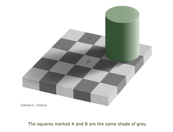
 As a photographer whose images are in museums, color judgement is critical to me. I have a 10-bit path showing 100% of ARGB. In order to do this accurately, one needs an environment that is LIGHT (such as the light grays of this very forum). I realize you're aesthetically fond of the dark environment, but any photographer worth his salt will tell you it screws up color and luminosity perception. If you doubt me, please see the attached image from: http://web.mit.edu/persci/people/adelson/checkershadow_illusion.html. Look at the light surrounds of the A square and the dark surrounds of the B square. Humans are not wired to see A and B as the same tone, as this example makes stunningly clear. So PLEASE PLEASE PLEASE allow us to select a light UI with black text. (Yes: as a retired programmer, I -do- realize that this will take some effort on your part, as all your icons are white; the font is white... I get it.) But this is a fundamental and nearly crippling mistake in your UI. Please fix it.
-
 Is there a way to see how big a file is in memory to see why AP is becoming Beachballhalla? In the info panel I only see Memory pressure which I assume denotes read/write velocity and Memory efficiency which I have no idea what it means. Especially since it displays as over 3k% which is interesting given what per cent means. I haven't found a way yet to display the internal memory use. I can sort of guess it with iStat menus and TOP but that's the whole app, not just my file. I can't optimise the app but I can optimise the file for performance once I know what's causing what to bloat.
 -
I spent most of the day working with spare channels today. Something that's always been a little bit cumbersome in a layer based app. Since you do live previews of the R,G,B,A channels this also slows it down noticeably when I'm going into the Channels tab (that's why I leave it tucked in behind the Layers panel). A dedicated Spare Channels panel would be great (tiled view, list view) to quickly swipe the pen over, right click and load a selection, or save a selection when right clicking on an empty part of the panel. A bit like the Styles or Swatches panel. Normal clicking and dragging would allow moving the layers around to organise them for easier findability. It's really a workflow enhancement to have the luxury of seeing these separately with bigger previews while leaving the regular Channels panel alone.
-

[Designer] UI/UX Feature suggestions & designs
Guest posted a topic in Older Feedback & Suggestion Posts
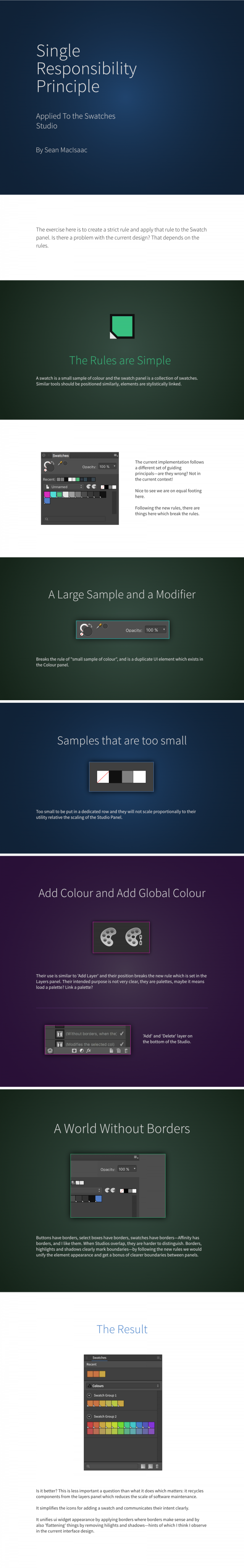
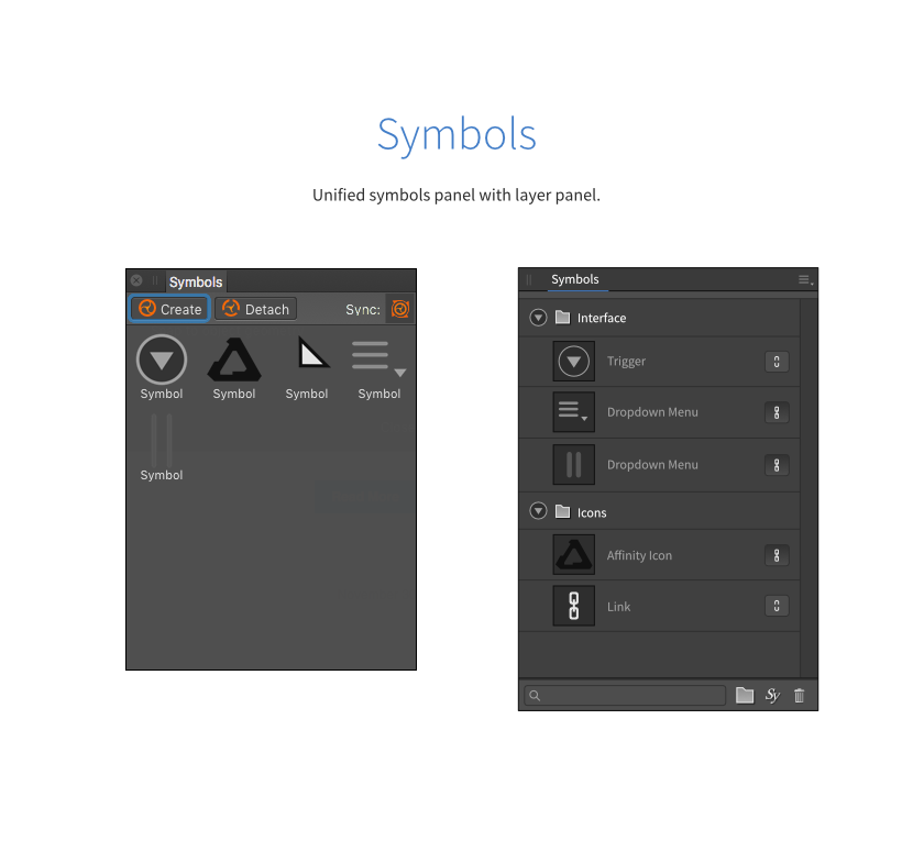
Hi, I've been using Affinity now for two professional projects and it's good. I noticed there are a few panels which can be consolidated to use the same template as the layers panel, this would lower the API surface area and improve maintainability over time. Just my 2 cents.
-
It would be great if Option + Click in any of the Affinity UI's little collapsable triangle would open or close (depending on current status) ALL the of the panel's other collapsable triangles (at the same hierarchy level when applicable). For example, in the Assets and Layers panels it would be great to have this functionality to quickly view the entire hierarchy or categories instead of scrolling and scrolling. Thanks for your consideration and all you do.
-
 Ok, so one of the paramount useful features of Sketch is layout grids. Being able to define a layout grid with columns and gutters without resorting to a mess with guides is great. I believe the Affinity could improve greatly on the Sketch grid, so here is my proposition for the improved layout grid and thoughts on how it could interact with the constraints feature that really needs to be fleshed out as well. First of all Affinity Layout Grid Create Movable grids with columns and gutters Grids should be resizable but should keep their ratios Support for breakpoints in grid definition, eg. the same grid should switch to mobile view if resized smaller. Padding around the grid should be separated from gutter values. Support snapping Support nameable size ranges (breakpoints) (eg. define XL as a range, L as a range etc.) Affinity Improved Constraints Support fixed distance padding eg. 20px manually entered Constrain to columns from the layout grid Support and remember breakpoints when constraining to layout grid Toggle visibility based on layout grid range Reflow text options Support minimum flex, (eg. resize with this untill this unit is 100px wide) support Div flowing, when resized smaller than minimum flex, reflow other objects as divs would. Support different symbols based on layout grid range, toggle to replace an area with another symbol when going down to small views I'd love to see any number of these features implemented, with things like this we could actually create responsive flexible layouts that would be able to be resized instead of creating multiple views for each page.
- 7 replies
-
- 4
-

-
- layout grid
- ui
- (and 4 more)
-
 Hi, Maybe it's dealt with, but I found that pulling down the font selector to set a font for an asset on the left of the screen is unhelpful in that it covers the very object you're trying to change. This removes some visual feedback and requires making sure the object is not on the left hand side before pulling down the font menu. I'm not quite sure it's fixable without a lot of effort, though, as you need to move either the object or move or shorten the font menu so it doesn't cover the text field you're trying to set. It's not exactly a major issue, more itch-level annoying :) Cheers!
 -
 Hi guys. This had me confused for a longer while and I think could be named better. In the snapping options, AD currently has "Snap to shape key points" and "Snap to object geometry". I was looking for an option to snap to nodes, which I think is the most common use case. I thought it would be under "Snap to shape key points", since I wasn't sure what you call a point/node/vertex/key point/control point in AD lingo (I mean, every program seems to have its own naming). I was very confused to see that it resulted in snapping to curves or their extensions; this is exactly what I thought the second option does (geometry). Turns out "key points" are actually extended guides from any objects (which in my document translates to "random lines at crazy angles appearing everywhere"), and "object geometry" means curves and nodes with preference given to nodes. May I suggest renaming it like so: Snap to object geometry > Snap to nodes, edges and intesections Snap to shape key points > Snap to points of importance and extended edges or whatever this is actually supposed to do, I'm not super clear on this despite reading help and trying to use it in my document. Or maybe the snapping options need to be broken down a little further? Cheers
 -
 Collapsible palette functionality that reduces the palettes into an icon. This would allow more screen real estate when working on designs. Clicking the palette's icon should restore that palette as a fly-out with the others remaining collapsed. Similar implementation to Adobe Photoshop / Illustrator (shown below). Also mentioned here: https://forum.affinity.serif.com/index.php?/topic/16282-cvollapsible-palettes-export-preview-actions-glyphs/?p=73830
-
In Affinity Photo, show document info such as resolution, dpi, bitdepth, etc. somewhere that can be seen at all times, no matter what tool you have active. Maybe the info could be shown in the bottom bar?
-
I find the UI in Affinity needs work. For instance, when pull up the "Soft Proof" dialogue and can flip through previews of the various settings, but I have to click each one, instead of being able to up and down arrow through them. That's very time-consuming and unnecessary. The same thing applies to the crop tool in Photo, where you can see a preview of the cut, but you cannot fine-tune adjust it's placement with the keyboard. I would like to be able to "nudge" the box where I need to.
-
Using the app's icon as the icon for every document is very confusing. Since it is so easy to implement, please have proper CFBundleTypeIconFiles.
-
 I will put two related topics here. 1. Both the area of function buttons along the top of the screen and the area of function buttons at the left side of the screen are called "the toolbar". It would avoid confusion if they had different names (perhaps one should be called "the toolbox"). 2. With regard to the left-side "toolbar": It is nice to be able to control whether its repertoire of buttons is presented in a single column or in two (or even more) columns. If I have quite a few buttons in my left-side toolbar, and decide that I should go for a two column arrangement (perhaps because I am running out of vertical space and plan to add more buttons), and make the selection for a two-column arrangement, the buttons are repositioned in a "row-first" way. That is, if "hand" was at the top, with "arrow" just beneath it, now "hand" will be at the top of the leftmost column and "arrow" at the top of the rightmost column. My own preference would be that in this case, the rearrangement would be "column first". In my example, "hand" would be at the top of the leftmost column and "arrow" just beneath it. My rationale for that is this. If I have several buttons of the same category (perhaps the different shapes of selection marquees), and they were vertically consecutive in the original "single column" arrangement, then when I go to a two-column arrangement I still expect them to be vertically consecutive. But others may prefer to think that still all the buttons should run essentially "top down" in their original sequence, just zigging and zagging between the two columns (the current arrangement in AP) My preference may perhaps come from the fact that in several of my graphic apps, I can make multiple toolbars, and I typically make them each vertical and single column, and adjacent, so when I have two columns that is actually two single-column toolbars. And of course all "related" buttons are in a certain toolbar, so they are in the same column. And perhaps most other AP users will not have such a preference. Doug
 -
I have a couple of points to raise regarding the rectangular marquee tool. 1. There either isn't or I cant find a display showing the marquee's dimensions; 2. There either isn't or I can't find a way of constraining the marquee's dimensions to a fixed aspect ratio; 3. There either isn't or I can't find a way of setting the marquee's dimensions to a fixed pixel size.
-
 I'm working in a Sketch shop and have to supply sketch files as deliverables - or at least for archive purposes. Copy/Paste from AD appears true visually so that's great. problem is that my careful organisation and labelling of elements in AD is lost. Given that Affinity is making a big play for UI use in 1.5, I think tidying up this part of the realworld workflow that many of us in this area have to deal with, is essential. Sketch has such a grip on this area, we need to be able to deliver editable files that are organized ande make sense to Sketch users. Obviously it's impractical to relabel everything on export, then do it again (once would be beyond practical) on the next export. Hoping this isn't a big ask - given the structure is there already - its just the labelling that's getting lost (I think)
 -
Ability to generate columns As a web designer, I need to set up grids really fast. Photoshop for instance adapted these guys' method - http://guideguide.me/- and even-though they haven't got it right yet, I still use it a lot. Ability to generate a Baseline As for baseline grids ( http://blog.invisionapp.com/design-snack-7-baseline-grids-in-web-ui-design/), I currently maken patterns in photoshop s described in this article. https://www.smashingmagazine.com/2011/11/establishing-your-grid-in-photoshop/. Generating this overlay and enabling snapping to the baseline like in indesign would be something unprecedented ( well maybe aside from a sketch plugin or two ) Generate the baseline and text styles with a modular scale http://www.modularscale.com/ seeing as the baseline is usually generated together with the text. A combination of these two doesn't seem so crazy i'd reckon. On a sidenote When watching the video ( https://affinity.serif.com/en-gb/ui-design-software/ ) about the UI capabilities of this software I find the part about the guides a bit misleading in all honesty. Look at this beautiful grid, creating it however is a bit of hassle, but you can toggle the visibility... Don't get me wrong I'm happy with the product you are supplying, especially at this price, but this feels a tad like false advertisement.
-
Ok sorry for writing here again but I'll just leave this here in the hope someone could find this useful. First, Thanks Guys for taking the time to port Photo to Windows, it's most appreciated, more than you may think. Second, I'll try and list some of the bugs/feedback I think are usefull for a user that's looking at photo as a replacement for Photoshop, not as a cataloguing device. The following points are not about bugs only, but also features desired for a more efficient workflow -As I stated before: no color selection tool with respective range control, I know there is selection for green/blue/ad red but it does not even come close to what a more advance user might want -No detailed luminosity mask/selection tool, Mandatory in my opinion, resterize to mask and selecti midtone/shadow/highlight are not viable alternatives for detailed work, nor are the options in the gear windows in every adjustement layer. -no color picker when opening the HSL A.L. ? really? it really pulls you way from your work. -No quick way to adjust brush flow and opacity. clicking on buttons is not the way to do it, it's a workflow killer, the old Alt+Rightclick Drag method is a Godsend for speed and reliability all in one gesture. -The image displayied seems to refresh and flickers and reconstruct its preview every time some changes are done or you zoom in and out. (I'd assume this is a graphic bug and will be solved in future releases of beta) -I didn't find a way to merge into a panorama the images opened in my editor, itseems you have to open them from the explorer provided, how abut I have all my needed images stack on layers and in the dialogue box I click 'use opened images' -No reliable way to align layers (sorry it's just that), creating a stack doesnt seem to work reliably. -Some plug-in that worked perfectly before nw don't seems to work (the nik collection) -overall the UI seems crowded on a 1080p screen, maybe ui scaling would be a good idea, and I know that windows scaling is os dipendet and OSX is app dependent. More or less these are my main concerns for now, and I repeat FOR NOW. I'd really like to switch to photo for my external editing needs but some of the features are really distracting and annoying, I don't necesserely want this to be photoshop, but undoubtebly there are some things PS does much more fluidly (in a workflow sense) and in a more detailed way. Please don't take this as a review or a negative experience, I do sincerely appreciate the work and effort that's going on for allowing us windows user to have photo at our disposal, but I feel even more involved in giving you guys feedback because you seem to listen much more than any other company. P.S. please please please guys make that luminosity mask panel happen please
-
For large images, especially in 32-Bit mode you have to constantly wait for the entire screen to be processed at the zoom level you're at. That kinda ruins the moment quite often. Attached is how Nuke solves that. A 'region of interest' widget that you draw over the portion you want to work on and only that gets processed. The rest of the image is just a buffer dump. A good option would be to have a way to clear the outside area to a constant colour fill when moving outside the previous buffer or clear it in general.
-
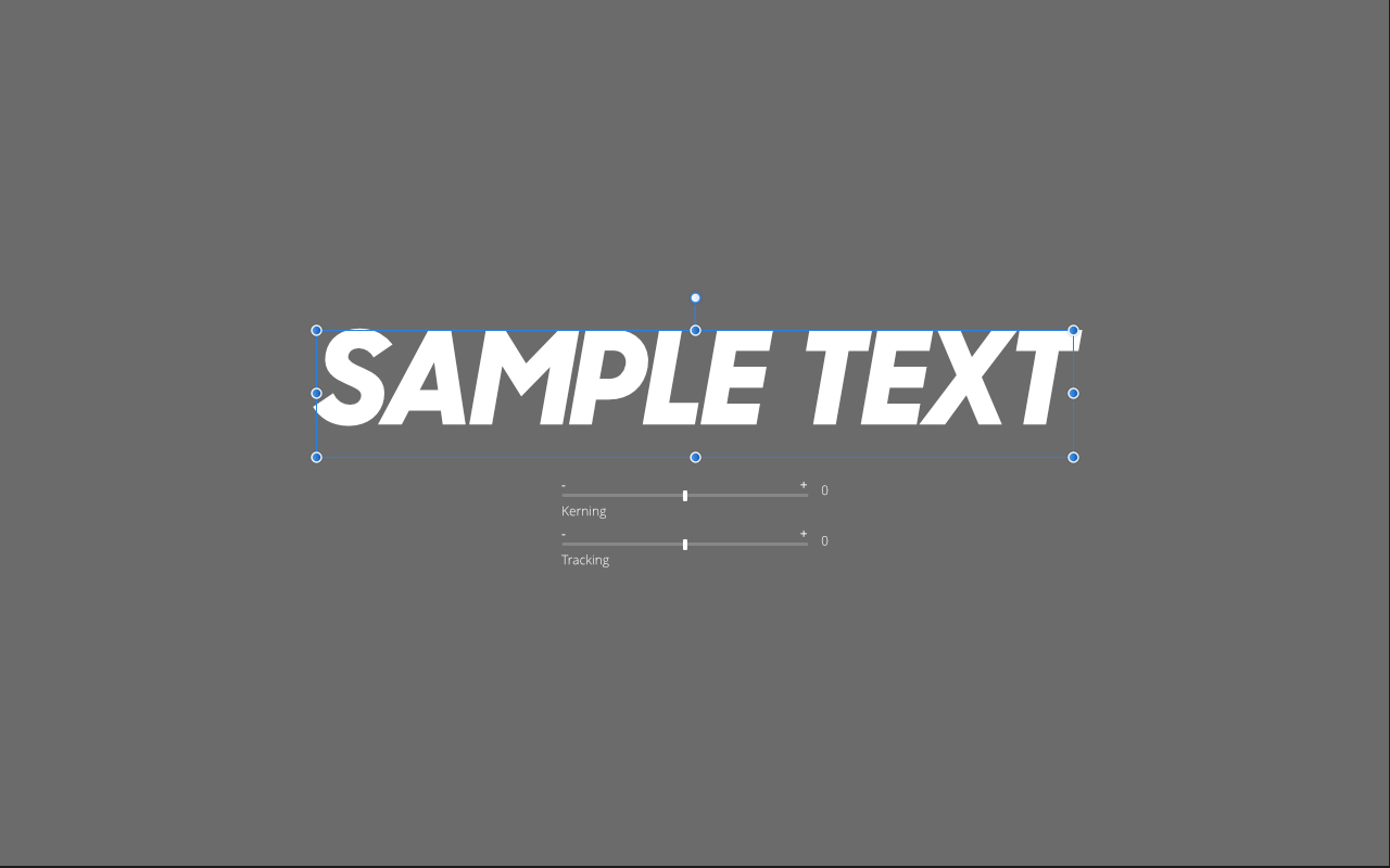
Kerning and tracking are the most common tasks in typography, yet we have to deal with tiny archaic interfaces in pretty much all apps out there. You already have a rotation tool that's good for getting the values into the ballpark fast and edit details later. Kerning and tracking don't have anything like that. What I'm suggesting is head-up display options added to the regular tools. I made a mockup (attached) of the art text tool to better illustrate that idea. Ideally the regular tools would have a small button (a blue '+' maybe) that lets you add that specific controller to the HUD of the related tool(s). Everybody has different needs and this would speed up workflows without having things present that the user may not need.
-
Working on a redesign of an app in my company, and I wanted to experiment with Affinity Designer. Having had worked with both Sketch, Adobe Photoshop and Adobe Illustrator, Affinity was the right amount of "strange" I needed. Right between Ps and Ai, with bits of Sketch, it's exactly what I need. I got accustomed to the snapping, and it's a joy to do UI design with it. Especially with Artboards. Very very easy. I'm a bit miffed with the occasional crashes from various sources, but those are going to be history once the beta goes MP and gets released. I've also tested Flinto, Pixate and Principle in parallell with Affinity Designer, and I settled on Principle. Flinto is simply too primitive and has issues with element positioning. Quite the odd UX they got. not a fan. Pixate is a bit complicated and just doesn't cut it in terms of more complicated stuff. Having said that, Principle is still not the best, lacking timelined animation & interaction. What I wanted to see was something along the lines of After Effects Timeline animation but for individual elements, adjustable timeline lenght, etc. I would've wanted to be able to stopwatch parameters of properties and be able to change them (create keyframes in the process). Alas, no. The principle phone client is really primitive. No wireless sharing, you have to be connected. Eugh ! Unfortunately I cannot give more info about the project, nor can I post more screens, because I'd then be in deep trouble. Cheers.
-
 After working with AD to export stuff for a mobile app, I came to the conclusion this would be a must. It's really difficult to navigate between lots of different things and not be able to organize them, and so it would be cool to have: 1. Layer/Export item color coding (like ps) 2. Export item grouping, to keep things tidy. setting a "Path" variable on this could be cool because it would allow for all items in this group to be exported in the path specified in the variable, without having to resort to "funky naming" like "mainfolder/subfolder"
 -
Hello One of Adobe's consistent behaviours has been to hid bloatware in places impossible to remember. One of AD's features has been a cleaner interface, even if I'm still looking for some Illustrator features and wonder if they're hidden or just not present... :) So this is a request to try and build a consistent interface. Going to your example video of scaling features, I understand why the corners should be in the top ribbon, that's an essential features. The scaling of strokes is more hidden, and the scaling of effects is three levels of interface deep... From a UI perspective, there's nothing that should prevent you having the 'scale w object' tick box directly on the panel. Actually the cog wheel adds very little and may well be dispensed with altogether! Thanks
-

Touch Bar
Oval posted a topic in Pre-V2 Archive of Affinity on Desktop Questions (macOS and Windows)
Still no informations, videos, pictures of the Touch Bar in action with Affinity? ;-)