Search the Community
Showing results for tags 'typography'.
-
 Hello I'd like to stress the need for a (very) good justification engine in Affinity Publisher, in order to produce high quality text-heavy publications. Because I'm not sure what the status on microtypography in Publisher currently is, I'll drop this info for your consideration. In the 1990's type designer Hermann Zapf and engineer Peter Karow developed the Hz-program, a justification engine which has gained a somewhat mythological status. Its algorithm combines multiline composing, hanging punctuation with word-spacing, letter-spacing and most controversial: glyph-scaling. Adobe has bought the patent, but it's not known whether they actually use the program in InDesign. You can however change most of these parameters (word-spacing, letter-spacing and glyph-scaling) in the justification engine in InDesign with a minimum, maximum and optimal amount. In my opinion, a paragraph composer with these settings, combined with extensive hyphenation settings are an absolute must for professional typographers. Some sources on this topic: - https://en.wikipedia.org/wiki/Microtypography - https://en.wikipedia.org/wiki/Hz-program - http://www.typografi.org/justering/gut_hz/gutenberg_hz_english.html Thanks for your consideration!
- 10 replies
-
- 1
-

-
- justification engine
- justification
- (and 3 more)
-
Good for this first beta version. For paragraph styles it would be more useful to put the leading at the body level, the two go together. It lacks more typographic management with non-breaking thin spaces for characters ;:!? Plan to move the point of origin of the page (point 0) in the page. Add the value of the gutter next to the number of columns in the toolbar. Ability to divide the page structure into columns.
-
 Hello, buddies! I have quite a hard time managing and changing fonts in both AP and AD, but one of the features I miss the most is the possibility to filter all my fonts to their specific families: serif, slab serif, sans, script, decorative, etc. Is it possible to be done? If not, will it be implemented? Also, is there any way of changing font size clicking 'n' dragging in the icon, like Photoshop? The only solution I've found so far to ease the size modification (as defined numbers aren't really a big help) is assigning the commands to increase and decrease to shortcuts, like Ctrl+Alt+>. All suggestions are welcome! Thanks.
 -
 The PDF import function is simply magical – it's amazing to be able to take PDFs of things I created years ago and have them turn into something reasonably workable. It would be even more useful if Publisher could automatically create styles based on fonts, text size, and so forth. Even if it didn't pick up everything, it would be great to have a starting point for editing heading styles and so forth.
 -
 In this Affinity Designer tutorial, You will learn how to create an amazing rope text effect using the Pen tool, Node Tool, and Rope Thick Brush. After this work applying outer shadow from layer effect for an amazing look. I hope you enjoyed. Thanks.
- 3 replies
-
- 4
-
-

-
- rope text effect
- using brush
- (and 4 more)
-
 Another essential feature I would like to suggest is the addition of vector and other objects on a line or in a frame of text thus it can flow with the rest of the text.
 -
 I have not yet been able to understand how external punctuation is achieved in a justified text. Today, by opening a PDF of InDesign with AD, I noticed that it has kept this feature even on editable texts. Is it possible to do this or is it because it gets text with external formatting?
-
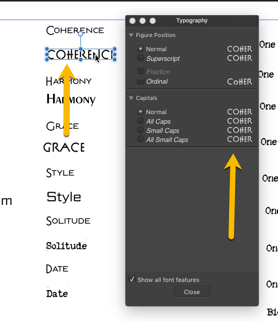
 I have a question if I may? On the IPad version of Designer, the Advanced Typography (Text Studio) options under the ‘OpenType’ menu don’t look or perform anything like your tutorial. In fact, the only options I have available are ‘Figure Positions’ and ‘Capitals’ which aren’t that exciting. Am I doing something wrong? Many thanks.
 -
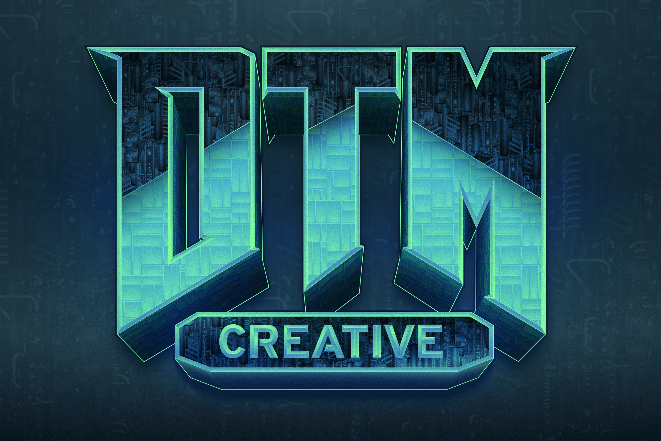
Really wanted to do a DOOM version of my branding for a while, so I took elements from both the original logo as well as the reboot and mashed it together. Really happy with the results. This is my first big project fully utilizing Affinity Designer. Fully vector and fully in-house.
-
 Hi all- New here! I'm trying to figure out how to write words in my logos (I know, the typing tool). What I mean is how do people write the words of a company name- do you usually download custom fonts from online websites, and if not, how does one make their own font? Maybe @ostrysharpcould help- I really loved your work in this feed.
 -
The typography window/panel cannot be made to accommodate a complete word. Could an option be available to increase the width of the panel?
-
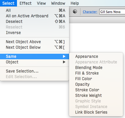
Hello! after Adobe pulled another stunt (with Lightroom this time) I'm preparing for an Adobe Free Future™! I've come back to Designer (ßeta 1.6/12) — and what I saw made me very, very happy. Cannot wait till I see what you guys do with Publisher! As you have guessed I'm still missing some features before I can ditch Illustrator all together: selecting objects by type/look (see screenshots with Graffix Select Menu) lockable guides and the making guides from objects. Also: split in to grid. overprint on a per object (fill/stroke) base (not only in the swatches). ability to choose a font (and other things) from the contextual menu. Despite its name, it's not very contextual right now. plugins/scripting would make Designer much more powerful of course. See for example what you can do with Python in DrawBot of Nodebox offset path (could be scripted?) more transform options like "transform each", which is very, very handy in Illustrator … Anyway, can't stress enough that you guys already did a fantastic job, making such a powerful app from zero. …without the income of subscription-model ;-). Keep up the good work! — Benjamin
-
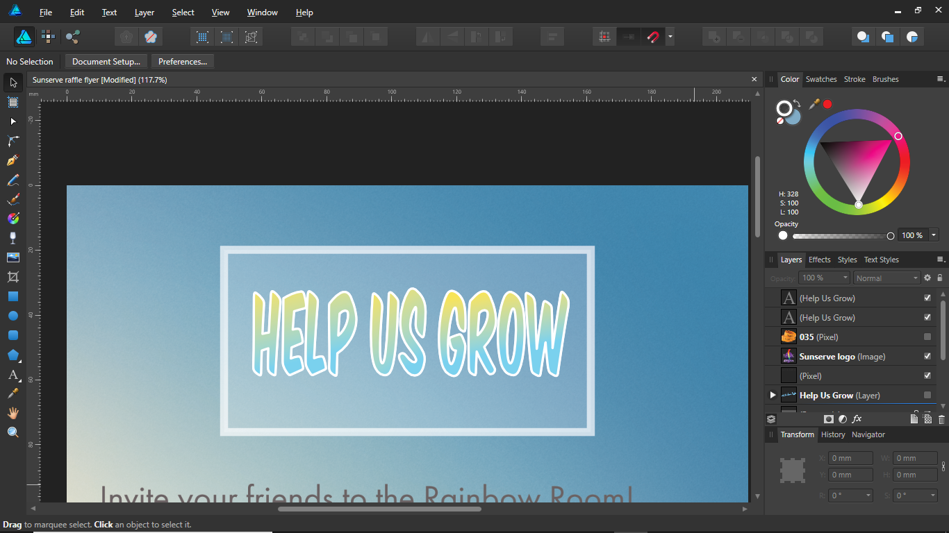
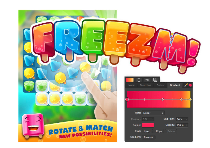
 Hi guys, I am currently working on this flyer and I want " Help us grow" to have that 3D depth to it like the "freezm" logo (images attached below) If anyone can help, I greatly appreciate it!!!
-
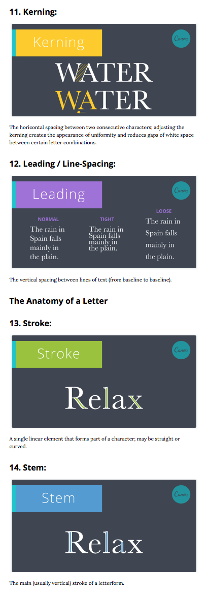
Hi all just wanted to share this link to, what I thought was a good explanation of typographic terms. A Beautifully Illustrated Glossary Of Typographic Terms You Should Know Example.
-
Right now both Artistic and Frame text tools mishandle Thai language text. Thai has a number of glyphs that go over or under the preceding glyph, like these two which spell the word duu, meaning to look: ดู In Designer, typing those two characters gives ด ู, which is an unreadable garble. Bizarrely, Affinity Photo handles Thai artistic and frame text okay, so the workaround isn't a hard one. But why make any workaround necessary?
-
Here are some album covers that I worked on a while ago but never got round to properly finishing. One is for a sort of "hard rock" cover (a bit of GIMP work on the background) and the other is more "trance" (all AD) but using the same logotype. The logotype was originally Times New Roman - I'm fairly sure of that - but AD made the modifications pretty easy, for the most part anyway. Neither is particularly Earth-shattering or anything like that but I thought I'd post them in case they were interesting to anyone (and before I completely forgot about them). P.S. The band name is fictional and not related to any existing band with the same name (I just thought it made some nice shapes).
-
 I know that Adobe Illustrator can work as an alternative to page layout software such as InDesign. Can AD also work as an alternative? Thank you
 -
 I have for example two fonts. In the first font kerning features added like: feature kern { # Kerning # DEFAULT lookup kern0 { pos quotedbl comma -100; pos quotedbl hyphen -50; pos quotedbl period -100; pos quotedbl A -70; pos quotedbl J -100; pos quotedbl a -40; For this font Open Type features is available on AD and kerning working fine. But for second professional font with settings like: feature kern { # Kerning # DEFAULT lookup kern0 { pos fraction hyphen.dnom -250; pos fraction plus.dnom -250; pos fraction plusminus.dnom -250; pos @_A @_C1 -23; pos @_A @_Dcroat -43; pos @_A @_T -69; pos @_A @_C.smcp1 -20; pos @_A @_U.smcp -10; pos @_A @_V.smcp -40; pos @_A @_f1 -15; pos @_A @_onesuperior -70; For this font Typography Panel is empty and kerning do not applying. Differences? In the secondary font kerning based on classes (groups of characters). And it seems that AD does not support it.
 -
 One feature in AD is bugging me for quite some time now. When I type the letters fi, they disappear. I already found out I can fix it by disabling Character > Typography > fi, but every time I open a new document it's enabled again. In my case, it's particularly annoying because my last name and my company name start with fi. So how can I disable this permanently? I don't even know what it's for, so I am probably never going to use it anyway.
 -
 Humble request to Typographers, Can any of you show off your font designs? Give a story how you used AD to create your font(s)? How you converted AD to font (rtf,otf)? Im just wondering how it can be done... I'm not a typographer, but I want to learn Dennis
 -
 Hey Everyone, I'm back with another video on how to add an Image inside of a Text: https://youtu.be/8Ykv45jox-w Let me know what you think and feel free to use this technique into your own design work. Thanks, Mike
-
Hey Everyone, I'm back with another video on how to add an Image inside of a Text: https://youtu.be/8Ykv45jox-w Let me know what you think and feel free to use this technique into your own design work. Thanks, Mike
-
 I have discovered an issue when pasting text from Mac Pages and Mac Mail documents. My clients usually send word documents for copy that I view in Pages, and I then copy and paste the text into the Designer document. I noticed that some of the text that I copy and paste is thicker and doesn't print as clearly than some others. It took me a while to find any discernible difference in texts because I could have two different text boxes with the same fonts, including font size, weight, spacing, and stroke, etc. I noticed that in the text boxes that have the slightly thicker fuzzier printing text that the typography buttons for ordinals and fractions were greyed out, whereas the text boxes that were more precise and clear were not. Unfortunately, I was not able to solve the problem easily by clicking the ordinals and fractions buttons as they were greyed out. On the clearer text boxes, these buttons were clickable, but not on the others. I've discovered that this happens whenever I cut and paste something from Pages or Mac Mail (have not tried any other programs but I assume it is with any text that is formatted). I've tried this with a number of fonts, and it's the same issue with any font that I use, so the problem is not with a specific font, it's with pasting formatted text from one program into a text box in Designer. If I paste the copy into Text Editor first and then paste it into the text box the ordinals and fractions boxes stay clickable. The only issue then is that I lose all formatting... clients often send documents with partial formatting that definitely saves time. Can anyone provide some insight into what is happening here and how I might solve this issue? Thanks!
 -
 Why Choosing right font combination is essence of graphic design. I think it should be enhanced on two field - basic filtering and font management (for Affinity Publisher). How Filters - user can filter available font by checking option like fx. Corel Draw did. If I looking Serif font to match used Sans Serif I simply check "serif". Option will use available font metadata, filtering by family, styles is base. Selecting by available chars / glyphs / letters / characters - is crucial for multinational support. It's saving time. When I use polish text letters like ą, ę, ł, ó, ź many times are not available in font. In place fx. ą is square or character from another font. It is not look nice. On this function is simple inputbox where I put my letter like "ą" and Affinity Designer / Affinity Photo show me only fonts which can view this char. Is a very simple and may be unique advantage (I don't find it in any application) Font presets - posibility set shortcut to prefered fonts. It's like most used fonts, but I choose fx. "kids stuff "- my preset and get drawing font to project for kids, and then when I change to "industry business" I have classic fonts. At some times last and most used fonts are not enough. It should be only global feature, because for one document text styles are enough. *Font management - install / deinstall font, font sites integration like Font Squirell - I'm not sure that should be part of AD / AP. I prefer here more sofisticated DTP app. I'll be think about font site integration for all Affinity apps, because in some place is very handy on creative desig if user looks for more unique typoghaphy.
-
- 2
-
-
- typography
- font metadata
- (and 4 more)
-
Hello everyone! I would like to show you a project I'm working on in my free time. Every letter gets random word and logo. I will post other logos from this project in this topic. On my instagram you can find black-and-white versions of these logos. I hope you will enjoy following this project with me! First part (A-E) on my Behance: https://www.behance.net/gallery/51624237/Logo-Alphabet-A-E Second part (F-J) on my Behance: https://www.behance.net/gallery/51888751/Logo-Alphabet-F-J Third part (K-O) on my Behance: https://www.behance.net/gallery/52040131/Logo-Alphabet-K-O Fourth part (P-T) on my Behance: https://www.behance.net/gallery/52517205/Logo-Alphabet-P-T Fifth part (U-Z) on my Behance: https://www.behance.net/gallery/53080625/Logo-Alphabet-U-Z
- 34 replies
-
- 4
-
-
- logo
- logo design
- (and 4 more)