Search the Community
Showing results for tags 'train'.
-
My favourite as a kid with its art deco looks and having the speed record of 126mph. Back then I didn't realise it was one of a quite a few class A4's. Designed by Nigel Gresley and built in 1938 by London & North Eastern Railway in Doncaster. I'll likely shrink it down a bit so there's more sky above the funnel but have left it like that for now so it's easier to work on and see the details. The outline's without the background otherwise it looks even more of a mess.
- 13 replies
-
- locomotive
- transport
-
(and 1 more)
Tagged with:
-
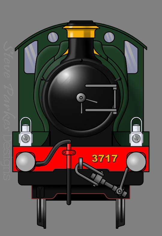
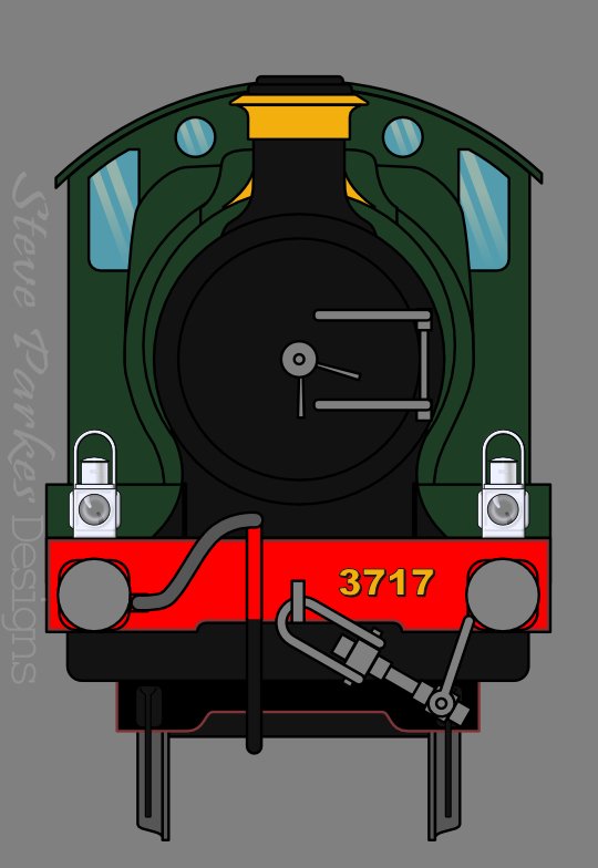
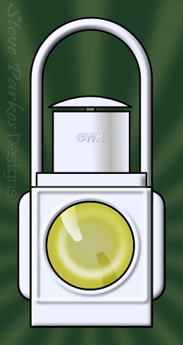
Great Western Railway (GWR) locomotive City of Truro. I had the pleasure of riding a train drawn by her in the 80s, and when I came across my photos again I thought she'd make a good subject. For the front view I looked up some original drawings on a GWR archive website, which avoided the problem of perspective; for the wheel, I had to make adjustments by guesswork. The colours are authentic GWR colours I found online on a model-makers' web page. The signal gantry is inspired by a magazine photo of a scene on the Severn valley Railway at Bewdley, England. And after I'd made the small lamps, I decided to do a big one. (Lamps or discs were fixed on the front of a loco to indicate what it was pulling, if anything. I used to have a book that explained the code, but I've forgotten what they were.) First draft, without shading. Driving wheel and maker's plate The small 'calling-on' signal, the lowest one, is upside-down! I have no idea why it was set up that way, nor why it's facing the wrong way (the track and turnout are to the left). And if you notice there are one or two small details missing . . . yes, they are! The 'distant' signals (yellow) are actually fixed at 'caution' (horizontal) and don't move. I thought I'd make them more interesting. 😊
- 3 replies
-
- steam engine
- train
-
(and 6 more)
Tagged with:
-
affinity designer Steam train in Designer from camera photo
NotMyFault posted a topic in Share your work
Hi, This post is a mixture of share your work and lesson learned. To get some practice with vector art, i start with photos of real world situations, and try to trace the curves manually. My goal is to stay 100% vector, and reach a high degree of accuracy even for small details (e.g. badges and symbols), but using as much simple shapes as possible (e.g. stars and ellipses for curves). After working several hours after business work for the last weeks the result is a mixture of nice / promising, and stuck in too much effort. Below you find the current state, missing lots of the under-carriage and fine details like tubes, nuts, color gradients. Lessons learned: Real photos always have a perspective distortion. This leads to some complexities: every wheel of the train differs, and ellipses don't accurately match a wheel viewed from perspective. So everey wheel needs to be adjusted individually, and every shapes needs fine tuning after conversion into curve. It might be easier to render this in 3D vs. trying to achieve this level of accuracy with Designer (lacking tools for perspective correction for pure vector documents). Some objects needs to be partitioned to correctly render the Z-axis / 3D Designer gets slower over time, after 2-3 hours you need to restart. Especially blur filters (or Layer FX) are taxing to the performance and lead to Designer become less responsive, even on my PC which is quite beefy. Now I'm curious how you rate my work, and what you recommend to improve the workflow (or artistic direction accuracy vs. abstraction vs. realism vs. imagination). This is 100% fun work, no intention to go commercial. Photo used as basis: own work. RBB is an active small steam train public transport with fixed schedule, used by tourists and commuters on the island Rügen in north-east Germany. -

multi Adventure Awaits - Illustration (Vector + Photo)
SalfingerAndrew posted a topic in Share your work
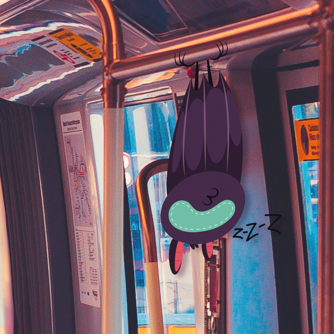
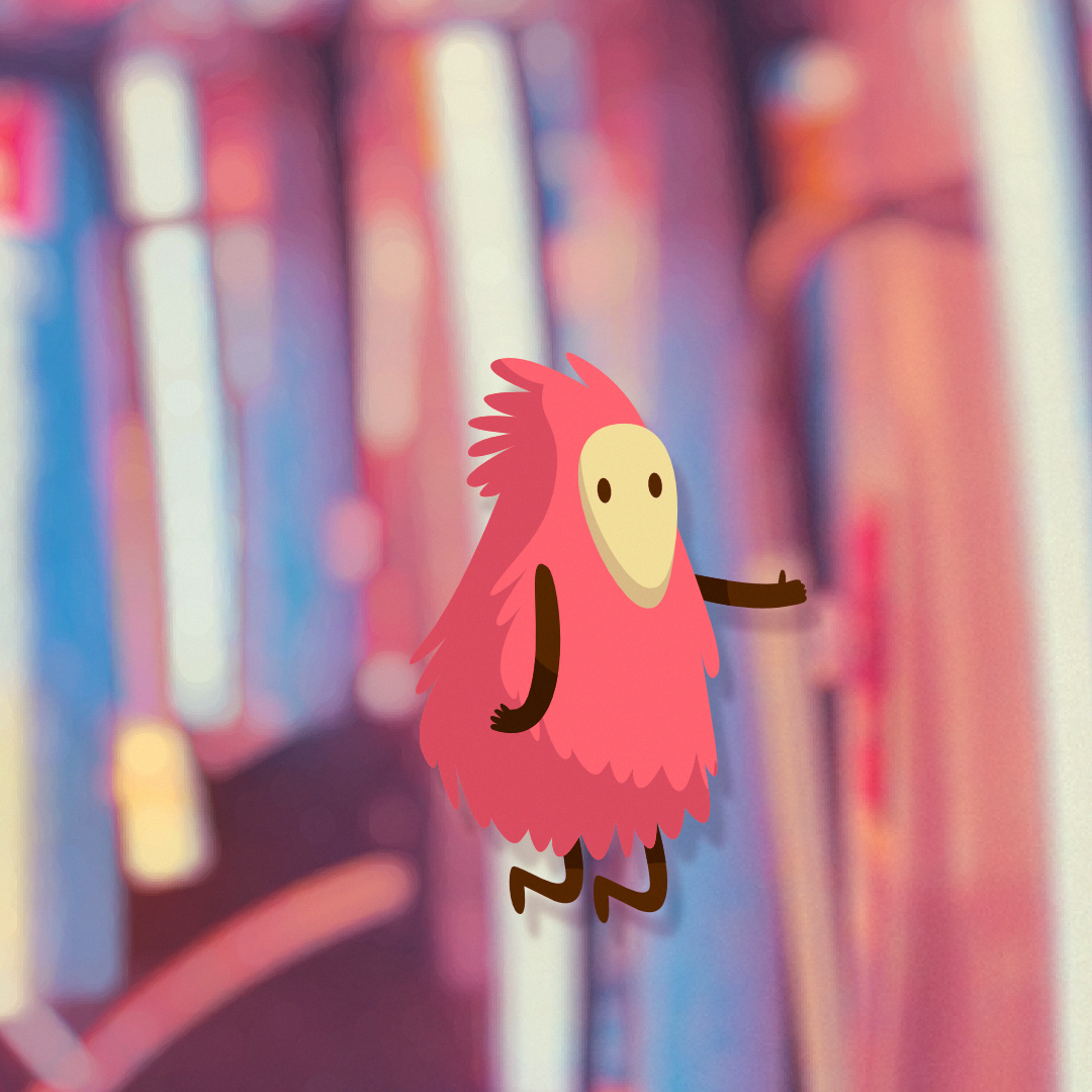
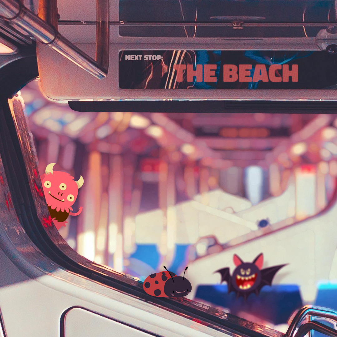
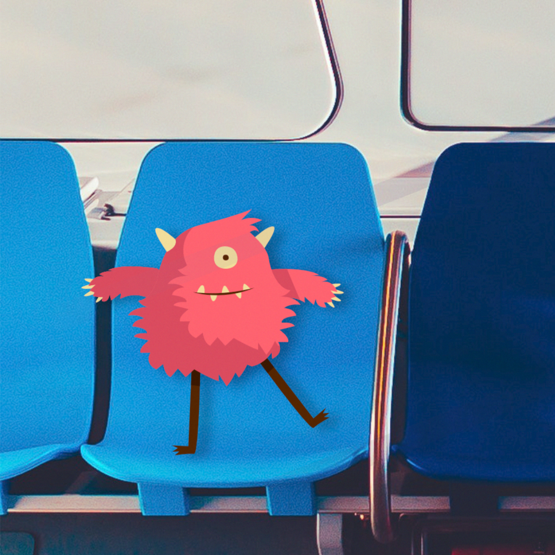
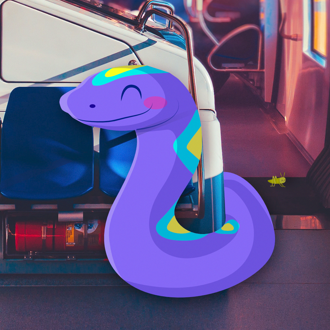
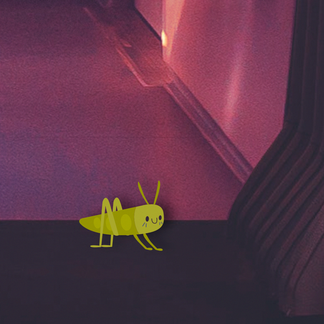
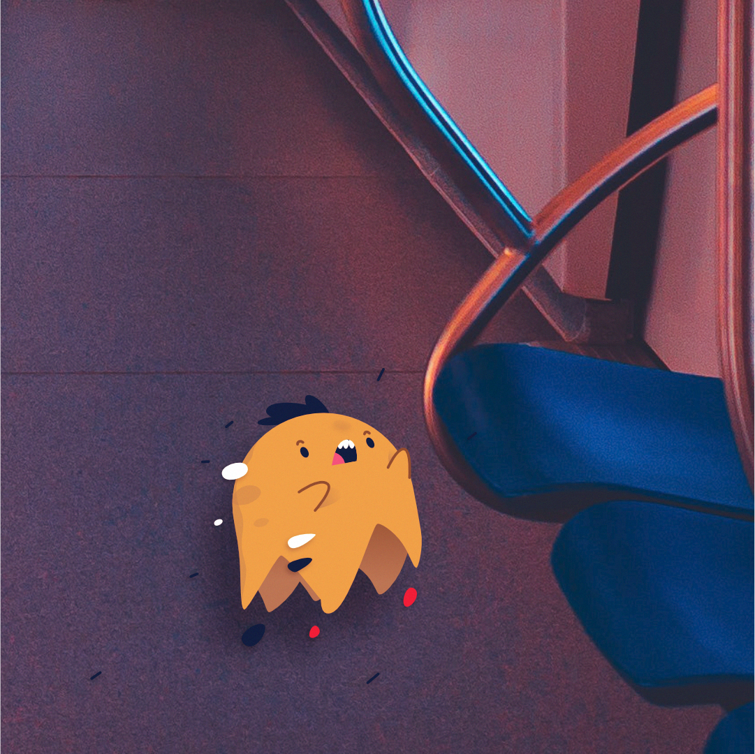
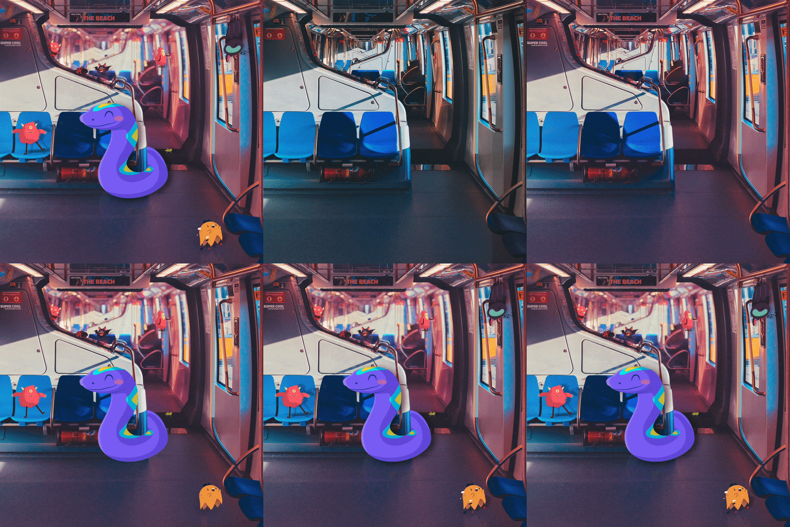
Hello everyone, Back with another illustration. Similar to “Light houses” this one is also a mixture of vector illustration with photography. The main vector objects (the monsters/creatures) where made in Affinity Designer then moved into Affinity Photo where I started with the background, removing all the people, followed by removing any text on the signs and labels around the train and replace it with my own text (a bit over kill since there kinda small to read and most people will never see it but was still fun to do) followed by placing the vector objects in, colour correcting the scene and adding shadows and other textuers such as dust and lens scratches. Overall the project was fun to mess around with and I’m happy with how it came out. Made with Affintiy Photo + Affinity Designer and made on the iPad Pro. Main image: Close Up: How it was made: Thank you for your time, Andrew.- 1 reply
-
- train
- affinity designer
-
(and 6 more)
Tagged with:
-
Hey! Having more time now due to you know what let me do more photo editing. Here is the first version of the photo of my commuter train in the morning entering my station: Afterwards went for a bit more dramatic look: Which one do you prefer?
-
This is the other side of the spectrum, good ol' isometric vectors It became part of a larger infographic that a colleague of mine finished (and which I can't share at the moment). The beauty of isometric design is that once You have correctly scewed and rotated Your building blocks even larger scenes become pretty straight forward – Affinity Spotlight recently shared a great tutorial on that. The trickier parts are of course geometries at odd angles, as well as round structures. Full disclosure: we bought a similarly looking original from iStock, but due to the messy way that vector and raster layers were intertwined we decided to use it just as a reference and rebuild the whole thing properly.
-
Just a couple of projects I keep working on when I have some spare time. I've lost count of how many times I've changed the portrait image or what I like to call The Doll.
-
Latest offering created in Affinity Designer and finished off in Affinity Photo...i'm really liking this software!

