Search the Community
Showing results for tags 'text-frame'.
Found 2 results
-
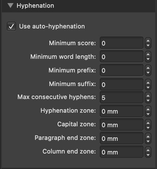
 I have an ongoing issue with hyphenation in justified text. The spaces between the words are just too big. I have tried around with the settings and as you can see below, I have (for my knowledge) already set it to the maximum of hyphenation possible. All the playing around with the numbers changed nothing (made it worse occasionally). Is there a setting for like the "maximum space between words"? Finally I figured the problem may be with the Hypenation Dictionary. Maybe the program just hast too few options to hyphenate? But the affinity help page only directs me to the hyphenation dictionary which is already installed. Are there any other you know of? As you can see in the example text below, there are two paragraphs. In the upper paragraph there are some, very few words hyphenated, although I would wish the text to be way more compact, even with more separations. In the lower paragraph, there is none, although there are many suitable words. Like those, who consist of two different words itself: "Kultur-behörde, Kunst-vereinen, Kunst-halle", even seperable into Kul-tur-be-hör-de or something like that. Also city names like "Ham-burg" or "Düssel-dorf". I find the look of these texts very unprofessional, but find no way (can not even think of a ciscumstantial way) to solve that. Can You? Thank you! Kind regards :)
-
 How can I VERTICALLY CENTER a text inside a Text Frame?