Search the Community
Showing results for tags 'text'.
-
 I import and flow text from frame to frame, but I find that the text can look different from one frame to the next, The first frame is often loosely leaded by the end frame leading is much tighter. Also the look of the text cab vary from looking crisp and sharp to looking much looser. All this yet I make sure that the typeface, size etc are exactly the same from frame to frame
-
 Hello Affinity Community, I'm working on a book-design and I can't change the leading of the text precisely. It jumps from super narrow to super wide. Do you know what setting I need to fix? Is it maybe the font? Thank you so much! Jessie
 -
As shown in the video, I am very confused as to why the text isn't wrapping properly when I 'edit detached' the height of an object that is created on the master page. Screen_Recording_2020-08-15_at_4_34.07_PM.mov
-
 I am an absolute newbie in drawing digitally (though not drawing physically). I set myself what I thought would be a simple beginner, teach-myself project using Designer. Your tutorials seem to start with an assumption of more basic knowledge (or jargon) than I have. I think my issue is a basic misunderstanding of layers, or deciding or managing the sequence of actions. Sorry to feel so stupid, but I am missing the "logic" of the process. [Maybe what is needed is a video tutorial at this level of (mis)understanding and decision-making.] My project: I want to draw some simple rectangular shapes and add text within each that I can center vertically and horizontally in each rectangle. I would like a different fill color in each rectangle, and different stroke-width outlines to my rectangles. I would then like to connect my rectangles with lines of different stroke widths and/or colors. (Result, sort of like a simple mind-map.) I'm fine with drawing, shaping corners, and filling the rectangles. Then I go astray. Adding text makes the rectangles disappear. Changing the color changes the color of the text. I cannot automatically align the text in the rectangles. I assume that my issues have to do with managing the layers in the layers panel, but maybe the text-alignment issues do not. Adding a text layer seems to make my "rectangle" layer disappear from the layers panel. I cannot seem to figure out what where it went. Should I add my text in the same layer as the original rectangle instead of its own layer? if so, how do I do this without making the fill and/or rectangle disappear? Art text? makes the text path curve around the shape of the rectangle, or something unexpected like that. (I still lose the color of the fill.) Text box? How do I fit it in the rectangle or not lose the fill color? How do I use the opacity sliders for the layers? For example, setting the opacity to 0 in the text layer simply makes the text gray and disappear, not let that layer show the rectangle's color and shape behind it show through, etc. When, or why, do I add new layer? Could someone kindly start me off with a very basic, step-by-step beginner's workflow to practice with to achieve my result? Or explain the logic behind sequencing the various processes to achieve my result? Such as: Step 1. select rectangle tool at left, draw and shape rectangle. Step 2. color fill rectangle? or should I add text and align? Step 3. set stroke around rectangle Step 4. add new layer???? select text tool and type text??? etc., etc.
- 7 replies
-
- 1
-

-
- affinity designer
- layers
- (and 3 more)
-
 I can't for the life of me work it out. Affinity_Publisher_Text_Different_Size.mov
 -
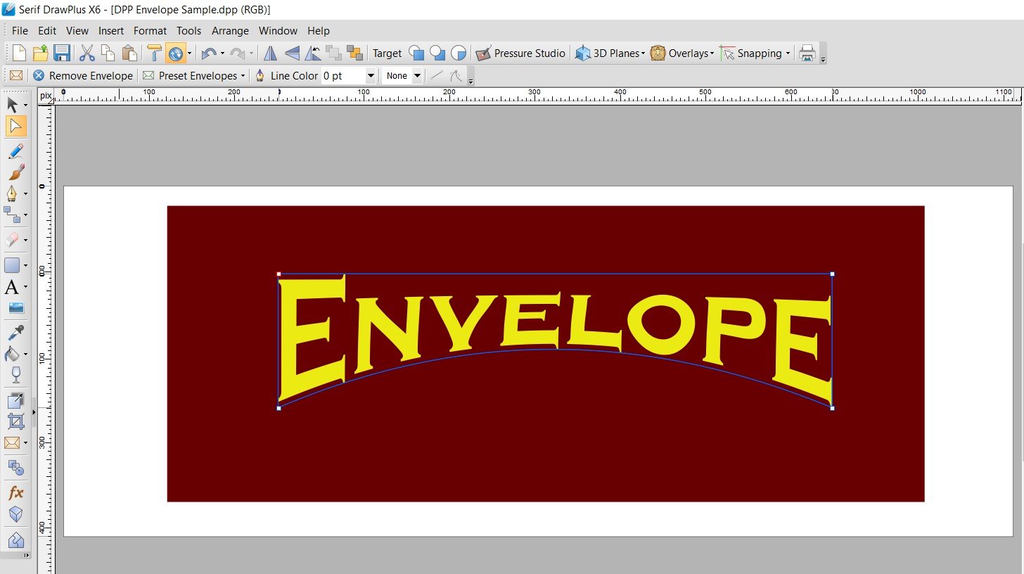
Why is there NO "Envelope" or "Warp" tool in Designer?! It's absurd! Envelope was there in Serif DrawPlus. Creating arc'd text (not on a path) is a BASIC text modification. With all the complex things Designer can do, why is this missing? This has been requested for years!
-
I have installed the latest release - 1.8.3 on windows and everything seems OK until I click on the space bar when adding text which completely closes publisher. There is a solution under the "resolved published bugs" folder saying to navigate to %appdata%\Affinity\Publisher\ and rename the 1.0 folder to 1.0 backup, then relaunch the app, but it did not allow me to rename the folder. It says this will be fixed on the next release, but this was published in October 2019, so it doesn't seem to be fixed. Has anyone got a solution to this? I will work on an older software until this is resolved.
-
 When I paste in something from some random website, or something from an another app — I get this WEIRD BACKGROUND i can’t remove. I found a workaround by using the effects presets, but it’s REALLY ANNOYING. SOMEBODY FINALLY FIX THIS OR GIVE US THE ABILITY TO IMPORT TEXT WITHOUT FORMATTING. This alongside how Affinity doesn’t remember my choice for spelling after I close my documents — and the fact how AFFINITY SEEMS TO THINK THE WORD “AUTO” IS MISSPELLED makes me literally scream every time i pick my ipad lol. come on guys please fix some of this stuff soon FullSizeRender.mov
 -
 Hello! Cannot find option to convert text in curves? How I can do it? Thx!
 -
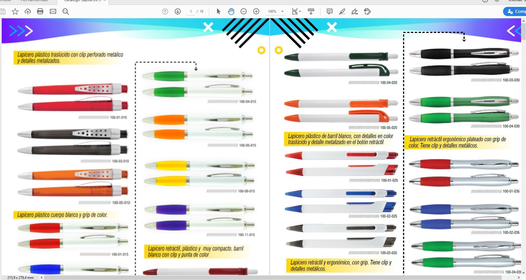
 I don't understand the "X" frame which appears to keep me from editing some of the objects in the attachments. No problem when the box and text are identified in the layers panel, but not all objects appear there. Also, a red line appears when expanding some items in the layers panel. I suspect this is related to my problem. No doubt this is another not seeing the forest for the trees. But I just completed a 90 page book and am trying to go through and make very minor adjustments / corrections and am expending a lot of time just trying to select an object, text box to make the change. I am able to click on an object, text frame in the layers panel or alternately use "find" to find and select the text or object to be edited. This is my first project with Affinity Publisher and up to this situation it's been a relatively easy to learn and use product. I do miss having cross-referencing, footnotes and endnotes, but I worked around those issues. Thanks,
-
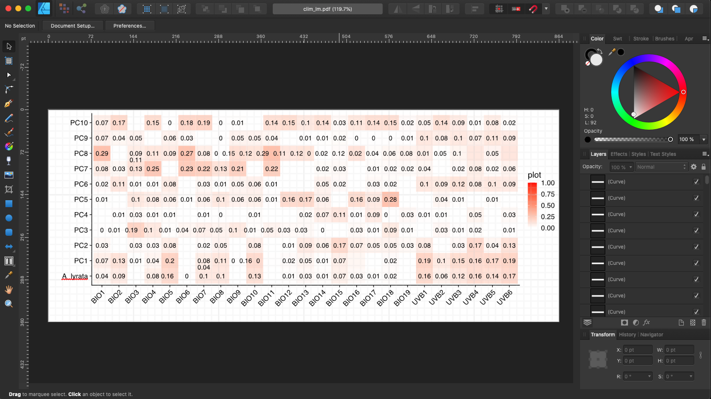
 I'm having a problem where text in pdf documents moves when imported into Affinity Designer (see screenshots). The issue seems to be especially bad with negative numbers or when digits have decimals before them. I have attempted selecting and deselecting the "Favor editable text over fidelity" and "Group lines of text into text frames" options and it does not seem to make a difference. Also, when importing the file, Designer tells me that the fonts used by the document are available. Is there a way to import a PDF document without the text shifting? I use Designer primarily to make small tweaks to figures and this issue makes using Designer extremely tedious as I have to fix the position of all text before exporting the document. For reference, running Affinity Designer 1.8.3 on macOS 10.15.5.
-
I just bought Affinity Photo yesterday. I'm Korean, and I use Korean version of Windows 10 Pro. And I installed this program on my lap top. HP Pavillion Gaming 15-dk0165TX WIN10 CPU : Core i7-9th RAM : 32GB HDD : M.2(NVMe) / 256GB VGA : GTX1660 Ti / VRAM:6GB I ran this program, and make some text, using Artistic Text tool for testing. And I tried to change the font type. I scrolled down on the font list. But it was getting slow down the moving speed around "M" group, and then it stopped for a while, and then moved a little bit, and then stopped for a while again. After this situation was occured, whole program speed also slowed down. And whole computer speed also slowed down for a while. I installed this program on another desk top computer which is in my office. CPU : Intel® Core™ i3-4130 RAM : 16GB HDD : 500GB VGA : Internal Graphic It was same situation with my lap top. I just bought this program yesterday. And I'm in a hurry, because I have to use this program and make some graphic results urgently.
-
 I am trying to place text inside of a rectangular callout. I cannot get it to work: both the artistic text tool and the frame text tool simply replace the callout shape. I can't find any online tutorials that cover this basic task. All I want to do is to have some text inside a callout that points to what the text describes.
 -
 Hello, when exporting a PDF from Publisher, I've noticed very poor text rendering when viewing in Acrobat. The quality improves and the letter forms (in this case Franklin Gothic) look more natural once zoomed in, but you have to zoom a long way. The dots in "i"s are joined to make them look like "l"s and the curved parts of letters like "s" look particularly awful. Attached is a spread from the original in Quark which is superiour, as well as a version made in Publisher. I've gone for standard settings for the PDF. I'd like a smooth transition to Publisher, but I fear my client will not be too pleased when viewing a proof PDF made in Publisher. Any tips? Thank you. Publisher – digital high quality.pdf Quark – screen medium.pdf
 -
I *think* it may be to do with optical alignment but I can't work it out. Any ideas?
-
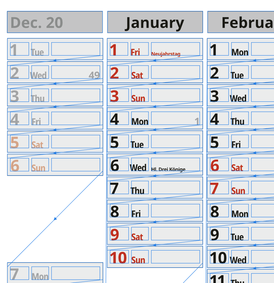
 I use connected frame text for a calendar layout. Each Day is one frame text - so i can place and align each day-element individually on different calendar layouts. But... how can I edit the complete text? In InDesign I used Ctrl-Y to edit the full text in a simple text editor. How to do this in Affinity Publisher?
-
 Why, when exporting an Affinity Publisher document to PDF, a specific page is completely rasterized (texts, vector graphics, etc.), and the other pages keep texts as texts and vector graphics as such? I need the texts to be kept as texts and the vector graphics as vector graphics, because if I export to a small PDF, if the text is rasterized in low resolution, it is almost unreadable and it looks ugly. Anyone ever happened something similar?
-
 In a text paragraph when I highlight a word, the highlight disappears when I zoom to 172%. I have Affinity Designer 1.7.2
 -
This applies to both Publisher and Designer. Publisher 1.8.3.641 on Win 10. If I add a stroke outline to text, weird things happen as I increase the stroke weight. The outline/halo ends up with lots of holes in it, particularly at high stroke widths. Interestingly this only happens for "solid" stroke style. Some fonts are worse than others. If I change to "dotted" stroke with curved end caps then I get a solid outline, i.e. what you would expect from "solid" stroke style. Sometimes the holes in the outline disappear on PDF export, sometimes not. textoutlinetest.afpub
-
 Having an issue in Designer where text spaces are exceptionally wide. See image. This is one of those issues that occur sometimes. It seems to appear and go away. I figure I mistakenly hit some mysterious keyboard combination that causes it to come and go. Any idea what causes this and how I can I can fix this? Clarification: I am not referring to the tracking between the letters but the extra large space between JACKSON and HOLE. That is a single space.
-
 How can I create in Designer, the equivalent of the "Envelope" feature which used to exist in Serif DrawPlus? I understand the Node tool works on shapes, but it does not seem to work on text. Please advise. Thanks, AC
-
 How do I combine these text letters into one shape/object and keep the stroke size intact? I converted the text to curves, I then "add" the shapes. And what happens is that I loose the stroke size, and the inner white areas are filled in. Thank you to anyone for helping solve this issue.
-
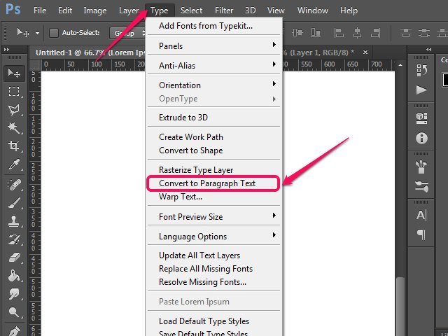
 Adobe Photoshop has an option to convert Paragraph Text to Point Text (Artistic Text) and vice versa. https://textuts.com/type-tool-in-photoshop-cs6-point-text-and-paragraph-text/ It is very useful at times. Hope to see this feature soon on Affinity Photo! 😅
-
Text usage is very slow. If I use a text frame, after less than a paragraph it starts to slow down -- I type in text and it takes a moment or two to show up on the screen. It gets slower as I integrate more text. Slightly worse with artistic text. Affinity Designer Version: 1.8.3.641 (recent install) OS: Windows 10 [10.0.18363.778] Video card: Radeon RX 570 (in case it helps) OS was recently installed, with minimal number of fonts installed. Same issue even on a clean boot with no other applications running. Strange: I have a dual-screen setup -- when I use the second screen for the dockers (I would like to have this setup) the problem is MUCH worse. Note my main screen is landscape and my second screen is portrait orientation. This is not very much text. I realize for many pages of text this would be the wrong application and that might be an issue but this is just a few paragraphs, that might appear on any number of flyers, info sheets, etc. Any ideas are much appreciated!
-
 Is it possible to have a frame text copy text from another? Almost like Fields, where you have a text frame copy from fields, but instead copy from another text.