Search the Community
Showing results for tags 'swatches'.
-
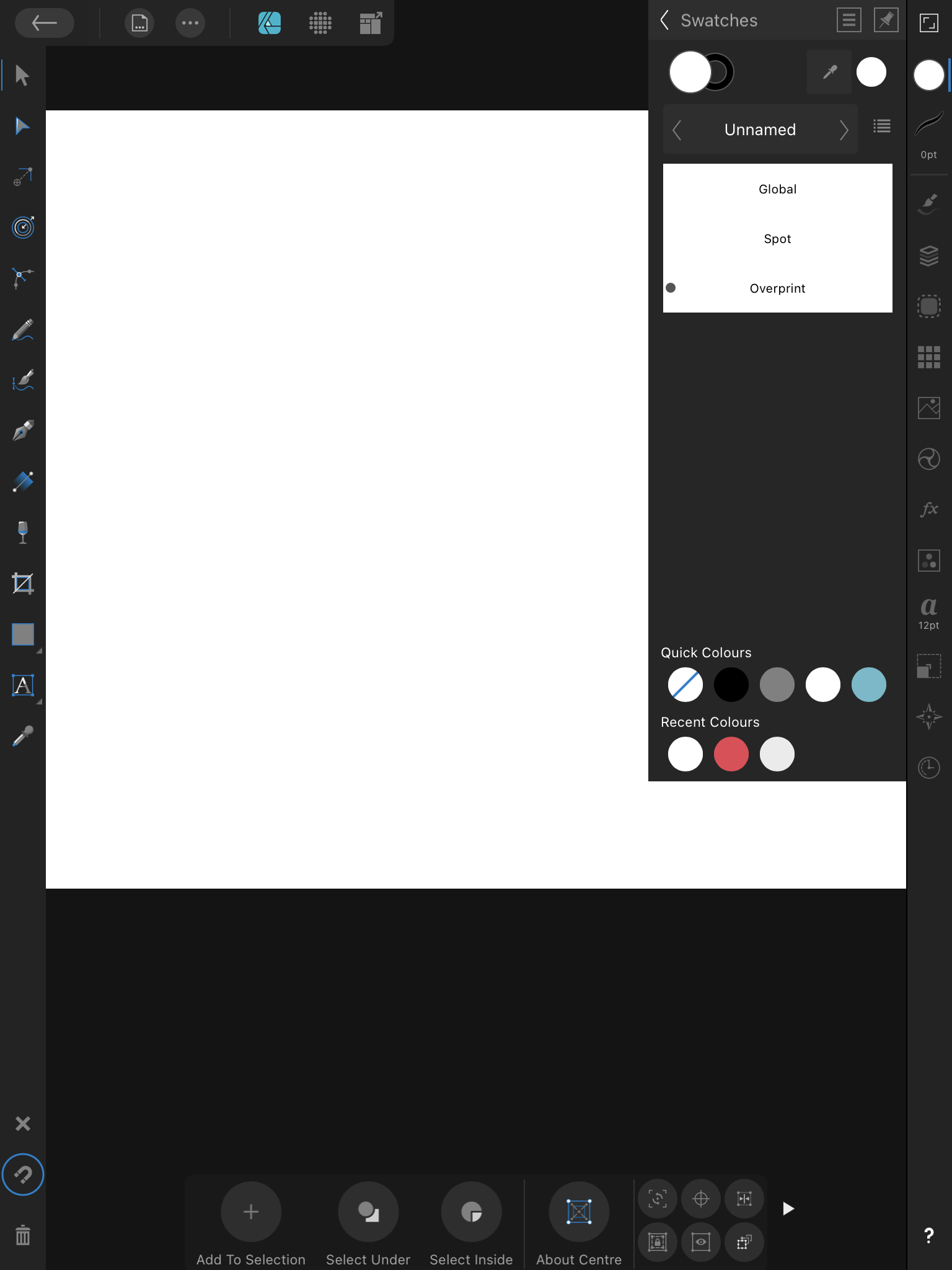
 There should be a black outline on these indicators, otherwise you can't see them on white swatches. See the attached image, and the name of the swatches. The only one you can see is overprint, the others are invisible on white. Thanks!
-
Whenever I edit a global colour value I have a chance the popup will move around the screen after the edit. See the attached video, it makes more sense when you actually see it. I can’t find a way to consistently trigger it, but it feels like the closer the popup is to the bottom edge of the screen, the more likely it is to happen. But it’s not a certainty as you can see. I feel this might have something with the physical screen size of my device? It’s a 9.7” iPad Pro and the screen is getting cramped by today’s standards, maybe the low amount of space is making the popup be “unsure” of where to stay? I also feel like this is less likely to happen when the device is in portrait orientation, it still happens though, just less frequently. Thanks! IMG_0538.MP4
-
 One little thing that might enhance usability would be to add some indicator with every colour swatch to show what kind of colour it is (CMYK, RGB, Greyscale, Spot). This could be a small symbol like in the Adobe products, or a letter or short word. It should be visible in the list view, there's enough space for something like that. In the compact view I don't see a way to add this info, except for the tooltip. Also, I would love to be able to see the (current) numeric values of swatches more easily. A swatch should show these after their name, maybe in parentheses, or italics: "Logo Red (CMYK 0-80-40-10)" or "Logo Red CMYK 0-80-40-10". If the swatch doesn't have a name, the current values could be shown on their own. Showing the numeric values does of course solve the issue of not knowing if a swatch is RGB or CMYK, so that no other indicator would be needed. A related issue is #77313 Color Numeric Value in Swatches, but if I understand that correctly, it deals with the CMYK/RGB approximations of Library Spot colours.
 -
I really need to be able to import swatches in the iPad apps, and I can find no logical reason not to have this feature. I can import brushes, fonts, symbols, assets, but not swatches? It is essential when working with color to be able to import a palette with specific characteristics. On the desktop it is so easy to do, but on the iPad it is impossible... Also I considered creating a swatches set myself from an imported image, but this required so much back and forth, clicking and opening menus it was a nightmare and I gave up after 4 colors. Please implement importing swatches soon.
-
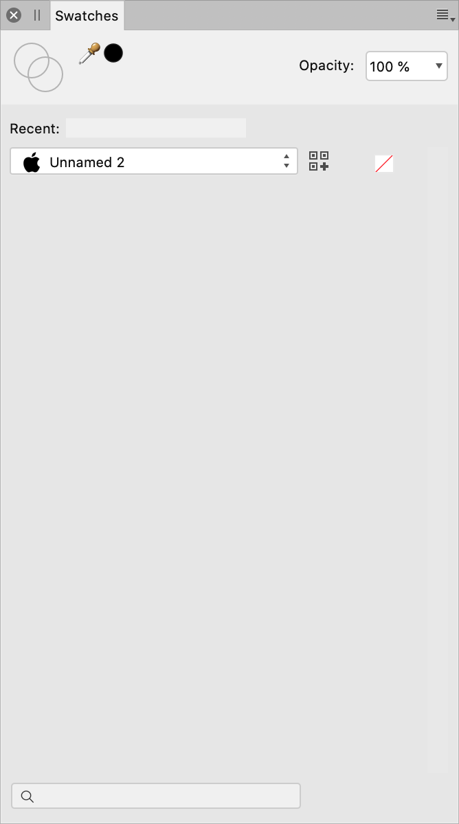
 Is it possible to access swatches from the context menu as shown below? Of course I mean document palettes should be listed here shouldn’t they, logically? If not, why not? Thanks
-
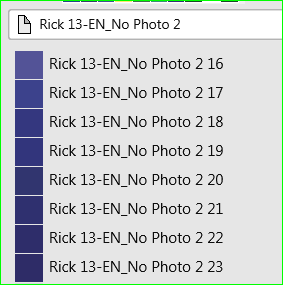
 I love Publisher but IMHO it has the worst colour system I have ever seen (in over 30 years). How did LAB, RGB and CMYK end up on the same palette when I only work in CMYK and the publication was set for CMYK? I NEVER work in LAB. I have 68 colours like this: "Rick 13-EN_No Photo 2 is the name of the publication. Useless as colour information for an in-document palette. It should be simple to create my own custom CMYK palette but instead it's horribly complicated, if not impossible. It's a monumental time waster. Why can I change a colour in this dialogue but not in that one. And then I can only change it in THAT dialogue, but not this one. A lot of things seem too clever by half in Publisher but colour handling is a serious fault in an otherwise pretty good app.
-
 Hi Guys, I need your help. I haven’t seen a tutorial of how to make a swatch or import a swatch or what files are supported for that. What am I missing? Thanks in advance, Alex
 -
 Dear All. I am creating artwork in Publisher which combines text and CMYK images and will be used to produce litho print from. I have (believe I have) created a 'text black' swatch. This is purely 100% K. No other colours. No Cyan, Magenta or Yellow. However, when I export as a pdf and review in Photo. The 'text black' has reverted to a CMYK black. Please help. Andrew PS. Is there a way to see seperations in Publisher?
 -
Hello everyone, I gathered some common used colour palettes used to make plots in R. Thought it might be useful for some of you as well. - colour brewer: only included set1 set2 set3 and paired (the ones I use the most) - viridis: viridis and magma - GeoDataViz: in here I also created gradients with 4 colours 0-25-50-75-100% if you spot any mistake let me know. cheers, Leonardo colour_brewer.afpalette geodataviz.afpalette magma.afpalette viridis.afpalette
-
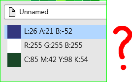
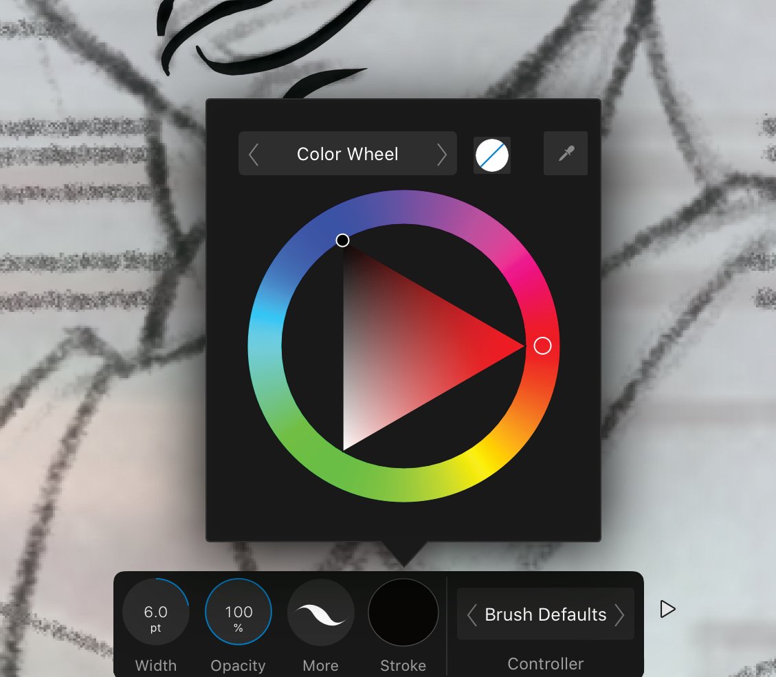
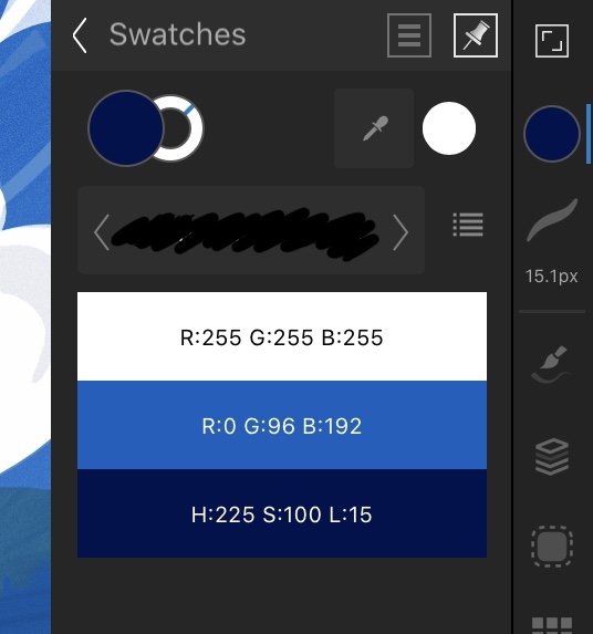
 Using the colour picker in the "magnified" mode, the RGB values on the document (e.g. fill layer) are different from the same colour in the swatches panel. For example, in a new layer filled with R:242 G:13 B:13 the corresponding colour on the swatches panel is R:220 G:51 B:17. It's the same for every choice. Is the swatches panel able to show the right colour? Thank you
 -
 In revising my AD color palette I see no way to delete multiply swatches (entire sections of individual swatches). Am I missing something?
 -
 Don't know if any one has run into this, but when going back and forth between two canvases I would use the colour picker tool, grab a colour to use, but upon going to my second canvas to use said colour the swatches swaps out to a different colour. Is there a way to stop this from happening so that I can keep the selected colours and swatches as I use them across the different canvases?
 -
 Want to use a vector brush? Want to use a specific color with your vector brush? Want to use a specific color that you carefully created and saved to your Swatches library? Too bad! Please add the ability to choose swatches within the color menus of the vector brush and pencil tools. Thanks!
-
 Hello: I've been using Affinity photo off-and-on for about a year now and still can't figure out how to place the black/white swatches on the front working space. I have to open the swatches panel to get to the black/white swatches. I'd like to add them to the tools panel so I can easily access them when using masks, etc. I recall seeing a screen shot of an Affinity Photo user's setup that had the b/w swatches on the working space so I know it can be done! Help! Also lest I forget! Please consider a "dissolve" blend mode! I use that mode all the time (ps cc) to help with color editing. It is divine for cleaning errant color blobs. Too, is there a way to import PS CC LUTS to AP? I am a hobbyist and have been using the GIMP, PS (since cs6) and now Affinity Photo for just about ten years now; I really like Affinity Photo and encourage everyone I can to give it a shot. I've worked with PSP, Krita and Inkscape; also Raw Therapee and Dark Table but mostly to explore and better understand images, lights/darks and color. Thanks much Silver711
 -
When I replied to this, I thought a bit more about the way color swatches work atm. I just don't think there is a need for a color swatch that is not "connected" to the objects that are using it. If I change a color swatch, I want to change all the objects that use it. InDesign does it this way, and it makes sense. I know that Illustrator does have "unconnected" swatches as well as "global" swatches -- but I never understood the reason for that. If there's a use case for "non-connected" swatches, please let me know I believe any such use should still be possible with "connected" swatches only. So all the swatches should behave as if they were a "global swatch". Or do "global swatches" have additional features that I haven't found out yet?
-
In the colour studio, I've added colours to a document swatch. How do I change them please? So say I wanted to change the dark blue in the illustration to something more turquoise.. how do I do this? The three bar menu only sports "Add current fill to palette". If I tap-hold on the colour it only brings up "Delete" and "Rename". I tried dragging the circles, but they don't budge, and I can't think where else I can tap on.
-
Updated to 1.8.4 today. Opened a document I was working on. The Swatches palette has a weird bug where the list of colours overlaps the palette selector dropdown. My carefully created set of colours for this document are now inaccessible. After trying the click the dropdown, it simply disappeared, and there doesn't seem to be any way to get it back. If I select "Add Document Palette" or "Add System Palette" the colours vanish, the dropdown is there but doesn't do anything, as it appears I can't switch between palettes any more. Related: There ought to be a way to auto-generate an "All colours used in this document" palette... Screenshot attached.
-
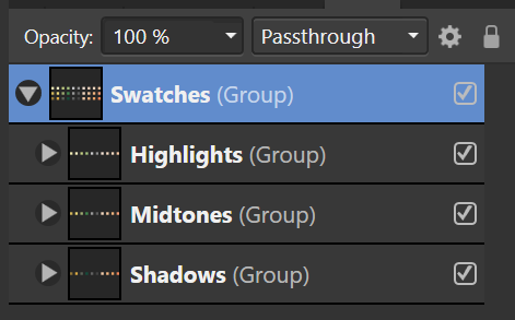
As yet I have not found any way to group swatches, like we can have sublayers under a top layer. This would be very useful when one has so many swatches that one has to scroll to find them. Up to now I simply put is a "title swatch" (a color I do not use) and make an artificial heading for swatches that are common to that part of my work. A group-type approach to swatches would be great.
-
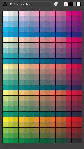
I used this palette a lot so I decided to make an Afiinity version and share it if other people are interested Have fun with the color :) Original palette here DC Comics 375.afpalette
-
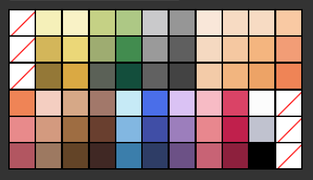
 Would it be possible to append the swatches and brushes palettes akin to the assets category? This would allow sub-grouping and make organisation much cleaner when dealing with large assets. Also including an 'add from selection' fill/line for swatches would be welcome. This could possibly facilitate sub-categories being auto-created and named if the selected swatches are already grouped (see Swatches2.png). My lo-tech solution (adding extra No-fill swatches in Swatches1.png) to get logical colour-grouping is time consuming and i often resort to just creating a specific layer for swatches, then having to cut/paste into a new document if i want that same palette again.
-
If you right-click a swatch and make a copy, then rename the copy, you have two swatches of the same color. AFPUB does not respect their name differences. When you apply the second swatch to an object, and then come back to that object later, it will have reverted to the original swatch and name since the two swatches have the same HSL - the swatch becomes highlighted when you select an object - the wrong swatch. This is a bit problematic if you wish to, say, assign #one swatch to section one of the document and assign #two swatch to section two of the document. The idea would be to come back later and change the colors of section two via editing the second swatch (the copy). It seems that you have to make a slight HSL change so that the objects don't confuse AFPUB by having the same HSL values. Essentially, this means you have to create a new colour swatch for section two that is not a complete duplicate of swatch #1. Screen recording: two picture objects, a single color swatch is used on each. Copy that swatch to make a duplicate. Assign duplicate swatch to second item. Select first object - uses original swatch. Select second object - original swatch is highlighted. Swatch copy is ignored and not used since it is entirely a duplicate. I would prefer to have an object keep the same swatch that was assigned and not revert to another with the same settings. Swatch Reverts.mov
-
 I'm using Affinity Designer 1.8.3.641 and noticed a small issue with swatches showing as "selected. The swatch panel can be in fill or stroke mode depending on which icon is in the foreground. Switching between them doesn't show the selected swatch for a particular object's fill/stroke. Example: - I have an object with a black fill and white stroke. - If the swatch panel is in fill mode, the black swatch appears selected (white square around that swatch). - If I change the swatch panel to stroke mode, the black swatch it still selected. - To get it to show that the white swatch is selected I have to click off of the object, then click back onto it. This all has to occur while the swatch panel is in stroke mode.
 -
It would be very helpful to have the same swatches as one has in the main Swatch Panel appear in both the Text Frame swatch option and the Gradient Effect as a swatch panel. I realize that this is asking a lot but if possible it would help work flow.
-
- 1
-

-
- swatches
- text frame swatche
- (and 1 more)
-
 So I've been wondering when and if you guys are going to add the ability to convert an image into a swatch. I understand how to do repeat patterns in designer but as a Fashion Designer the ability to make an image then convert it to a swatch then use that swatch to fill my clothing designs would be a god send the amount of time alone I would save is beyond measure. It's one of the few features I feel are a MUST be added to your program.
 -
 AP Color sliders can be changed to see the reference RGB Hex #. My question: Is there a way in Swatches Panel to type the known Hex values to add the color to the Swatches Palette? This is a very simple process in Procreate Swatches to add colors to the Swatches Palette. Type Hex number, click color and it's added, maximum 30 per Swatches Palette.